BREAKING: More than 3,000 #coronavirus deaths registered in Scotland according to new data from @NatRecordsScot. Hold my e-hand as I take you into a deep-data dive for @BBCScotlandNews including a look at new deprivation figures...
Although no fancy graphics this week as my Macbook went kaput taking my #rstats scripts with them #alwaysbackupyourdatamarc...
So, yes, the bad news is that 3,213 ppl in Scotland have sadly now died as a result of #COVIDー19. The good news however is that& #39;s a decrease of 110 from the previous week. Better yet, this is the second weekly reduction in a row.
The discrepancy b/ween @scotgov + @NatRecordsScot death totals remains about the same (53%). This is because former is based on deaths of those testing +ve for #COVIDー19. Latter figures include ALL deaths where #coronavirus (included suspected cases) was mentioned on death cert
The death rate per 10,000 ppl is sadly still the highest in #Inverclyde (13 per 10,000). That is DOUBLE the national average of 5.72. The council area has been labelled the " #coronavirus capital" of Scotland ( https://www.bbc.co.uk/news/uk-scotland-52530505)...">https://www.bbc.co.uk/news/uk-s...
The good news is that there also seems to be a significant reduction in so-called & #39;excess deaths& #39;...
The total number of ALL deaths for the past week was 1,434 incl 415 #coronavirus deaths. So the proportion of #COVIDー19 deaths is down to 29% from a high of 36%.
We also see a further reduction in weekly deaths in care homes (60 --> 57%), although weekly deaths in hospitals are holding at 37%. Interestingly, the number of deaths in private homes has doubled in the last week to 6%.
Now - if you& #39;ve stuck with me to here - the amazing @NatRecordsScot folks have published additional contextual data this week which gives us a better picture of what& #39;s going on...
This includes PRE-EXISTING CONDITIONS of those who have died from #coronavirus. We can see that the most common conditions in March/April were respiratory and heart diseases. This isn& #39;t a surprise - but what is, is the spike in April deaths involving dementia/Alzheimer& #39;s (31%).
Anyone have any thoughts as to why this might be? Moving on...
We now have death rates based on deprivation. These are broken down into "quintiles". For the uninitiated, that& #39;s just fancy geek-speak for where a population has been divided into five equal groups (of 20%) based on a variable. In this case we& #39;re talking about deprivation.
Now, the data shows the death rate in the most deprived category (category 1) is 86.5. That& #39;s more than double (actually 77%) the rate of more affluent ppl (category 5) dying from #coronavirus where the death rate is 38.2. BUT...first a sanity check....
We need to check that this isn& #39;t "normal" i.e. that proportionally more ppl in the more deprived category one are "normally" dying than the better-off category five demographic...
The @NatRecordsScot folks have thankfully provided this contextual data. Looking at ALL causes of death, we can see that sadly the death rate in more deprived areas is "normally" higher. The difference between cat 1 and cat 5 death rates is 63%...
That compares to a 77% difference between the most and least deprived categories for #coronavirus deaths. So it does seem fair then to conclude #COVIDー19 is affecting deprived areas, and at a higher than "normal" rate.
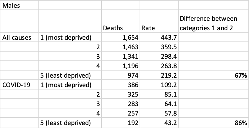
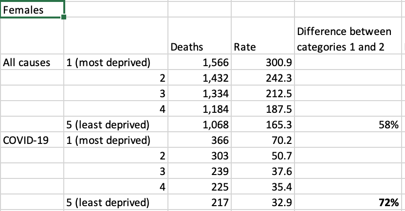
But what about a deprivation AND gender breakdown? Well, looking at men first, we see a significant gap (86%) between #coronavirus deaths amongst the most deprived and the most affluent quintiles/grps. That& #39;s significantly higher than the & #39;normal& #39; gap of 67%.
We are also given an insight into the type of urban/rural area #coronavirus deaths are most prevalent. Not surprisingly, these are most common in densely populated areas...

 Read on Twitter


