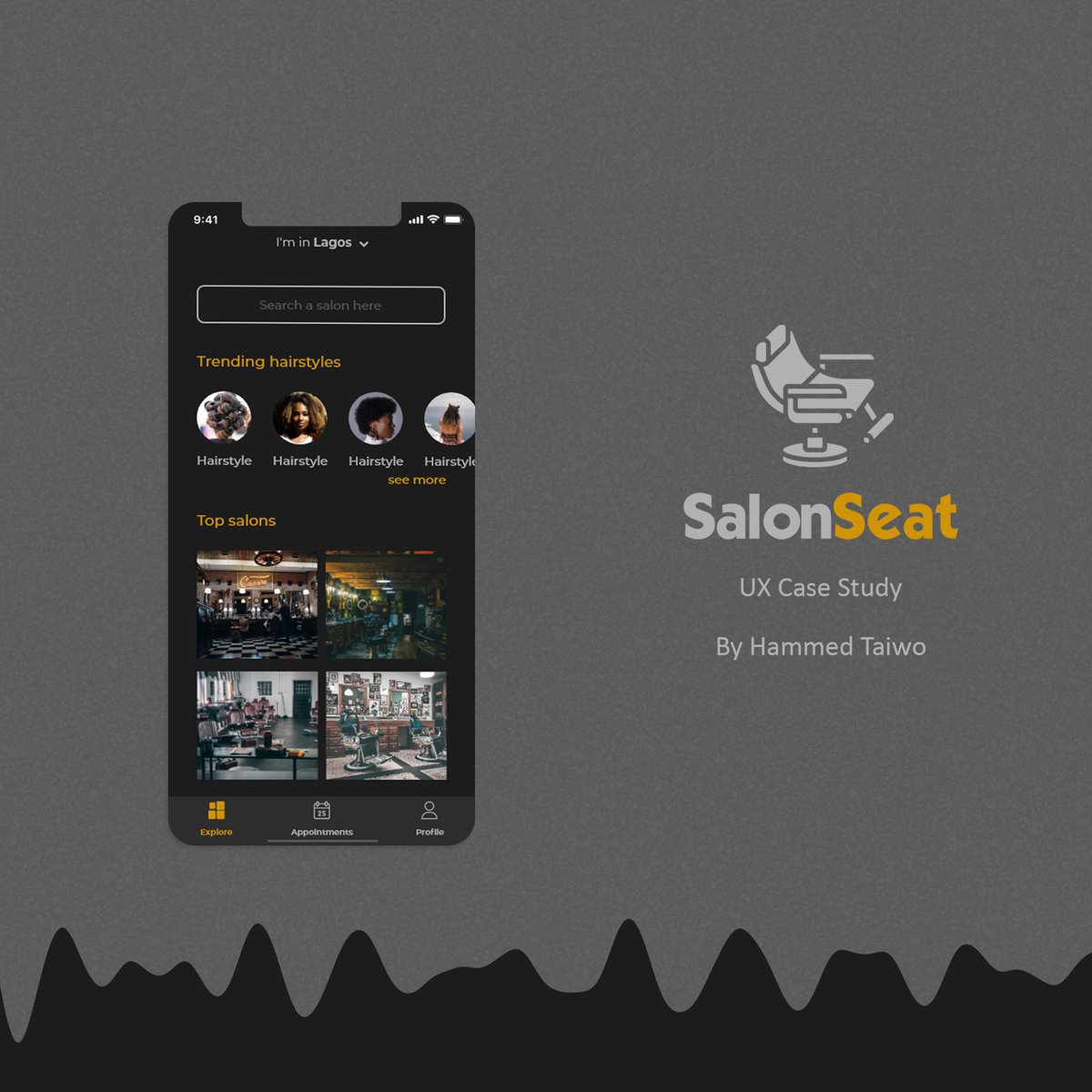
Here is a UX Case Study thread for an online barbershop app SalonSeat. The tools used were @AdobeXD and @Photoshop.. let’s get started
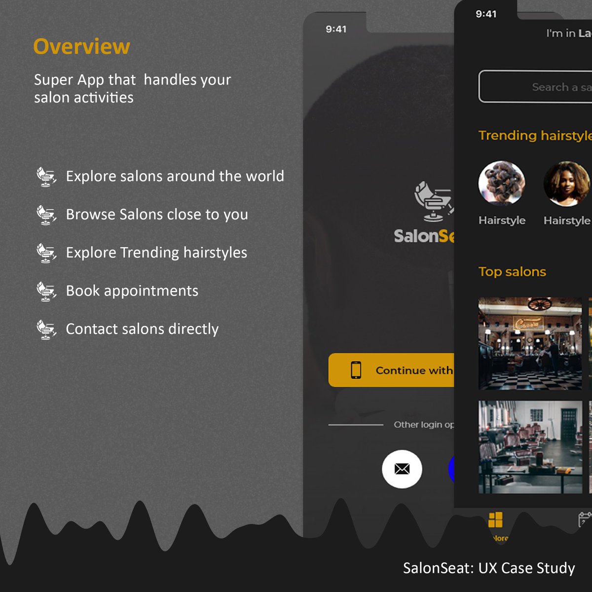
OVERVIEW
SalonSeat App makes connecting with your favorite hair salons possible in a blink of an eye. When you’re in a new city or new country, the headache and scare of who you could get your hair styled, trimmed, or shaved has been brought to an end.
SalonSeat App makes connecting with your favorite hair salons possible in a blink of an eye. When you’re in a new city or new country, the headache and scare of who you could get your hair styled, trimmed, or shaved has been brought to an end.
PROBLEM STATEMENT
When individuals get to a new neighborhood or city, they have an issue of where to get their hair treated. This has become a problem for so many salons are available, but few are actually up to par. Some can even go worse to the extent of destroying your hair.
When individuals get to a new neighborhood or city, they have an issue of where to get their hair treated. This has become a problem for so many salons are available, but few are actually up to par. Some can even go worse to the extent of destroying your hair.
GOAL
The aim of SalonSeat is to bring closer customers and beauty salons. This bridge will create a sense of confidence and trust for users all around the world. Also, SalonSeat will give you the updates on the trendy hairstyles of the moment.
The aim of SalonSeat is to bring closer customers and beauty salons. This bridge will create a sense of confidence and trust for users all around the world. Also, SalonSeat will give you the updates on the trendy hairstyles of the moment.
RESEARCH ANALYSIS
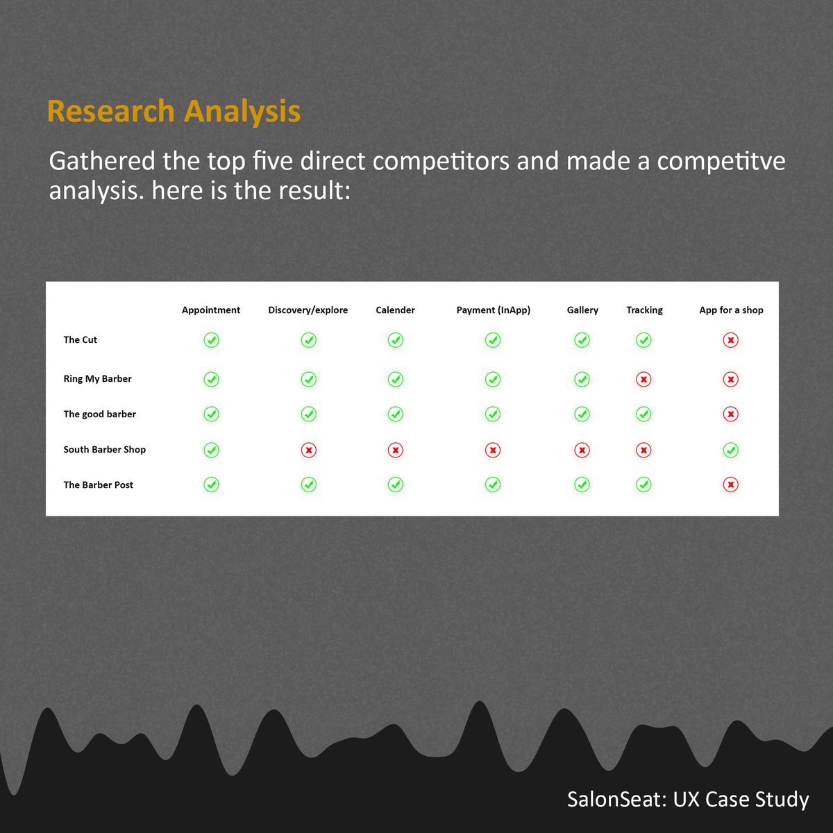
I spent some time surfing the net to check for both direct and indirect competitors. Unfortunately, I found out that out of the few top apps, they’re not really functioning well in Africa. I made a competitive analysis to illustrate what they have in common:
I spent some time surfing the net to check for both direct and indirect competitors. Unfortunately, I found out that out of the few top apps, they’re not really functioning well in Africa. I made a competitive analysis to illustrate what they have in common:
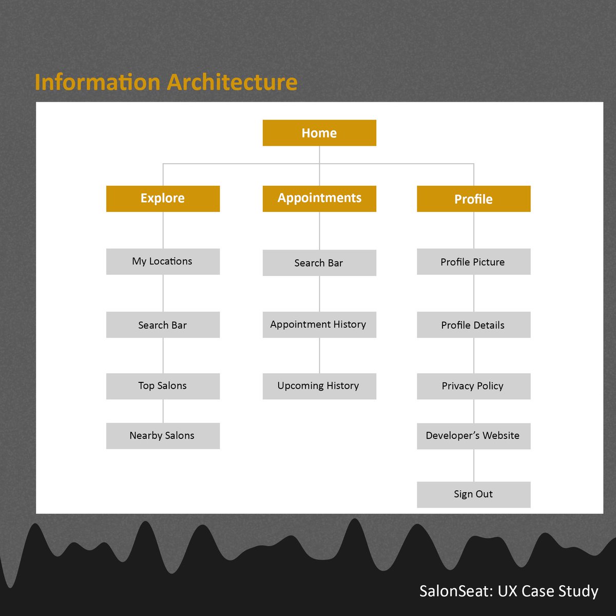
INFORMATION ARCHITECTURE Information architecture deals with the chain of information in every part of the system. I critically looked into this flow of information because a single wrong flow can lead to a bad user experience which we cannot afford to happen.
USER FLOW
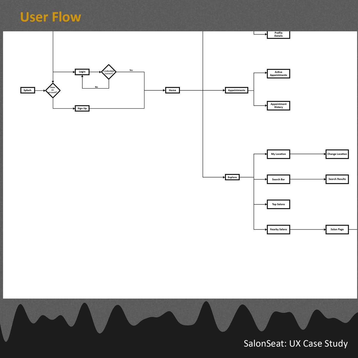
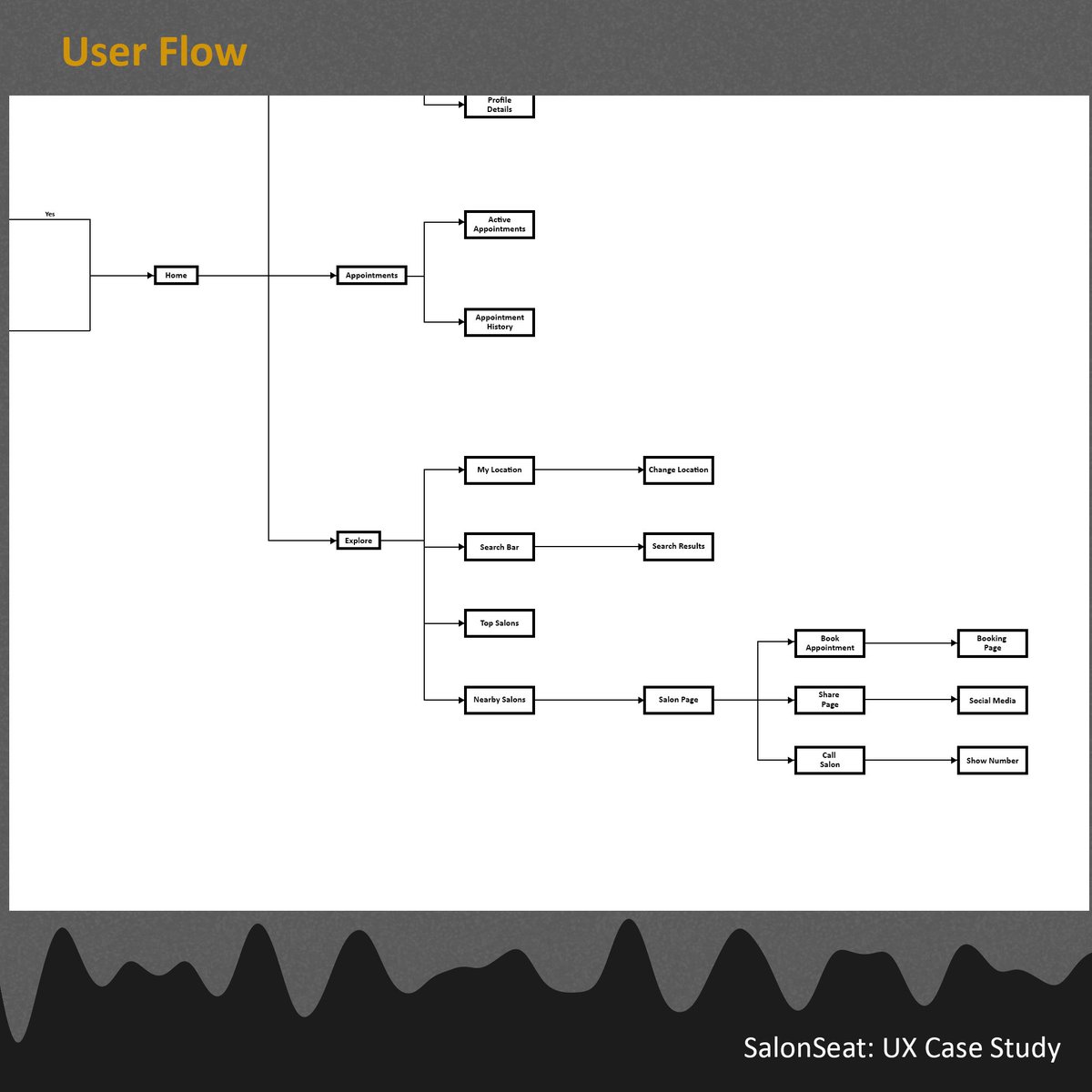
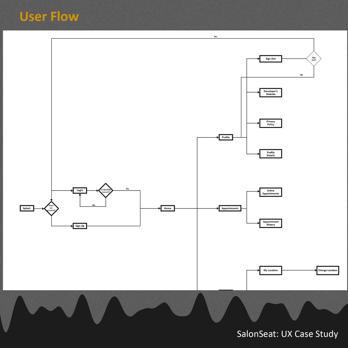
A User Flow points out every step a user takes in a system to achieve a specific goal. The goal could be to send a message, to post a status, etc. The user flow blueprints the paths taken to achieve that goal.
A User Flow points out every step a user takes in a system to achieve a specific goal. The goal could be to send a message, to post a status, etc. The user flow blueprints the paths taken to achieve that goal.
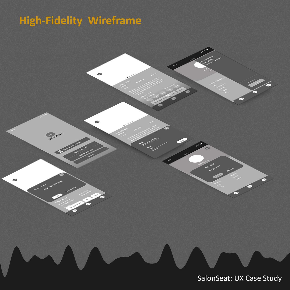
HIGH-FI
When the Low-Fi was completed, I moved further to bringing the sketches a bit more to life. This time I moved from Photoshop (which I used for the sketching) to Adobe XD (where the magic will happen). In this phase, I did more of interface organization and other roles
When the Low-Fi was completed, I moved further to bringing the sketches a bit more to life. This time I moved from Photoshop (which I used for the sketching) to Adobe XD (where the magic will happen). In this phase, I did more of interface organization and other roles
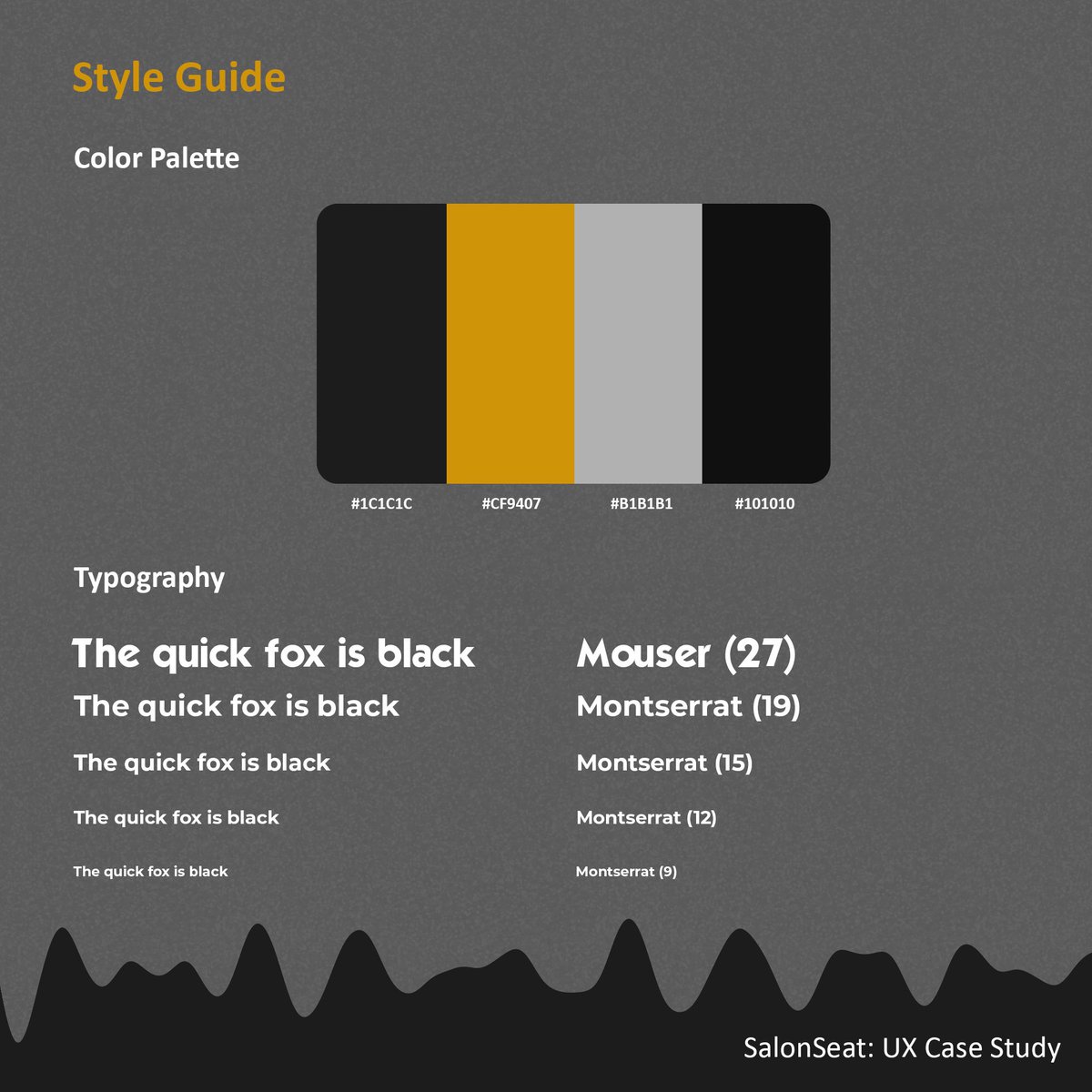
STYLE GUIDE
I went with the legendary Montserrat as the font of choice. It has a feel it gives the system which correlated with the experience we we want for the user. Also, the mode for the app is dark mode. It gives the app the chilly and professional feel of a salon.
I went with the legendary Montserrat as the font of choice. It has a feel it gives the system which correlated with the experience we we want for the user. Also, the mode for the app is dark mode. It gives the app the chilly and professional feel of a salon.
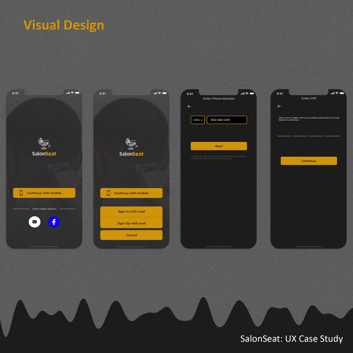
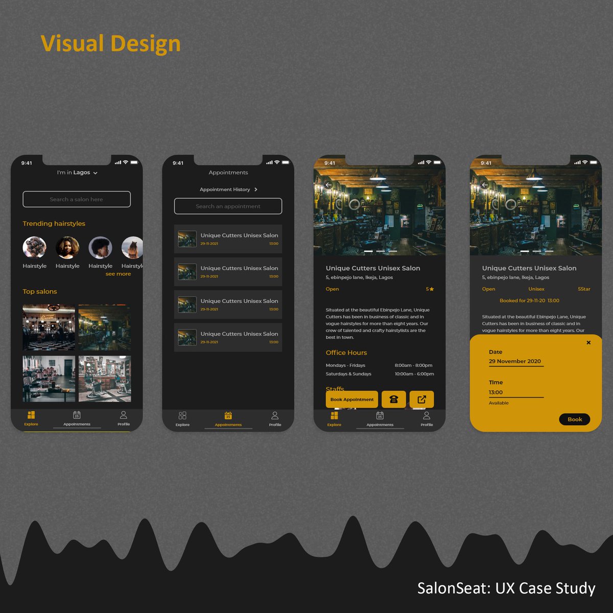
VISUAL DESIGN
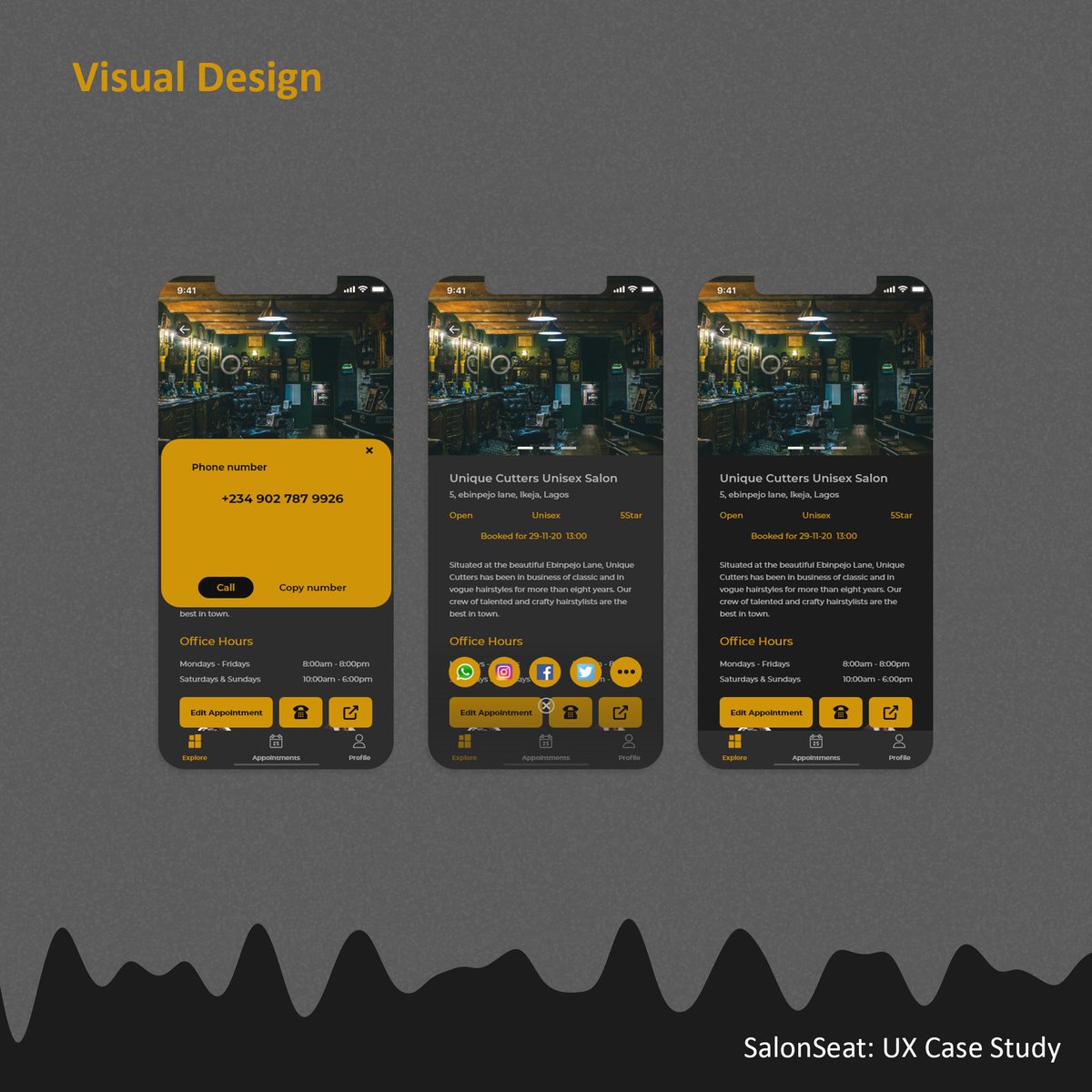
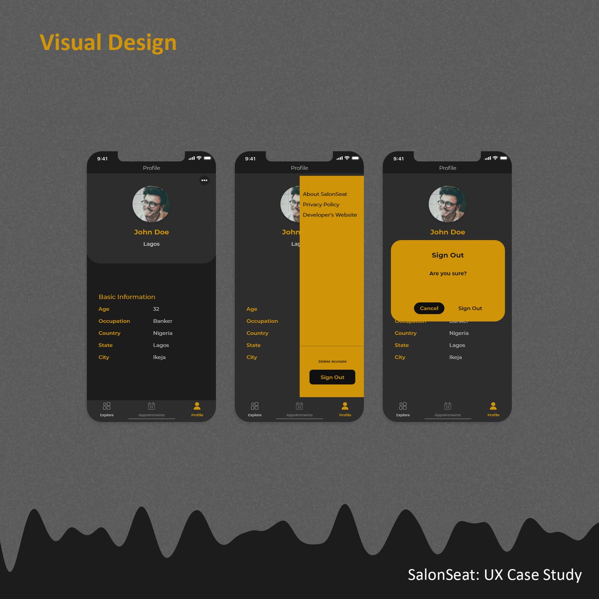
After defining the design guidelines I’ll be using, I proceeded to giving the system color, typography, and iconography. This officially brought the system to life and can be presented to the stakeholders for reviews.
After defining the design guidelines I’ll be using, I proceeded to giving the system color, typography, and iconography. This officially brought the system to life and can be presented to the stakeholders for reviews.
WHAT’S NEXT?
A responsive prototype will be carried out, UX testers will test the prototype for us to know if a pain point is still available. If it is, then we reiterate to fix it and any other issues. If not, we proceed to the developer handoff phase and implementation
A responsive prototype will be carried out, UX testers will test the prototype for us to know if a pain point is still available. If it is, then we reiterate to fix it and any other issues. If not, we proceed to the developer handoff phase and implementation
Here is an interactive prototype of the app:
Have any idea you wanna bring to life? I’m just a button away. I’m always open for projects!! Thank you.

 Read on Twitter