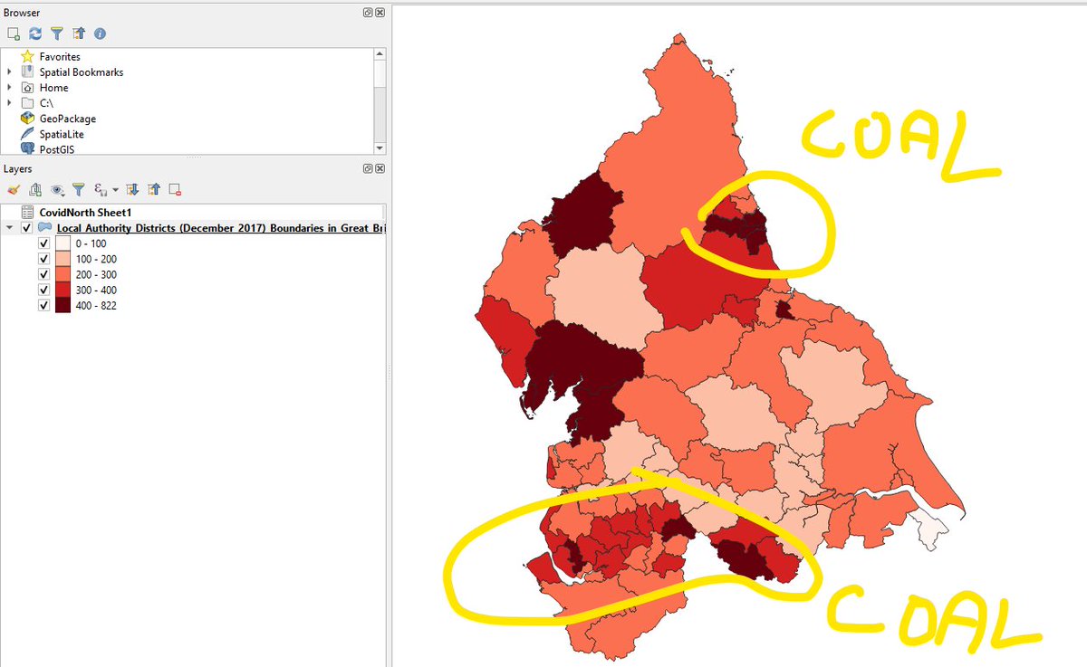
I saw it this morning. Diagnosed cases of Covid-19 by local authority in England (I just looked at the North). So I got all the data together to reproduce this map, the proposed popular interpretation of which I have reproduced in MS Paint.
I& #39;m now pretty (75%?) sure that it& #39;s just an artefact of testing efficiency. Former industrial areas are urban and deprived and we& #39;re testing more people in urban and deprived areas. So there are more positives there.
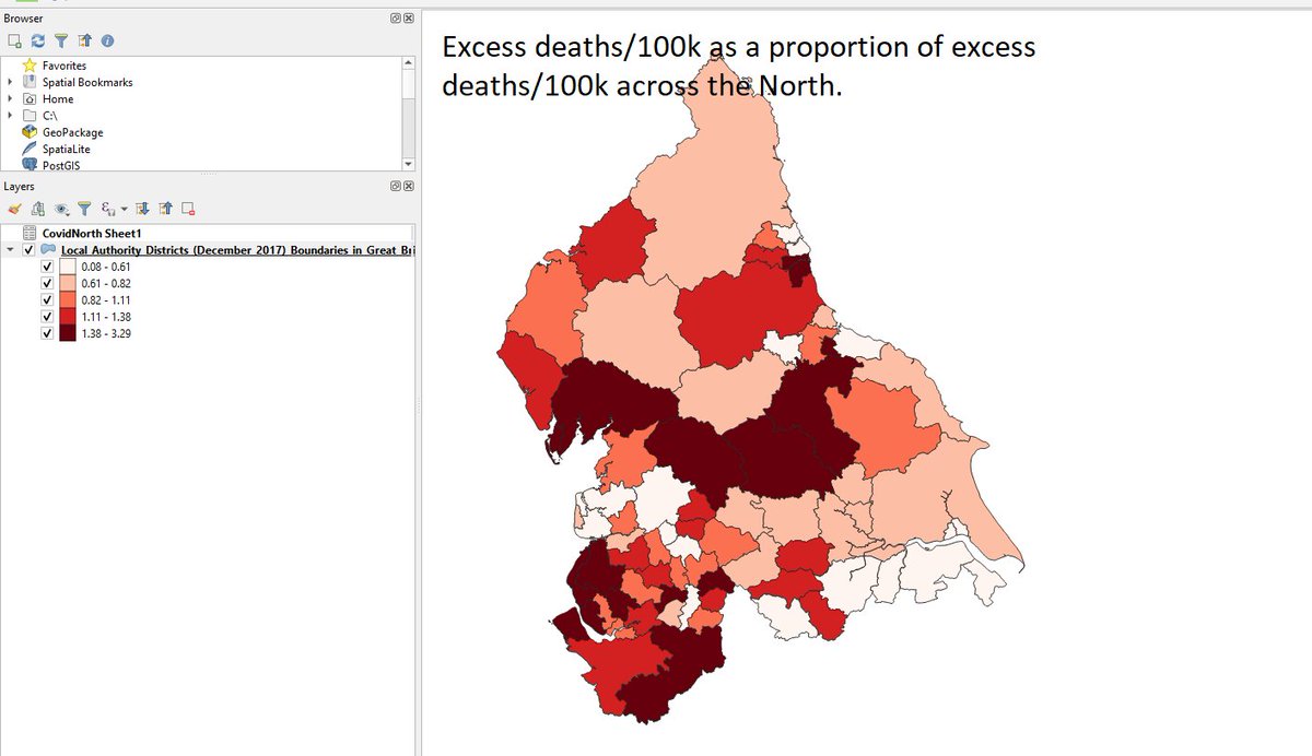
Excess deaths is the way to know where is really getting hit hardest by Covid-19. So here& #39;s my best guess at excess deaths by local authority. Much of post-industrial Yorkshire and Lancashire getting off lightly. Cheshire, Cumbria, North Yorkshire getting hit hard.

 Read on Twitter


