So let& #39;s look at the government& #39;s graphic design for the crisis.
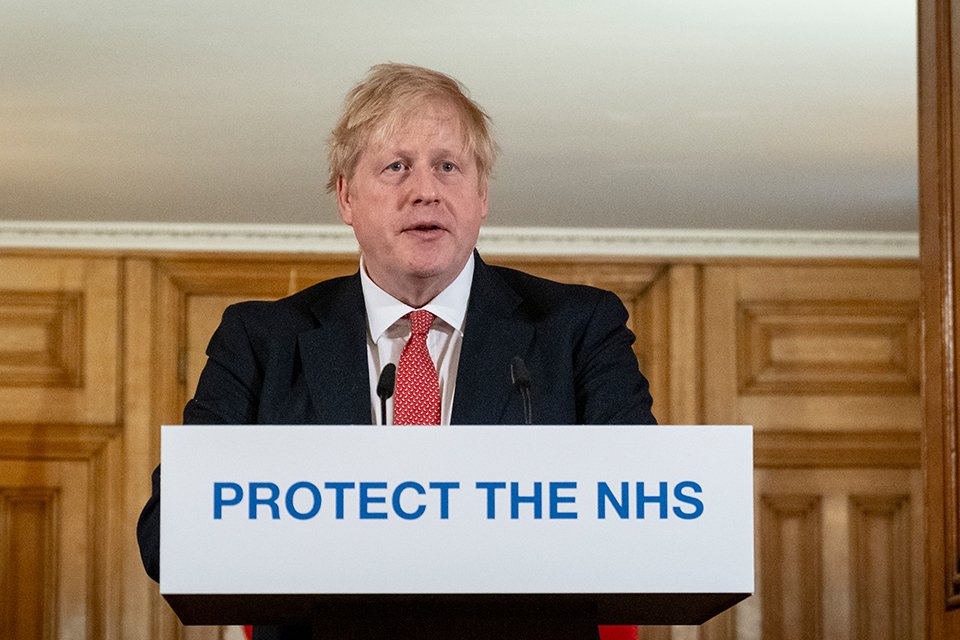
The first version was just the .gov URL in lowercass on a white background, which was then replaced by this.
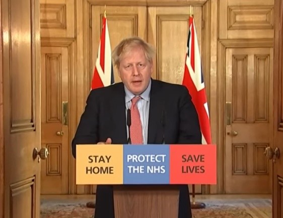
Three podiums, one line on each. So you didn& #39;t the x + y = z which reinforces the message.
The first version was just the .gov URL in lowercass on a white background, which was then replaced by this.
Three podiums, one line on each. So you didn& #39;t the x + y = z which reinforces the message.
So this came along, all three on one podium.
The designer used the colours of the three main English parties. Reinforces this as a time of unity, but am betting it was noticed in 3/4 countries that make up UK, and that Conservatives hated it.
The designer used the colours of the three main English parties. Reinforces this as a time of unity, but am betting it was noticed in 3/4 countries that make up UK, and that Conservatives hated it.
That message, by the way, is a lovely bit of copywriting. Clear, simple, can be used consistently, and you can say it in normal conversation without sounding like a dick. That& #39;s important.
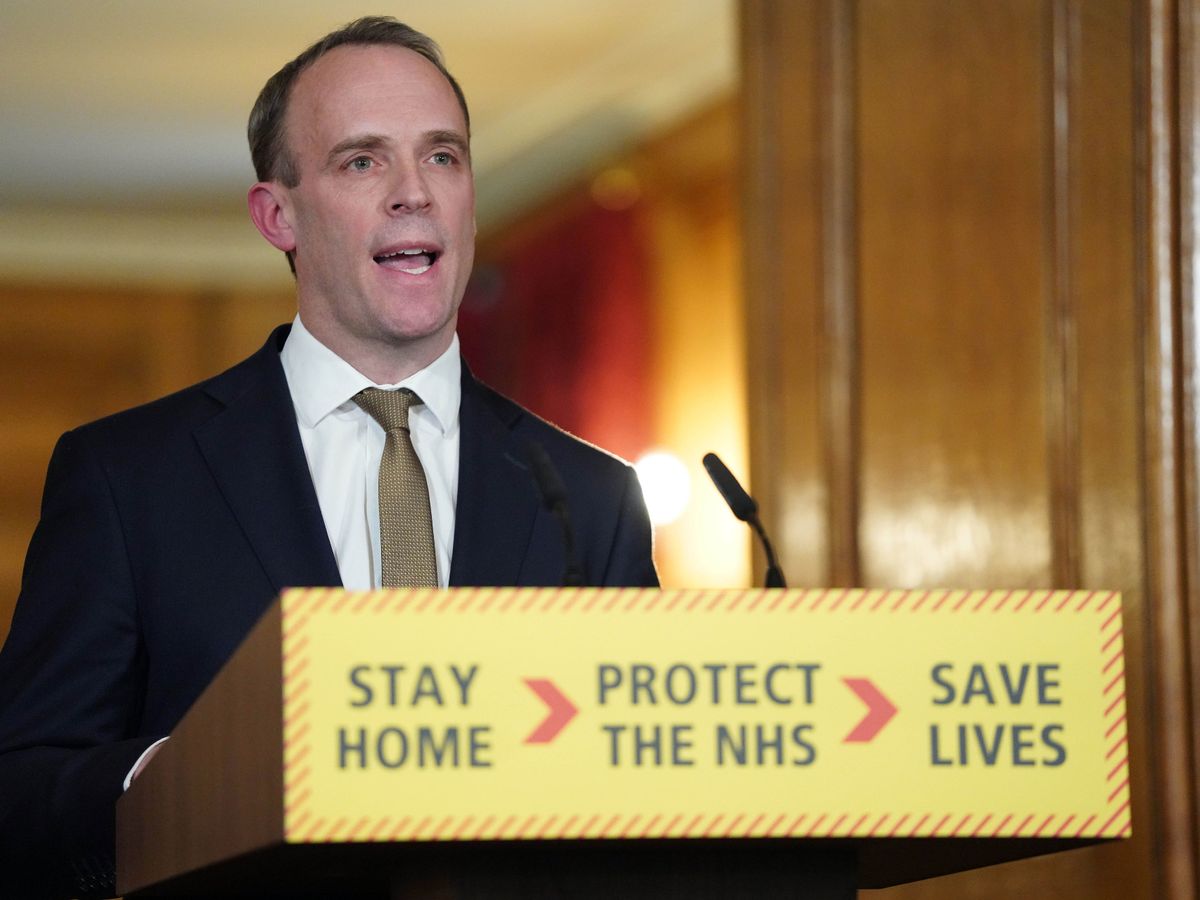
So then we got Crisis 0.1.
Emergency services branding, shows a step up in the crisis - says this is now a real emergency. Similar to signs waved on & #39;Save the NHS& #39; marches in last few years, too.
Also makes x + y = z messages really clear.
Emergency services branding, shows a step up in the crisis - says this is now a real emergency. Similar to signs waved on & #39;Save the NHS& #39; marches in last few years, too.
Also makes x + y = z messages really clear.
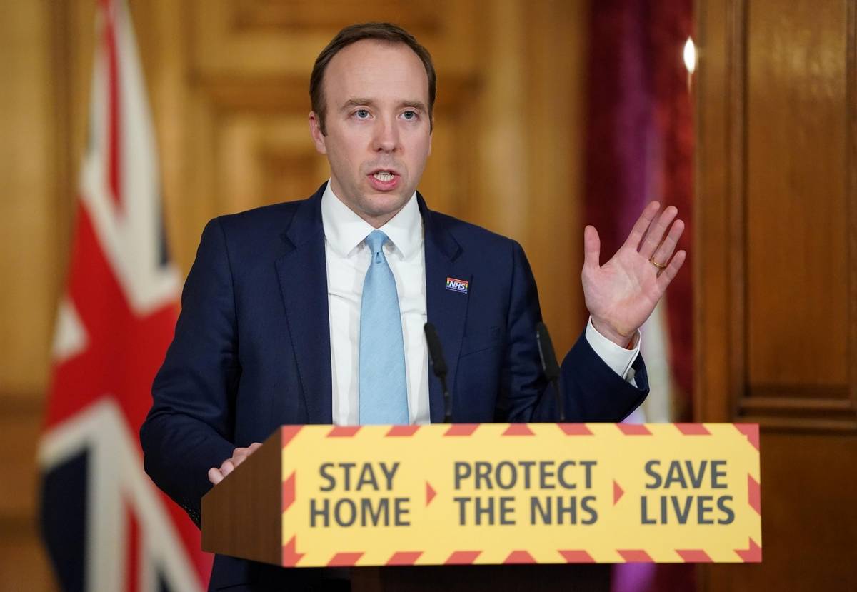
The next version, Crisis 0.2.
Bolder lines. Makes it even stronger, but I can see why a designer liked the thinner lines. More on trend with recent design.
Bolder lines. Makes it even stronger, but I can see why a designer liked the thinner lines. More on trend with recent design.
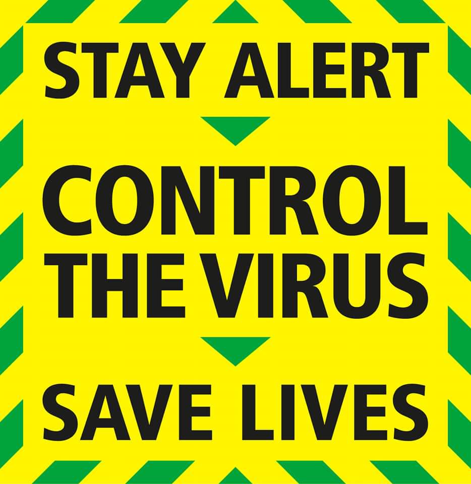
Which takes us to the new version.
Which says it& #39;s now much safer, with that green stripe replacing the red. Weakens the message.
And the message becomes gibberish. I understand & #39;stay home& #39; but & #39;stay alert& #39;? How? What does it mean?
& #39;Control the virus& #39;? You what?
Which says it& #39;s now much safer, with that green stripe replacing the red. Weakens the message.
And the message becomes gibberish. I understand & #39;stay home& #39; but & #39;stay alert& #39;? How? What does it mean?
& #39;Control the virus& #39;? You what?
If, as reported, this branding is launched today...
It will replace something simple and effective with something meaningless.
It will weaken the message. Bad copy, poor design, will kill people.
It will replace something simple and effective with something meaningless.
It will weaken the message. Bad copy, poor design, will kill people.

 Read on Twitter