So, let& #39;s talk about Olympic dressage.
Dressage has had a remarkably long presence in the Olympic Games, being included since 1912. Over 100 years. That& #39;s a lot of dressage.
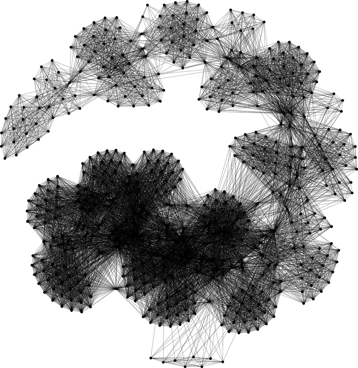
Ever wonder what 100 years of dressage looks like? Well, it looks something like this.
2/n
Dressage has had a remarkably long presence in the Olympic Games, being included since 1912. Over 100 years. That& #39;s a lot of dressage.
Ever wonder what 100 years of dressage looks like? Well, it looks something like this.
2/n
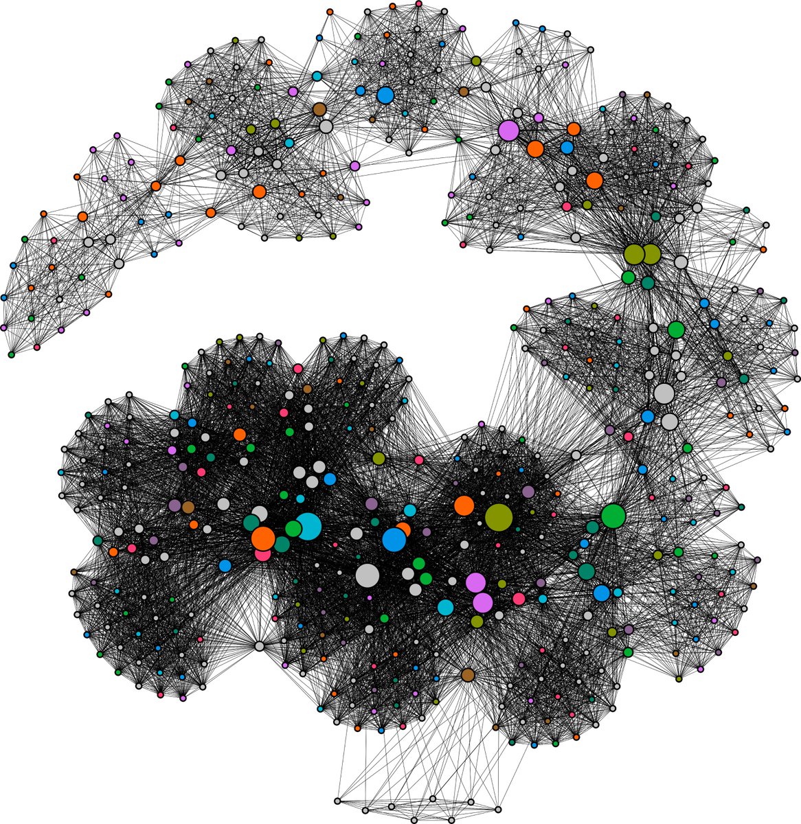
You& #39;re looking at 513 competitors from 21 games, spanning 1912 to 2012. Each competitor is linked to every other rider they competed against. The thickness of the edge that connects them represents the number of times they competed against each other. Time travels clockwise.
2/n
2/n
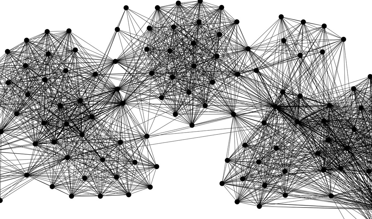
Even in this basic graph there are several interesting things that stick out. This little cluster represents riders who competed at the boycotted 1980 Moscow Olympics.
3/n
3/n
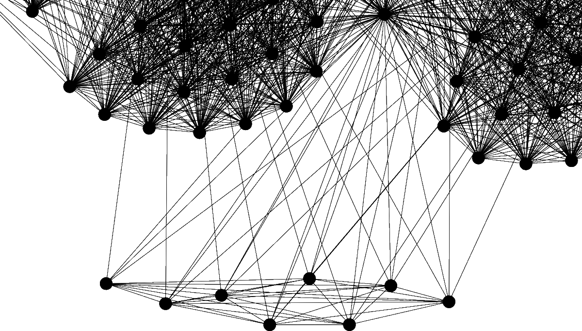
And this gap between competition clusters highlights just how low the participation was at the 1932 Games held in Los Angeles.
4/n
4/n
Only 10 riders from 6 countries were able to compete, due to the financial pressures of both the Great Depression and the long distance of shipping horses from Europe. Germany could not afford to send a team at all.
5/n
5/n
But more interesting is how this graph shows the professionalization of elite dressage.
6/n
6/n
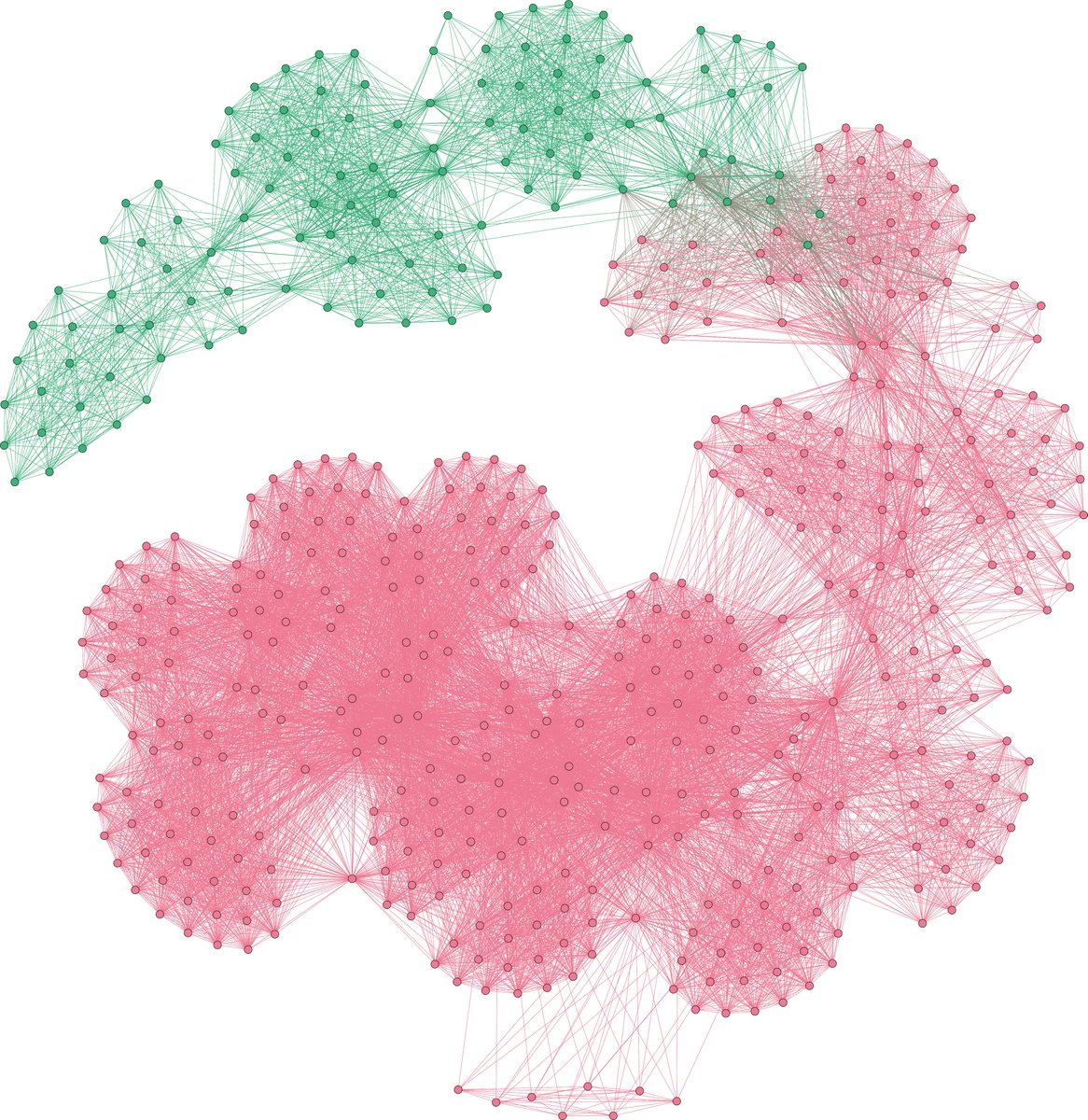
In this view, each node is colored by the rider& #39;s first Olympic appearance. Green for pre-1952, when only officers in the military were allowed to compete, and red for post-1952, when civilians were allowed to compete. Olympic dressage demilitarized essentially overnight.
7/n
7/n
But the civilians who were competing in 1952 don& #39;t make up the dense, tightly connected network of competitors in Olympic dressage& #39;s recent past. Largely, the competitors who first appeared between 1952 and 1954 petered out within an Olympic cycle or two.
8/n
8/n
Now, there are other ways we can look at this data to show how Olympic dressage became a professional pursuit. Here, the nodes are scaled to represent the number of times a rider has shown at the Olympics, and colored by the nation they represent.
9/n
9/n
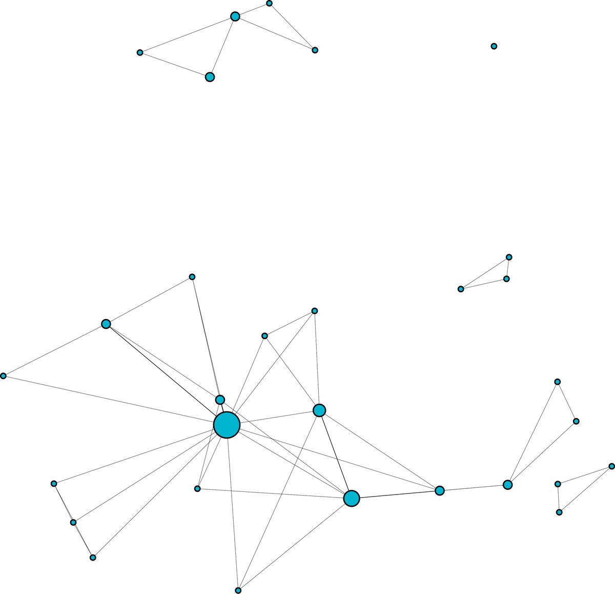
While this is a noisy graph, there are two standout observations. One, the entire network of competitors is supported by a spine of riders with multiple Olympic appearances. And two, the more recently a rider has competed, the greater a chance of multiple Olympic showings.
10/n
10/n
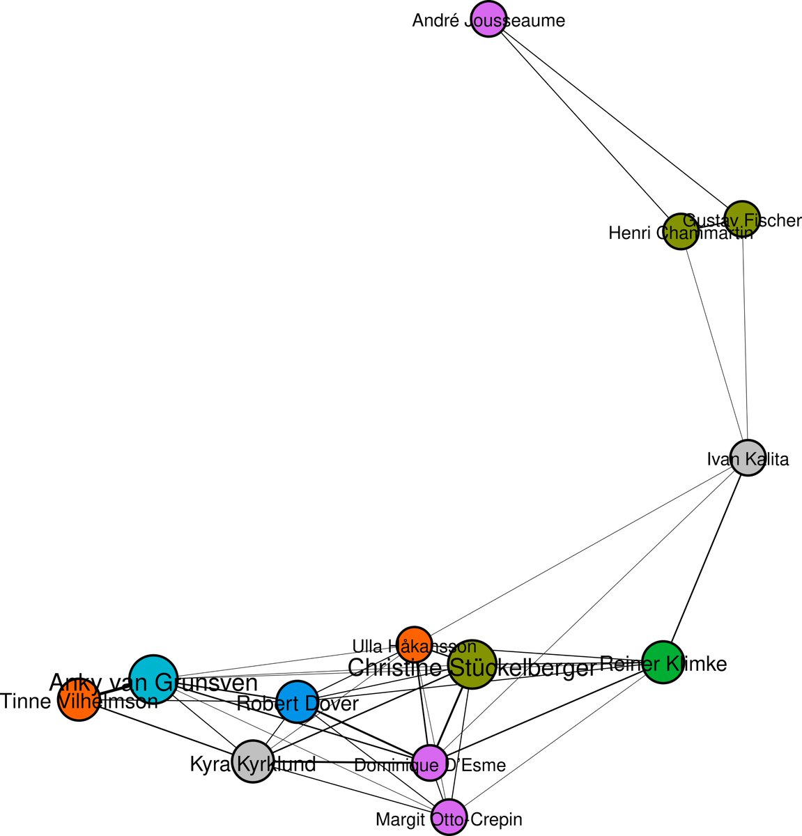
We can distill this graph down to a core of riders with two or more decades -- five or more Olympic cycles -- worth of experience. The most temporally recent section of the graph always remains the heaviest.
11/n
11/n
Most of those core professionals are very recognizable to dressage riders and other equestrians.
12/n
12/n
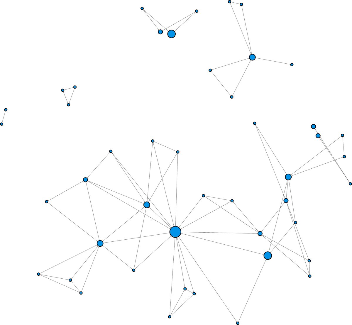
Additionally, we can manipulate this graph to illustrate the history of individual nations at the Games, perhaps with results surprising to the average dressage rider. For instance, the United States isn& #39;t actually all that bad at (at least) qualifying riders.
12/n
12/n
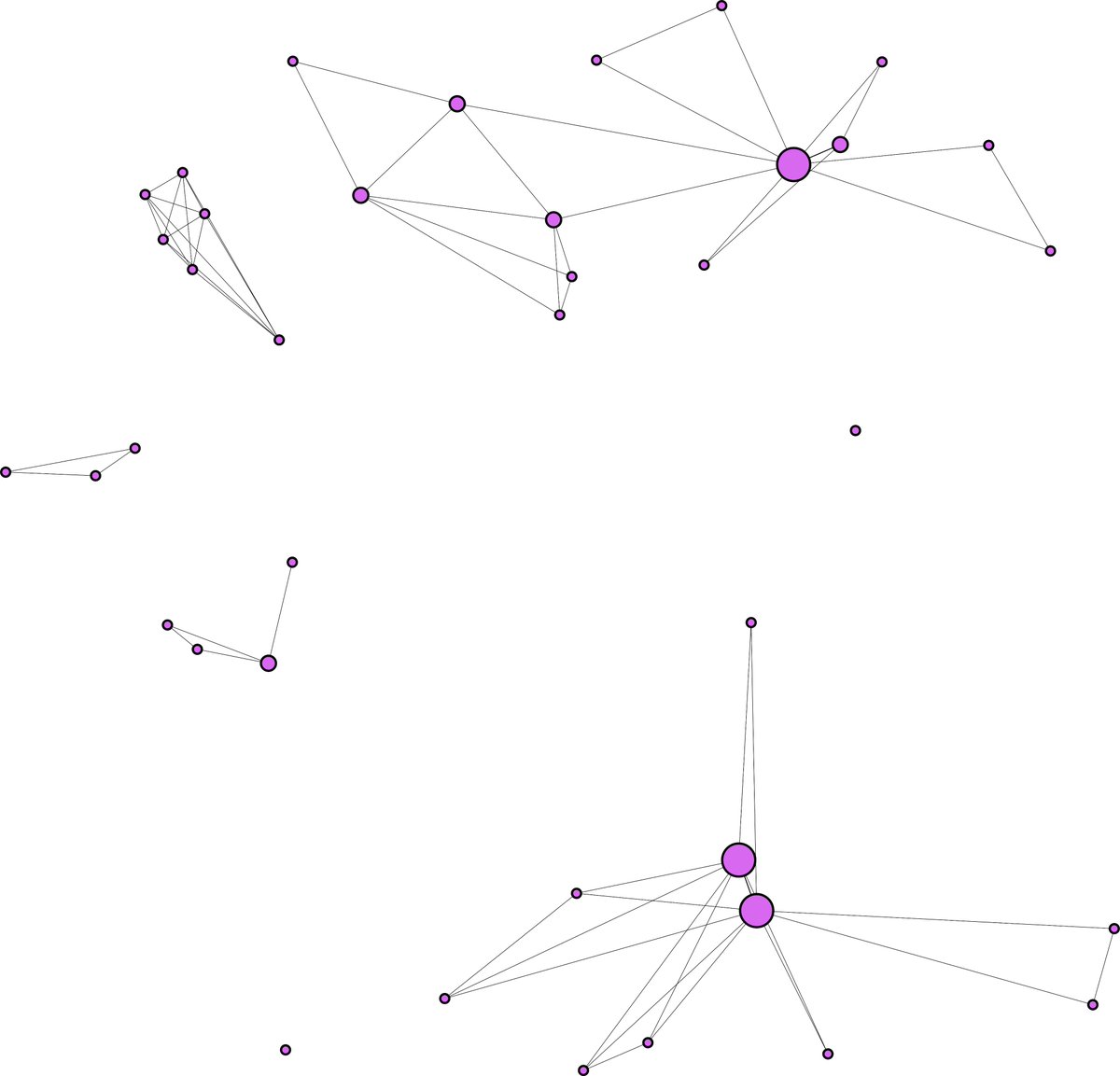
The French influence during the early years of the Olympics is also evident. French riders brought home a quarter of the medals awarded between 1912 and 1948.
13/n
13/n
The Olympic equestrian events are so unique in that a rider can compete over and over across decades, and that creates a complexity that is hard to parse out just from rows and rows of data in chart after chart.
15/n
15/n
But borrowing from graph theory lets us make those connections come alive, and helps us interpret datasets too large to hold in our heads alone. My dataset was tens of thousands of rows long, but visualizing it let the data turn itself into a choose your own adventure tale
16/16
16/16
(Technical info, for those interested)
Data: Mostly Wolfgang Niggli& #39;s "Dressage: A Guideline for Riders and Judges"
OCR: Tesseract+gImageMagick
Visualization: Gephi
Postprocessing: Inkscape, GIMP
Data: Mostly Wolfgang Niggli& #39;s "Dressage: A Guideline for Riders and Judges"
OCR: Tesseract+gImageMagick
Visualization: Gephi
Postprocessing: Inkscape, GIMP

 Read on Twitter