A bar graph race chart also shows a sudden increase in Sindh& #39;s capacity as the gap has widened since 2015, Punjab is especially lagging, while KP and Balochistan are inching back towards their 2008 values 5/7
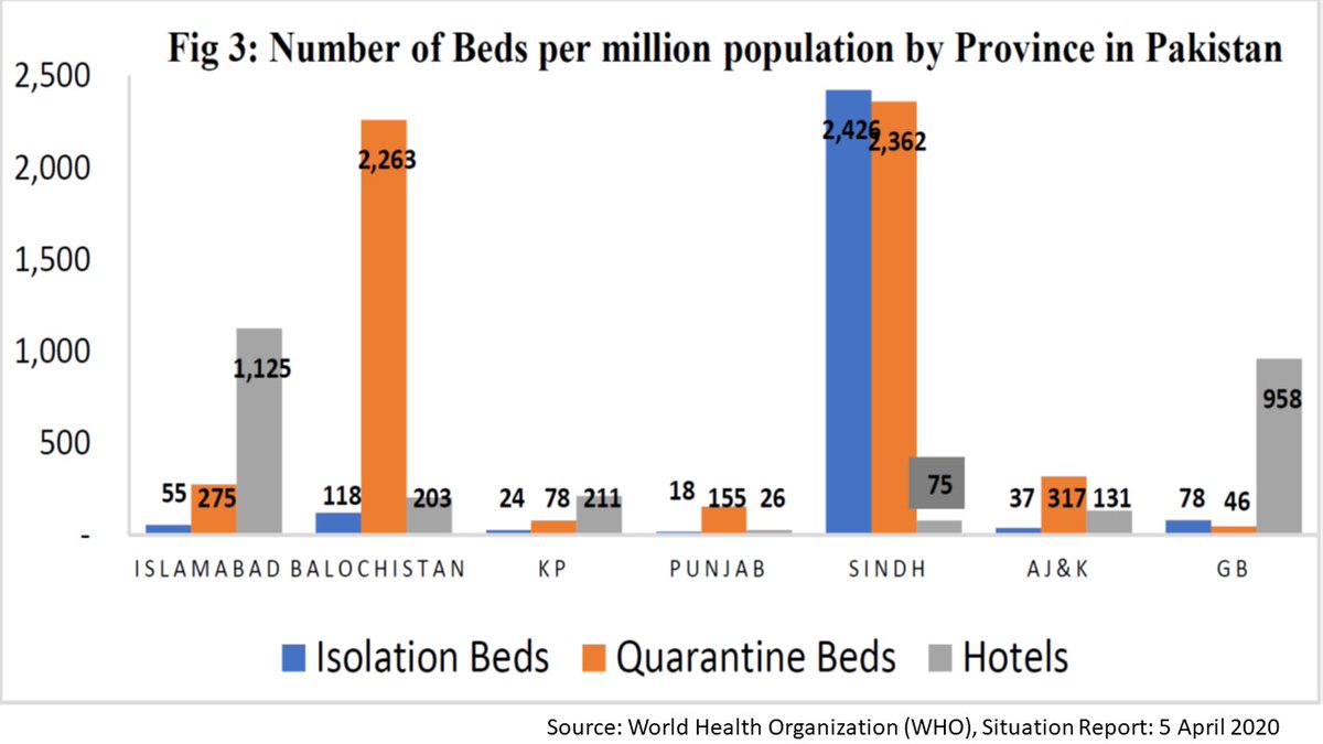
Perhaps this was the reason why Sindh seemed better prepared to deal with #COVID_19 when compared with other provinces. This final graph is from WHO& #39;s report from 5th April 2020, it shows the stark differences in the capacity of the various provinces in dealing with Corona 6/7
Data source for hospital beds is PBS http://www.pbs.gov.pk/content/hospitalsdispensaries-and-beds-province">https://www.pbs.gov.pk/content/h... for population figures I used the 1998 population as base and used the annual census growth rate between 1998-2017 to predict populations for each year till 2018. 7/7
Just to add one more things. All graphs except for the WHO graph were made using https://flourish.studio"> https://flourish.studio . The WHO graph was copy pasted from their Situation Report for April 5, 2020.

 Read on Twitter


