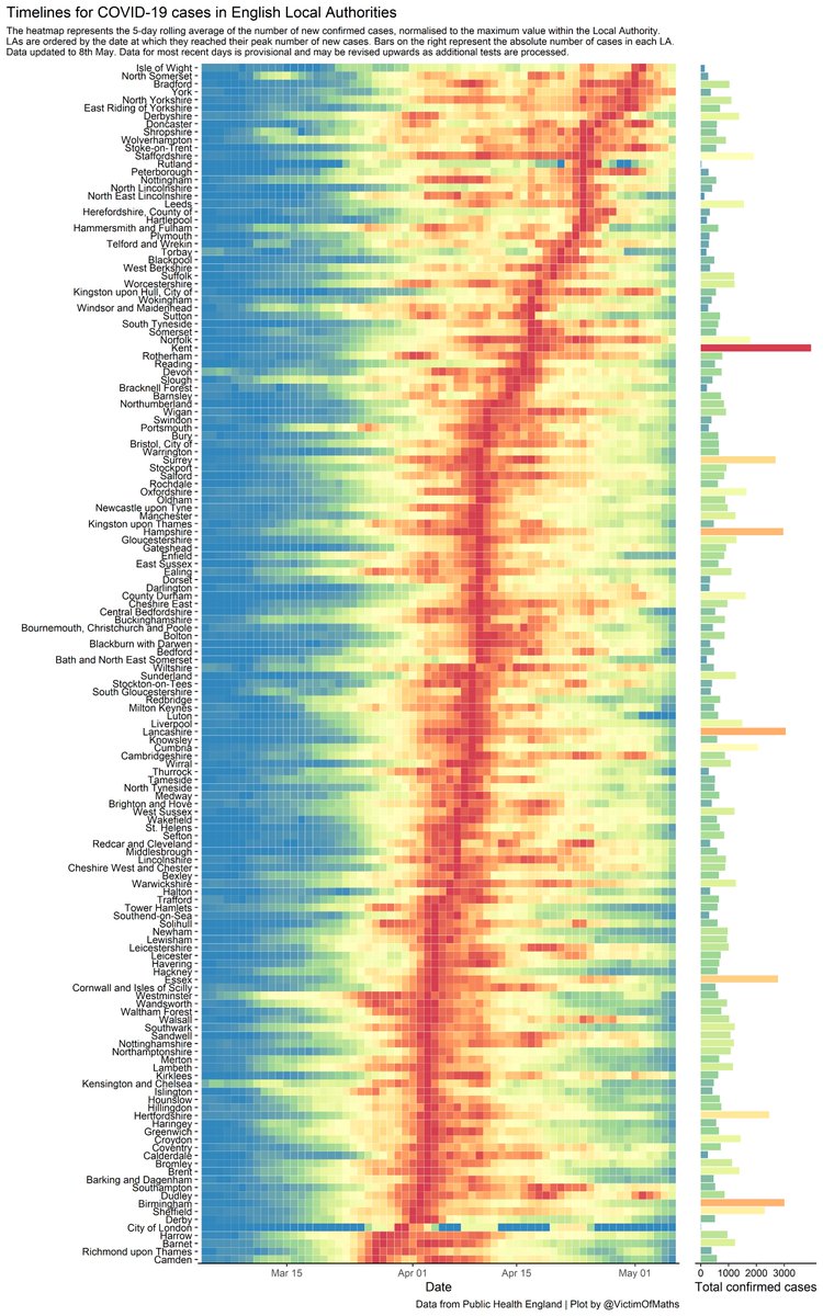
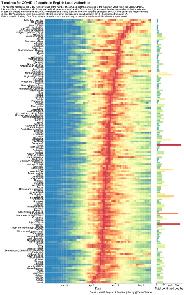
Here& #39;s some good news - we& #39;re finally starting to see some blue reappear on the right hand side of these figures.
Updated code here: https://github.com/VictimOfMaths/COVID-19/blob/master/LAHeatmaps.R">https://github.com/VictimOfM...
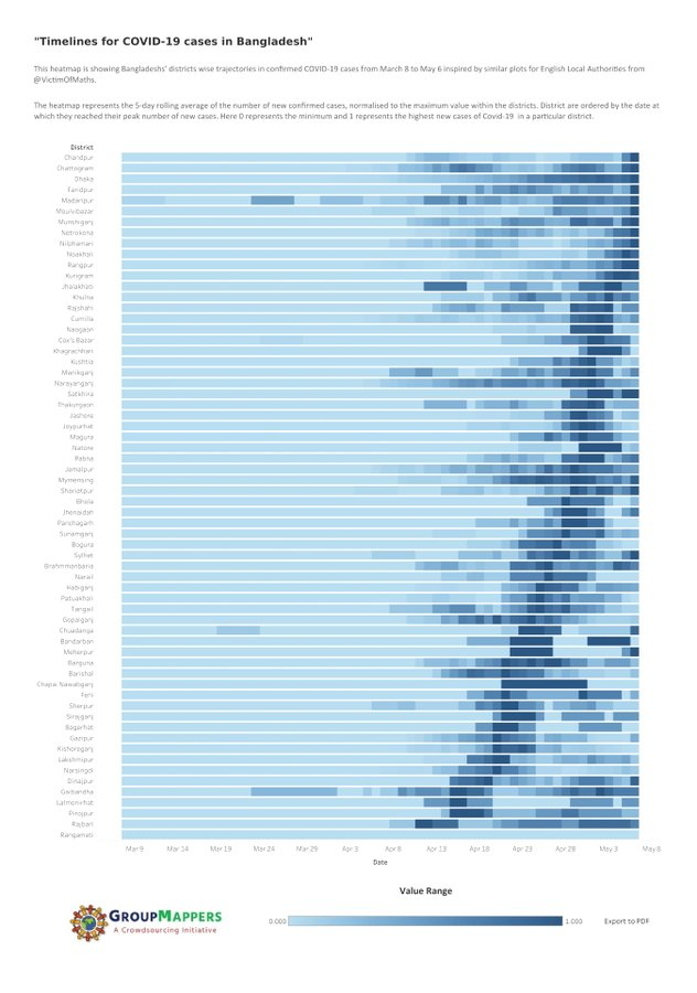
This is also very cool - some folk in Bangladesh have created a similar plot to this for COVID-19 cases in Bangladeshi districts:
http://groupmappers.com/covid19-square-heatmap/">https://groupmappers.com/covid19-s... http://groupmappers.com/covid19-line-heatmap/">https://groupmappers.com/covid19-l...
http://groupmappers.com/covid19-square-heatmap/">https://groupmappers.com/covid19-s... http://groupmappers.com/covid19-line-heatmap/">https://groupmappers.com/covid19-l...

 Read on Twitter


