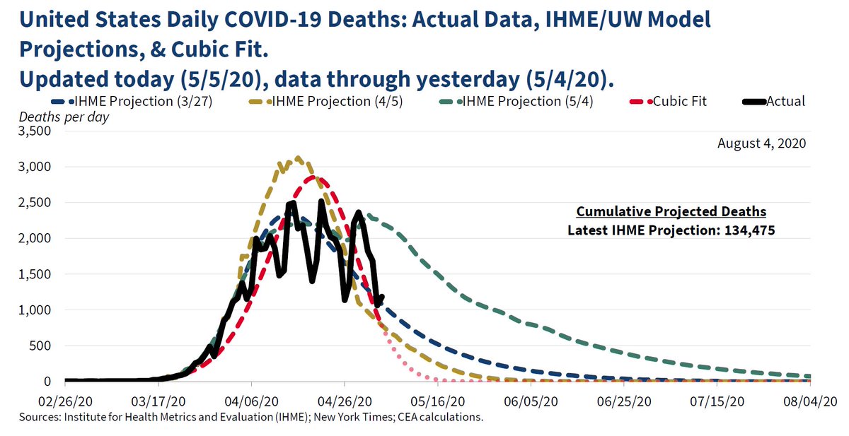
As we continue learning more about COVID-19, CEA tracks the evolution of case and mortality projections over time to better understand the disease and inform policymakers.
You can follow @WhiteHouseCEA.
Tip: mention @twtextapp on a Twitter thread with the keyword “unroll” to get a link to it.

 Read on Twitter


