We would really appreciate a color picker that allows us to write constraint-satisfaction formulas expressing how the various colors in the scheme relate to each other. And then drag around whatever isn& #39;t constrained, freehand.
Color schemes are, like, a lot of work!
(We& #39;ve been making an effort to feel more emotional investment in the tools we use on a daily basis, like we did when we were young before it was traumatized out of us. So we& #39;re designing a terminal color scheme around the theme of cherry blossoms.)
Terminal color schemes are particularly hard because you really care a lot about contrast between the text and the background.
oh cool SVG has an elliptic arc command in its path definition syntax. that& #39;s very nice. we& #39;re used to PostScript, which ... doesn& #39;t.
(did you know that you cannot describe an elliptic arc with a Bézier curve? you can approximate one arbitrarily closely, but it is not straightforward. basically the only people who have ever had to worry about it are people developing software that edits fonts.)
another cool thing about the CSS <path> element is that it has the pathLength attribute. you might (if you know a fair amount about this problem) think that it would save browsers from having to compute a line integral to implement text along a path, but it doesn& #39;t.
it just saves the SVG author from having to ensure that their computation agrees precisely with the browser& #39;s.
we& #39;re just sharing our random thoughts as we glance through the CSS spec, heh. it& #39;s nice to have a topic to talk about that is harmless enough to be appropriate for Twitter.
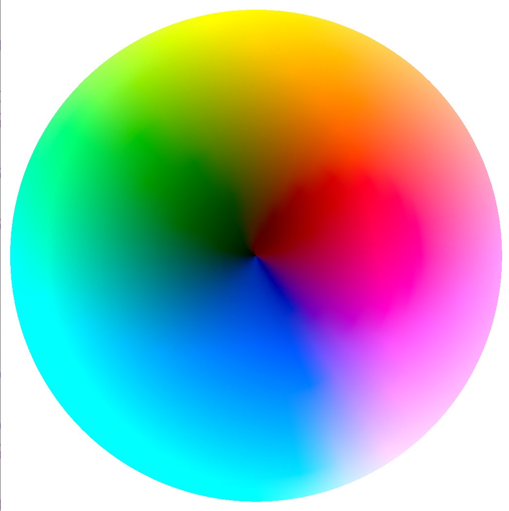
Update: Behold our CIELAB color wheel. It is rendered in SVG. The SVG is generated at runtime by JavaScript.
We are giving ourselves permission to put this down, for now; it was only meant to be a fun thing and we can& #39;t afford to spend too much time on it. We& #39;re pleased we solved the rendering part. (This is also doing color math, behind the scenes.)
If you see that sort of shadow-like boundary, shaped like an upside-down W pointing to the bottom left... you& #39;re not imagining that. We are not 100% that it& #39;s supposed to be shaped like that; most color wheels we could find to compare to are HSL.
It is entirely possible that we got a coefficient wrong somewhere making blue more prominent than it should be, or whatever. Or that the projection we chose, which we think is looking down at the top of the color cylinder, is actually doing something weirder.
If anyone reading this has worked on this kind of code and has thoughts on how to validate that stuff, by all means say hi! :)
Okay, some friends found some other color pickers to compare against, and we convinced ourselves that it& #39;s supposed to look like that. No two color pickers use quite the same projection, it& #39;s interesting.
We thought people might enjoy seeing our process, so we can tweet about that a little.
We couldn& #39;t find another color picker that uses quite the same mapping of parameters to space that we have. A friend did find one which was *almost* like ours. We played with it a bit and intuited that they put lightness from 1.0 at the center to 0.0 at the outside...
... whereas we did the reverse. You can see the dark colors on ours are near the center.
We wanted to compare though just to see if there were any other differences, so we briefly flipped ours inside-out. (That was easy code-wise; we replaced "radius" with "1.0 - radius" at a key place.)
We prefer it the way we showed it first, though, so we changed it back.
We said above that this is rendered in SVG. How did we do that? Does SVG have some awesome gradient primitive that lets you describe this sort of thing?
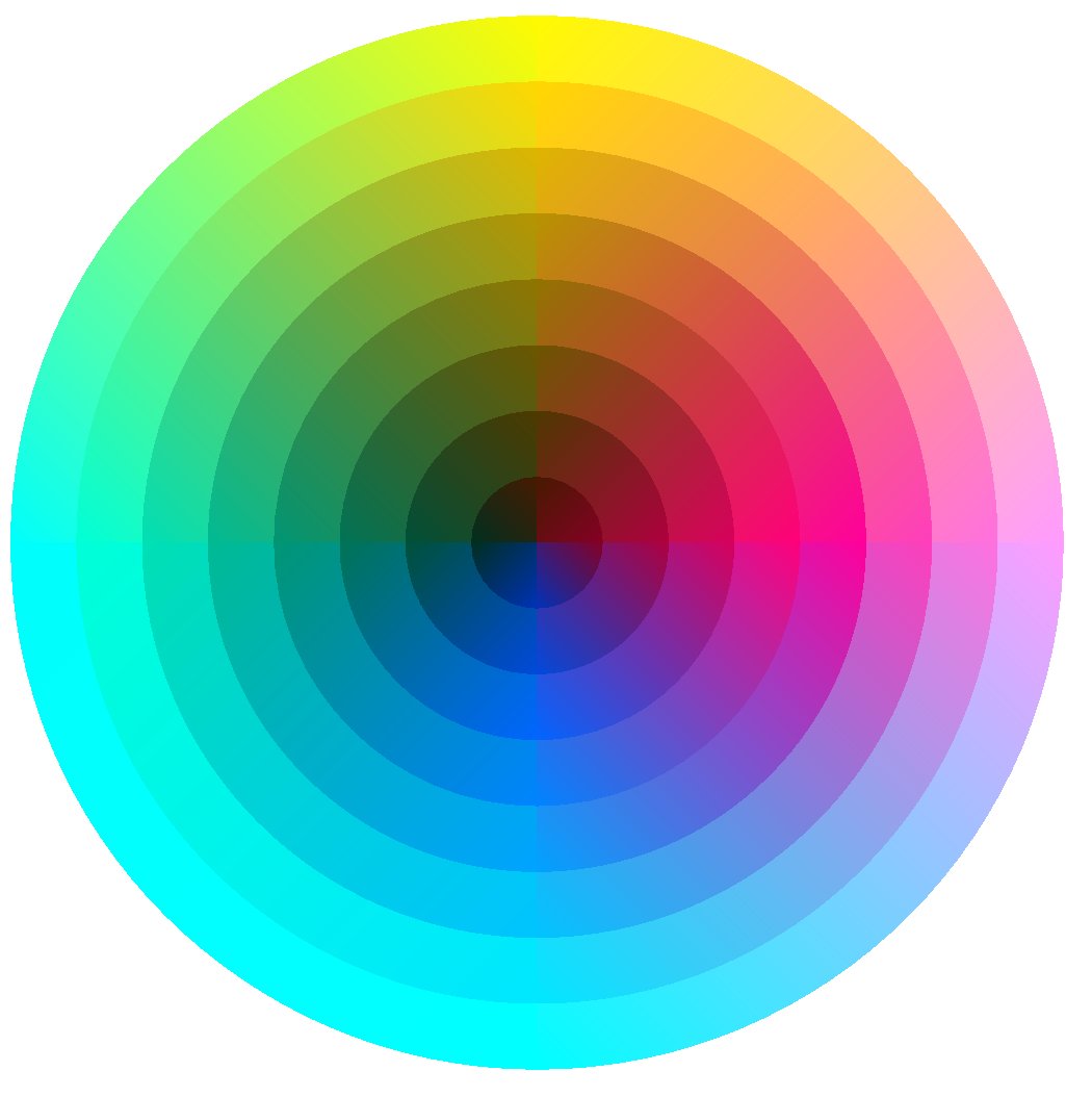
Nope. It definitely does not. SVG has two gradient primitives, but neither of them is really suitable for this. Here, let us show you how this is made by turning down the "resolution"...
You& #39;re seeing four pie-slices, like a pizza that you& #39;ve made two cuts in. And then in each pie-slice, you& #39;re seeing eight color bands, successively smaller pies as you go from outside to inside.
This may look fine on its own, but if you compare it to our original, you can see that there is a *lot* of detail missing.
What we did is, in each ... onion ring quarter there, each quarter has a single linear gradient. The gradient& #39;s control points are at the outer corners of the onion ring.
We actually tested this by just building a single little piece... In case you& #39;re not sure which pieces we mean, here& #39;s a pic of just one of them. We built this part first.
That& #39;s a single SVG <path> element, with two elliptic arc segments and two line segments. It just computes the coordinates using trigonometry, and converts it to the SVG PathData format.
So we made the <path> first, with a fake gradient that was just hardcoded to go from red to green. Then we made it a real gradient based on our color math. Then we turned up the numbers.
In the final rendering that we showed near the start of the thread, you& #39;re seeing what these wedges look like when there& #39;s 32 pizza slices, and 128 onion rings. We played with the numbers and those ones were small enough that we couldn& #39;t tell the difference from going higher.
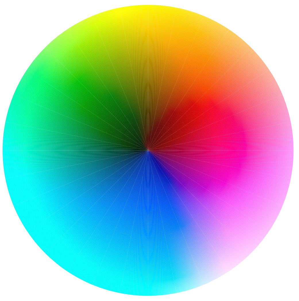
We had to figure out how SVG controls anti-aliasing though, because before we set it to turn on anti-aliasing, we were getting moire effects, like this...
Fortunately, we& #39;ve done enough graphics programming that we didn& #39;t have to spend time wondering what the fuck. That seems like an issue that could have been really weird and frustrating to somebody who didn& #39;t happen to know about it.
If you zoom in in that pic, though, as a bonus, you can see the boundaries between the wedges and rings with the real parameters (32 x 128).
The gradient control points are actually set at the outer corners of each wedge-ring. It& #39;s just a one-dimensional gradient that goes between those two points. So we needed to make the number of wedges high enough that the fact it& #39;s straight lines wasn& #39;t apparent.
We were happy that SVG made it easy to use elliptic arcs as part of the paths. That meant we didn& #39;t have to "fake it". Do you know how you draw a circle if you don& #39;t have some sort of curve primitive? You draw lots of lines, and make them short enough that they look round.
That generally requires a lot more lines though, like actually several times more lines than pixels. You wouldn& #39;t think it, but your eye will pick up on the not-roundness of sharp corners that are smaller than a pixel. So we were glad we didn& #39;t have to do that.
We have no idea whether any of our followers have noticed this, but there& #39;s an assumption we made in this rendering which isn& #39;t quite accurate...
The assumption is that, when we give SVG a gradient and tell it to draw it, the colors it draws in between are actually the colors that should go "in between" in our rendering.
That isn& #39;t quite true though, because SVG is interpolating in... well, actually the spec doesn& #39;t seem to say what color space it& #39;s interpolating in, but even if the color space were specified, there would be several ways to interpolate since it& #39;s a 3-dimensional space.
And there& #39;s no way to tell it about any of that so we just had to know that it would be slightly wrong. But we tested this with a larger number of wedges, thus relying less on the SVG color interpolation, and we can attest that it doesn& #39;t lose any detail that& #39;s visible to us.
We didn& #39;t want to go with a larger number of wedges in the final thing because this is already 4096 <path> elements with just the 32 wedges by 128 rings, and it was starting to be a bit slow.
This would be a really great use for a gradient mesh primitive, like the tool in Adobe Illustrator, but ah well.
Anyway! So that& #39;s where the project stands, for now. Maybe some other time we& #39;ll pick it back up and build actual UI elements so the user can actually pick colors and stuff.
For now, we& #39;ll leave you with a closing thought. If you& #39;re a beginning programmer and you don& #39;t know how you would learn to do something like this, we have some advice. It& #39;s really simple: Go to the source. Go to the authoritative source.
In this case, we knew that SVG was the best tool for making vector graphics in a web page, so we went to the SVG specification. It& #39;s here: https://www.w3.org/TR/SVG11/expanded-toc.html">https://www.w3.org/TR/SVG11/...
Reading specs is hard (if you& #39;re not autistic in the way that makes you predisposed to enjoying formal language), but it& #39;s a skill well worth developing.
We& #39;d be shocked if there are any tutorials on how to write graphics code that renders a color wheel, because it& #39;s just not a task that very many people have had to do. If you& #39;re going to do stuff like this, you need to learn how to learn from reference material.
It can be super confusing to look at, say, the list of SVG elements in the table of contents and not know when you would use them... but it& #39;s very worth developing the habit of thinking, every time you see something like that, when would I use this?
Just come up with a concrete example, in your head, of what each thing would be good for. Then you can move on, you don& #39;t have to study all the details of it up front. You can know that it& #39;s there when you want to do something like it.
We& #39;ve been thinking lately about how we learned this stuff as kids, and what pieces of our strategy are worth passing on... so that& #39;s why you& #39;re getting this philosophical musing about how to learn. Hope it helps somebody. :)
Oh! One other little lesson about how we knew to do this. We read about color spaces a long time ago, not because we had any immediate use for the information, but just because they were cool. So we knew that there were some out there designed for different purposes...
... and when we needed that knowledge, we knew where to look up whether there were any color spaces that were particularly good for matching human perception. Although one of our mutuals pointed out CIELAB, so we didn& #39;t actually have to. Make friends, that& #39;s another good tip. ;)
Okay. Now that& #39;s really all for tonight, except feel free to ask questions; we enjoyed showing off. If you read this far, thank you!
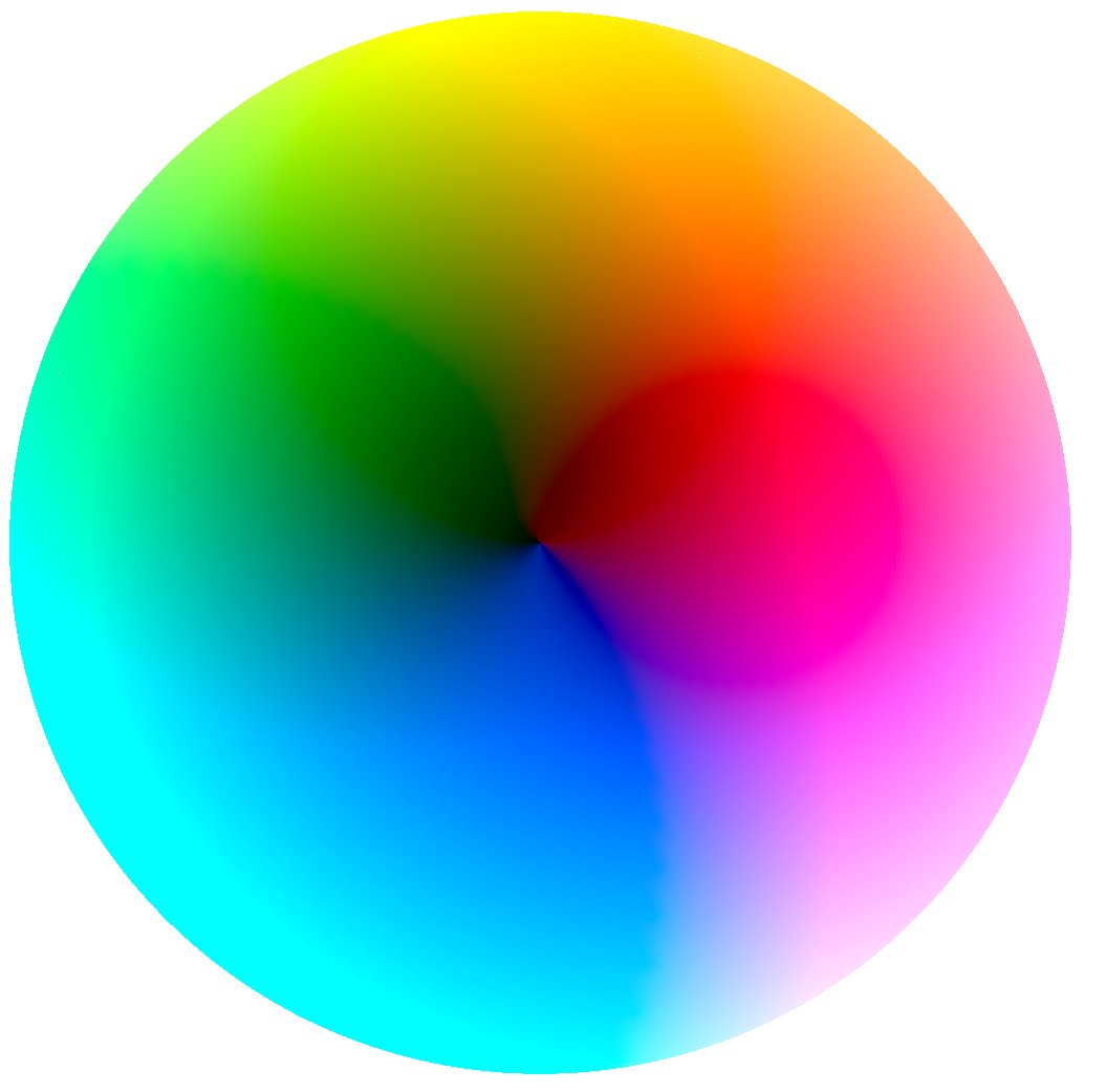
Okay, actually, explicating that bit about how the gradients work, caused us to realize that we were still missing a lot of detail. So we did up the number of wedges to 128 after all.
Look at the bottom half, that curvy line just to the right of center, the boundary between the blues and the violets. See what a pretty, mathematically precise curve that boundary makes?
If you look back to the top of our thread, that boundary isn& #39;t visible at all in the 32-wedge version. Here, have a link up-thread for convenience. https://twitter.com/ireneista/status/1257510144902139906">https://twitter.com/ireneista...
The reason it& #39;s not visible is precisely because of our reliance on the SVG linear gradients for the color stuff within the wedge. That boundary happens to be behavior that& #39;s very particular to the CIELAB color space; sRGB or whatever, doesn& #39;t have it.
We only started thinking about that because we described it here on Twitter. Then we went looking to see if we could see an effect, and, yeah.
Looking back and forth now, it& #39;s obvious to us, especially since we had that other tweet that clearly showed the size and position of the wedges, for comparison. https://twitter.com/ireneista/status/1257556393248382978">https://twitter.com/ireneista...
We& #39;ll have to do some performance work on this down the line, if we continue with it, since this is getting to be really quite a lot of <path> elements. It works smoothly on our machine but probably not for everybody.
We don& #39;t want this excellent question and ensuing discussion to get lost, so we& #39;re linking it up to the thread explicitly. https://twitter.com/moocowpong1/status/1257573763576508417">https://twitter.com/moocowpon...
The continuation of this thread is over here. https://twitter.com/ireneista/status/1265377713625456643">https://twitter.com/ireneista...

 Read on Twitter