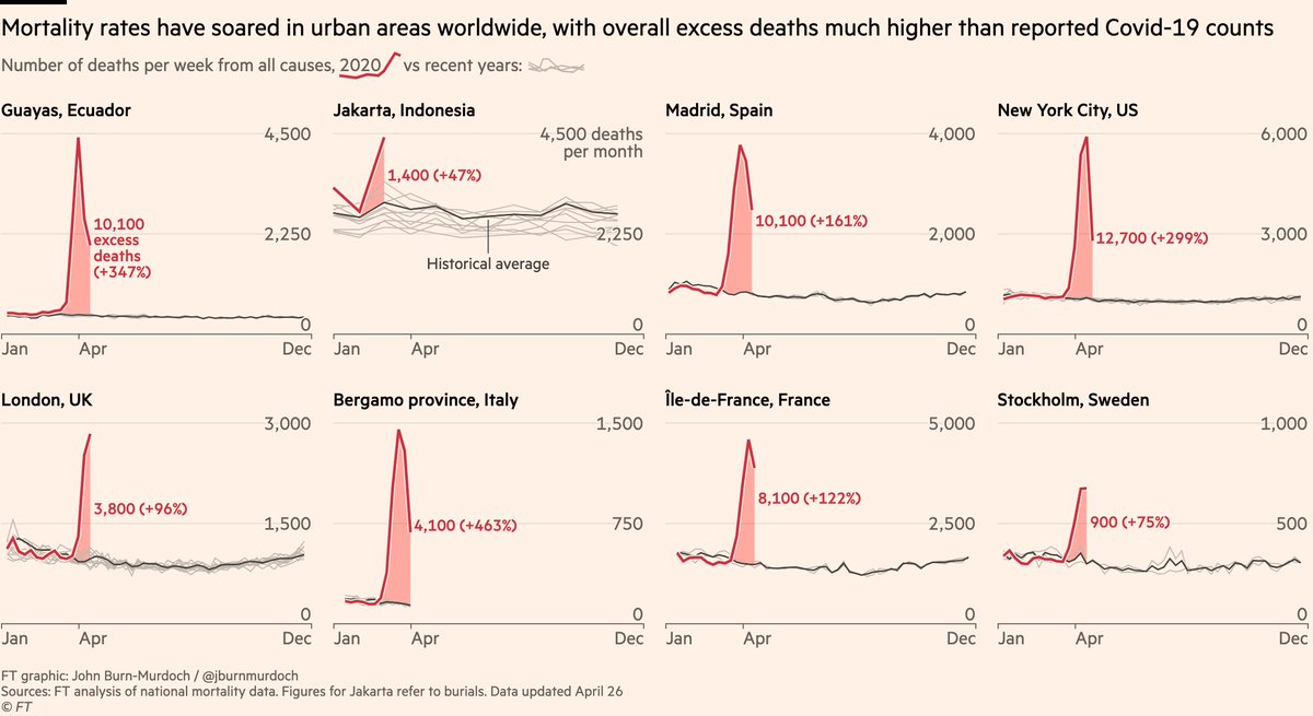
NEW: a lot of data on reported Covid deaths is highly suspect, so we’ve been looking into excess mortality — how many more people than usual have been dying around the world in recent weeks?
Story by me, @ChrisGiles_ & @valentinaromei (free to read): https://www.ft.com/content/6bd88b7d-3386-4543-b2e9-0d5c6fac846c">https://www.ft.com/content/6...
Story by me, @ChrisGiles_ & @valentinaromei (free to read): https://www.ft.com/content/6bd88b7d-3386-4543-b2e9-0d5c6fac846c">https://www.ft.com/content/6...
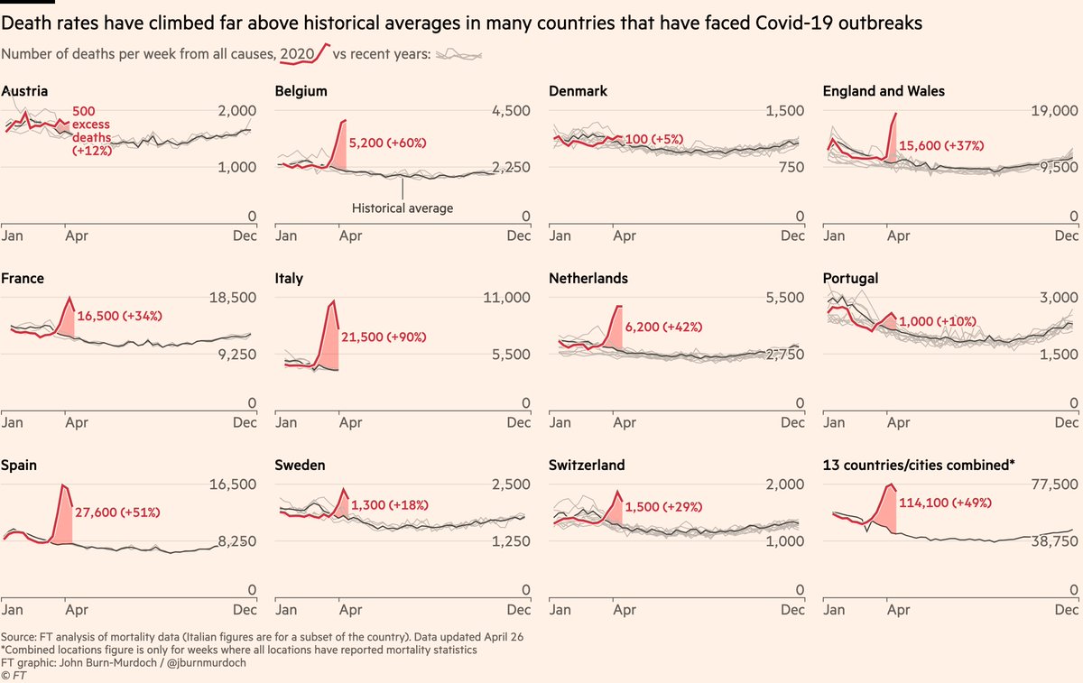
The numbers are remarkable, and put to bed the idea that Covid-19 is akin to a bad flu season.
You can clearly see that in almost every country, spikes in mortality are *far* higher than what we see from flu etc (grey lines are historical death numbers) https://www.ft.com/content/6bd88b7d-3386-4543-b2e9-0d5c6fac846c">https://www.ft.com/content/6...
You can clearly see that in almost every country, spikes in mortality are *far* higher than what we see from flu etc (grey lines are historical death numbers) https://www.ft.com/content/6bd88b7d-3386-4543-b2e9-0d5c6fac846c">https://www.ft.com/content/6...
The picture is even more stark in the cities & regions hardest hit by outbreaks.
In Ecuador’s Guayas province, 245 Covid deaths have been reported to date, but all-cause mortality data show *more than 10,000* extra deaths since 1 March compared to the average in recent years.
In Ecuador’s Guayas province, 245 Covid deaths have been reported to date, but all-cause mortality data show *more than 10,000* extra deaths since 1 March compared to the average in recent years.
So far we’ve analysed data from 14 countries, finding 122,000 more deaths in recent weeks than the usual average for those same places and same weeks.
This is an increase of 52%. Crucially, that’s also 45,000 more deaths than accounted for in reported Covid deaths.
This is an increase of 52%. Crucially, that’s also 45,000 more deaths than accounted for in reported Covid deaths.
Ecuador is emblematic. For several weeks it’s been clear that the reported numbers vastly understate the true death toll, with coffins piling up in the streets.
Excess all-cause mortality is the best way to get around this data quality issue and reveal what’s really happening.
Excess all-cause mortality is the best way to get around this data quality issue and reveal what’s really happening.
But it’s far from just Ecuador. In several other countries overall excess mortality is much higher than reported Covid deaths.
This includes England & Wales (47% more excess deaths than reported Covid deaths), Sweden (40%), Spain (33%), and many others.
This includes England & Wales (47% more excess deaths than reported Covid deaths), Sweden (40%), Spain (33%), and many others.
In the coming weeks, we’ll be joining @J_CD_T, @atmccann and co at @TheEconomist & @nytimes in the quest to get a handle on the true human cost of coronavirus.
We’ll be updating our excess mortality numbers for our current set of 14 countries, and expanding that list.
We’ll be updating our excess mortality numbers for our current set of 14 countries, and expanding that list.
Please email us at coronavirus-data@ft.com if you can point us to data for any other countries or cities on all-cause mortality (total numbers of deaths from all causes), preferably broken down by week or day, and running right up to and including recent weeks  https://abs.twimg.com/emoji/v2/... draggable="false" alt="🙏" title="Folded hands" aria-label="Emoji: Folded hands">
The data also highlight another point I’ve been making:
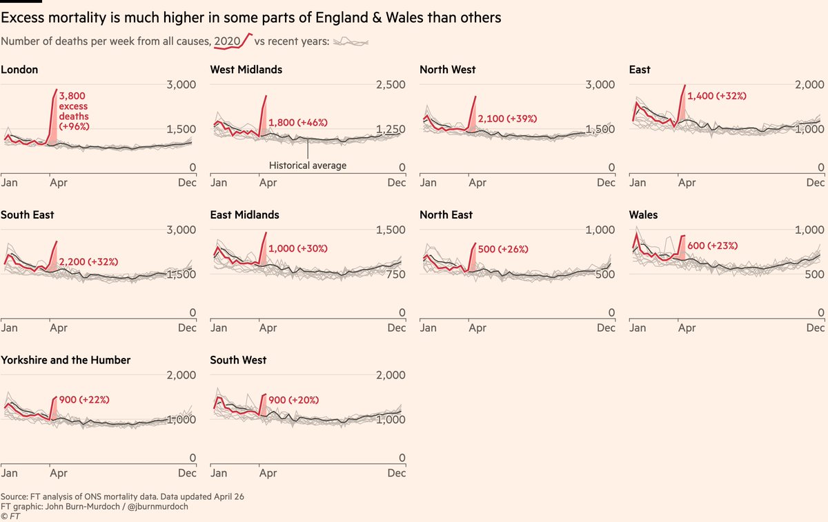
Covid outbreaks are much better understood as happening on a local than national scale.
Here are excess deaths across England & Wales.
London deaths have almost doubled vs usual. In the South West, uptick is much smaller.
Covid outbreaks are much better understood as happening on a local than national scale.
Here are excess deaths across England & Wales.
London deaths have almost doubled vs usual. In the South West, uptick is much smaller.
Also suggests excess mort is good proxy for true Covid death toll.
If excess deaths were just capturing heart attacks at home, deaths directly related to lockdown etc, we’d expect excess mort to rise similarly everywhere.
But we see far bigger spikes where outbreaks are worst.
If excess deaths were just capturing heart attacks at home, deaths directly related to lockdown etc, we’d expect excess mort to rise similarly everywhere.
But we see far bigger spikes where outbreaks are worst.
Notes on methodology:
• In each case we establish a historical baseline using deaths in the same country/city for the same weeks in 2015-2019
• Our excess deaths are the 2020 number minus that average
• In each case we establish a historical baseline using deaths in the same country/city for the same weeks in 2015-2019
• Our excess deaths are the 2020 number minus that average
• Even when using official mortality statistics like this, there can be a lag in reporting, meaning more deaths can be retrospectively assigned to past dates.
• This means our excess mort numbers may rise *for the weeks we’re already showing here* as well as over future weeks.
• This means our excess mort numbers may rise *for the weeks we’re already showing here* as well as over future weeks.
• In case anyone wondered why we don’t include Istanbul here, we believe the spike in burials in Istanbul are *displaced* rather than excess: many Istanbul residents who’d typically be buried in their home towns are unable to travel, so they’re being buried in Istanbul instead.
• We’re being as careful as possible with what data we do and do not include, but please do contact us either here or at coronavirus-data@ft.com if you spot anything that strikes you as being off. As with all our Covid data reporting, this is a live exercise and we will iterate
Finally, a short process thread on the Eucador data:
I’ve been looking for all-cause mortality in Ecuador for about a month now, and made a breakthrough last week when I stumbled upon this 2019 study of Ecuador’s mortality registry https://pophealthmetrics.biomedcentral.com/articles/10.1186/s12963-019-0183-y">https://pophealthmetrics.biomedcentral.com/articles/...
I’ve been looking for all-cause mortality in Ecuador for about a month now, and made a breakthrough last week when I stumbled upon this 2019 study of Ecuador’s mortality registry https://pophealthmetrics.biomedcentral.com/articles/10.1186/s12963-019-0183-y">https://pophealthmetrics.biomedcentral.com/articles/...
That led me to this section of the Ecuadorian national statistics website, where they have incredibly detailed data on every death registered in Ecuador in 2012-2018 by day, province and cause of death https://www.ecuadorencifras.gob.ec/category/poblacion-y-demografia/">https://www.ecuadorencifras.gob.ec/category/...
Earlier this month Ecuador’s civil registry began publishing special data on all-cause deaths this year, initially by month but subsequently by day. This means we can now make detailed comparisons of how this year’s figures compare https://www.registrocivil.gob.ec/cifras/ ">https://www.registrocivil.gob.ec/cifras/&q...
It’s an impressive response to a crisis. Many governments would (and indeed have) put their heads in the sand and keep all such statistics buried deep, perhaps never publishing them even years later.
Ecuador has chosen to be transparent, even though it paints a dreadful picture.
Ecuador has chosen to be transparent, even though it paints a dreadful picture.
Footnote: a few people are asking where certain countries are in this data:
• Germany: as Chris explains, German data will be out this week https://twitter.com/ChrisGiles_/status/1254474669018755075
•">https://twitter.com/ChrisGile... The US: we show NYC in the charts here and will be adding US states in coming days & weeks
• Germany: as Chris explains, German data will be out this week https://twitter.com/ChrisGiles_/status/1254474669018755075
•">https://twitter.com/ChrisGile... The US: we show NYC in the charts here and will be adding US states in coming days & weeks

 Read on Twitter


