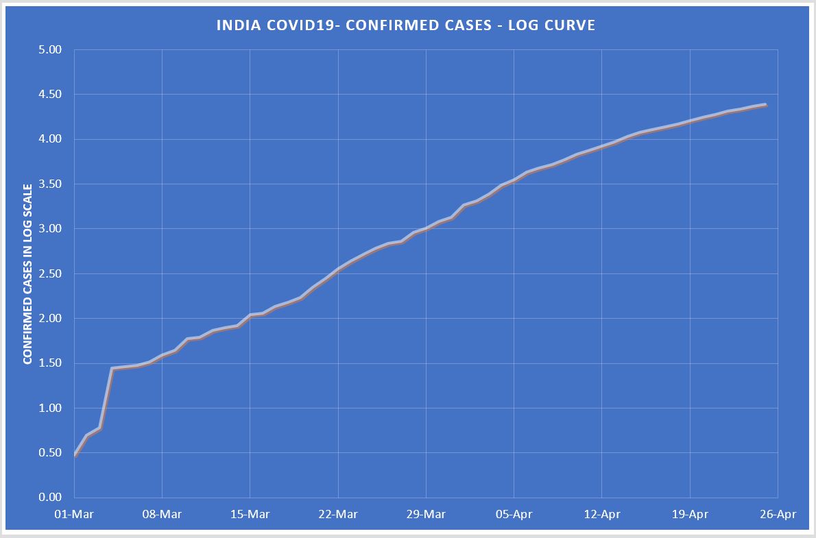
How is India& #39;s #COVID19 confirmed cases trajectory?
Plotting confirmed cases in log scale at Y-axis.
This graph will give you an insight about the trajectory we are now following & leaving to your judgements
Hint: To see the slope, look at the squares graph pass in each week!
Plotting confirmed cases in log scale at Y-axis.
This graph will give you an insight about the trajectory we are now following & leaving to your judgements
Hint: To see the slope, look at the squares graph pass in each week!
I fully relied the evening bulletins of MoHFW here.
When you plot this or confirmed cases collated from States do not much difference in a log scale.
So decided to go by the official figures!
When you plot this or confirmed cases collated from States do not much difference in a log scale.
So decided to go by the official figures!
Yep! You have to look at the data like this!
Even if you decide to look at the data in parts, never follow the daily ones thrown by MoHFW mandarins!
Considering the long time of asymptomatic, look at weekly or biweekly data to understand trend!
Even if you decide to look at the data in parts, never follow the daily ones thrown by MoHFW mandarins!
Considering the long time of asymptomatic, look at weekly or biweekly data to understand trend!
Seen today that @manoramanews is going blah blah about lockdown effects!
Problem is they don& #39;t look at the data in resonance with the very nature of this virus!
Let me say LOCKDOWN IS ONLY SHIFTING INEVITABLE FOR COUPLE OF WEEKS AHEAD!
THAT IS IT!
Problem is they don& #39;t look at the data in resonance with the very nature of this virus!
Let me say LOCKDOWN IS ONLY SHIFTING INEVITABLE FOR COUPLE OF WEEKS AHEAD!
THAT IS IT!
To understand how the virus is growing, we should look at it through the window of 7 days!
Let& #39;s look this data from pre-lock down and post lock down, taken Janta curfew date
This table shall be further discussed in the next tweet.
Let& #39;s look this data from pre-lock down and post lock down, taken Janta curfew date
This table shall be further discussed in the next tweet.
Avg weekly growth was 18% pre-lockdown, it remained same for next week &then increased to 20% in the second week of lockdown and now at 8%, 55.5% reduction than what was before lockdown.
But the net effect is 18% pre-lock down only reduced to 13% post lockdown!
That is it
But the net effect is 18% pre-lock down only reduced to 13% post lockdown!
That is it
If you don& #39;t understand what I mean, the average growth between 15/03 to 21/03 was 18%. I did not take previous data, because it was so small and not representative.
But if we look at average growth between 22/03 to 25/04 it is 13%.
That is the real picture of LOCKDOWN!
But if we look at average growth between 22/03 to 25/04 it is 13%.
That is the real picture of LOCKDOWN!
PS: The better way of looking the whole data of #COVID19 is at 2 weeks slots, because that is the average time of showing the symptoms!

 Read on Twitter


