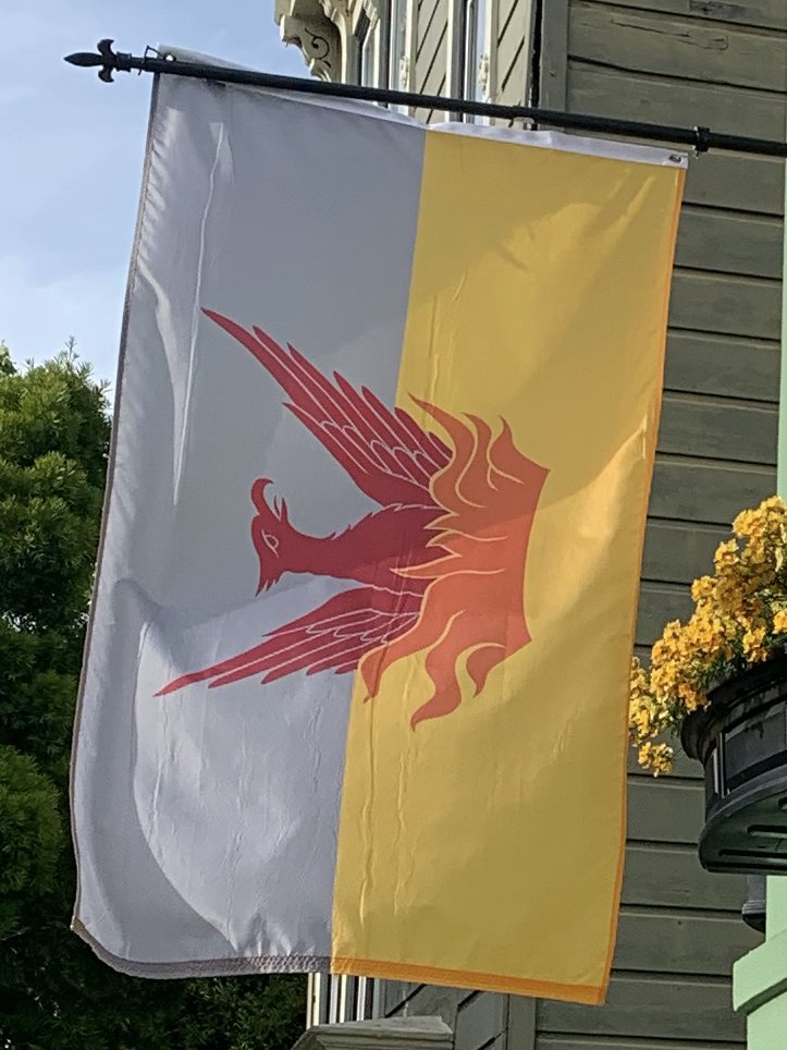
As a reminder to folks less familiar with flag design, here are the five principles of a good flag design, and how the Fog & Gold Flag holds up to them. I& #39;ll give the flag a score A-F for each principle. Here we go. 1/9
Principle #1:
Keep it simple. The flag should be so simple that a child can draw it from memory.
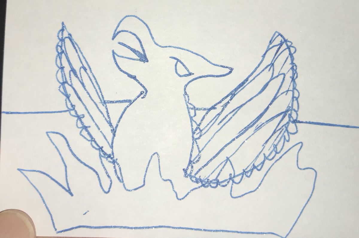
In lieu of a child, I& #39;ve tried to draw the flag on my smart phone using my meager drawing skills. Admittedly, the flame, and especially the phoenix are hard to draw.
Grade: C-
2/9
Keep it simple. The flag should be so simple that a child can draw it from memory.
In lieu of a child, I& #39;ve tried to draw the flag on my smart phone using my meager drawing skills. Admittedly, the flame, and especially the phoenix are hard to draw.
Grade: C-
2/9
*My child says they want to see how they draw the flag. Here are the results without color. Child was uninterested in coloring the design.
3/9
3/9
Principle #2:
Use Meaningful Symbolism. The flag& #39;s images, colors, or patterns should relate to what it symbolizes.
Phoenix symbolizes rebirth after fires
Gray represents our fog
Gold represents our origins and success.
Grade: A-
4/9
Use Meaningful Symbolism. The flag& #39;s images, colors, or patterns should relate to what it symbolizes.
Phoenix symbolizes rebirth after fires
Gray represents our fog
Gold represents our origins and success.
Grade: A-
4/9
Principle #3:
Use 2 or 3 Basic Colors. Limit the number of colors on the flag to three which contrast well and come from the standard color set.
Let& #39;s count the colors:
1: Gray
2: Gold
3: International Orange
4: Crimson
4 colors. Not bad.
Grade: B
5/9
Use 2 or 3 Basic Colors. Limit the number of colors on the flag to three which contrast well and come from the standard color set.
Let& #39;s count the colors:
1: Gray
2: Gold
3: International Orange
4: Crimson
4 colors. Not bad.
Grade: B
5/9
Principle #4:
No Lettering or Seals. Never use writing of any kind or an organization& #39;s seal.
No letters, words or seals have been placed here.
Grade: A+
6/9
No Lettering or Seals. Never use writing of any kind or an organization& #39;s seal.
No letters, words or seals have been placed here.
Grade: A+
6/9
Principle #5:
Be Distinctive or Be Related. Avoid duplicating other flags, but use similarities to show connections.
Although two other city flags have a phoenix, there aren& #39;t many phoenix& #39;s on flags in general. Other flags have 2 horizontal background colors. However... 7/9
Be Distinctive or Be Related. Avoid duplicating other flags, but use similarities to show connections.
Although two other city flags have a phoenix, there aren& #39;t many phoenix& #39;s on flags in general. Other flags have 2 horizontal background colors. However... 7/9
Principle #5: (cont)
(Be Distinctive or Be Related. Avoid duplicating other flags, but use similarities to show connections.)
This flag has a super unique color:
Gray
Flag is relatable due to using former phoenix, and all know our fog and Gold Rush history.
Grade: A-
8/9
(Be Distinctive or Be Related. Avoid duplicating other flags, but use similarities to show connections.)
This flag has a super unique color:
Gray
Flag is relatable due to using former phoenix, and all know our fog and Gold Rush history.
Grade: A-
8/9

 Read on Twitter


