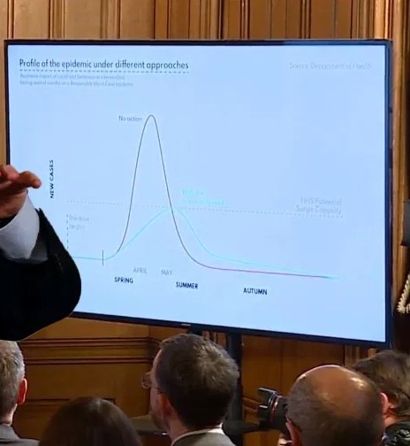
It occurred to me recently that this whole "Flattern the curve" mantra that we all bought into at the start of the outbreak was a complete crock of shit. The graphs we were presented with were completely misleading. There we no labels on the y-axis. We should have known. 1/3
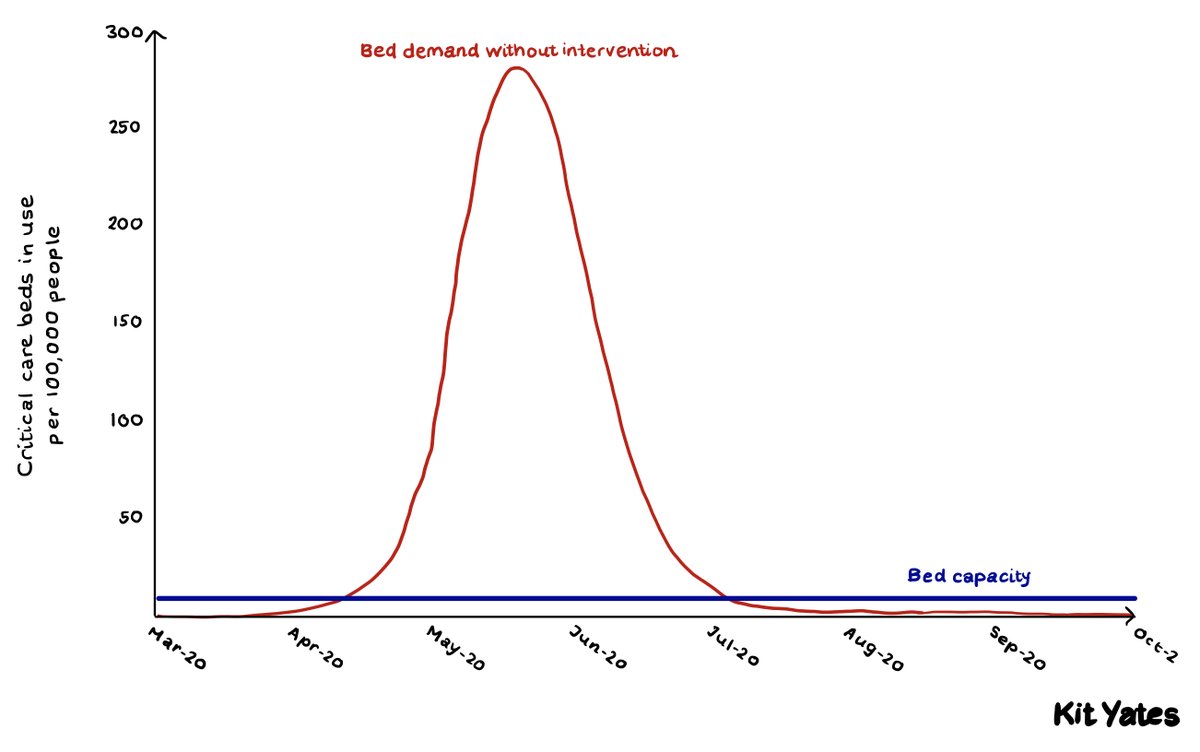
In reality the curve looks like this. There was never going to be any chance of "flattening the curve" and arriving at herd immunity without hugely overwhelming critical care capacity. It was a complete sham. 2/3
I wonder if it& #39;s a coincidence that you can& #39;t get slides from govenment breifings before the 30th of March (hence the photo in the first tweet): https://www.gov.uk/government/collections/slides-and-datasets-to-accompany-coronavirus-press-conferences
Are">https://www.gov.uk/governmen... they deliberately trying to supress evidence of these early mis-steps? 3/3
Are">https://www.gov.uk/governmen... they deliberately trying to supress evidence of these early mis-steps? 3/3

 Read on Twitter


