The latest @ICNARC report is out. Let’s see if I can do a summary which is both jargon-free and typo-free this week (feedback welcome).
I won’t focus on dispelling the “at deaths door” myth this week as lots of great research is now coming out making that point strongly. /1
I won’t focus on dispelling the “at deaths door” myth this week as lots of great research is now coming out making that point strongly. /1
Full report is here and runs to 4pm on 23 April. It covers 6,720 patients, with outcome data on 4,078 of them; 2,067 deaths and 2,011 discharged from critical care.
I’m summarising the report on behalf of @ICS_updates and @COVID19actuary. /2
https://www.icnarc.org/DataServices/Attachments/Download/c5a62b13-6486-ea11-9125-00505601089b">https://www.icnarc.org/DataServi...
I’m summarising the report on behalf of @ICS_updates and @COVID19actuary. /2
https://www.icnarc.org/DataServices/Attachments/Download/c5a62b13-6486-ea11-9125-00505601089b">https://www.icnarc.org/DataServi...
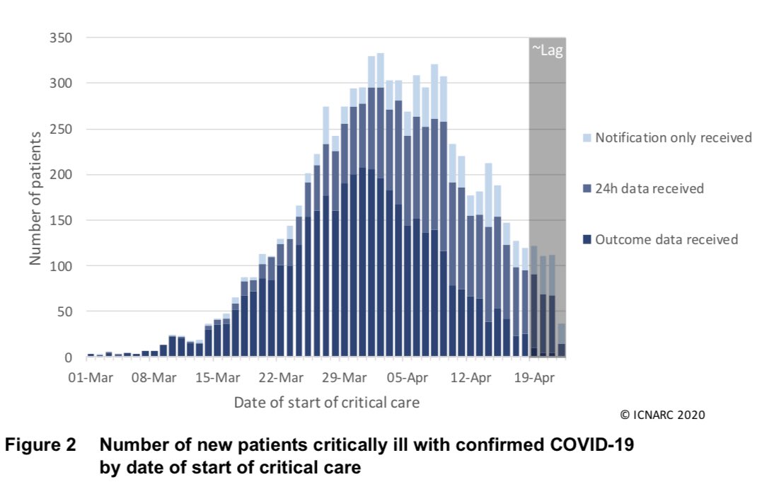
I loved this new chart - both for its clarity and for the good news message it illustrates. It is clear that we are well past the first peak of ICU admissions.
Social distancing really works. Let’s keep it up. /3
Social distancing really works. Let’s keep it up. /3
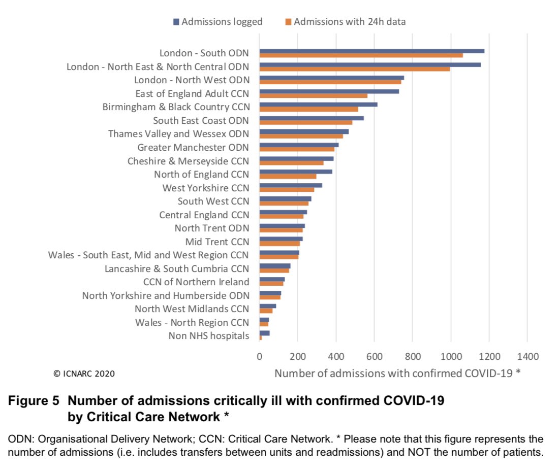
Not much change in week in Fig 5 (was Fig 4 last week) which still shows concentration in London (top 3!) and surrounding areas as well as Birmingham, Manchester and Merseyside. /4
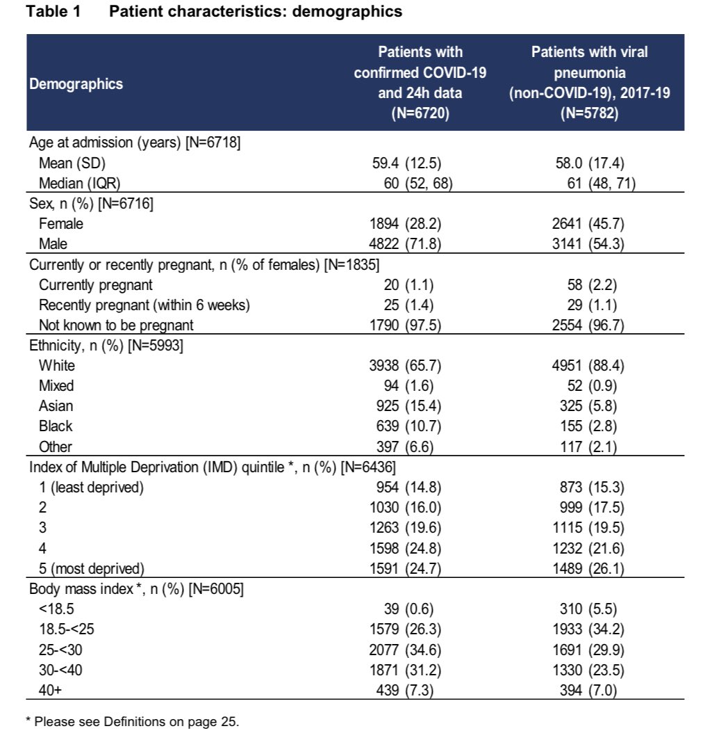
Some changes to Table 1 which now has more demographic info.
A socioeconomic gradient in ICU admissions is very clear!
As @maitlis so powerfully articulated two weeks ago, this disease is NOT a great leveller.
More deprived people are both more exposed and more vulnerable. /5
A socioeconomic gradient in ICU admissions is very clear!
As @maitlis so powerfully articulated two weeks ago, this disease is NOT a great leveller.
More deprived people are both more exposed and more vulnerable. /5
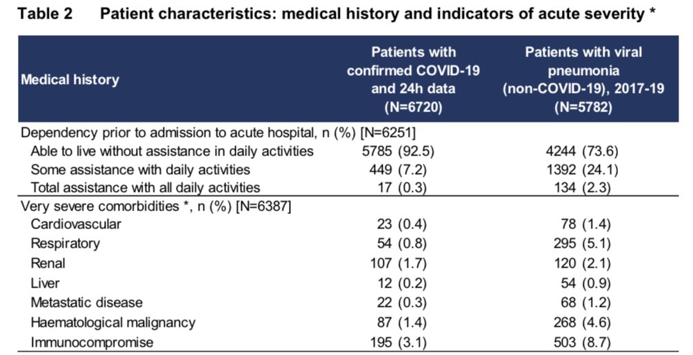
Table 2 now shows us the info on severe comorbidities (only 8% of ICU patients) and ability to live without assistance prior to admission (93% of ICU patients). These are little changed since my first analysis four weeks ago. /6
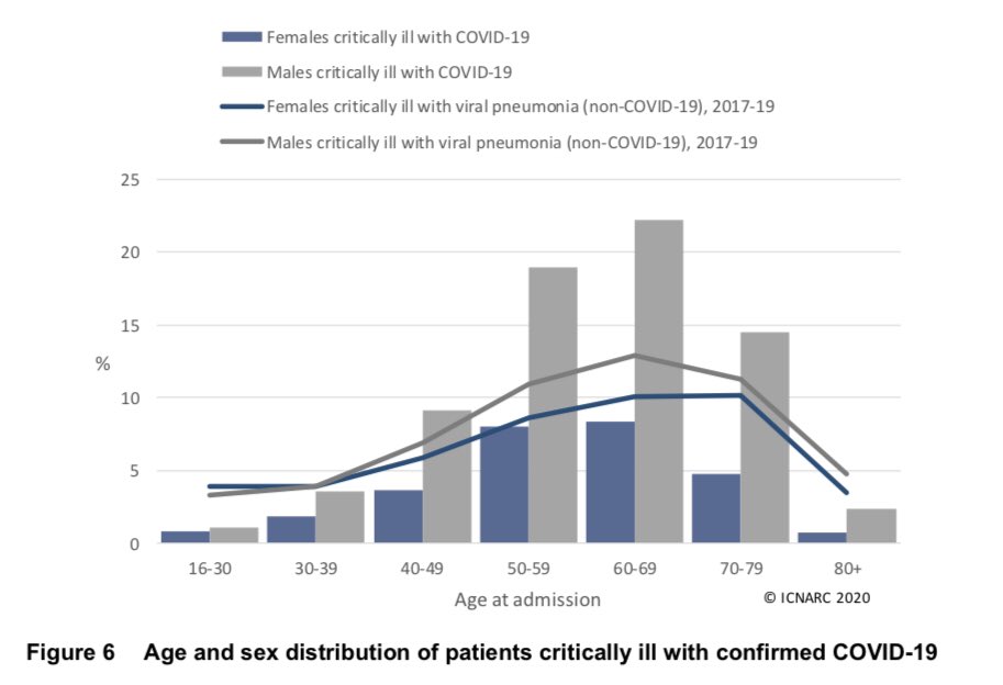
Barely any change in age and sex distribution. Three quarters of ICU patients are males. It seems males aged 50-80 are particularly vulnerable to COVID-19 when compared to non-COVID viral pneumonia. /7
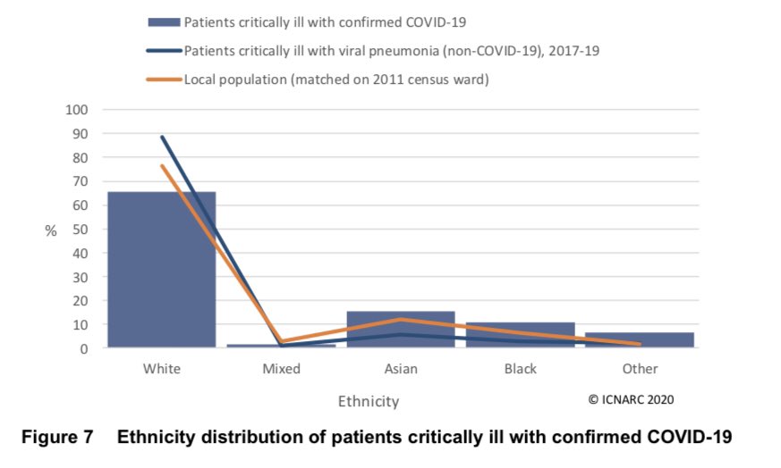
As the numbers get bigger it‘s harder to dismiss the difference between the ethnicity of ICU patients and what we’d expect based on location.
Compared to whites, admissions are:
- Asians, 50% likely
- Blacks, twice as likely
- Others, more than 4 times as likely!
/8
Compared to whites, admissions are:
- Asians, 50% likely
- Blacks, twice as likely
- Others, more than 4 times as likely!
/8
Key ethnicity https://abs.twimg.com/emoji/v2/... draggable="false" alt="👆" title="Up pointing backhand index" aria-label="Emoji: Up pointing backhand index">question is why?
As @edgeb12 pointed out last week, the location info is nearly 10 years old, so ethnic minority population may be higher in key areas.
Or are there differences in exposure and/or susceptibility between ethnicities?
Research is much needed! /9
As @edgeb12 pointed out last week, the location info is nearly 10 years old, so ethnic minority population may be higher in key areas.
Or are there differences in exposure and/or susceptibility between ethnicities?
Research is much needed! /9
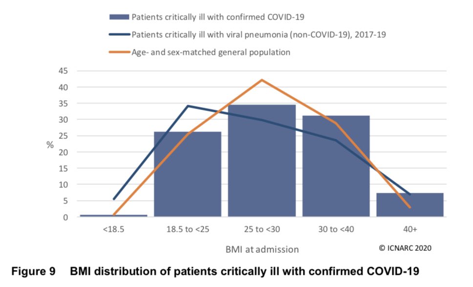
BMI distribution is about what we’d expect for those of a healthy weight (or under).
An interesting distinction becoming apparent within overweight majority. Less cases than expected among ‘overweight but not obese’ (BMI 25-30). Far more cases among severely obese (BMI>40). /10
An interesting distinction becoming apparent within overweight majority. Less cases than expected among ‘overweight but not obese’ (BMI 25-30). Far more cases among severely obese (BMI>40). /10
I try to stick within my expertise and avoid much comment on medical specifics better covered by others.
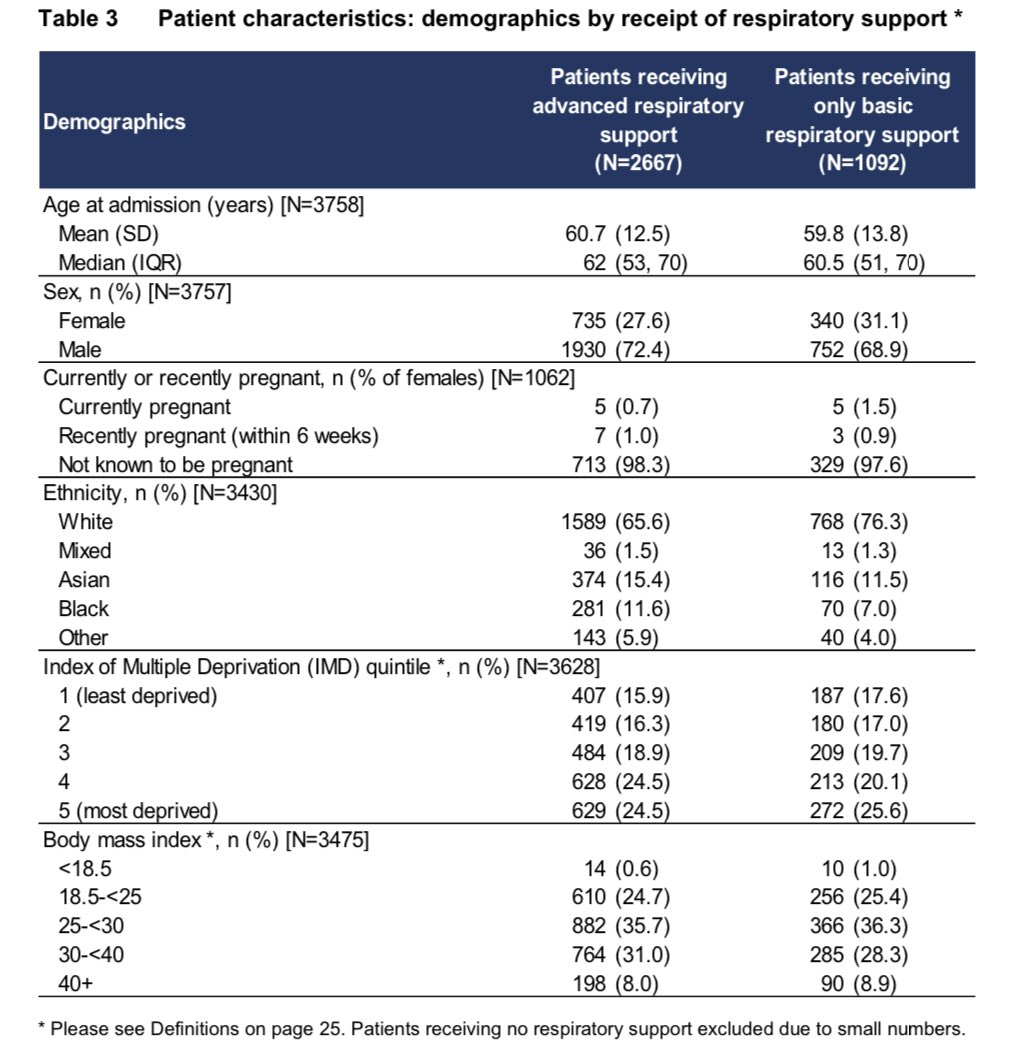
Interesting to look at T3 tho which shows distributions of those receiving basic (less serious) & advanced support.
Reinforces sex, ethnic & socioeconomic differences! /11
Interesting to look at T3 tho which shows distributions of those receiving basic (less serious) & advanced support.
Reinforces sex, ethnic & socioeconomic differences! /11
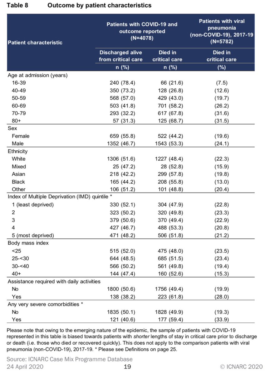
Outcomes data becomes more powerful each week (up from 3000 to 4000 this week). Surviving ICU is still 50/50 overall!
Below age 50, 1-in-4 dies.
Above age 70, 1-in-3 lives.
We do NOT see such significant differences in outcome by sex, ethnicity, socioeconomics or BMI.
/12
Below age 50, 1-in-4 dies.
Above age 70, 1-in-3 lives.
We do NOT see such significant differences in outcome by sex, ethnicity, socioeconomics or BMI.
/12
Outcomes no longer clearly worsening as BMI increases https://abs.twimg.com/emoji/v2/... draggable="false" alt="👆" title="Up pointing backhand index" aria-label="Emoji: Up pointing backhand index">is a change from last week.
Outcomes still worse for those with severe comorbidities and those who needed assistance with daily living prior to admission. In both cases only 4/10 survive (it’s 5/10 for others). /13
Outcomes still worse for those with severe comorbidities and those who needed assistance with daily living prior to admission. In both cases only 4/10 survive (it’s 5/10 for others). /13
That’s it for me for this week. Great to see admissions falling for now but COVID-19 is still a huge threat. Please stay at home if you can.
Thanks to @aroradrn for suggesting these updates.
You can support the intensive care community here. /14 https://twitter.com/ICS_updates/status/1248568944048439296">https://twitter.com/ICS_updat...
Thanks to @aroradrn for suggesting these updates.
You can support the intensive care community here. /14 https://twitter.com/ICS_updates/status/1248568944048439296">https://twitter.com/ICS_updat...
Typo/clarification that tweet 8 should say “Asians 50% MORE likely”. Omission of more makes it ambiguous and potentially misleading (sorry).

 Read on Twitter