One of the many challenges to trying to understand if COVID-19 has "peaked" in Virginia is the issue of testing. First, the # of tests results reported each day varies. In the last week, the # of tests ranged from 1,619 to 4,497. More tests should mean more confirmed cases.
Second is the variability of who is tested. Are tests one day more heavily weighted toward known hot spots like nursing homes with clear exposure to COVID-19? Or toward a general population that may have some symptoms consistent with COVID-19?
Then there& #39;s the time lag. Cases reported today could involve people who became ill days or weeks ago. (Lag can be caused by people who wait before they can get tested and by the time it takes a lab to get test results back)
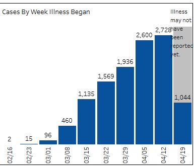
So, is there a better measure than waiting each morning to see how many new cases reports for the previous day? One might be to look at @VDHgov data that breaks down cases by week when patient had the onset of COVID-19. In theory, this would show how quickly the virus spread
But there are limitations with this data. The biggest is that it can& #39;t answer the question: What is the heck is happening NOW? This onset of illness data is best looking backwards to what was happening 2 or 3 weeks ago.
But even that look back can be misleading. The @VDHgov chart has a caveat letting you know the data for the current week is incomplete: "Illness may not have been reported yet" But this warning applies to past weeks too, as same lag that impacts daily case count is at work here
Most of the cases confirmed today involve patients who got ill in the past -- maybe a few days ago, maybe a few weeks ago. That means each day, @VDHgov is assigning many the onset of cases to previous weeks.
Right now, you could look at weeks starting April 5 and 12 and conclude -- Wow, it looks like the number of people getting sick has leveled off. But if you come back tomorrow, the # of cases for both weeks will have changed, with April 12 week growing the fastest.
On Tuesday, for instance, the chart showed 2,230 cases had an onset of the week starting April 12. Three days later, the chart is showing 2,728 cases for that same week. Tomorrow, you can bet there will be more.
So, the onset data is best for looking at way back in the past, maybe a month. So, it you want the onset data to tell you what is happening today, you should check back on May 25.
This thread is a long way of saying that those of us on the outside looking can& #39;t expect to have someone serve up a single line graph that allows us to say (in our best authoritative tone), "Look, now I can see what is happening" .
This is frustrating to us at an organization that has sought to organize and display campaign finance and election data is ways that make it easier for people to see what is going on, to reach their own conclusions.

 Read on Twitter


