All right, then! Poll seems pretty conclusive so:
My process on this painting - a thread.
Feel free to ask questions (in fact, consider yourself encouraged to do so) as I go! https://twitter.com/vmaderna/status/1252717497729548288">https://twitter.com/vmaderna/...
My process on this painting - a thread.
Feel free to ask questions (in fact, consider yourself encouraged to do so) as I go! https://twitter.com/vmaderna/status/1252717497729548288">https://twitter.com/vmaderna/...
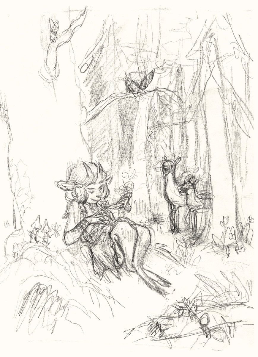
First step is sketching. I figure out what I want *very* roughly on my sketchbook first and then do a bigger, more detailed drawing.
But not TOO detailed. Nothing I hate more than when the sketch is better than the final, keeping it loose tends to help! https://abs.twimg.com/emoji/v2/... draggable="false" alt="😅" title="Smiling face with open mouth and cold sweat" aria-label="Emoji: Smiling face with open mouth and cold sweat">
But not TOO detailed. Nothing I hate more than when the sketch is better than the final, keeping it loose tends to help!
I transferred the sketch to Arches cold press peper - too thick for my lightbox so I did a printout of my sketch, covered the back with graphite & used it as carbon paper.
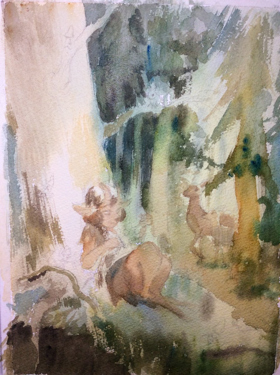
Then I started with general watercolor washes, just getting a feel for general value and hues/temperature.
Then I started with general watercolor washes, just getting a feel for general value and hues/temperature.
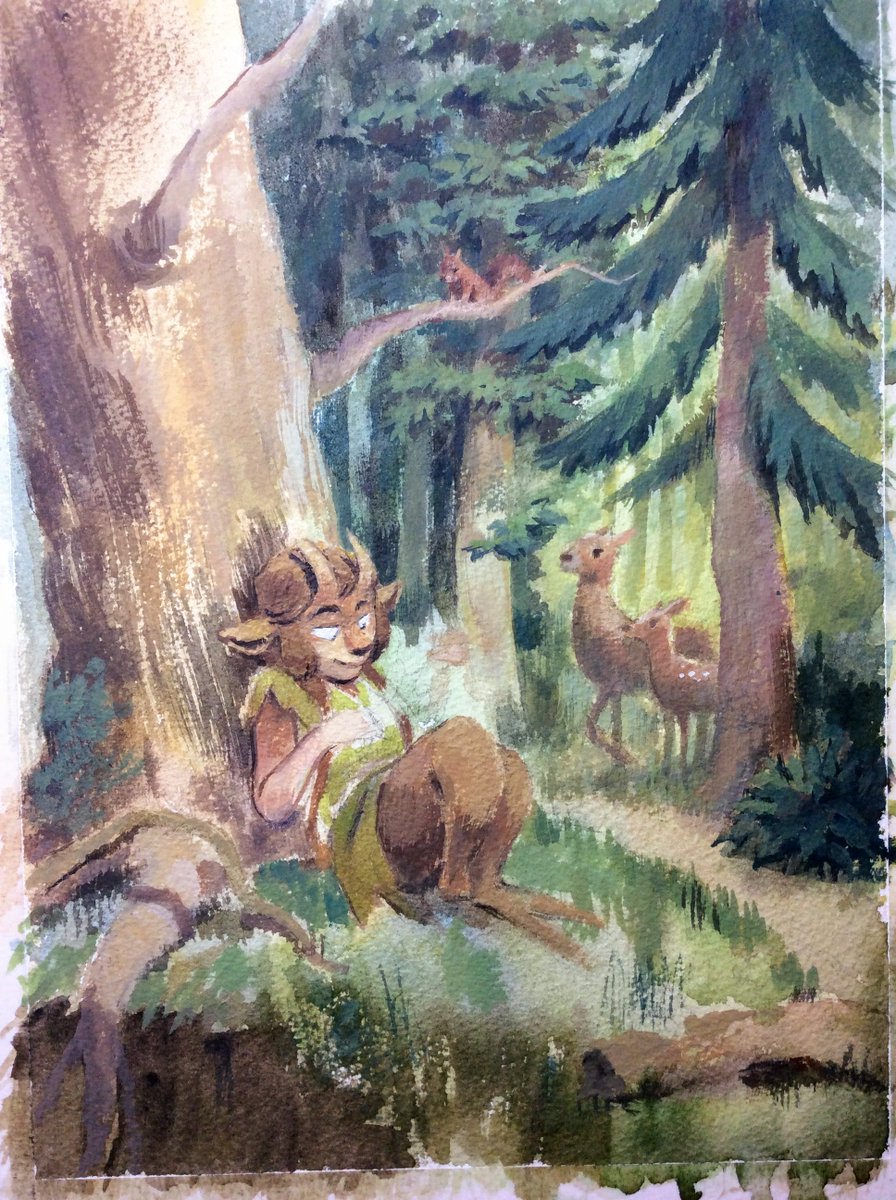
I did as much as I could with transparent color and then I started adding gouache - mostly white at first as you can just mix it with your watercolors for opaque paint.
I had a technical issue: my white gouache had some separation and it ended up having excess gum arabic, and it dried with a shiny finish. The shiny hands were lifted first, and after some inner conflict because I liked how it turned out, the shiny face suffered the same fate.
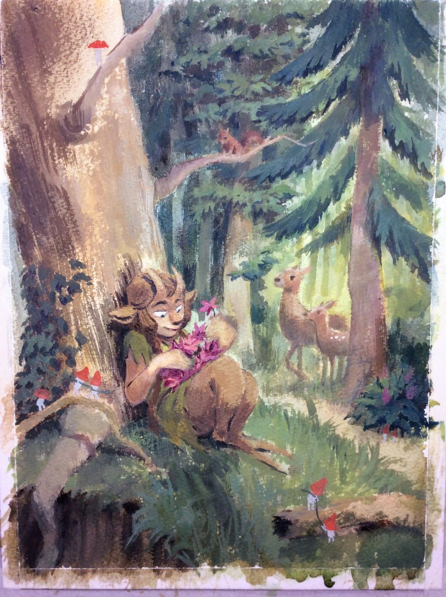
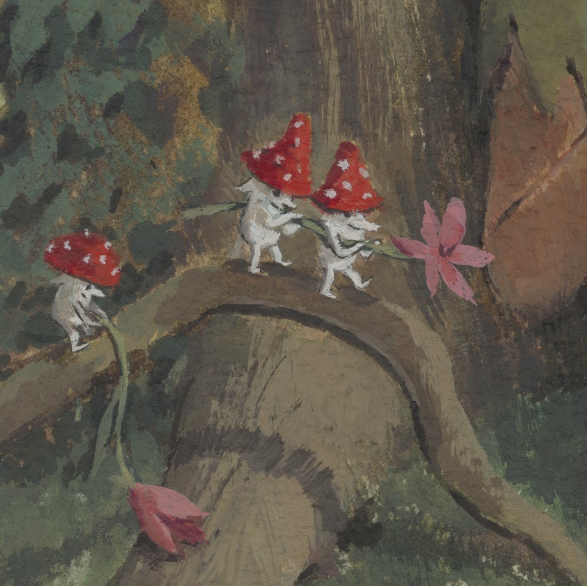
I pretty much painted background to foreground, I left these little mushroom guys for last as it would have been a pain to have them early on and have to paint around them.
Then it was just a matter of adding detail, clarify shapes and values, tighten some areas, blend some others. And done!
Scanning time! Because I& #39;ve used a highly textured paper, I scan twice, the second time rotating the painting 180º. I don& #39;t let my scanner do ANY adjustments, even if this dull, dark version of my painting is a bit painful to look at!  https://abs.twimg.com/emoji/v2/... draggable="false" alt="😅" title="Smiling face with open mouth and cold sweat" aria-label="Emoji: Smiling face with open mouth and cold sweat">
I set the two scans as layers of a PS file. Then I select Edit> Auto-Align Layers> Collage to make them match. Not always perfect so I check & adjust by putting the top layer in Difference mode.
Once I& #39;m happy with the alignment I set the top layer to Darken & this happens:
Once I& #39;m happy with the alignment I set the top layer to Darken & this happens:
Then it& #39;s color adjustment time!
For me there& #39;s two must-have layers for adjustment:
- Levels
- Selective Color
Sometimes I might add a gradient or a Hue/Saturation layer, but these are the two I always always use.
For me there& #39;s two must-have layers for adjustment:
- Levels
- Selective Color
Sometimes I might add a gradient or a Hue/Saturation layer, but these are the two I always always use.
Sorry I made a mistake!  https://abs.twimg.com/emoji/v2/... draggable="false" alt="😱" title="Face screaming in fear" aria-label="Emoji: Face screaming in fear"> The top layer goes in LIGHTEN mode.
Darken is for when you have glare (from varnish or shiny finish paints like acrylics/oils)
Darken is for when you have glare (from varnish or shiny finish paints like acrylics/oils)
(If you have both glare and texture you can just set the layer to normal at 50% - 60% opacity - sometimes this works better either way depending on the texture!)
LEVELS is self-explanatory: makes darks darker & lights lighter. For subtle value shifts you can use Curves but Levels is usually enough.
Levels alters saturation some which I tend not to mind but if it gets problematic you can set it to Luminosity mode & adjust saturation later.
Levels alters saturation some which I tend not to mind but if it gets problematic you can set it to Luminosity mode & adjust saturation later.
SELECTIVE COLOR lets you adjust by color. I set it to Absolute and eyeball things as needed. Generally I can pop whites a bit, makes blues richer (they tend to scan duller for me), make blacks more chromatic, etc. It& #39;s subtle but it lets you control things more than Hue/Sat.
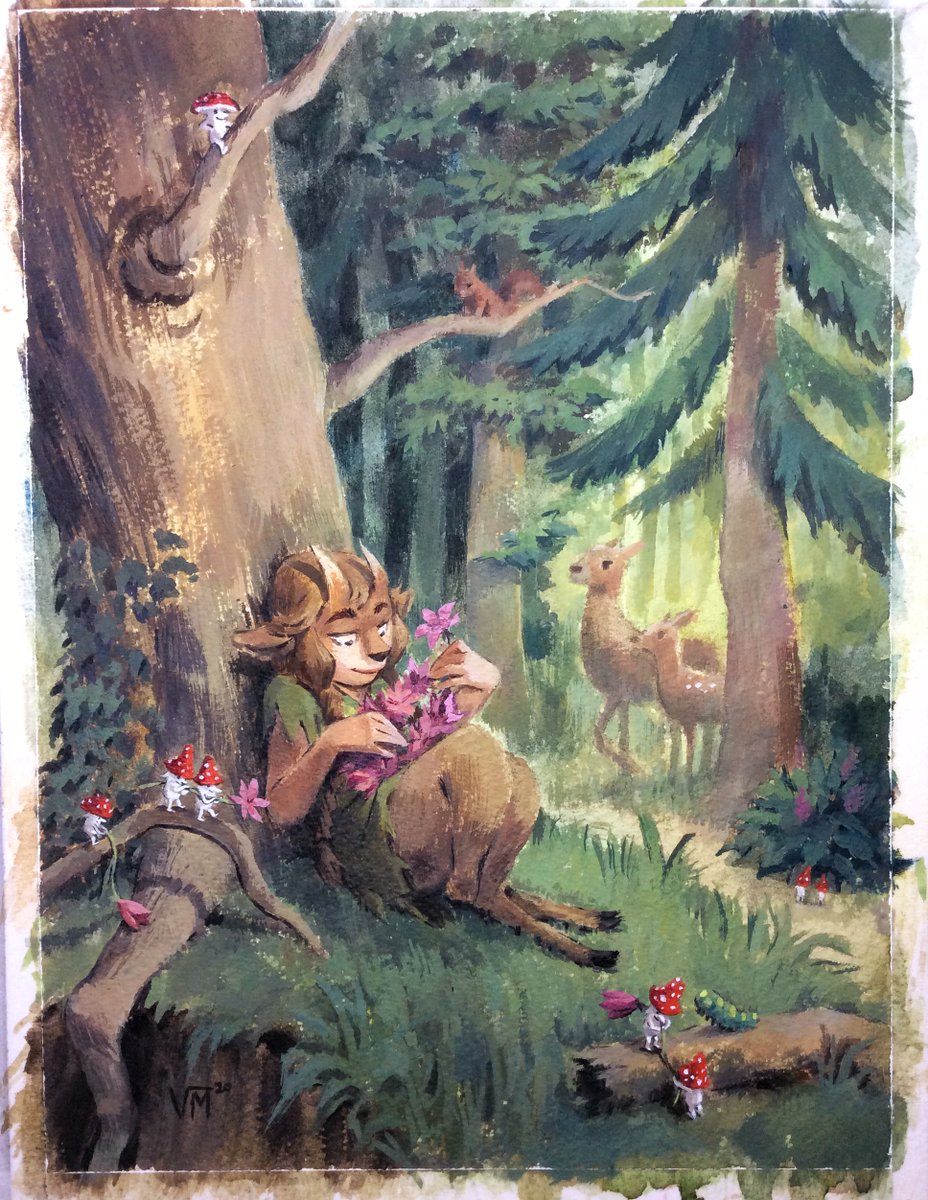
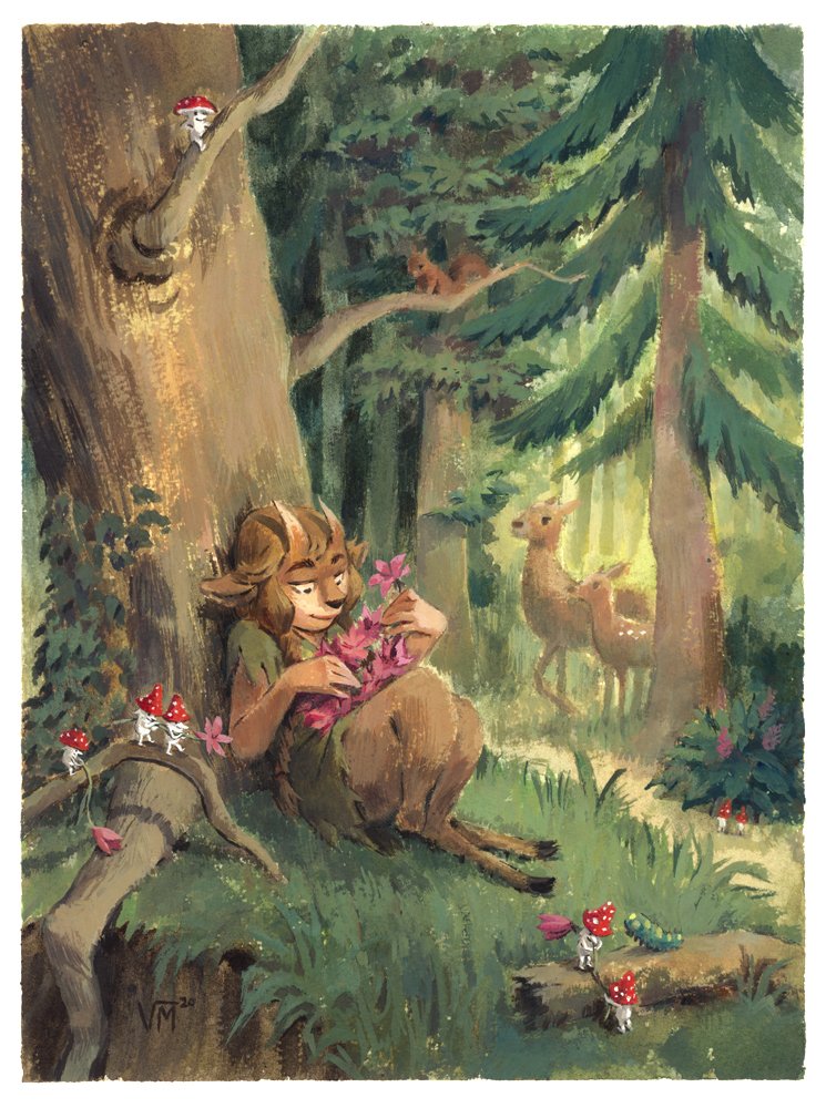
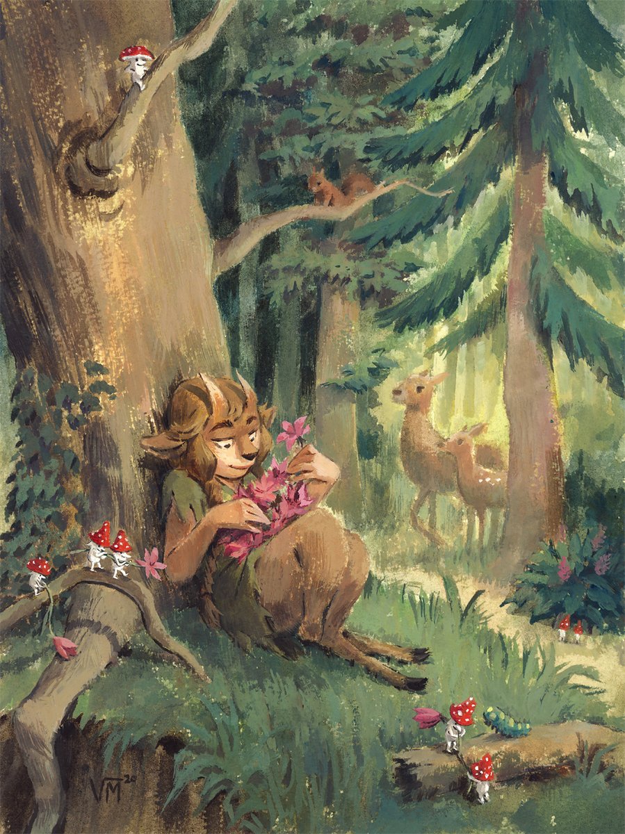
These two adjustment layers left my image looking pretty close to my original; this is the version I sent to the person who commissioned the painting. But sometimes you want to take things a bit further, especially if (unlike here) you& #39;re *only* delivering a digital file.
You can alter the look of your painting a lot with Selective Color alone. Gradients set to Overlay/Soft Light can also enhance your image (example https://abs.twimg.com/emoji/v2/... draggable="false" alt="👇" title="Down pointing backhand index" aria-label="Emoji: Down pointing backhand index">). Gradient Map, Photo Filter & Color Lookup can also achieve interesting results. You can be as subtle or as bold as you like!
You can also use the Clone Stamp tool to remove any visible stains or hairs or if you missed a bit of paint somewhere. I don& #39;t do this unless it& #39;s really noticeable or annoying as imperfection is, to me, part of the charm of traditional art!  https://abs.twimg.com/emoji/v2/... draggable="false" alt="😀" title="Grinning face" aria-label="Emoji: Grinning face">
I forgot to mention in the the traditional steps: the early watercolor layers and up to this point, I& #39;ve been working wet-on-wet, spraying the paper with water right at the start, from looser to tighter as it dries. Gives the BG that fuzzy, dreamlike look. https://twitter.com/vmaderna/status/1253726537658048513">https://twitter.com/vmaderna/...
I think that covers everything, but if you have questions, ask away!  https://abs.twimg.com/emoji/v2/... draggable="false" alt="😊" title="Smiling face with smiling eyes" aria-label="Emoji: Smiling face with smiling eyes">
 https://abs.twimg.com/emoji/v2/... draggable="false" alt="💛" title="Yellow heart" aria-label="Emoji: Yellow heart">

 Read on Twitter
 " title="First step is sketching. I figure out what I want *very* roughly on my sketchbook first and then do a bigger, more detailed drawing. But not TOO detailed. Nothing I hate more than when the sketch is better than the final, keeping it loose tends to help! https://abs.twimg.com/emoji/v2/... draggable="false" alt="😅" title="Smiling face with open mouth and cold sweat" aria-label="Emoji: Smiling face with open mouth and cold sweat">">
 " title="First step is sketching. I figure out what I want *very* roughly on my sketchbook first and then do a bigger, more detailed drawing. But not TOO detailed. Nothing I hate more than when the sketch is better than the final, keeping it loose tends to help! https://abs.twimg.com/emoji/v2/... draggable="false" alt="😅" title="Smiling face with open mouth and cold sweat" aria-label="Emoji: Smiling face with open mouth and cold sweat">">
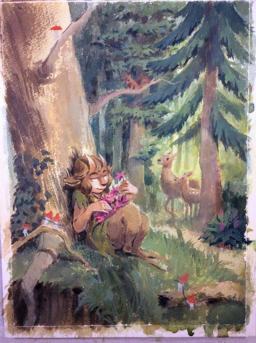
 " title="Scanning time! Because I& #39;ve used a highly textured paper, I scan twice, the second time rotating the painting 180º. I don& #39;t let my scanner do ANY adjustments, even if this dull, dark version of my painting is a bit painful to look at! https://abs.twimg.com/emoji/v2/... draggable="false" alt="😅" title="Smiling face with open mouth and cold sweat" aria-label="Emoji: Smiling face with open mouth and cold sweat">" class="img-responsive" style="max-width:100%;"/>

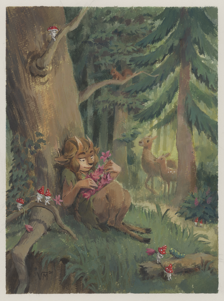


 ). Gradient Map, Photo Filter & Color Lookup can also achieve interesting results. You can be as subtle or as bold as you like!" title="You can alter the look of your painting a lot with Selective Color alone. Gradients set to Overlay/Soft Light can also enhance your image (examplehttps://abs.twimg.com/emoji/v2/... draggable="false" alt="👇" title="Down pointing backhand index" aria-label="Emoji: Down pointing backhand index">). Gradient Map, Photo Filter & Color Lookup can also achieve interesting results. You can be as subtle or as bold as you like!">
 ). Gradient Map, Photo Filter & Color Lookup can also achieve interesting results. You can be as subtle or as bold as you like!" title="You can alter the look of your painting a lot with Selective Color alone. Gradients set to Overlay/Soft Light can also enhance your image (examplehttps://abs.twimg.com/emoji/v2/... draggable="false" alt="👇" title="Down pointing backhand index" aria-label="Emoji: Down pointing backhand index">). Gradient Map, Photo Filter & Color Lookup can also achieve interesting results. You can be as subtle or as bold as you like!">


