My friend and I have been doing a flag quiz together over quarantine. I& #39;ve learnt loads of new ones and have now become a self appointed flag design critic. No one asked, but no one is stopping me so here we go with some hot takes, oven gloves optional AMIRITE.
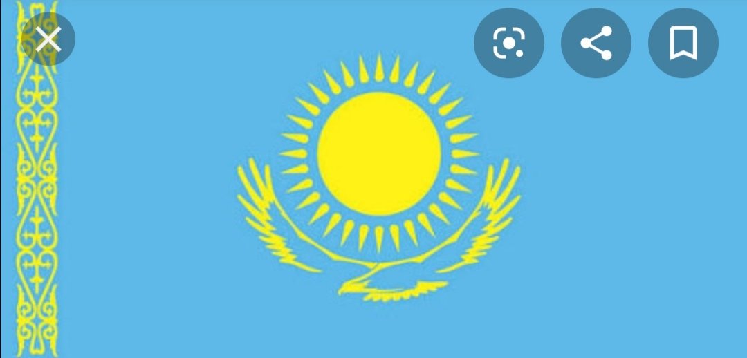
Kazakhstan flag is a bad bitch. Striking colour combination, simple but intricate design. The imagery could easily come off trite (birds, sun), but the layout is interesting enough to make it artful. It& #39;s giving me silent retreat slash ice cream wrapper vibes and it WORKS. 8/10
Albania flag, I& #39;m sad to report, is terrifying. Truly butters. A two headed monster with propulsive tongues - why?? This is the album cover for your little brother& #39;s shitty death core band. It& #39;s ominous. It& #39;s aggy. It& #39;s unnecessary. A 2.5/10 from me.
Peru, I love you m8, but you& #39;re doing too much with this crest. A llama, a plant, a horn projectile vomiting gold coins, a wreath, a ribbon..... whose caffineated 6 year old designed this? Where is the coherence? Where is the clarity?? The colour scheme is okay, so you get 4/10.
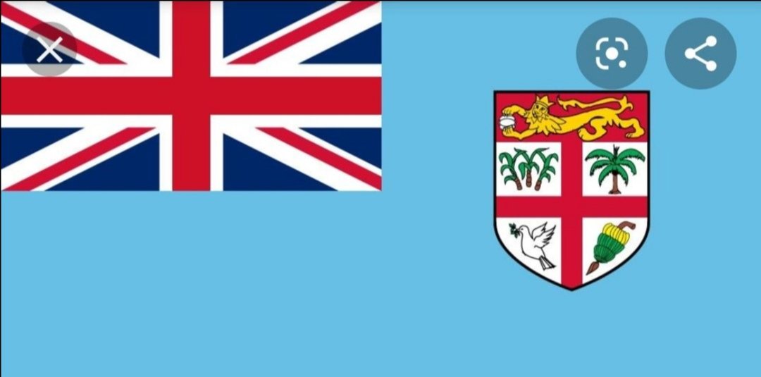
Don& #39;t know what flag this is cos my friend sent it last night and I& #39;m still guessing (don& #39;t tell me!) but I YELLED when I saw it because what kind of Microsoft Paint nonsense is this? The designer of this is not a patriot. They don& #39;t respect their country or indeed themselves.
My rage about this flag needs a few more tweets for itself. The haphazard slapping of the Union Jack in the corner... I know other Commonwealth countries have this but at least the rest of the design is simple. Also fuck putting your colonisers on your flag, RATE URSELVES!!
The layout? A mess. The colour scheme? Calamitous! This bright blue does not belong here!! And the crest... sweet Lord, the crest. What is the lion holding? A sanitary towel? That dove is not there of his free will, look at his face, he is MORTIFIED.
Seriously. Its like a - 4/10. No bueno. Let me round off with one that I like cos I& #39;ve been shit talking for a while now.
Chile flag is low key, but it& #39;s doing something!! I& #39;m not an art historian but I feel like some Golden Triangle shit is happening here cos it just feels BALANCED. Colour scheme simple but bold, that star nestled sexily in the corner. It& #39;s a subtle delight and a 7.5/10 from me.
I will be back with more flag analysis soon! Til then, if you hail from any of the low scoring countries, be the change you want to see! Email your leaders and tell them that your flags are making you look like mugs in these here Twitter streets.
Plenty of talented designers twiddling their thumbs having lost work. Commission one to get your shit together! Help a freelancer out whilst also restoring some gravitas to your global image. WIN and WIN. I& #39;ve been Vanessa, award winning flag critic, thank you & good day

 Read on Twitter


