I wrote an article about the UK being "over the peak" and what this means.
https://theconversation.com/coronavirus-the-uk-could-well-be-over-the-peak-136757
I">https://theconversation.com/coronavir... thought I& #39;d summarise why this isn& #39;t universally good news in a thread.
1/n
https://theconversation.com/coronavirus-the-uk-could-well-be-over-the-peak-136757
I">https://theconversation.com/coronavir... thought I& #39;d summarise why this isn& #39;t universally good news in a thread.
1/n
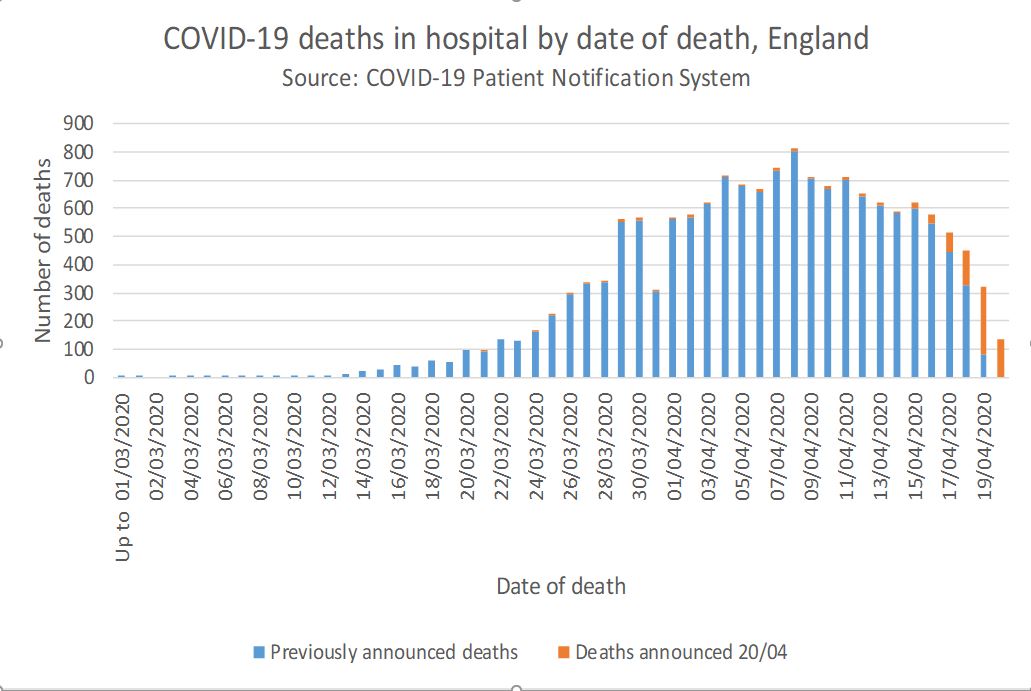
Firstly, data released by NHS England suggests we are over the peak. In fact it suggests the peak in deaths was likely around the 8th of April: almost two weeks ago. 2/n
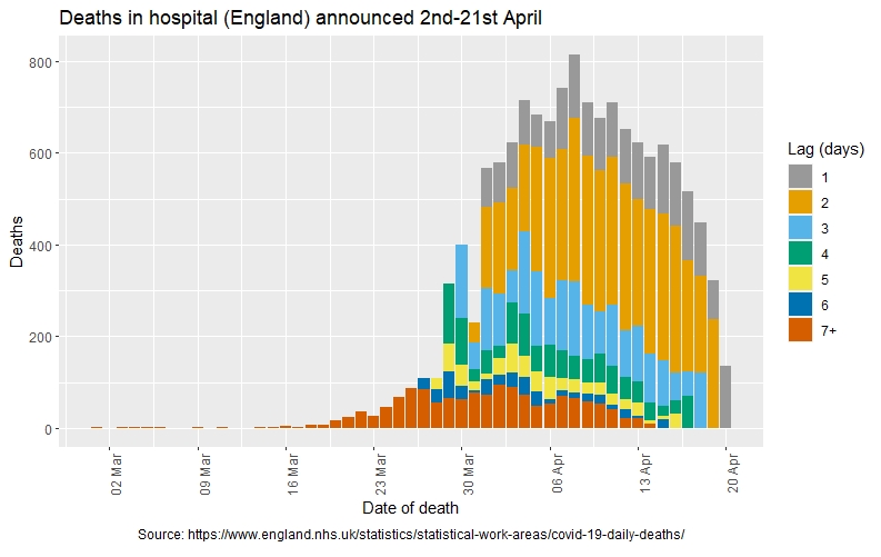
The reason we haven& #39;t been confident of the date for a while is because of the lag in reporting. Even looking by date of death, the numbers of deaths that occurred up to a week ago that have so far been reported can change significantly. Thanks to @KatLeeming for the figure. 3/n
But now we& #39;re far enough away from the peak for the numbers not to change too much. We can see that the 8th had the highest number of deaths. It should be said that there is some noise in the figures and the peak is broad, so the actual "peak" might vary a little bit. 4/n
It& #39;s also important to remember that even death figures are subject to over- (people who dies with not because of COVID19) and under- (cases going unreported in the community) reporting, but the majority of deaths are occuring in hosptals and being recorded by the NHS. 5/n
You could take the date date of maximum deaths and back calculate the date at which the number of cases fell. The mean time from infection to death is known to be 21 days which suggests a peak in cases on the 18th of March - *before* lockdown. But this calculation is wrong. 6/n
Lots of people have been using this erroneous argument to suggest infections peaked before we went into lockdown, suggesting we could significantly relax resitrcions with no second flare up. This doesn& #39;t seem to be consistent with the data. Here& #39;s why. 7/n
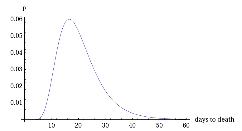
This distribution of the time from infection to death is assymetrical meaning the peak (mode) deaths occurs at around 18 days well before the mean. In short, modelling suggests the peak number of cases as consistent with lockdown having the decisive impact. 8/n
Here& #39;s a look at that assymetrical distribution via @cheianov .
I hate to be a party pooper. It& #39;s great that we have brough the spread under control, but there is still long way to go. 9/n
I hate to be a party pooper. It& #39;s great that we have brough the spread under control, but there is still long way to go. 9/n
I wanted to finish by saying it seems strange to be taking solice form a graph showing numbers of deaths. Each of the deaths recorded on the chart above was a person with a family and friends who will be struggling to mourn them in these incredibly difficult circumstances. 10/n

 Read on Twitter


