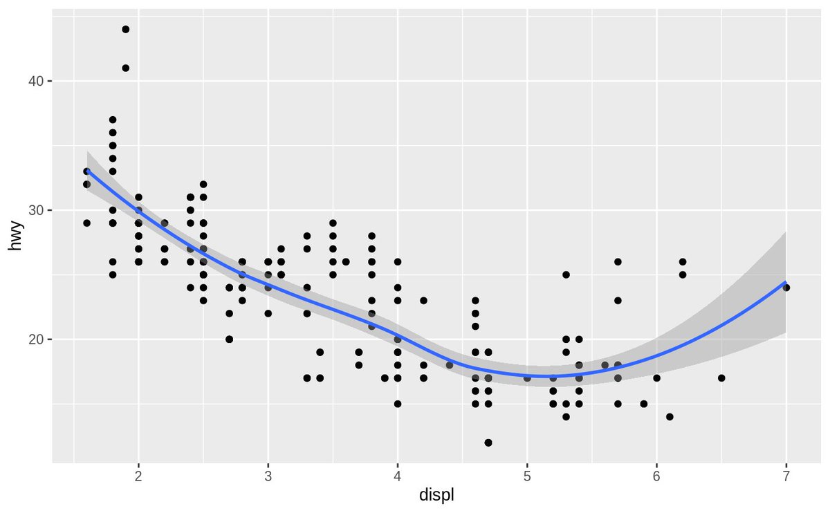
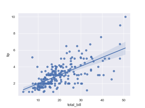
Honest question: how do people interpret/use the partly-shaded area in plots like these that can be made easily in Seaborn and ggplot2? What does one take away from a point being in or out of the area? what other information can be gleaned?
Is it something like "given <some assumptions> about these points being <a sample> of <the output of some process>, and the line being <some real thing>, then there& #39;s some n% likelihood that the true value of the line lies in this area"?
The question behind the question is basically: what are the assumptions used to compute these areas, how often are these assumptions reasonable for a given chart, and do readers of any given chart know the answers to either of those questions? :)
Another possible interpretation: the shaded area contains n% of the lines that can be drawn by using a random sample of m% of the points?
@hadleywickham @michaelwaskom I& #39;d love to hear your thoughts on this! I get many requests to implement similar features in Plotly Express and I& #39;m trying to get an intuition about how these work/what they& #39;re for...
@JessicaHullman @mjskay I& #39;d love your input into the above and/or commentary on the responses below if you felt so inclined :)

 Read on Twitter


