The making of my latest Maul shot:
A behind-the-scenes thread. https://abs.twimg.com/emoji/v2/... draggable="false" alt="⤵️" title="Arrow pointing rightwards then curving downwards" aria-label="Emoji: Arrow pointing rightwards then curving downwards">
A behind-the-scenes thread.
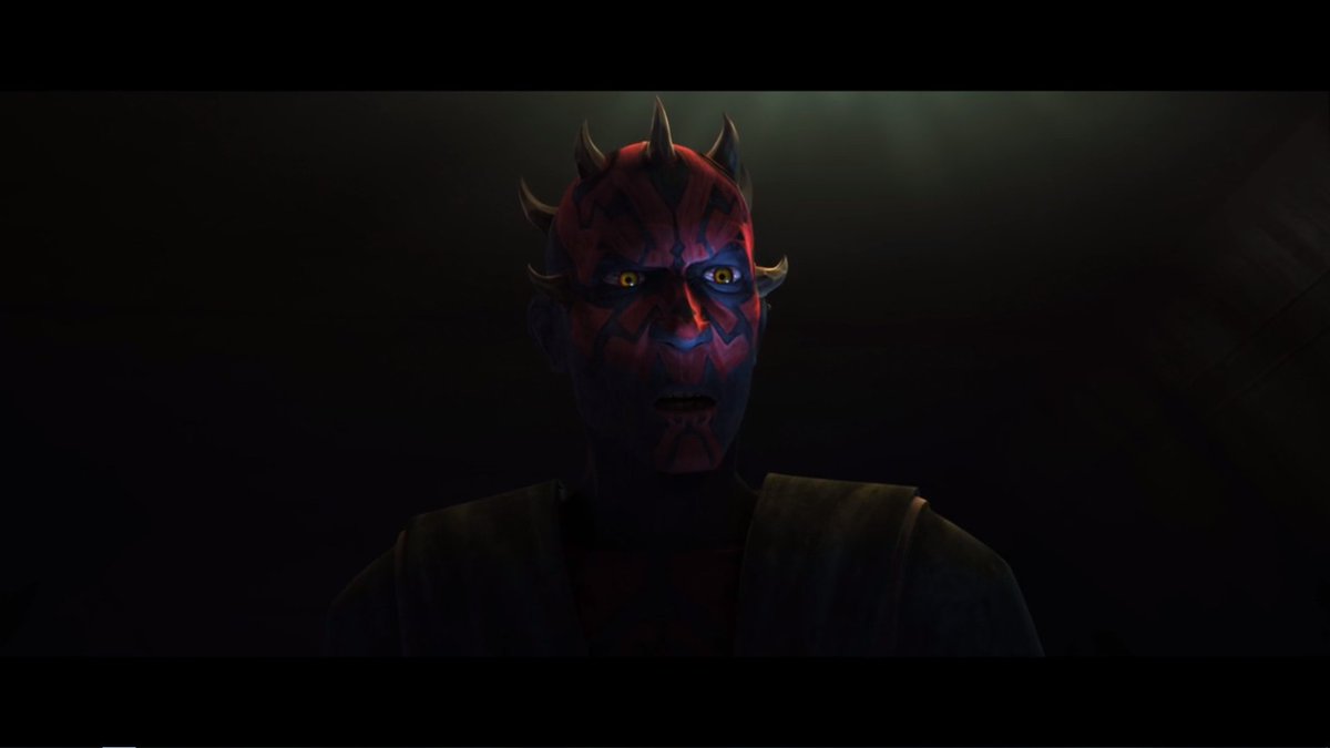
The shot was inspired by the scene its caption comes from. So here& #39;s what we& #39;ll use as a model.
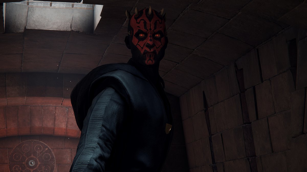
My first thought was to capture it in the menus. Don& #39;t do that often, as the camera movements are very limited - but for the bust shot I had in mind here, it seemed good enough.
However, I couldn& #39;t get Maul to look the way I wanted, so ended up deciding against it.
However, I couldn& #39;t get Maul to look the way I wanted, so ended up deciding against it.
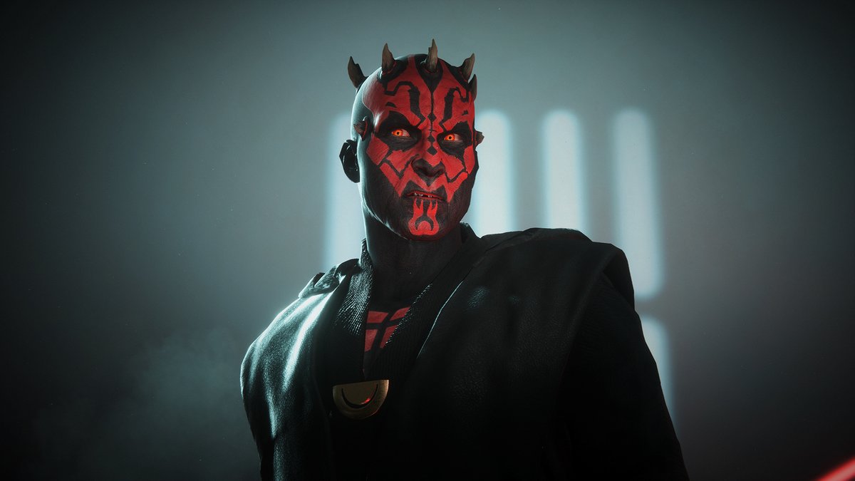
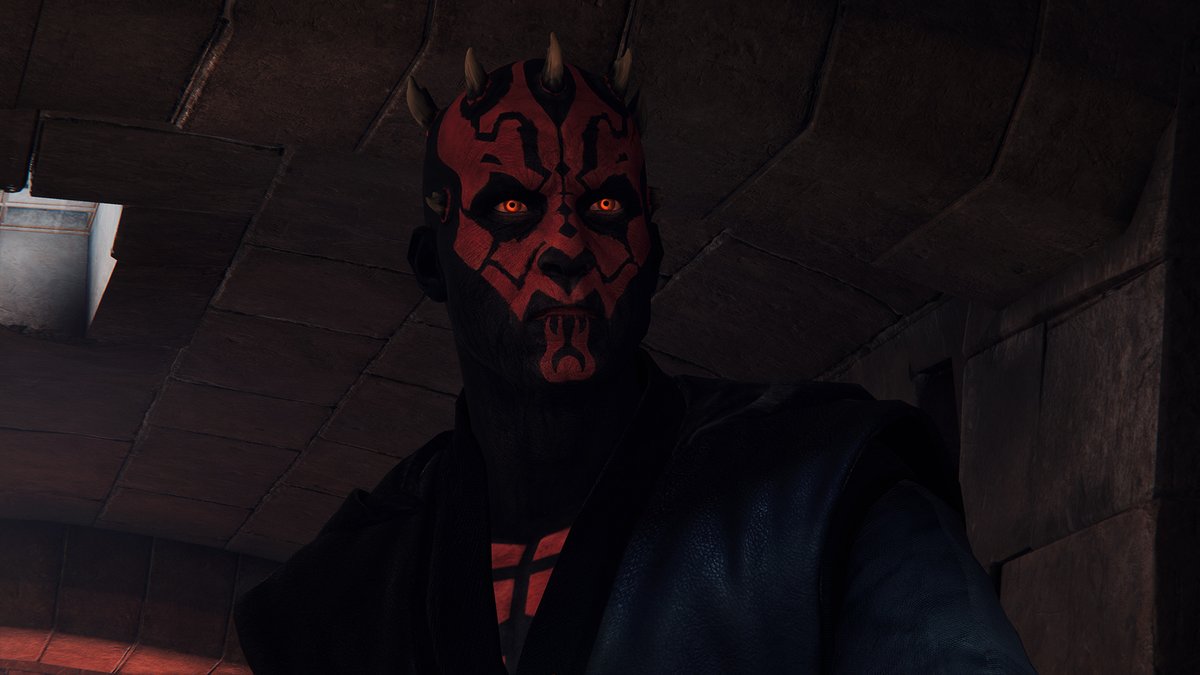
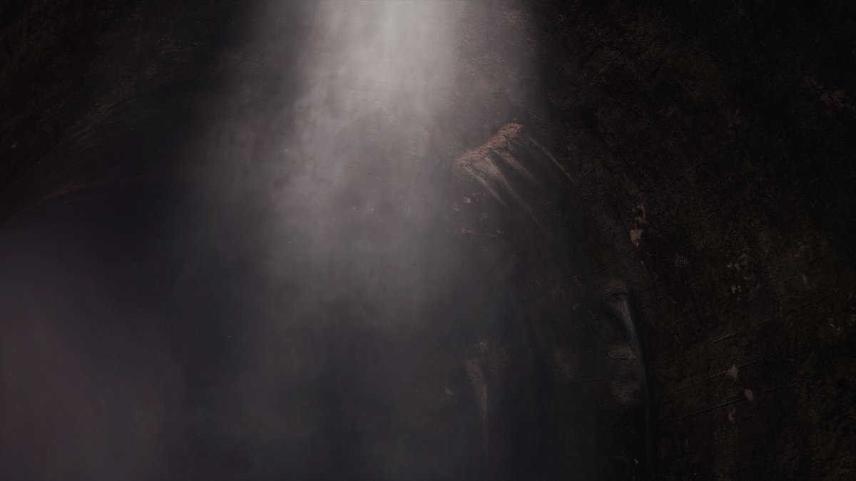
I remembered taking this shot of Fives a while ago, and how the lighting of that spot in Maz& #39;s Castle was coming from above, quite harsh & casting strong shadows.
Just what I was searching for.
Perfect. https://twitter.com/Ark3ros/status/1117809664203329538?s=20">https://twitter.com/Ark3ros/s...
Just what I was searching for.
Perfect. https://twitter.com/Ark3ros/status/1117809664203329538?s=20">https://twitter.com/Ark3ros/s...
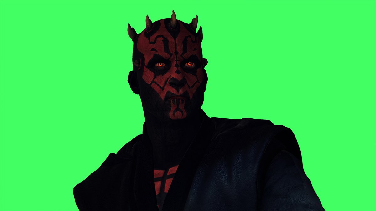
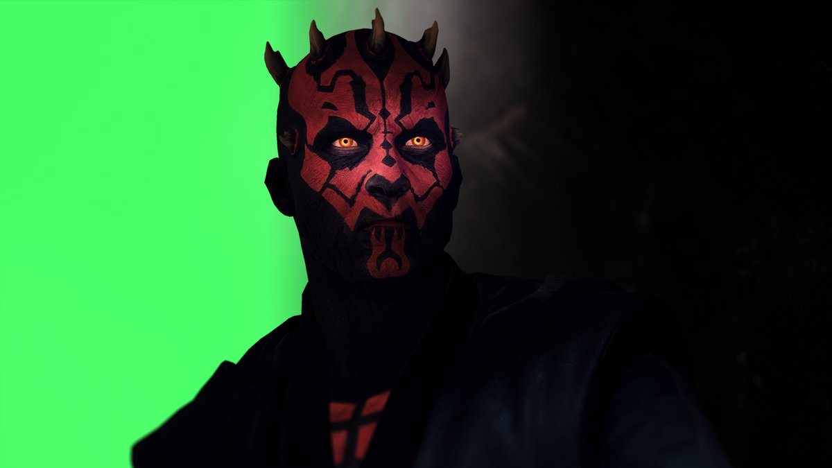
Camera settings adjustments. ReShade colour tweaks. Chromakey that shit.
Congrats, we& #39;ve got ourselves a foreground.
Congrats, we& #39;ve got ourselves a foreground.
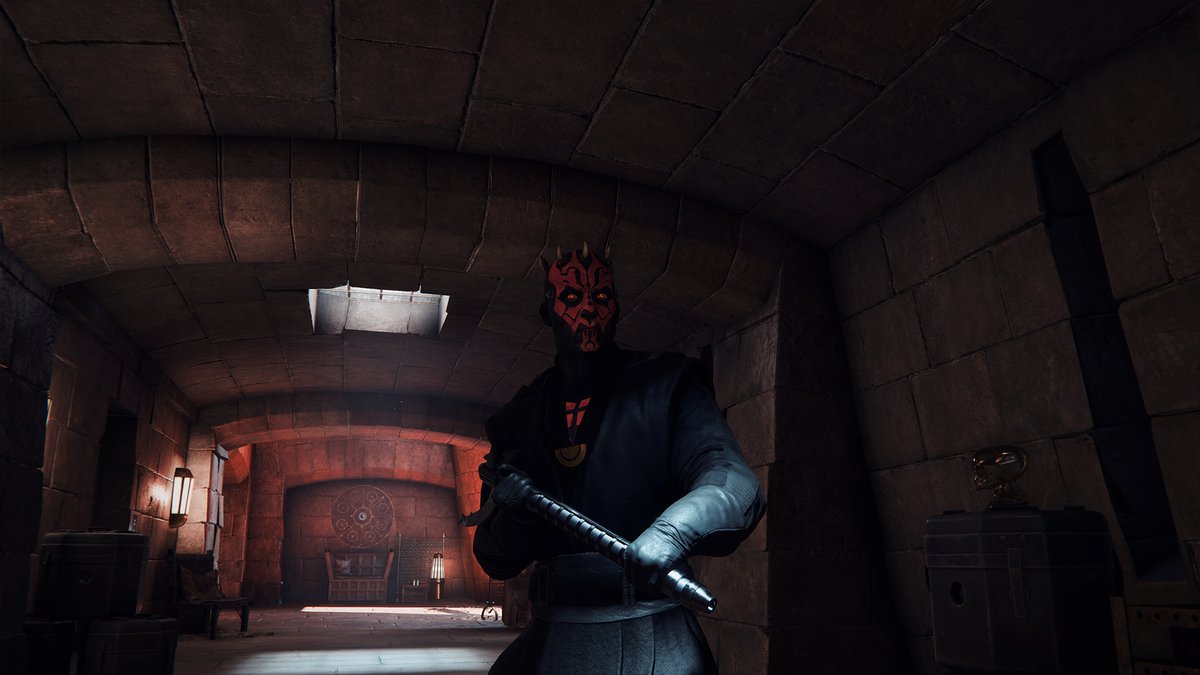
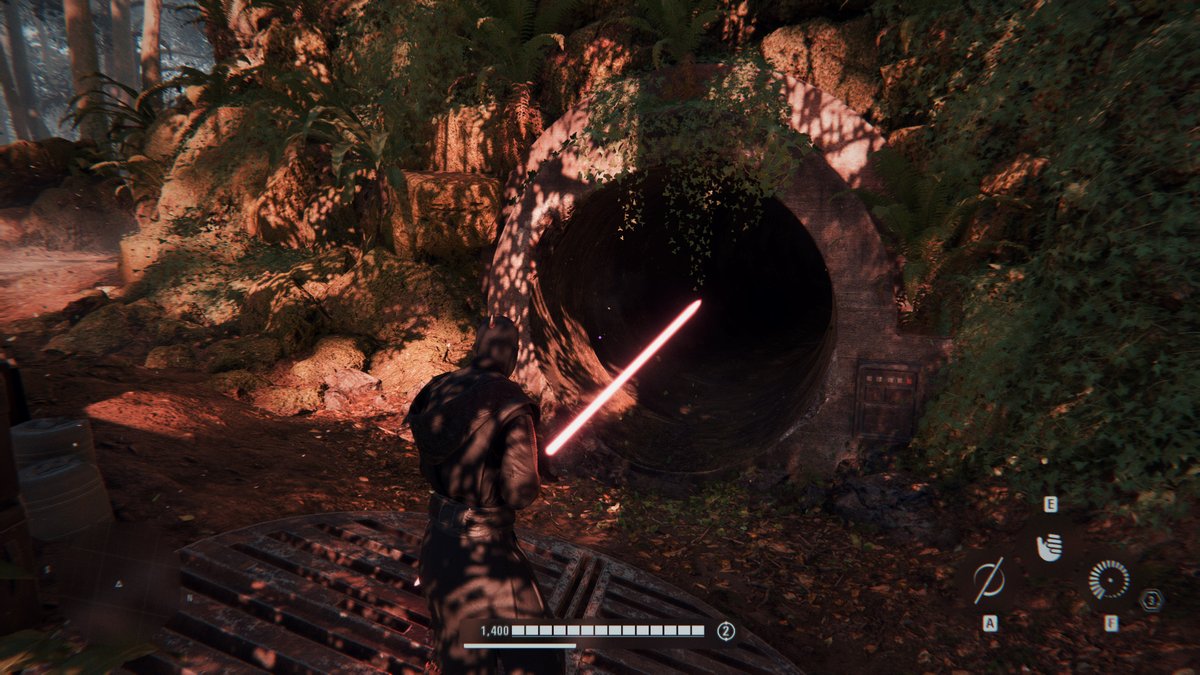
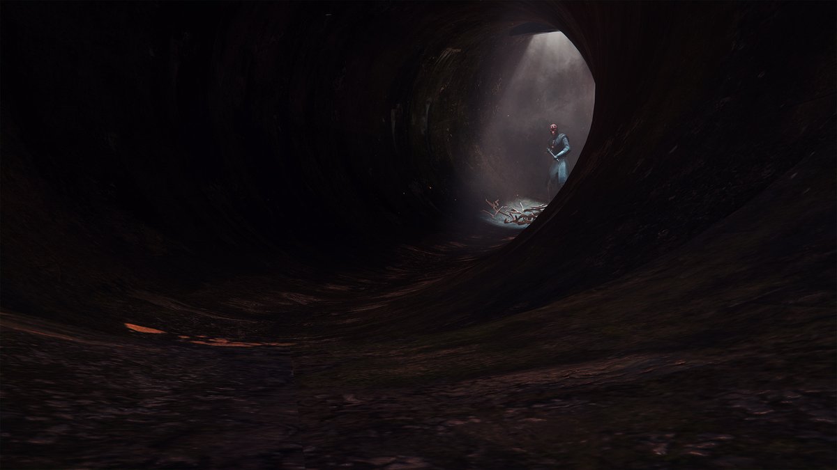
Now onto the background then. What shall we use to picture the underground tunnels of Mandalore?
Welp, one certain location comes to mind.
Welp, one certain location comes to mind.
Okay, the tunnel lighting looks good. Let& #39;s feature it on the shot.
Camera positionment, exposure tweaks, blah blah more boring technical stuff.
Looks okay I guess.
Camera positionment, exposure tweaks, blah blah more boring technical stuff.
Looks okay I guess.
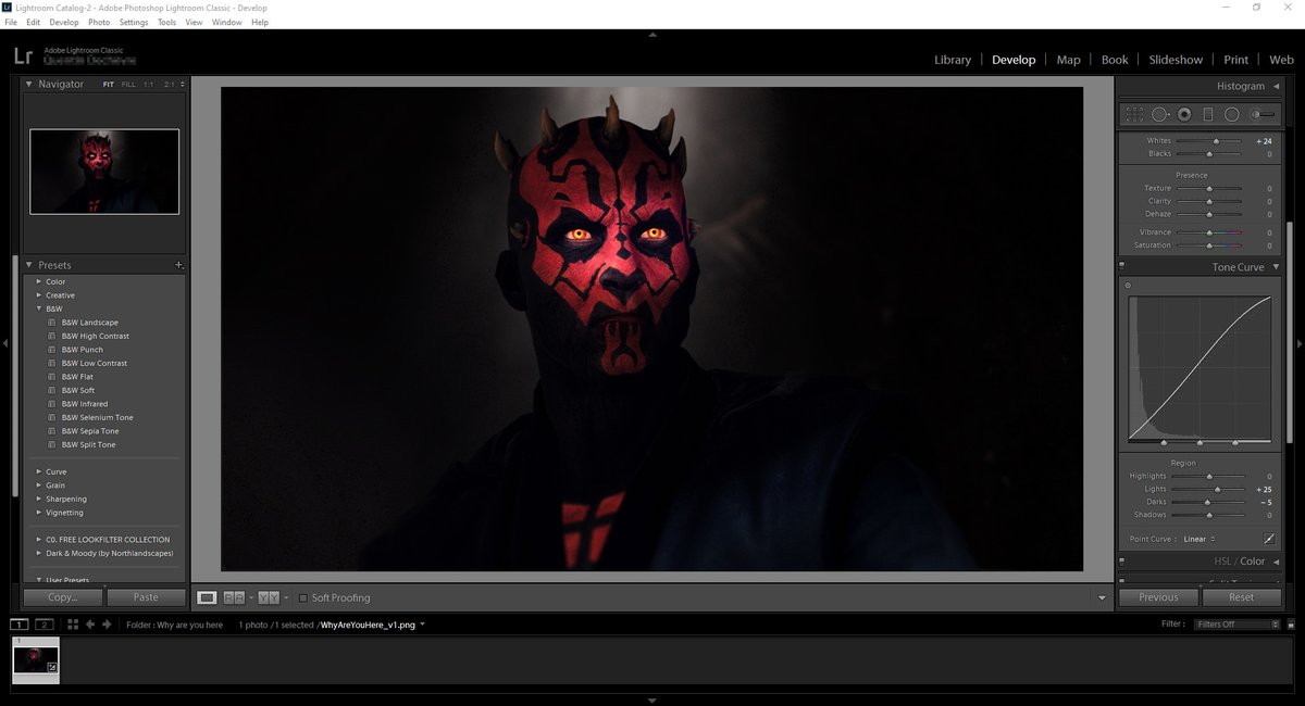
ALT+F4 the game. Enter the Photoshop chapter.
Remove the green screen and put Maul on top of the background. Easy.
Remove the green screen and put Maul on top of the background. Easy.
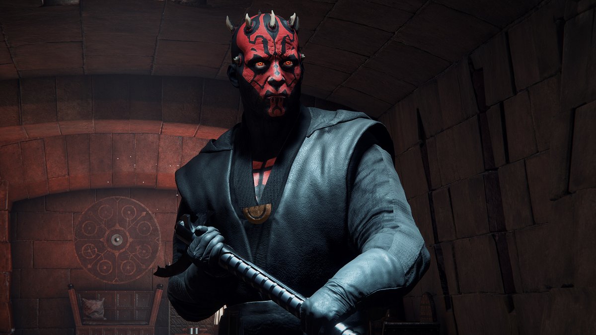
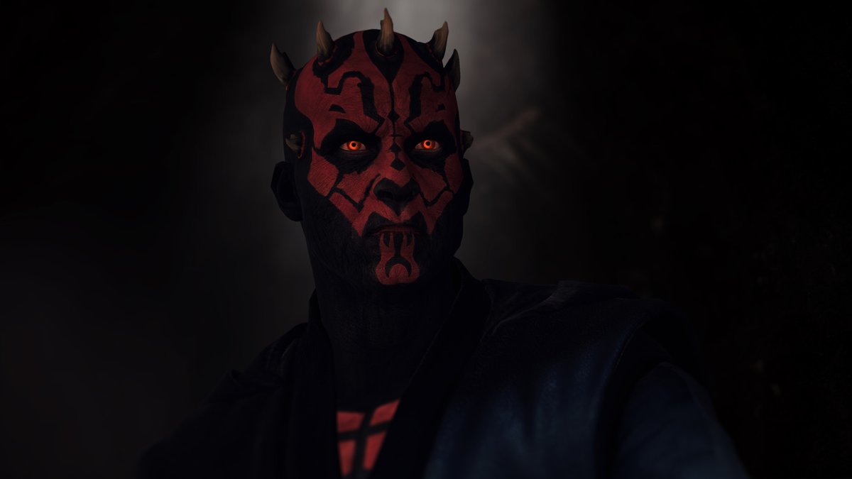
Now comes the tricky part. The shot is "accurate" as is, yet far from looking great.
This is where you& #39;ll have to take creative liberties. There& #39;s no guidelines - it& #39;s up to you to see what works and what doesn& #39;t.
So uhh, let& #39;s start by darkening the background maybe.
This is where you& #39;ll have to take creative liberties. There& #39;s no guidelines - it& #39;s up to you to see what works and what doesn& #39;t.
So uhh, let& #39;s start by darkening the background maybe.
Yep, that looks better. The background shouldn& #39;t be the center of attention anyways.
What else?
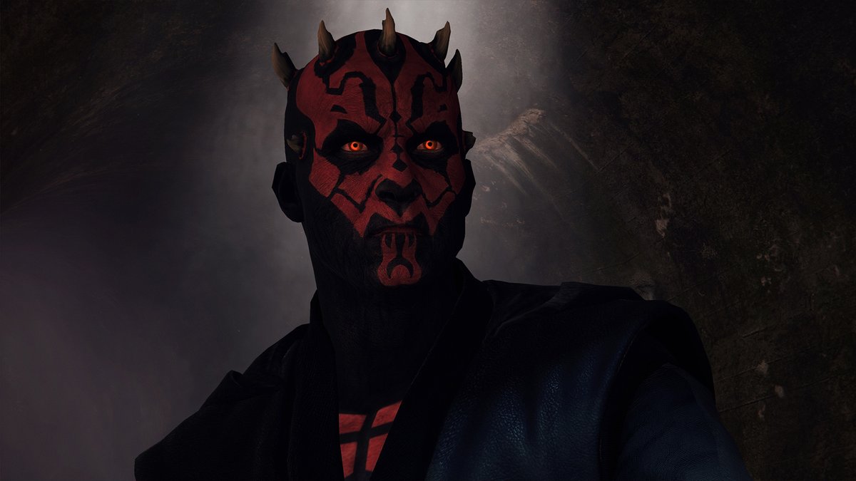
Blurring the background, as that& #39;ll also unconsciously redirect the attention to Maul. And let& #39;s even blur his torso, so that only the head stands out.
What else?
Blurring the background, as that& #39;ll also unconsciously redirect the attention to Maul. And let& #39;s even blur his torso, so that only the head stands out.
That& #39;s better but still not great.
In that TCW episode, the area around Maul& #39;s eyes is brighter due to the light cast by Ahsoka& #39;s lightsaber. Let& #39;s try and replicate that look.
In that TCW episode, the area around Maul& #39;s eyes is brighter due to the light cast by Ahsoka& #39;s lightsaber. Let& #39;s try and replicate that look.
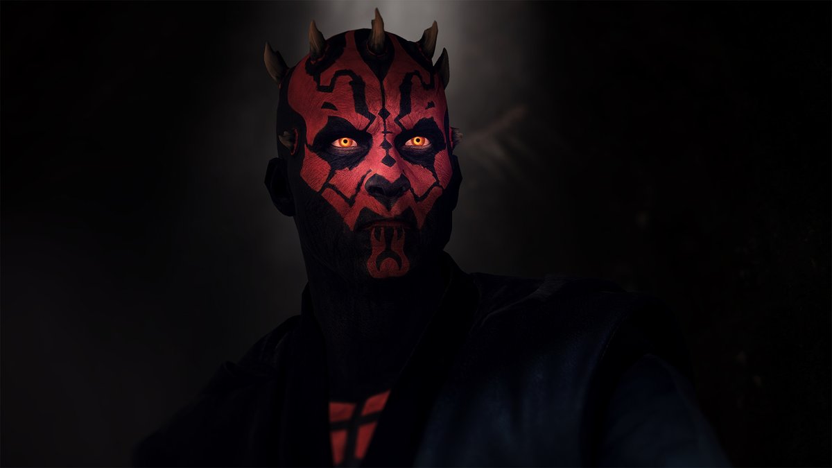
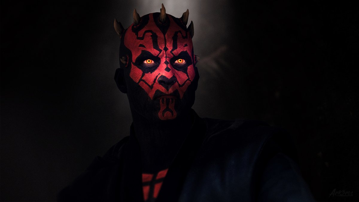
Ooft that makes a big difference. I love it, looks so much more menacing, so much more Clonewarsy.
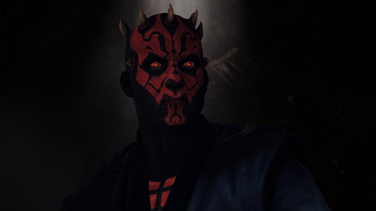
Also darkened the rest of his body a bit, so that his silhouette gets lost in the dark and is barely distinguishable from the background.
Also darkened the rest of his body a bit, so that his silhouette gets lost in the dark and is barely distinguishable from the background.

 Read on Twitter
 " title="The making of my latest Maul shot:A behind-the-scenes thread. https://abs.twimg.com/emoji/v2/... draggable="false" alt="⤵️" title="Arrow pointing rightwards then curving downwards" aria-label="Emoji: Arrow pointing rightwards then curving downwards">" class="img-responsive" style="max-width:100%;"/>
