Behind The Badge: @TorinoFC_1906
Thread https://abs.twimg.com/emoji/v2/... draggable="false" alt="👇" title="Down pointing backhand index" aria-label="Emoji: Down pointing backhand index">
Thread
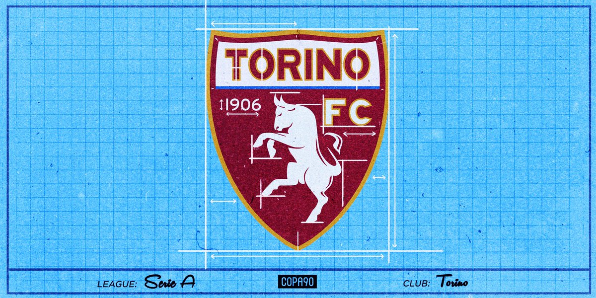
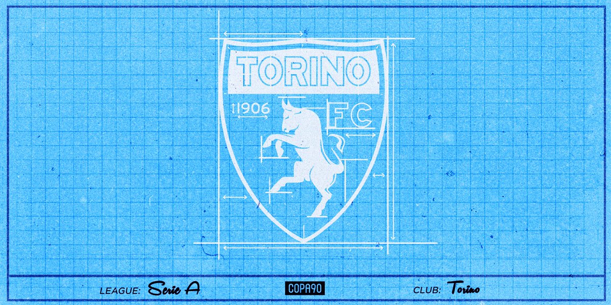
Italian Football Club Torino were founded in Turin, Piedmont, in 1906. The club’s logo is deeply rooted in the symbolism of their home city. The city’s coat of arms is the raging bull and Torino literally means ‘young bull’. Their nickname is also ‘Il Toro’, meaning ‘The Bull’.
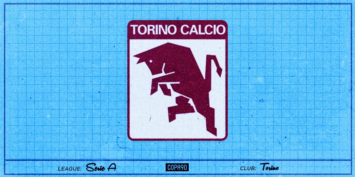
In the 1980s, the Torino badge was square in shape with a stylised bull and the words ‘Torino Calcio’. This badge is still held in high regard by the fans, and in 2013 it was voted by the readers of Guerin Sportivo as the most beautiful club logo of all time.
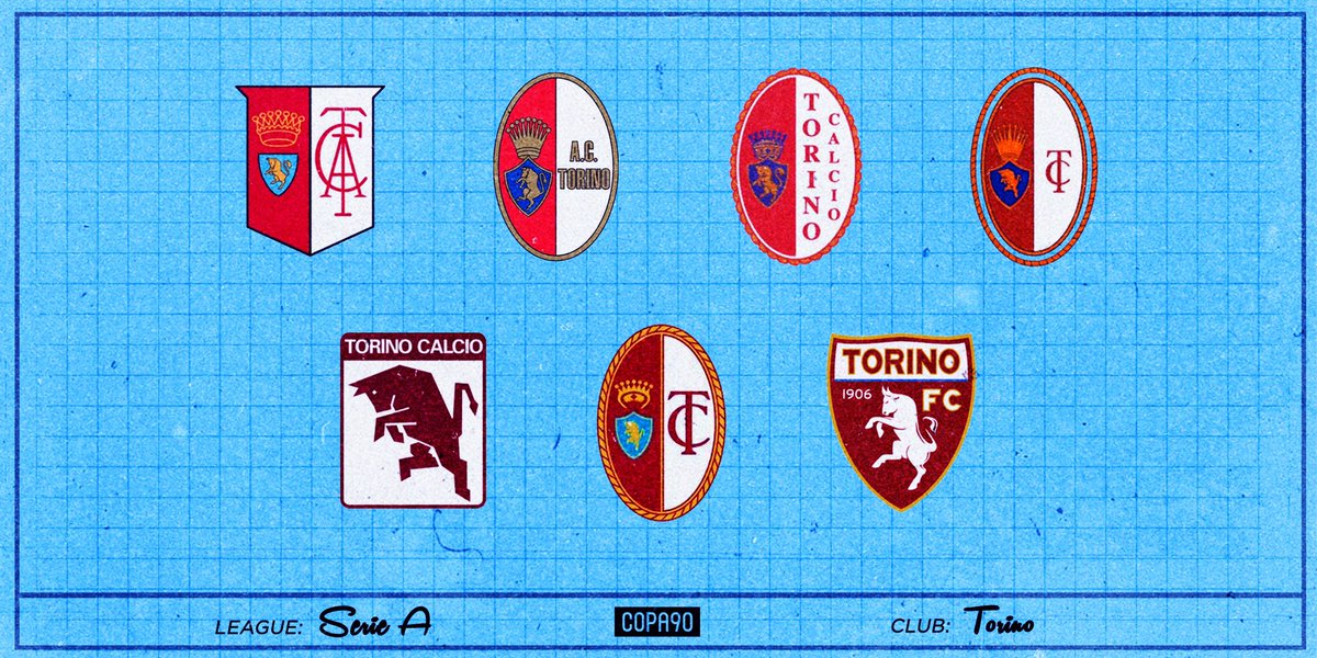
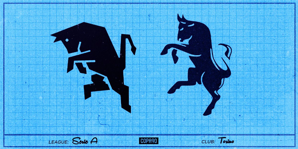
The bull hasn’t always looked the same, with the current version much more curved than the blocky, geometric version used during the 1980s. Other changes to the logo have included the shape between the ‘egg’ and more square shaped shields.
Torino achieved promotion in the 2004-05 season. However, having accumulated heavy debts, they were denied entry into Serie A and the club’s bankruptcy was announced soon after. The FIGC accepted the proposal of a new professional entity, known as ‘Società Civile Campo Torino’.
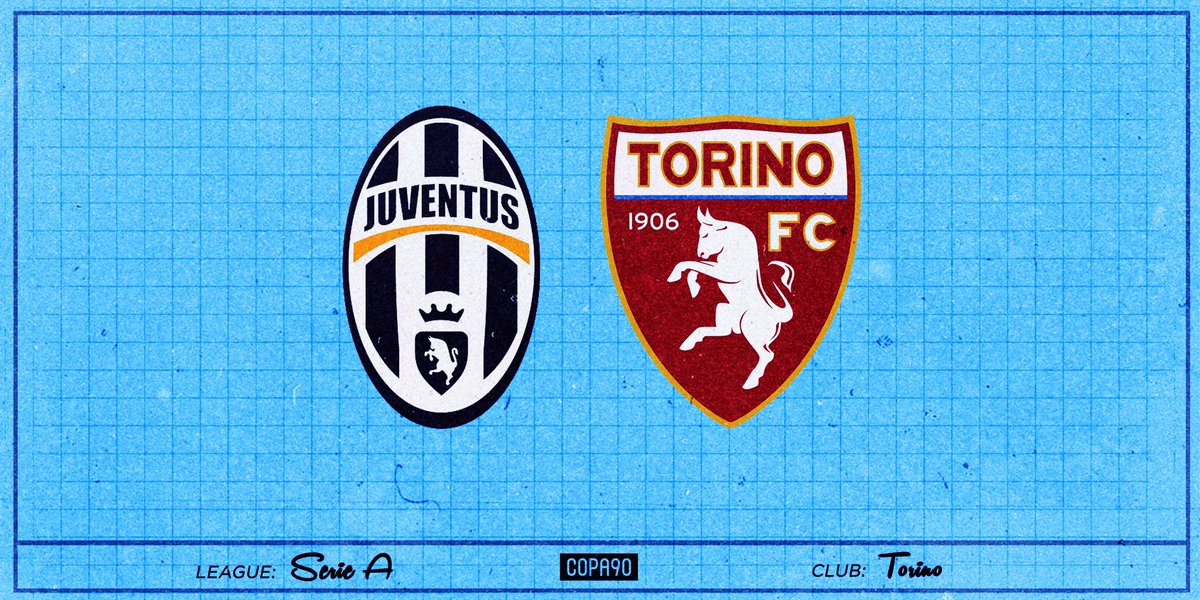
Torino are not the only club in Turin to use the bull motif, with Italian giants Juventus having used it for long periods of their existence. That changed in 2017, when Juve decided to rebrand to a massive ‘J’. This was partly down to them wanting a completely separate identity.
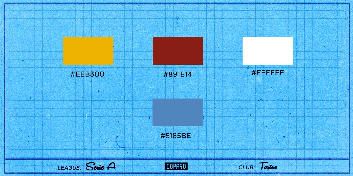
Their first kit was striped orange and black, just like the kits used by historical predecessors Internazionale Torino and Football Club Torinese. The colours were considered inappropriate as they resembled those of the Habsburg’s, so Torino later opted for Granata, a dark red.
What club would you like to see next?  https://abs.twimg.com/emoji/v2/... draggable="false" alt="🤔" title="Thinking face" aria-label="Emoji: Thinking face"> #BehindTheBadge

 Read on Twitter
 " title="Behind The Badge: @TorinoFC_1906 Thread https://abs.twimg.com/emoji/v2/... draggable="false" alt="👇" title="Down pointing backhand index" aria-label="Emoji: Down pointing backhand index">" class="img-responsive" style="max-width:100%;"/>
 #BehindTheBadge" title="What club would you like to see next? https://abs.twimg.com/emoji/v2/... draggable="false" alt="🤔" title="Thinking face" aria-label="Emoji: Thinking face"> #BehindTheBadge" class="img-responsive" style="max-width:100%;"/>


