Today is the 35th anniversary of #CarmenSandiego, released for the Apple II on April 23, 1985.
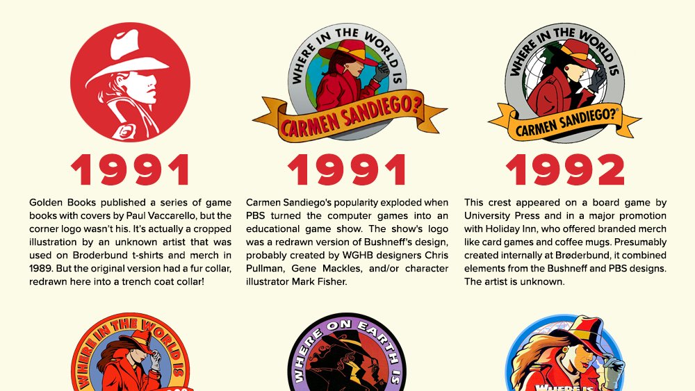
To celebrate, I created an infographic about Carmen& #39;s circular logo. Who knew it went through so many iterations?
Link: https://www.acriticalhit.com/infographic-evolution-carmen-sandiego-crest-logo/">https://www.acriticalhit.com/infograph...
To celebrate, I created an infographic about Carmen& #39;s circular logo. Who knew it went through so many iterations?
Link: https://www.acriticalhit.com/infographic-evolution-carmen-sandiego-crest-logo/">https://www.acriticalhit.com/infograph...
And here& #39;s a thread of some additional info that didn& #39;t quite fit.
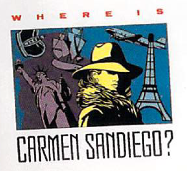
The cover photo for the first game may& #39;ve been a stock photo that might show up in any old stock catalogs that exist. Last time I mentioned this, @textfiles tweeted this cryptic response: https://twitter.com/textfiles/status/1162078513987489792">https://twitter.com/textfiles...
The cover photo for the first game may& #39;ve been a stock photo that might show up in any old stock catalogs that exist. Last time I mentioned this, @textfiles tweeted this cryptic response: https://twitter.com/textfiles/status/1162078513987489792">https://twitter.com/textfiles...
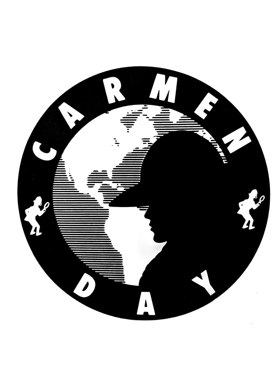
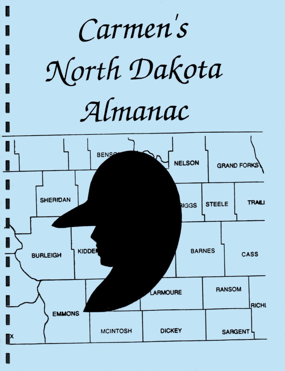
The North Dakota teachers imitated the Carmen Day sticker for their internally-made materials, but couldn& #39;t get the face quite right. They also kept the border edge even though it didn& #39;t really make sense design-wise.
The detectives on the outer edge of the Carmen Day sticker first appeared in the manual for the first game. These illustrations by Gene Portwood were reused as design assets throughout the & #39;80s.
The "Golden Books" logo is modified from merch art used in 1989, when Carmen was still wearing fur. I& #39;ve never seen any of this merch in the wild, but would love to get a decent scan of the image. Surely someone held onto some folders?
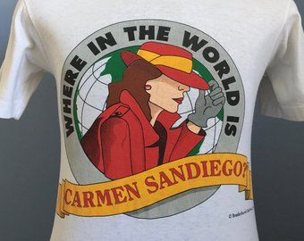
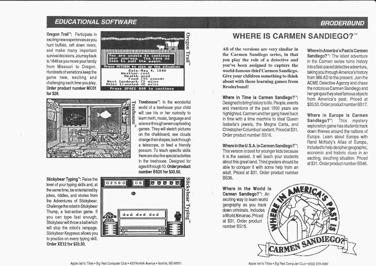
The original Bushneff crest also existed as lineart using slightly different fonts, which was apparently printed on shirts. It also pops up in promo materials for the other & #39;80s games with one word changed.
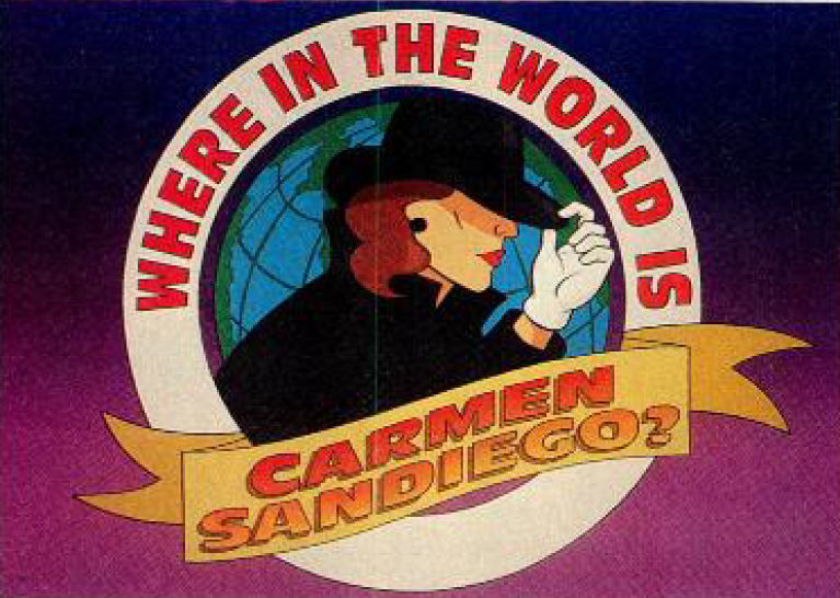
The Bushneff art was modified for an early DIC pitch card, before the title was changed to "Earth."
Were they actually considering having cartoon Carmen wear black? (Note: Batman & #39;89 producer Michael Uslan was also a producer on this show.)
Were they actually considering having cartoon Carmen wear black? (Note: Batman & #39;89 producer Michael Uslan was also a producer on this show.)

 Read on Twitter