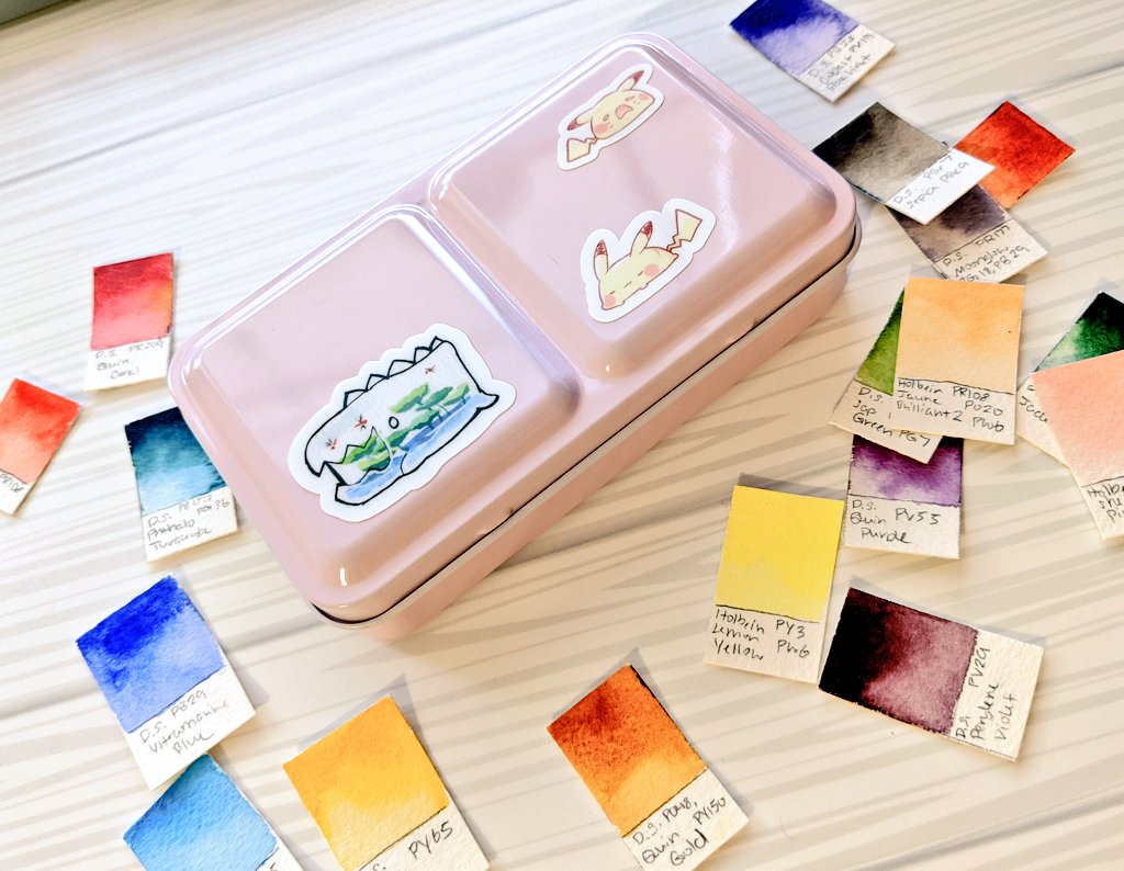
I wanted to put together/rearrange a new palette based on what I have learned about watercolors! I still love my old palette and will continue to use it but I am building a new one with travel in mind.
What& #39;s wrong with my old main palette:
-none of the colors are labeled; chaotic mess
-The arrangement of colors is pretty unbalanced or has lots of similar colors so it& #39;s not efficient
-lots of randomly chosen colors that weren& #39;t picked with mixability in mind so they mix muddy
-none of the colors are labeled; chaotic mess
-The arrangement of colors is pretty unbalanced or has lots of similar colors so it& #39;s not efficient
-lots of randomly chosen colors that weren& #39;t picked with mixability in mind so they mix muddy
First: Taking Inventory
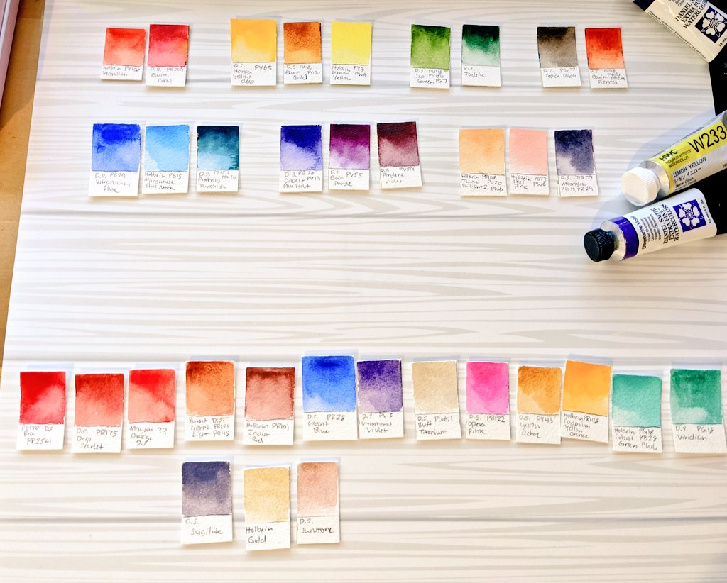
I wanted to be able to see all of my color options in a way that I can move them around easily. I made swatch cards with each color& #39;s name and pigment information, then picked out colors I definitely wanted to have in this palette
I wanted to be able to see all of my color options in a way that I can move them around easily. I made swatch cards with each color& #39;s name and pigment information, then picked out colors I definitely wanted to have in this palette
Why does pigment info matter:
most brands include pigment info on the tube. The P stands for pigment, followed by another letter and some numbers (ex. PY3). A color may have multiple pigments in the mix, like this tube of lemon yellow.
most brands include pigment info on the tube. The P stands for pigment, followed by another letter and some numbers (ex. PY3). A color may have multiple pigments in the mix, like this tube of lemon yellow.
Why do you care? Because single-pigment colors tend to be a lot more flexible for mixing without yielding muddy, dull colors. This is why single pigment colors are hyped and considered a staple; multi pigment colors are usually more of a "convenience color" mixed for you
This doesn& #39;t mean convenience colors are bad or useless; some multi pigment colors mix beautifully in various combos or can have special properties, and above all, are convenient especially for those not comfortable with color mixing/color theory!
But I wanted to carefully consider my balance of single and multi pigment colors in this palette because I want a lot of mixing flexibility for travel. So my colors are based off of what I personally know I use a lot + ones I want to practice mixing with
About White Pigment
a lot of pastel-ish colors or variations of colors in premade large cheap palettes are the same repeated pigments with white added. Adding white to make a designer color isn& #39;t necessarily a bad thing but too much can make muddy mixes.
a lot of pastel-ish colors or variations of colors in premade large cheap palettes are the same repeated pigments with white added. Adding white to make a designer color isn& #39;t necessarily a bad thing but too much can make muddy mixes.
now I adore these colors but notice something? They all have the white pigment PW6: the same white pigment as this tube of titanium white. You can make a whole range of your own pastel colors by just picking up a tube of white!
back to color picking. The main cluster is colors I decided on, the top row is colors I was wavering on (they& #39;re more special effects or convenience colors). I have some handmade watercolor palettes on the side I was considering pulling colors from too.
I wanted to include a large variety of warm/cool variatioy of basics like the primary colors for mixing, as well as some more moody secondaries I& #39;m not used to using, my basic go-to convenience colors, and then a couple special ones to make things pip
Let& #39;s talk the palette that will house the paints. I got one of these very cute, compact meeden palettes off Amazon. It& #39;s almost exactly like the palettes that Prima uses to house their paints, with a few small differences (the mixing tray droops more, the pan tray is tighter)
You see, these palettes are meant to hold 12 half pans of paint. Some people add another 5 or so in the middle placed horizontally like in my prima palette above. I will be modifying the palette a bit so that it can house 21 half pans instead
First, filling the pans. I bought a bunch of plastic half pans cheap on amazon, then labelled them with some writeable washi tape. The tray from my meeden palette is tighter as I mentioned before, so I used some pliers to bend things a little so that 7 pans can fit in the middle
Here is my final selection btw! I tried to organize the colors a bit based on their properties or what I use them for. One half pan of handmade watercolor that I use frequently as a convenience color made the cut in the bottom row

 Read on Twitter
 Assembling My New Watercolor Palette - a thread https://abs.twimg.com/emoji/v2/... draggable="false" alt="✨" title="Sparkles" aria-label="Emoji: Sparkles">I wanted to put together/rearrange a new palette based on what I have learned about watercolors! I still love my old palette and will continue to use it but I am building a new one with travel in mind." title="https://abs.twimg.com/emoji/v2/... draggable="false" alt="✨" title="Sparkles" aria-label="Emoji: Sparkles">Assembling My New Watercolor Palette - a thread https://abs.twimg.com/emoji/v2/... draggable="false" alt="✨" title="Sparkles" aria-label="Emoji: Sparkles">I wanted to put together/rearrange a new palette based on what I have learned about watercolors! I still love my old palette and will continue to use it but I am building a new one with travel in mind." class="img-responsive" style="max-width:100%;"/>


