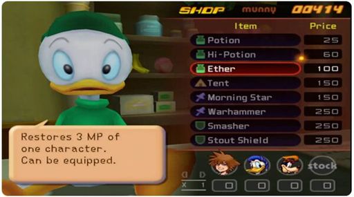
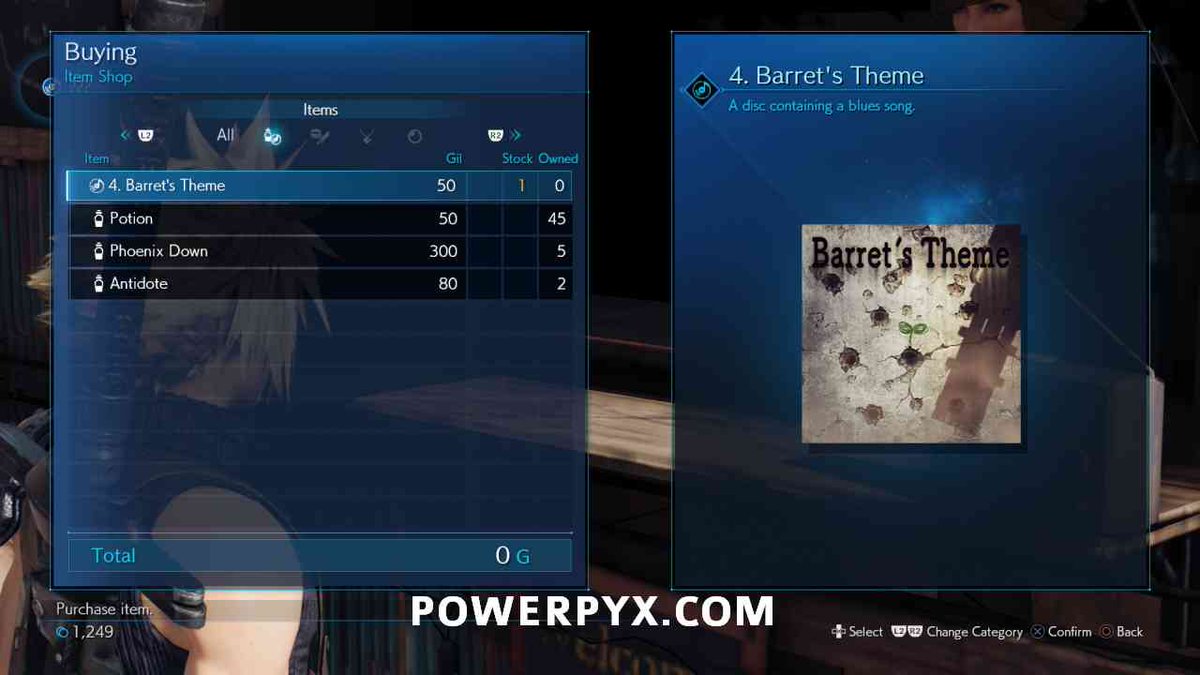
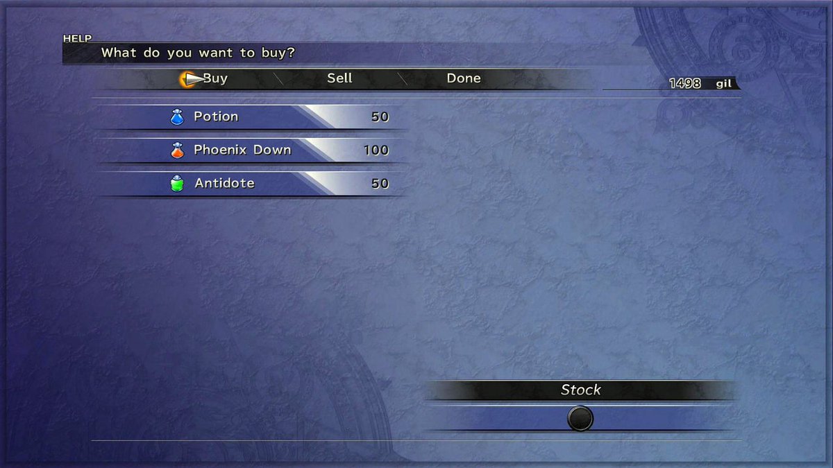
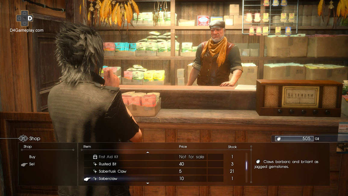
2002 item shop UI vs 2020 item shop UI. Gun to your head, in five seconds, tell me how much money Cloud has. You probably won& #39;t find it in 5. A thread?
I dont have a problem with square windows, blue backgrounds, frosted glass, right angles, or any of the other hot UI trends of 2020. In isolation. But when you bring them all together with terribly small font, I come up for air.
Kingdom Hearts& #39; Item Shop UI was so smart they literally plastered Huey on half of the screen because he& #39;s cute and they had nothing else to do with the space. Meanwhile Cloud has no fucking idea how much money he even has.
Final Fantasy X& #39;s item shop took up the whole screen, somewhat unjustifiably, but at least the information was clear.
Final Fantasy 15 barely took any screenspace at all, had arguably too-small of text, but they AT LEAST highlighted how much money I have. So I can find it in 5 seconds.
How is it that the UI of Final Fantasy VII Remake& #39;s shops somehow takes up the whole screen, and obscures the most important information? When this same team has made so many good UI& #39;s for this exact thing, over a dozen times?
This thread is getting some engagement, thank you! If you like this one, you might like this one I made yesterday about the quality of FF7R& #39;s environment props. https://twitter.com/CornChopsMcBob/status/1252739075041185792?s=20">https://twitter.com/CornChops...

 Read on Twitter


