The article explaining the calculations is here
2/ https://www.ft.com/content/67e6a4ee-3d05-43bc-ba03-e239799fa6ab">https://www.ft.com/content/6...
2/ https://www.ft.com/content/67e6a4ee-3d05-43bc-ba03-e239799fa6ab">https://www.ft.com/content/6...
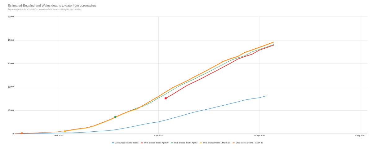
The methods are simple and involve no forecasting of how the Covid-19 pandemic will progress.
It is just an updating model - taking the best data from @ONS, the best concept (all cause mortality), and removing the delays in producing that data in a conservative way
3/
It is just an updating model - taking the best data from @ONS, the best concept (all cause mortality), and removing the delays in producing that data in a conservative way
3/
It is easily checked and every week, when the ONS data is published, will be a test to see whether it is on track or not.
So far, it has proved remarkably accurate and we haven& #39;t published until now so we could check it was not giving a false steer
4/
So far, it has proved remarkably accurate and we haven& #39;t published until now so we could check it was not giving a false steer
4/
We know that linked to Coronavirus there have been many excess deaths since mid-March - In England and Wales, there have been 15,161 cumulatively in the ONS data already published.
Excess deaths is death registrations compared with the recent five year average.
5/
Excess deaths is death registrations compared with the recent five year average.
5/
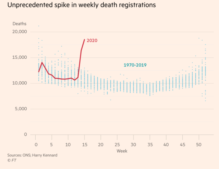
The England and Wales chart, compared with the previous 50 years shows this is not a normal seasonal flu
Carl Henegan, professor of evidence based medicine at Oxford university, says: "I don’t think we’ve ever seen such a sharp upturn in deaths at that rate"
Carl Henegan, professor of evidence based medicine at Oxford university, says: "I don’t think we’ve ever seen such a sharp upturn in deaths at that rate"
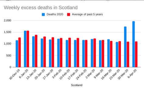
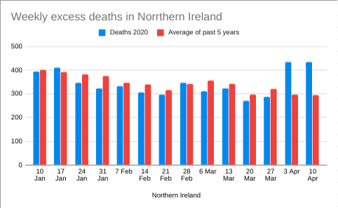
But the excess deaths are just as pronounced in Scotland - figures from the National Records of Scotland
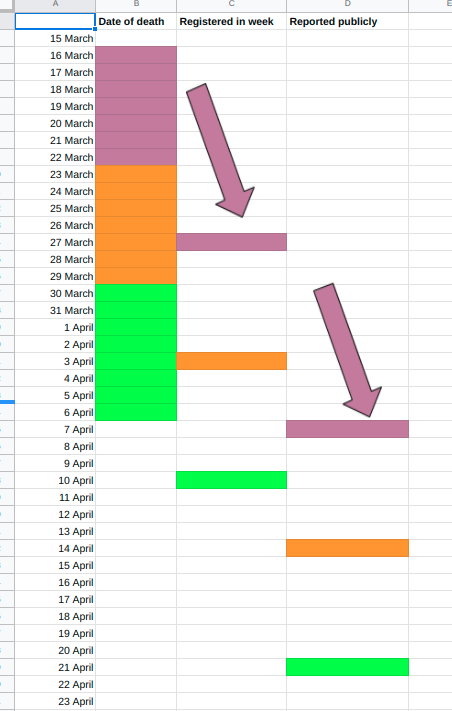
But these data come with big delays. In England & Wales, the data published on April 21, refers to death registrations in the week ending April 10 and there is an average delay between death and registration of 4 days.
So it relates to deaths in week to 6 April
So it relates to deaths in week to 6 April
For Scotland, the delay (yesterday) was 17 days (new data published today), for NI it was 14 days yesterday.
So the excess deaths figure of around 17,000 across the UK in official figures is over 2 weeks out of date.
The challenge is how to update to the present
So the excess deaths figure of around 17,000 across the UK in official figures is over 2 weeks out of date.
The challenge is how to update to the present
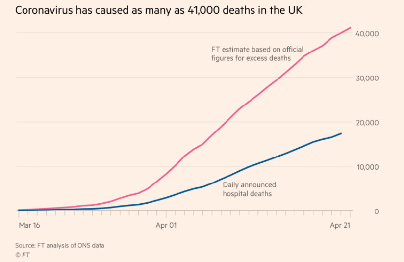
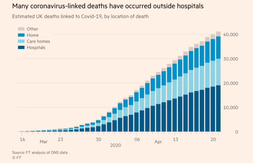
The updating mechanism that worked best was to use the daily reports of hospital deaths of those who tested positive for Covid-19 and scale them to the community with knowlege of the proportion of people who typically die in hospital (this has ranged between 46% and 48%)
Let& #39;s recap the assumptions made explicitly
1) @ONS can count death registrations
2) Excess all cause mortality is a good measure of deaths directly or indirectly linked to Covid-19
3) There is a stable pattern between hospital Covid-19 deaths and all deaths
That is all
1) @ONS can count death registrations
2) Excess all cause mortality is a good measure of deaths directly or indirectly linked to Covid-19
3) There is a stable pattern between hospital Covid-19 deaths and all deaths
That is all
Getting all the data together and thinking hard about lag strutures makes it all more complex, but the results have been tracking the cases, especially in England & Wales
- note here yesterday& #39;s all cause mortality registrations were about 2,000 down due to the bank holiday
- note here yesterday& #39;s all cause mortality registrations were about 2,000 down due to the bank holiday
So, this is where the 41,000 figure comes from.
- 17,000 excess deaths so far but that is out of date and the following two weeks had stable and high levels of hospital deaths
- 17,000 excess deaths so far but that is out of date and the following two weeks had stable and high levels of hospital deaths
And if you assume a stable pattern in location of deaths, the numbers for those outside hospitals now suggests over 10,000 people have died in care homes more than would have been expected for this time of the year so far
I will update the figure every day using the latest daily hospital announcements. And there will be weekly shifts up or down according to the new official excess deaths numbers.
Today, there will be new numbers for Scotland
This official data will provide a check
Today, there will be new numbers for Scotland
This official data will provide a check
I& #39;ve kept assumptions conservative, so I would expect revisions to be more likely to be upward than downward. This was a deliberate choice.
This is not supposed to be an alarmist exercise.
This is not supposed to be an alarmist exercise.
I will be transparent about whether the model is going wrong - that will help refine it.
Remember, there is no forecasting of government policy or the disease here. Just an attempt to update lagged quality data with information we already have from partial data
Remember, there is no forecasting of government policy or the disease here. Just an attempt to update lagged quality data with information we already have from partial data
I will not try to forecast the course of the pandemic.
I am not an epidemiologist
This is a statistical exercise
ENDS/
I am not an epidemiologist
This is a statistical exercise
ENDS/

 Read on Twitter