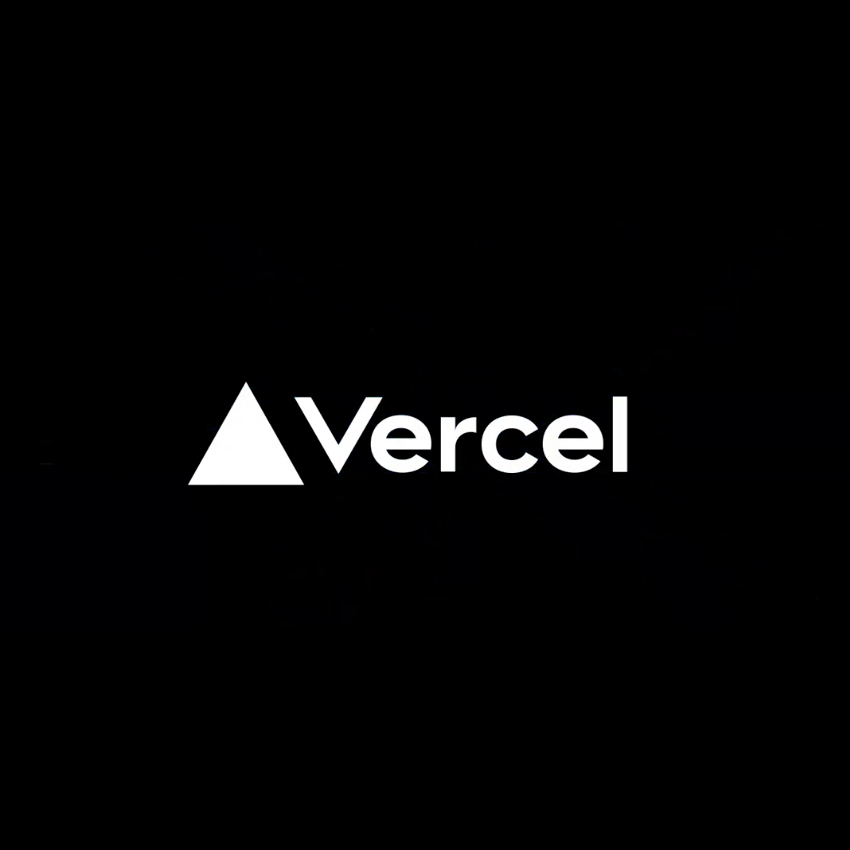
the one on the left? geometrically aligned, but that& #39;s why it looks unbalanced to me
the one on the right? probably still needs tweaking, but text shifted down and to the left a bit, feels a bit more balanced to me
i& #39;ll put a poll in the next tweet if you want to have opinions
the one on the right? probably still needs tweaking, but text shifted down and to the left a bit, feels a bit more balanced to me
i& #39;ll put a poll in the next tweet if you want to have opinions
[poll] opinions on logo edits in tweet above

 Read on Twitter


