THREAD...
1/ Identify your personas
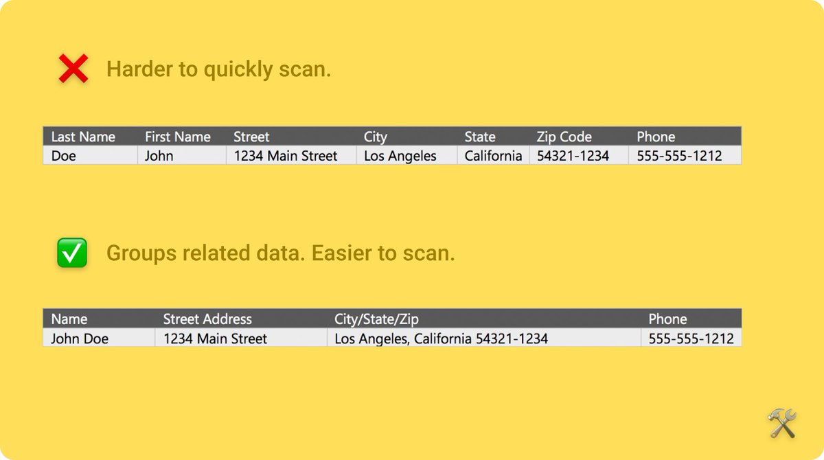
These apps are mainly used for enterprise.
Your users will need specific information from complex data in order to do their jobs.
Identify those personas upfront so you can cater the data to their needs.
These apps are mainly used for enterprise.
Your users will need specific information from complex data in order to do their jobs.
Identify those personas upfront so you can cater the data to their needs.
2/ Reduce data volume
Make cuts based on what your users use most.
Often, the same data is shown multiple times. Combine elements where it makes sense.
Make cuts based on what your users use most.
Often, the same data is shown multiple times. Combine elements where it makes sense.
3/ Shape the page
Give your interface structure.
Present the user with essential information first. Then follow it with supporting content.
Ask yourself: "What story are you telling with the data?"
Give your interface structure.
Present the user with essential information first. Then follow it with supporting content.
Ask yourself: "What story are you telling with the data?"
4/ Start ugly
A common trap is to fall in love with how the graphs look vs how the graphs work.
To avoid that, start ugly —with raw data.
Starting this way will help you think through the relationships in the data and stick to solving your user& #39;s problems.
Function > Form
A common trap is to fall in love with how the graphs look vs how the graphs work.
To avoid that, start ugly —with raw data.
Starting this way will help you think through the relationships in the data and stick to solving your user& #39;s problems.
Function > Form
5/ Use good typography standards
Font weight, kerning, and spacing impact your users& #39; ability to quickly read and interpret data from your interface.
- Use monospaced numbers
- Align currency by decimal
- Keep line heights narrow, but legible
Font weight, kerning, and spacing impact your users& #39; ability to quickly read and interpret data from your interface.
- Use monospaced numbers
- Align currency by decimal
- Keep line heights narrow, but legible
6/ Use color with purpose
Use a conservative color palette.
Save eye-catching colors for important data —like error messages (usually red), key metrics, or link text.
Use a conservative color palette.
Save eye-catching colors for important data —like error messages (usually red), key metrics, or link text.
7/ When to increase density
 https://abs.twimg.com/emoji/v2/... draggable="false" alt="❌" title="Cross mark" aria-label="Emoji: Cross mark"> Not on components like alert dialogs and dropdowns. They become less effective, less readable, and less tappable.
 https://abs.twimg.com/emoji/v2/... draggable="false" alt="✅" title="White heavy check mark" aria-label="Emoji: White heavy check mark"> Use it to fit lots of data on-screen. Added density makes it easier to scan, interpret, and compare data.
8/ Don& #39;t forget about touch
Unless you’ve completely ruled out your users needing to touch the screen to interact with your interface, don’t forget the minimum sizes for touch targets.
Unless you’ve completely ruled out your users needing to touch the screen to interact with your interface, don’t forget the minimum sizes for touch targets.
9/ Use text instead
Sometimes, you just need to use text to communicate exactly what your users want to know.
COVID-19 trackers are a good example.
You want to prioritize actionable data over volume of data.
Sometimes, you just need to use text to communicate exactly what your users want to know.
COVID-19 trackers are a good example.
You want to prioritize actionable data over volume of data.
10/ Let users export data instead
When dealing with giant data sets, it may be best to let users export that data to another tool where they can interact with it better.
Let your users export via XML, XLS, JSON, or CSV.
When dealing with giant data sets, it may be best to let users export that data to another tool where they can interact with it better.
Let your users export via XML, XLS, JSON, or CSV.
11/ The "So What?" Test
People use data to get shit done. Help them do that.
Scrutinize every component on your interface.
Ask, "Is this important for the user to get their job done?"
If not, then find a way to make it useful —or remove it.
People use data to get shit done. Help them do that.
Scrutinize every component on your interface.
Ask, "Is this important for the user to get their job done?"
If not, then find a way to make it useful —or remove it.
For more product tips  https://abs.twimg.com/emoji/v2/... draggable="false" alt="👉" title="Right pointing backhand index" aria-label="Emoji: Right pointing backhand index"> http://theproductperson.com"> http://theproductperson.com
If you enjoyed this thread, following @ProductPersonHQ would be appreciated.
I& #39;m releasing this tweet thread in article form tomorrow. So stay tuned.
If you enjoyed this thread, following @ProductPersonHQ would be appreciated.
I& #39;m releasing this tweet thread in article form tomorrow. So stay tuned.

 Read on Twitter


