I am not a professional epidemiologist, but I do communicate data to general audiences for a living. I also live in a state that just decided to lift stay-at-home orders early. I am incredibly frustrated about what is happening right now. So, a thread. 1/13
First, and most importantly - regardless of your field or intended audience - if you are trying to communicate data for impact and influence, you really must accept the following: 2/13
In #dataviz it doesn& #39;t matter whether what you illustrate is strictly true. What matters is whether the plausible good-faith interpretations of a reasonable member of your audience are true. 3/13
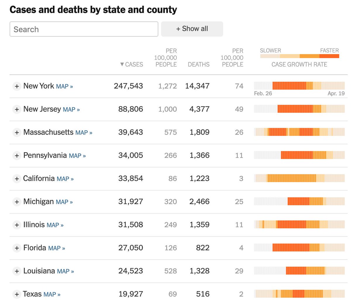
Today I tweeted my concerns about this graphic from the New York Times. It is true that the *rate of growth* is slowing. It is also true that a totally reasonable reader could look at it and mistakenly interpret that the number of new cases is dropping each day. 4/13
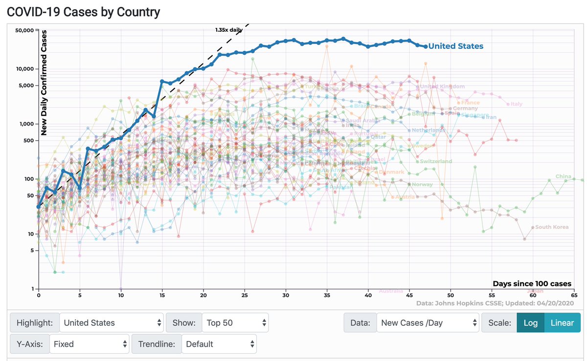
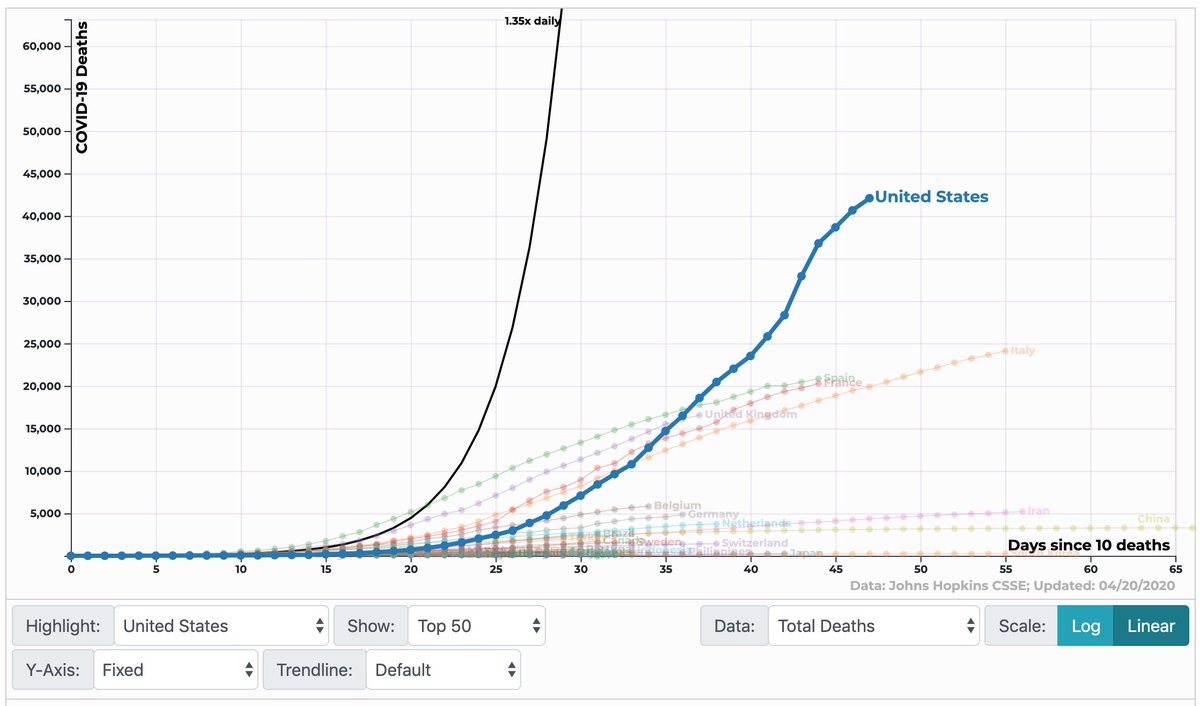
It& #39;s not. The 91-DIVOC graphs show the number of new cases per day has been flat for weeks. It isn& #39;t decreasing. (The number of tests performed is also pretty flat during an exponential outbreak, so read what you will into whether this true trend is flat or positive.) 5/13
These interpretations matter. People are deciding whether to wear masks, distance themselves, and ask their employees to return to work. You want to bet all of these decisions on whether busy readers are catching the difference between a slope and a first derivative? 6/13
We choose how to communicate these things and I see too many researchers and data journalists getting smug about readers misinterpreting things. Stop and recognize the biases. Ever notice the differences in how we choose to communicate about different topics? 7/13
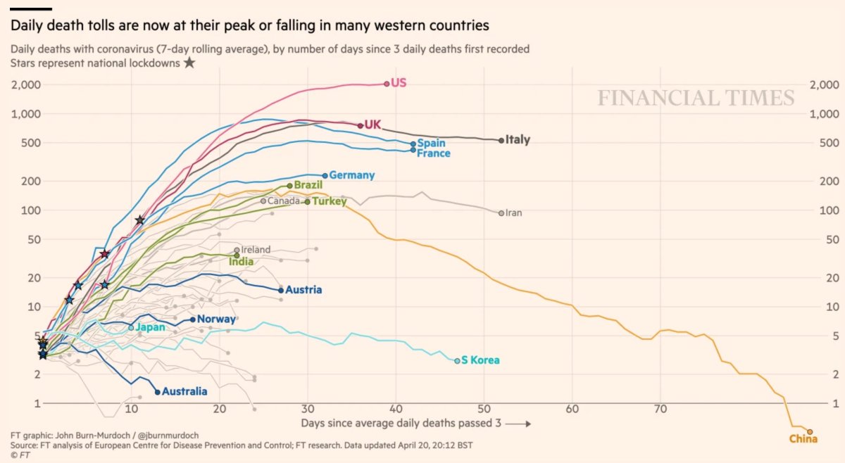
This is important. Folks are communicating about the *RATE OF CHANGE* for the pandemic, often on log scales, giving reasonable but mistaken people the perception that the worst is behind us. We see lots of this. The growth is slowing, but it is still growing. 8/13
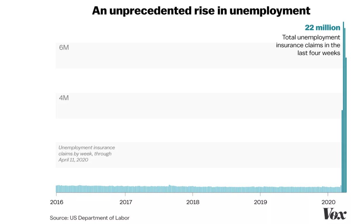
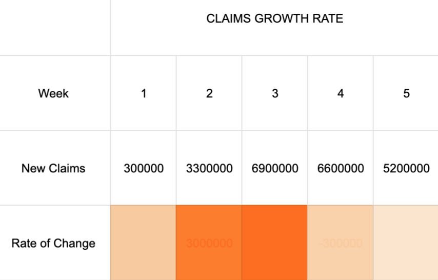
But then when folks talk about jobs linear scales and absolute losses are fine. How many times have you seen an unemployment chart like this in the last month (I& #39;m not picking on Vox or FT, most outlets have similar graphs.) 9/13
So I& #39;ll leave you with a hypothetical. Would we see any less support for curbing social distancing measures and reopening the economy this early if we were accustomed to seeing the sharp slope of linear cumulative COVID death numbers (again, 91-DIVOC)... 10/13
Would we be less eager to jeopardize lives and reopen the economy if data journalists rejected the linear scale bar graphs of unemployment numbers and instead graphed the rate of change in week-to-week numbers? We& #39;re back to the orange bars in the 4th tweet here. 11/13
So to conclude, I& #39;m not saying unemployment and COVID should be graphed the same way. I am saying we need to think really carefully about how things are communicated and subsequently understood. 12/13

 Read on Twitter