HOW states are visualizing their cases is actually pretty interesting. Here& #39;s OH, with gradients at logical places (50, 100, 500, 1000, 2000). (The darkest, btw, is Marion prison, where the state is testing everyone.)
https://coronavirus.ohio.gov/wps/portal/gov/covid-19/dashboards">https://coronavirus.ohio.gov/wps/porta...
https://coronavirus.ohio.gov/wps/portal/gov/covid-19/dashboards">https://coronavirus.ohio.gov/wps/porta...
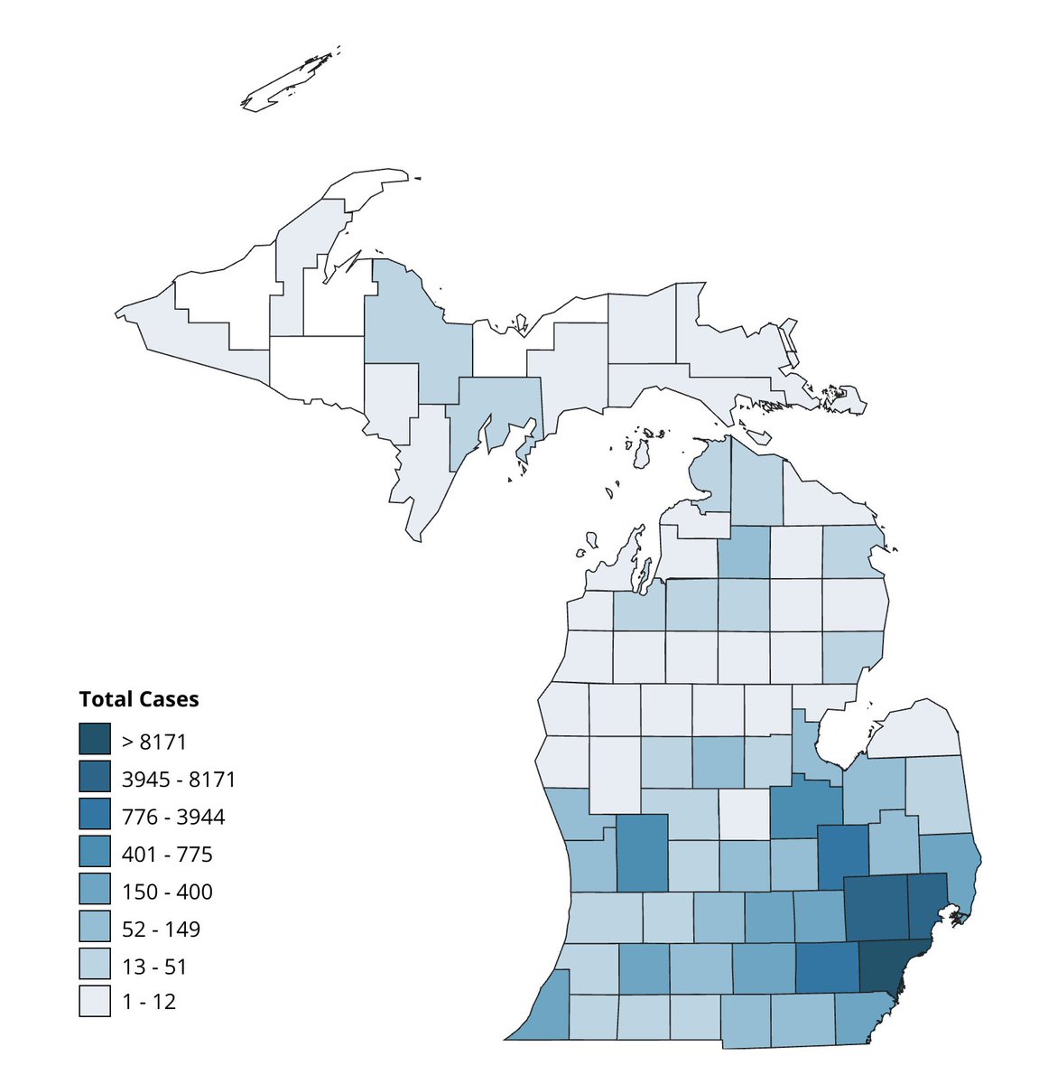
MI counts are arbitrary cut-offs that at least show how the virus exists at different concentrations across the state (tho doesn& #39;t break out Detroit City).
https://www.michigan.gov/coronavirus/ ">https://www.michigan.gov/coronavir...
https://www.michigan.gov/coronavirus/ ">https://www.michigan.gov/coronavir...
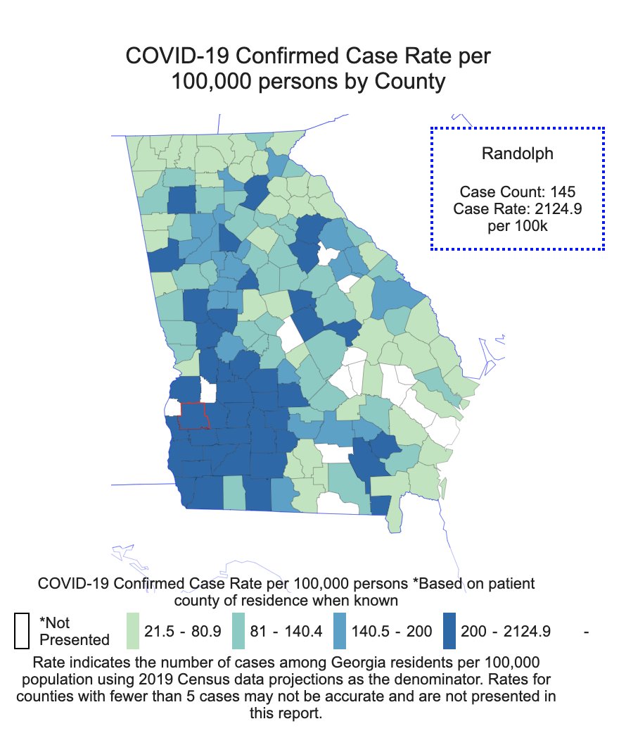
Here& #39;s GA& #39;s map, with cutoffs that make it look like most of the state is unaffected. Open up! this map says.
Of course that hides what& #39;s really going on in GA, which is that there& #39;s a really big cluster in rural SE GA. Randolph County has 2124 cases/100K people.
This is a heavily black area w/a devastating number of cases for its population.
This is a heavily black area w/a devastating number of cases for its population.
In other states, the big surge in cases are prisoners. https://twitter.com/jeremychrysler/status/1252320702994231298">https://twitter.com/jeremychr...
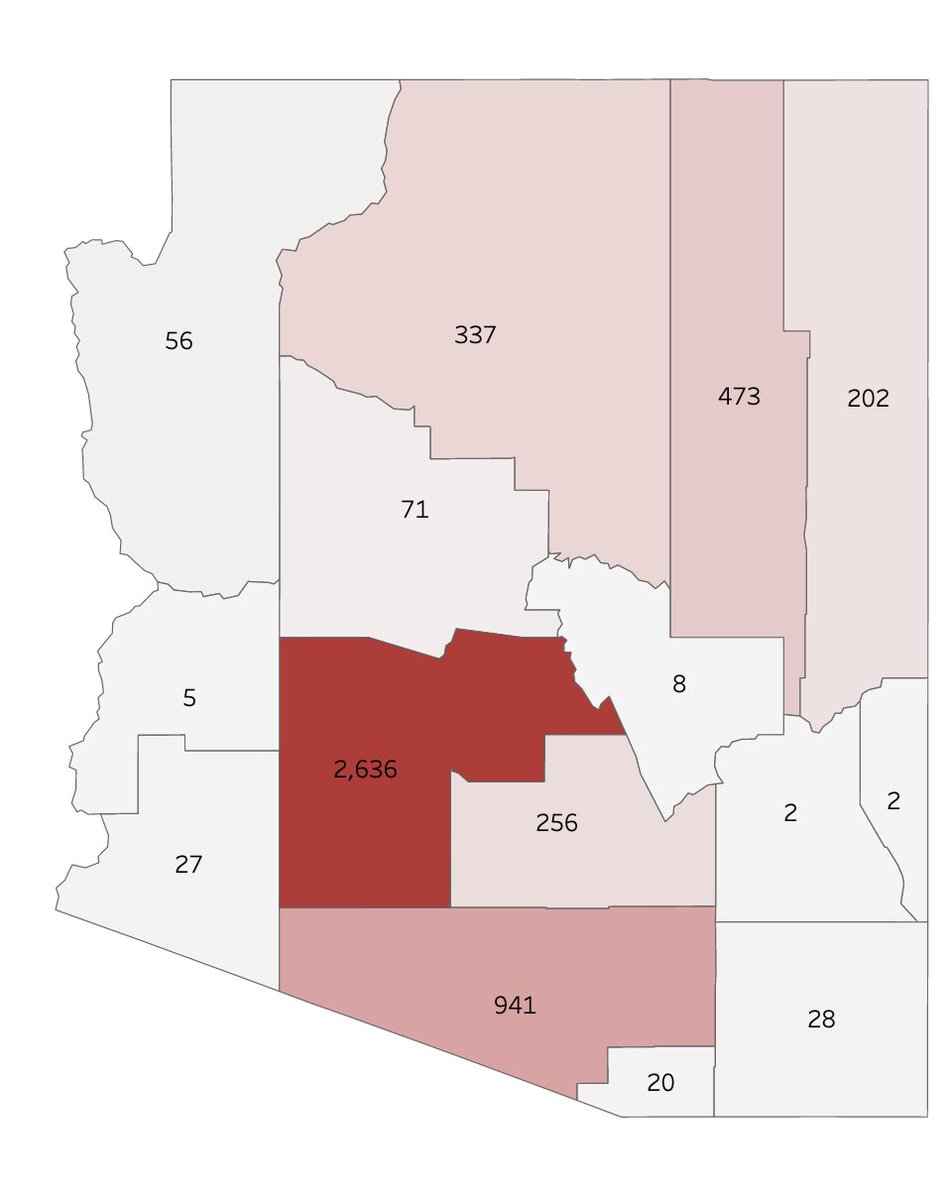
Here& #39;s AZ& #39;s cases per county versus AZ& #39;s cases per 100,000, which shows how devastating the Navajo cluster is.
Oops: Forgot the link to GA& #39;s maps. https://dph.georgia.gov/covid-19-daily-status-report">https://dph.georgia.gov/covid-19-...

 Read on Twitter


