PROFESSOR GATO, back yet again (working from home) with the latest cut at the question of
"does lockdown and social distancing create better COV outcomes?"
the answer from this latest data update is still a resounding "NO".
"does lockdown and social distancing create better COV outcomes?"
the answer from this latest data update is still a resounding "NO".
let& #39;s once more lay out the key argument here:
correlation is not causality.
but material causality without correlation is deeply implausible.
a metaphor: imagine a car rolling down a hill. You seek to stop this from happening and push against the car.
correlation is not causality.
but material causality without correlation is deeply implausible.
a metaphor: imagine a car rolling down a hill. You seek to stop this from happening and push against the car.
even if you cannot stop it, you can slow it. given 100 cars on 100 hills vs 100 more where you did nothing, this ought to show up in the data. if it doesn’t, then we can conclude that your push is so weak as to be irrelevant. but what if the cars you pushed actually sped up?
at that point, we may begin to fear that you are pushing on the wrong end of the car.
this seems to be what we are seeing in the COV data.
to measure this, we need standards and the harder the data, the better.
here& #39;s what i did:
this seems to be what we are seeing in the COV data.
to measure this, we need standards and the harder the data, the better.
here& #39;s what i did:
for degree of drop in social interaction, i used google mobility data.
i generated a score based on the simple avg of the % drop in 5 categories
1.Retail/Restaurant
http://2.Grocery"> http://2.Grocery and Pharmacy
3.Parks usage
4.Public Transit Hubs
5.Workplaces
i generated a score based on the simple avg of the % drop in 5 categories
1.Retail/Restaurant
http://2.Grocery"> http://2.Grocery and Pharmacy
3.Parks usage
4.Public Transit Hubs
5.Workplaces
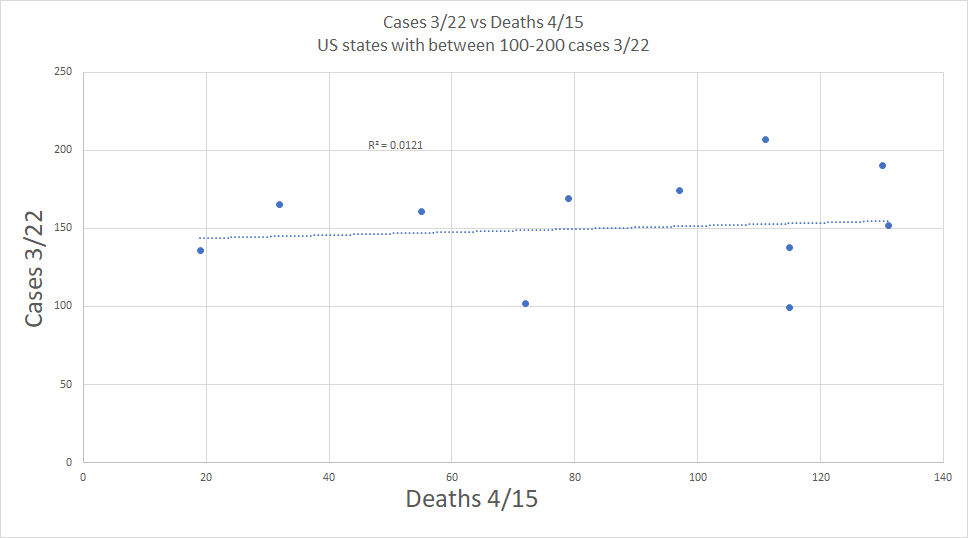
i then used worldometer data for deaths/mm population. deaths are a better measure than cases because cases are FAR too noisy a series. it mostly measures the extent of testing. it& #39;s 90% data artifacts. it does not even correlate to future deaths
deaths are better counted
deaths are better counted
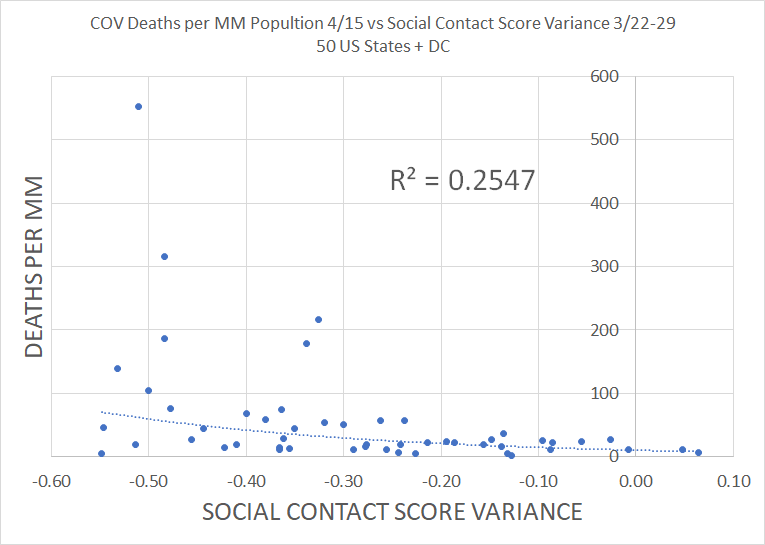
you pick a date in the past (the week of 3/22-29) measure the drop in social interaction. then you look forward 29 days to today to see what happened on deaths. this should be plenty of time to see death differentials from policy emerge.
(degree of drop has been stable)
(degree of drop has been stable)
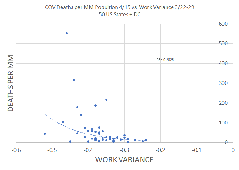
if distancing works, then we should see a drop in social interaction correlate with lower deaths.
but, instead, we see the opposite. this is deeply damning to the social distancing hypothesis.
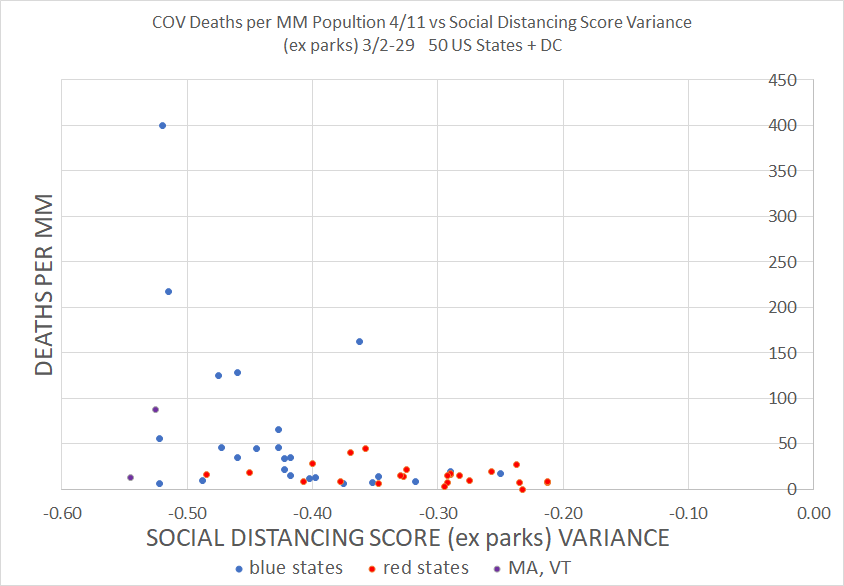
here are the 50 US states. very hard to see how this is consistent with SD working.
but, instead, we see the opposite. this is deeply damning to the social distancing hypothesis.
here are the 50 US states. very hard to see how this is consistent with SD working.
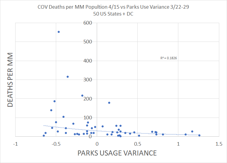
the role of parks is unclear, may be injecting a weather dependent signal, and varies FAR more erratically than other variables.
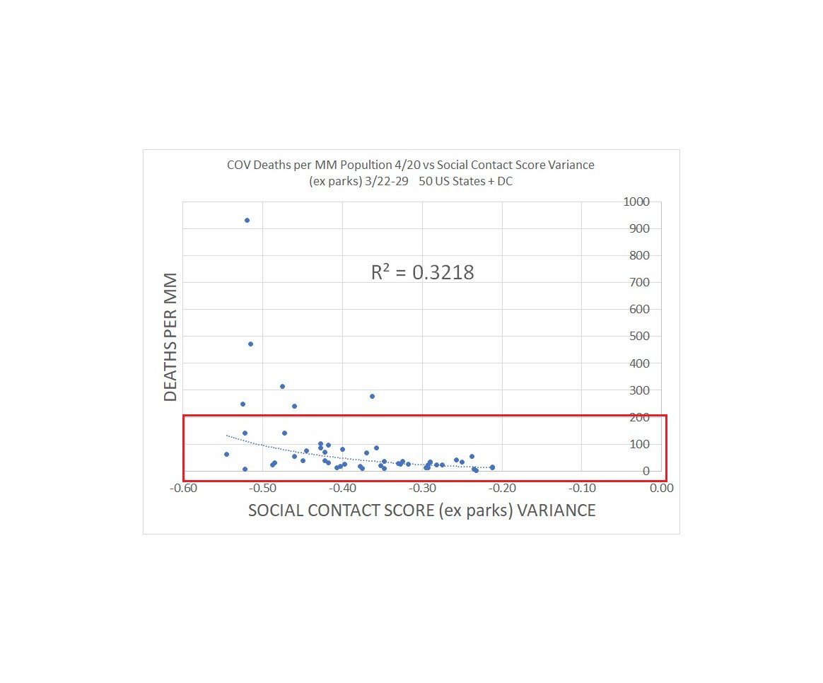
so i took a cut without parks. r2 is even more inverse to hypothesis.
but the difference is less great than w/ the 4/15 data.
so i took a cut without parks. r2 is even more inverse to hypothesis.
but the difference is less great than w/ the 4/15 data.
this same relationship inverse to the SD hypothesis emerges in every single subset of the data. there is simply no way to cut it that argues for or even supports lockdown working.
not one.
not one.
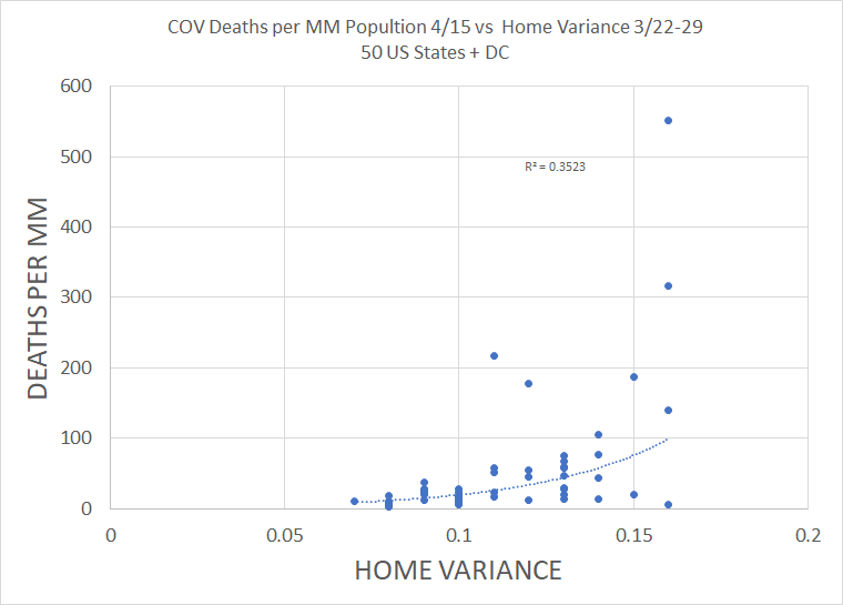
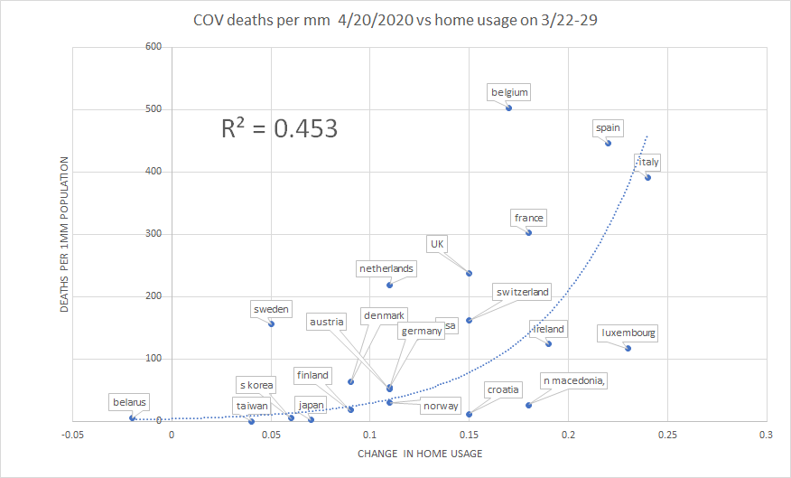
google also provides "time at home" data. this should be a good measure of shelter in place.
again, it provides the opposite correlation to hypothesis.
r2=.35. that& #39;s a serious problem for shelter in place proponents.
again, it provides the opposite correlation to hypothesis.
r2=.35. that& #39;s a serious problem for shelter in place proponents.
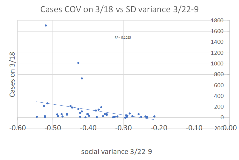
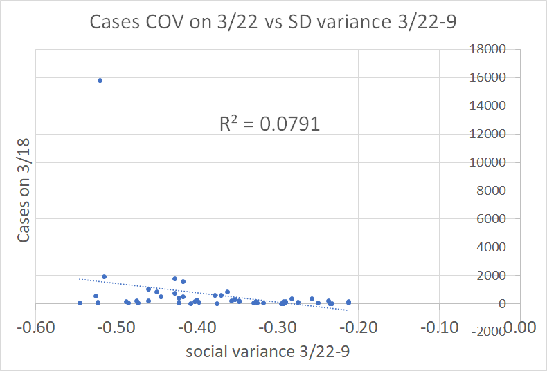
one hypothesized source of this inverse correlation is that high case counts drove stricter policy.
this sounds very plausible, but disintegrates upon examination.
there is insignificant correlation. this is, at best, a minor issue.
this sounds very plausible, but disintegrates upon examination.
there is insignificant correlation. this is, at best, a minor issue.
as i laid out previously, the strong driver looks to be politics. (party of state governor as governors are the ones imposing policy)
MA and VT are a separate category as despite having GOP governors, i struggle to call either a red state with a straight face.
MA and VT are a separate category as despite having GOP governors, i struggle to call either a red state with a straight face.
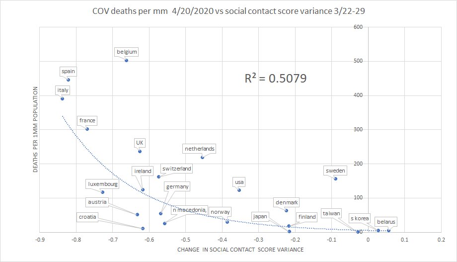
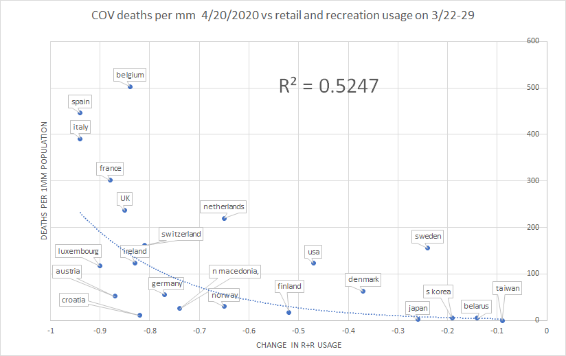
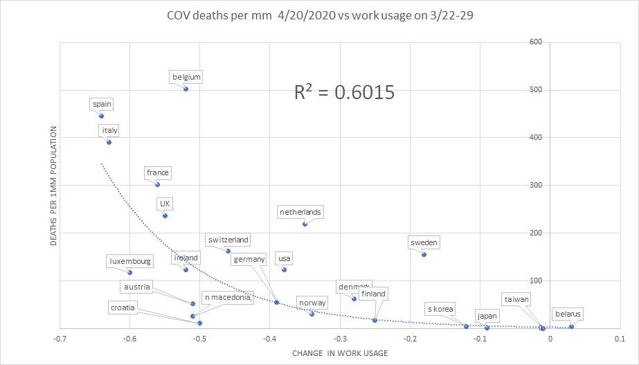
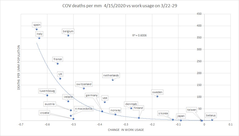
this relationship on correlations holds even more strongly in the rest of the world.
my suspicion is that the R2& #39;s are so much higher because policy varied by much more than it did across US states.
my suspicion is that the R2& #39;s are so much higher because policy varied by much more than it did across US states.
south korea actually saw social interaction scores RISE 3%, yet has very low deaths per mm.
this is typical in asia and implies that some factor other than SD is dominant.
this is typical in asia and implies that some factor other than SD is dominant.
2 country cherry picks here can be made to show anything we want.
compare sweden and norway, and distancing looks great.
compare norway and finland and it looks awful.
this is why we need to look at the larger scale data.
it is not kind to SD, nor, as this shows, to SIP.
compare sweden and norway, and distancing looks great.
compare norway and finland and it looks awful.
this is why we need to look at the larger scale data.
it is not kind to SD, nor, as this shows, to SIP.
what& #39;s also amazing is how constant this data pattern has stayed and how the relative rankings of countries have barely changed at all since policies of SD/SIP were enacted.
given policy variance, you& #39;d expect relative movement if policy were having an effect.
there is little
given policy variance, you& #39;d expect relative movement if policy were having an effect.
there is little
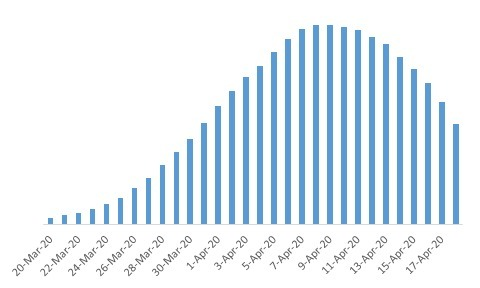
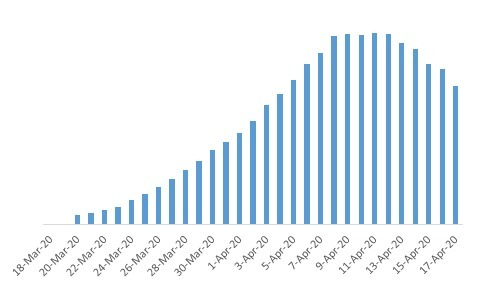
here& #39;s the daily death charts of NY state and sweden.
can you tell which is which?
fun fact: both peaked on the exact same day (4/8)
can you tell which is which?
fun fact: both peaked on the exact same day (4/8)
all in all this is incredibly damaging to the case for lockdowns and shelter in place. this has been arguably the most expensive policy ever enacted in human history.
it was done based on models that all failed so horribly that calling them garbage is too kind.
it was done based on models that all failed so horribly that calling them garbage is too kind.
whatever the effects of COV, piling massive economic damage on top for no gains CANNOT be the solution.
this has been a scandal and a travesty.
"because it sounded good" is NOT the basis for running the entire global economy into a ditch.
mao& #39;s 5 year plans sounded good too...
this has been a scandal and a travesty.
"because it sounded good" is NOT the basis for running the entire global economy into a ditch.
mao& #39;s 5 year plans sounded good too...
it& #39;s time to hold those who championed this hot mess to account
we just paid a price so extreme it& #39;s breathtaking to pursue policies that failed utterly.
it& #39;s time to develop herd immunity to "experts".
remember how their plan fared this time next time they start yapping.
we just paid a price so extreme it& #39;s breathtaking to pursue policies that failed utterly.
it& #39;s time to develop herd immunity to "experts".
remember how their plan fared this time next time they start yapping.
there is always some crackpot apologist telling you that "we just need smarter guys next time" but it& #39;s never true.
no one gets this right from the top down. like an economy, it only works from the bottom up
people are the answer, not politicians.
please try to remember that.
no one gets this right from the top down. like an economy, it only works from the bottom up
people are the answer, not politicians.
please try to remember that.
and please, whatever your opinion, demand data from those who claim this "worked."
when you go on TV and wet your pants crying wolf, you& #39;ll move heaven, earth, and slant data to make it look like there was one if you value your political career.
assess these claims critically
when you go on TV and wet your pants crying wolf, you& #39;ll move heaven, earth, and slant data to make it look like there was one if you value your political career.
assess these claims critically

 Read on Twitter
