Happy Monday on Hong Kong time everybody! Hope you had a nice Quasimodo Geniti. Ours was splendid. We had a (very modestly sized due to rgulations) BBQ at a friend& #39;s house up in the New Territories.
Hong Kong is a remarkable place. 10 minutes from my house in one direction lands you at one of the best-rated seafood restaurants in the world, a famous internationally-recognized NGO, and gleaming towers of apartments with sweeping seaviews.
Ten minutes in the other direction gets you tin roofs and siding and open latrines and wells.
Yesterday& #39;s BBQ was with the tin-roofs-and-latrines side. Which, as a general rule of thumb, means the food was better and the company friendlier.
Yesterday& #39;s BBQ was with the tin-roofs-and-latrines side. Which, as a general rule of thumb, means the food was better and the company friendlier.
I love this place. But more than that, I will never succeed in peeling back all the layers of complexity of this place.
Okay, on to COVID data!
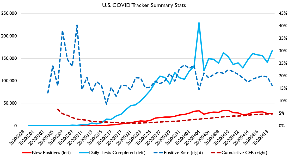
Tests are continuing their slow linear increase. We are now at about 150k-170k tests a day.
Positive % of tests seems to be gradually falling, which is a good sign too.
So this is pretty encouraging data!
Tests are continuing their slow linear increase. We are now at about 150k-170k tests a day.
Positive % of tests seems to be gradually falling, which is a good sign too.
So this is pretty encouraging data!
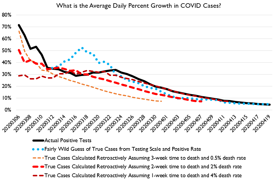
On the curve-flattening front, we continue to see flattening, which is good. Rate of increase in cases and deaths continues to fall.
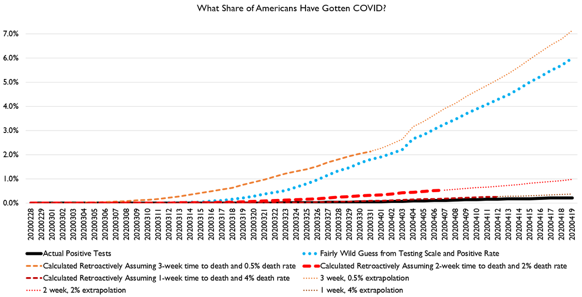
ANd here are some estimates of how many Americans have probably gotten COVID. At least 0.9% of Americans have basically for sure been exposed. But perhaps as much as 7.5%.
Note that you cannot calculate an IFR by dividing deaths by 7.5% of the US pop, because that 7.5% is calculated assuming a 0.5% IFR and a 3-week time-to-death, thus it has an IFR assumption baked into it.
Rather, that 7.5% infection scenario implies that about 90,000 people will die, of which only 35,000 already have, which implies high rates of death will continue throuugh May.
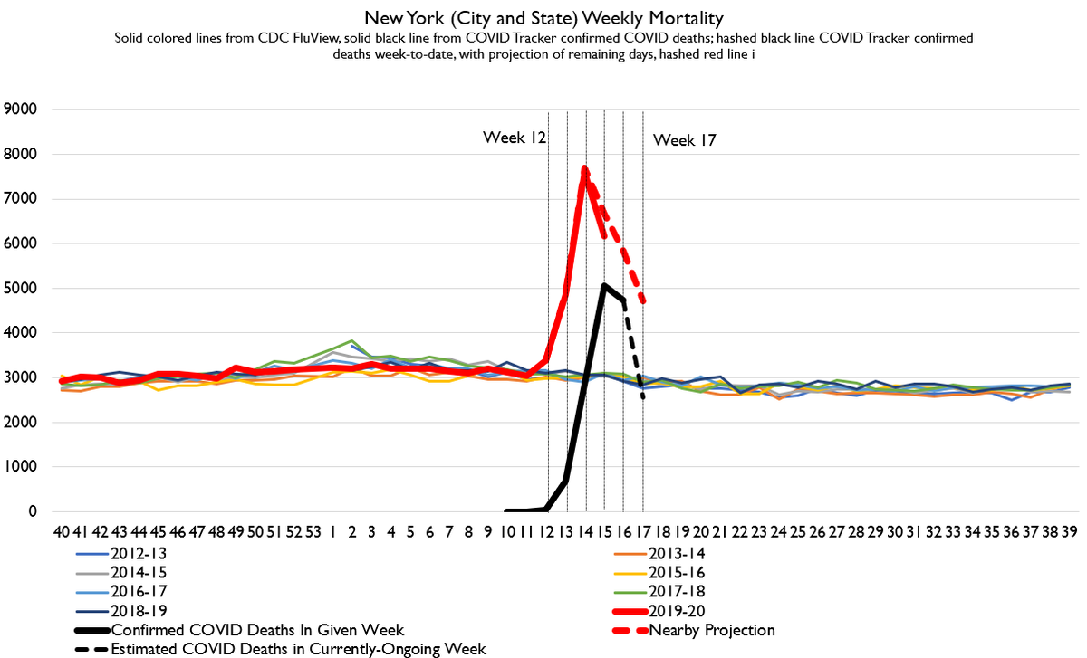
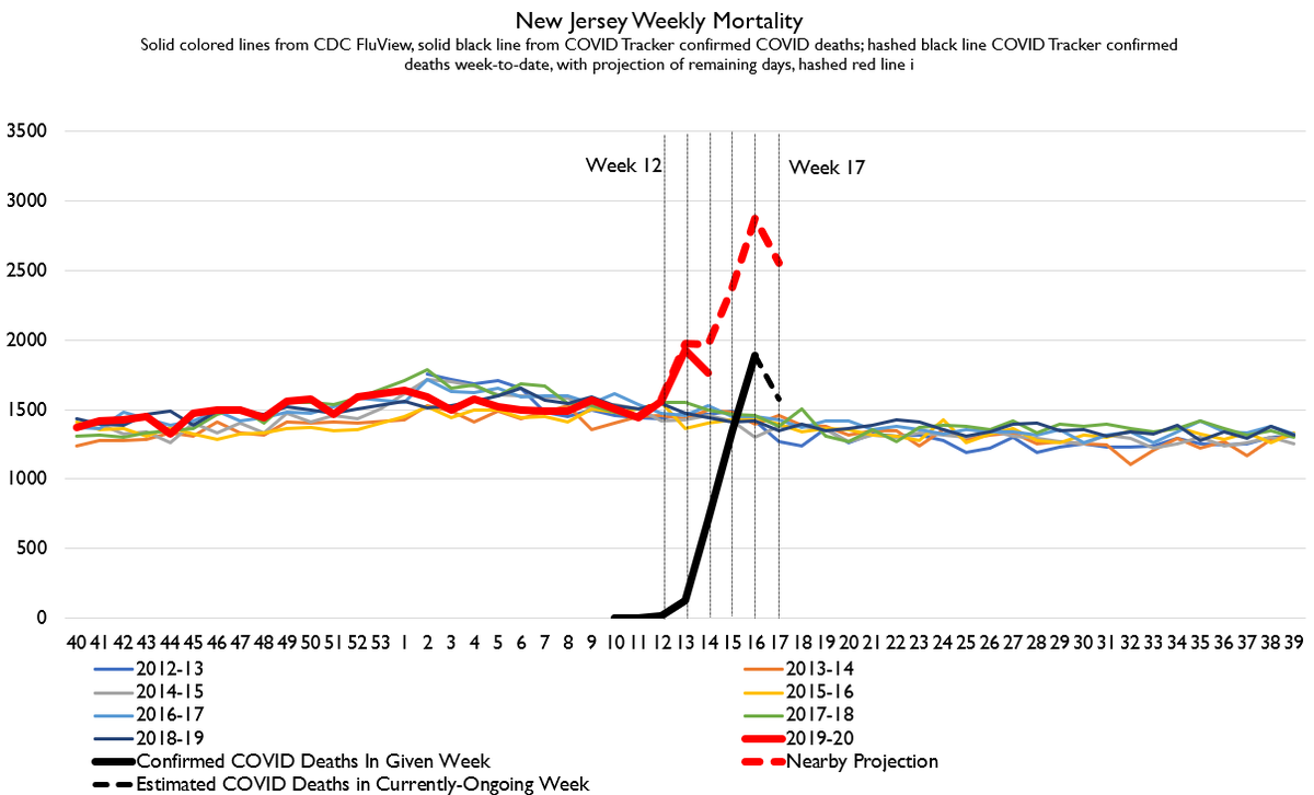
Here& #39;s an updated New York chart with all the data we& #39;ve got. It looks like NY is probably getting through this thing, although still that death spike is gonna show up as pne of the largest in recorded history for NY.
Which, btw, I& #39;m working on extending the "recorded history."
Which, btw, I& #39;m working on extending the "recorded history."
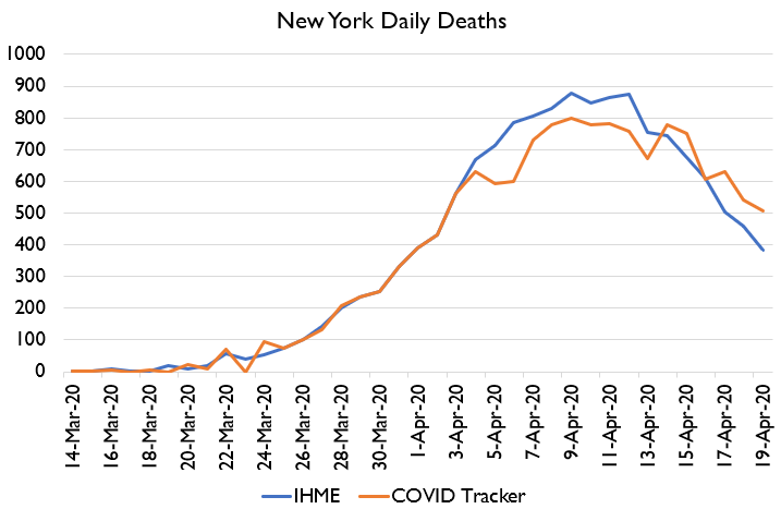
Here& #39;s NY daily deaths vs. IHME from about 2 weeks ago. What you can see is IHME overestimated the peak, but was too optimistic about the downslope. This is consistent with a lot of the critiques of IHME& #39;s symmetric deaths assumptions.
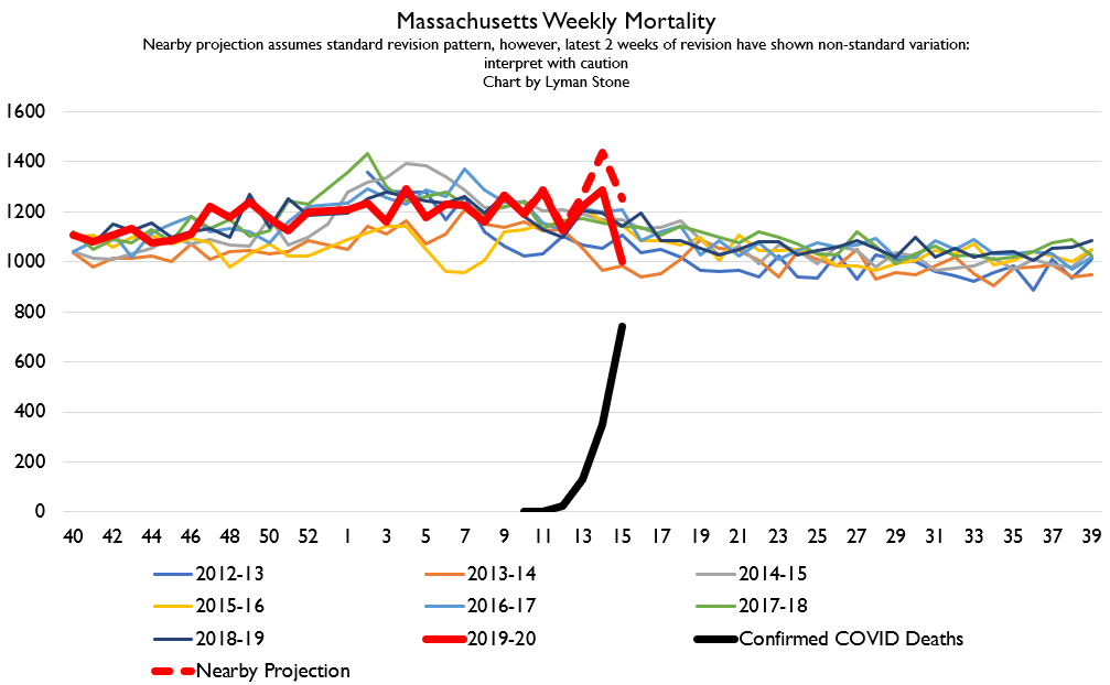
I got a question about MA. MA is a state that usually reports its data reasonably promptly. Here& #39;s what it looks like so far. The death spike in MA is a lot lower than you& #39;d expect based on COVID confirmations. However, MA& #39;s revisions in recent weeks have been like 15%.
Since revisions only ever go upwards, you can go ahead an slap a mental "it might be 50-200 deaths higher than that" on top of my red dotted line too.
People may have questions about other northeastern states.
Connecticut.... doesn& #39;t bother to report all-cause mortality surveillance data at all.
Because, well.... Connecticut. There& #39;s your explanation.
Connecticut.... doesn& #39;t bother to report all-cause mortality surveillance data at all.
Because, well.... Connecticut. There& #39;s your explanation.
Rhode Island is a faithful and iligent reporter of all vital statistics in easy-to-use public formats but unfortunately they have big issues with non-residency and their small size. So their average latest-week revision runs like 20-80%, and 2nd week runs 5-25%.
So Rhode Island is a state that tries very hard to do a good job but due to its small size and high mobility just faces great difficulties.
Connecticut just doesn& #39;t try.
For reference, when I say New York& #39;s death stats are reported rapidly and well, what I mean is latest-week revisions even in these exceptional times amount to <10% and typically 5% or less.
Vermont is a poor reporter of vital statistics in general, and also due to Rhode Island-like issues they routinely have 20-50% revisions to the latest week.
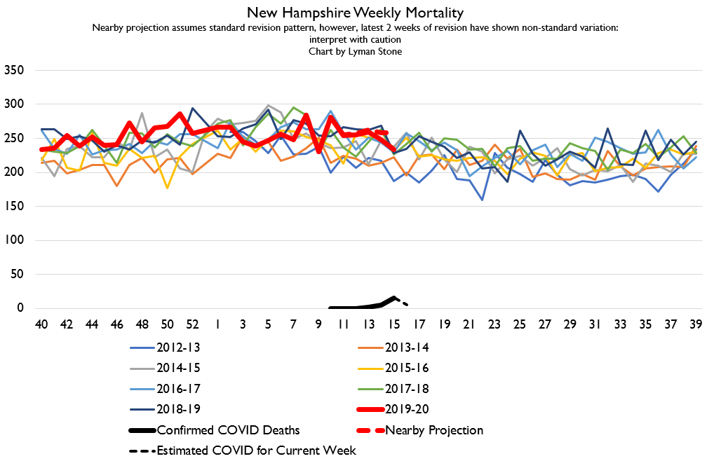
New Hampshire is normally a pretty good and timely reporter, and they seem to be reporting reliably now.... but they& #39;re kinda boring since they have very few COVID deaths.
Same story for Maine: decently good reporter, but no reason to expect a large death spike given very low number of reported COVID deaths.
Outside of the northeast there are ****only two states**** single-digit-percent revisions in the latest week in a typical update.
When I tell you what they are, you& #39;re going to agree with me that vital statistics reporting is a surprisingly good indicator of governance quality.
When I tell you what they are, you& #39;re going to agree with me that vital statistics reporting is a surprisingly good indicator of governance quality.
They are.....
Minnesota and Utah.
So our "reliable reporting" states are basically New Hampshire, Maine, New York, Utah, and Minnesota.
Minnesota and Utah.
So our "reliable reporting" states are basically New Hampshire, Maine, New York, Utah, and Minnesota.
By the way, I think that "can accurately count dead bodies and new babies quickly, correctly, and report the data to the public" is actually an eminently rational metric for effective delivery of government services.
These are extremely basic public health and administrative tasks that directly impinge on the lives of citizens: sluggishness processing birth and death paperwork is a big hassle!
But beyond that, it speaks to how well government agencies coordinate, and how committed they are to transparency.
I have a mental ranking of states based on, "Can you get preliminary birth data?" and "How easily and in what format?" as well as "How timely and reliable is mortality surveillance data?"
These variables together turn out to be a pretty close match to a lot of intuitions about where governance is basically efficient and not-too-corrupt.
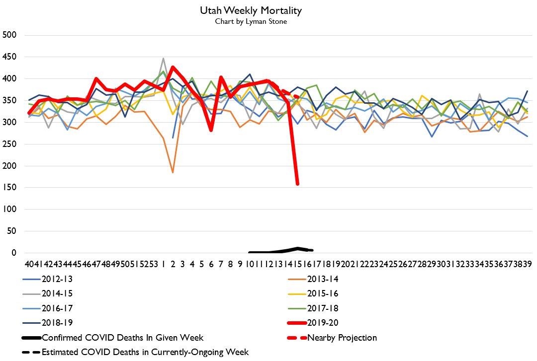
Anyways, FWIW, the problem is these high-quality-reporting states also mostly have not had very big outbreaks (which.... may suggest their public health systems are more effective.... hmmmm). So here& #39;s MN and UT.
So really our *only* case where we have top-quality reporting AND a large outbreak in New York.
That& #39;s why I focus on New York. All the other good-quality reporters just haven& #39;t had enough reported deaths to have an expectation of a bump!
That& #39;s why I focus on New York. All the other good-quality reporters just haven& #39;t had enough reported deaths to have an expectation of a bump!
The big drops in recent weeks are 100% due to woefully incomplete reporting as CDC rushed week 15 out the door way before it was ready. This was irresponsible of the CDC. https://twitter.com/tmoran711/status/1252080146221334529">https://twitter.com/tmoran711...
I try to account for this in my red dotted line, but obviously the accounting is imperfect.
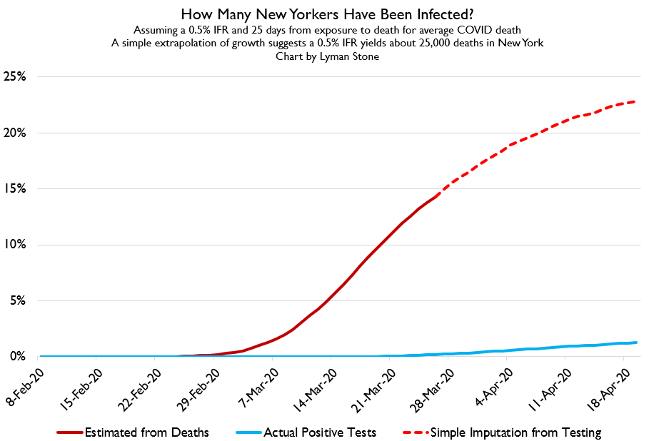
So I want to do a slightly more detailed look at prevalence.
Data from NY pregnant women in late March/early April suggested about 15% had COVID antibodies, a high prevalence.
So, what does my death-based metric suggest prevalence was at that time?
Data from NY pregnant women in late March/early April suggested about 15% had COVID antibodies, a high prevalence.
So, what does my death-based metric suggest prevalence was at that time?
Well, a naive estimation of infections 25 days previously with a 0.5% IFR would put prevalence in New York state during the study window.... pretty near 15%.
I think it& #39;s quite possible that New York has indeed had exposure as high as 15, 20, 25%.
Note that& #39;s still not super close to herd immunity. Also note that New York has had a huge death spike. Also note that half of the deaths expected from that curve have not yet occurred.
Note that& #39;s still not super close to herd immunity. Also note that New York has had a huge death spike. Also note that half of the deaths expected from that curve have not yet occurred.
Because I calculated infections retroactively from deaths, when I impute infections forward based on time trends in positive cases, I am basically forecasting future deaths.
So this model "forecasts" that NY has 25,000 COVID deaths getting to about 24% exposure. Suggests that getting to herd immunity of 50-80% exposure would probably lead to 50,000 to 80,000 deaths in New York.
In a normal year, New York has 140k-170k deaths. So that would be about a 50% increase in the TOTAL YEARLY DEATHS for the year.
Effect on life expectancy would be smaller due to the older age of those who die from COVID, but still you& #39;d expect to see New York& #39;s life expectancy tick downwards appreciably.
Put another way:
At ***0.5%*** IFR, which is consistent with ***the highest estimates of prevalence we have***, you& #39;re still talking about having a MASSIVE death spike SHARPLY reducing life expectancy and killing TENS OF THOUSANDS in EACH STATE.
At ***0.5%*** IFR, which is consistent with ***the highest estimates of prevalence we have***, you& #39;re still talking about having a MASSIVE death spike SHARPLY reducing life expectancy and killing TENS OF THOUSANDS in EACH STATE.
New York alone would have as many or more deaths as would typically occur in the whole country during flu season.
So when I say that exposure in the US on the whole is <8%, understand that this disguises the fact that there are some places like New York where exposure is quite high indeed.

 Read on Twitter