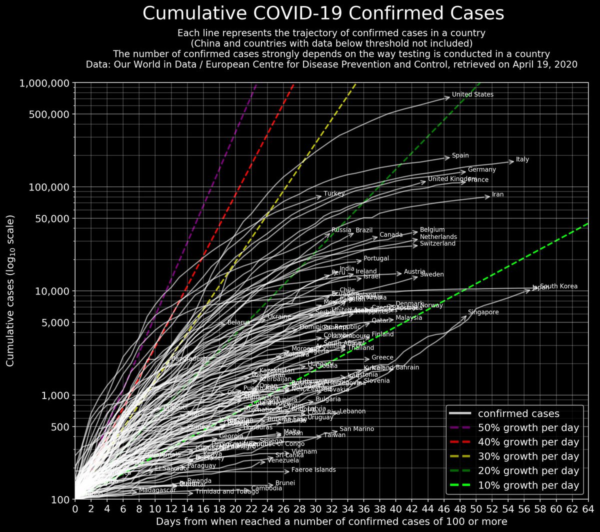
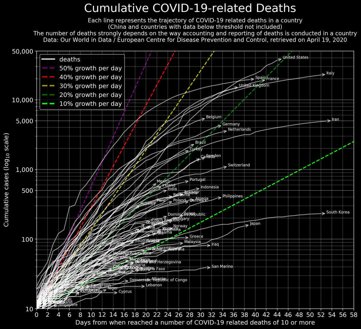
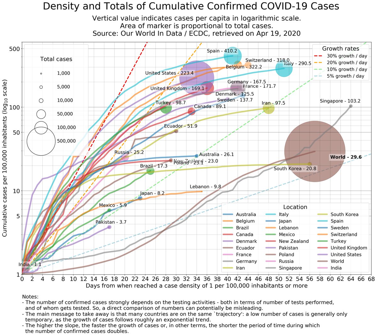
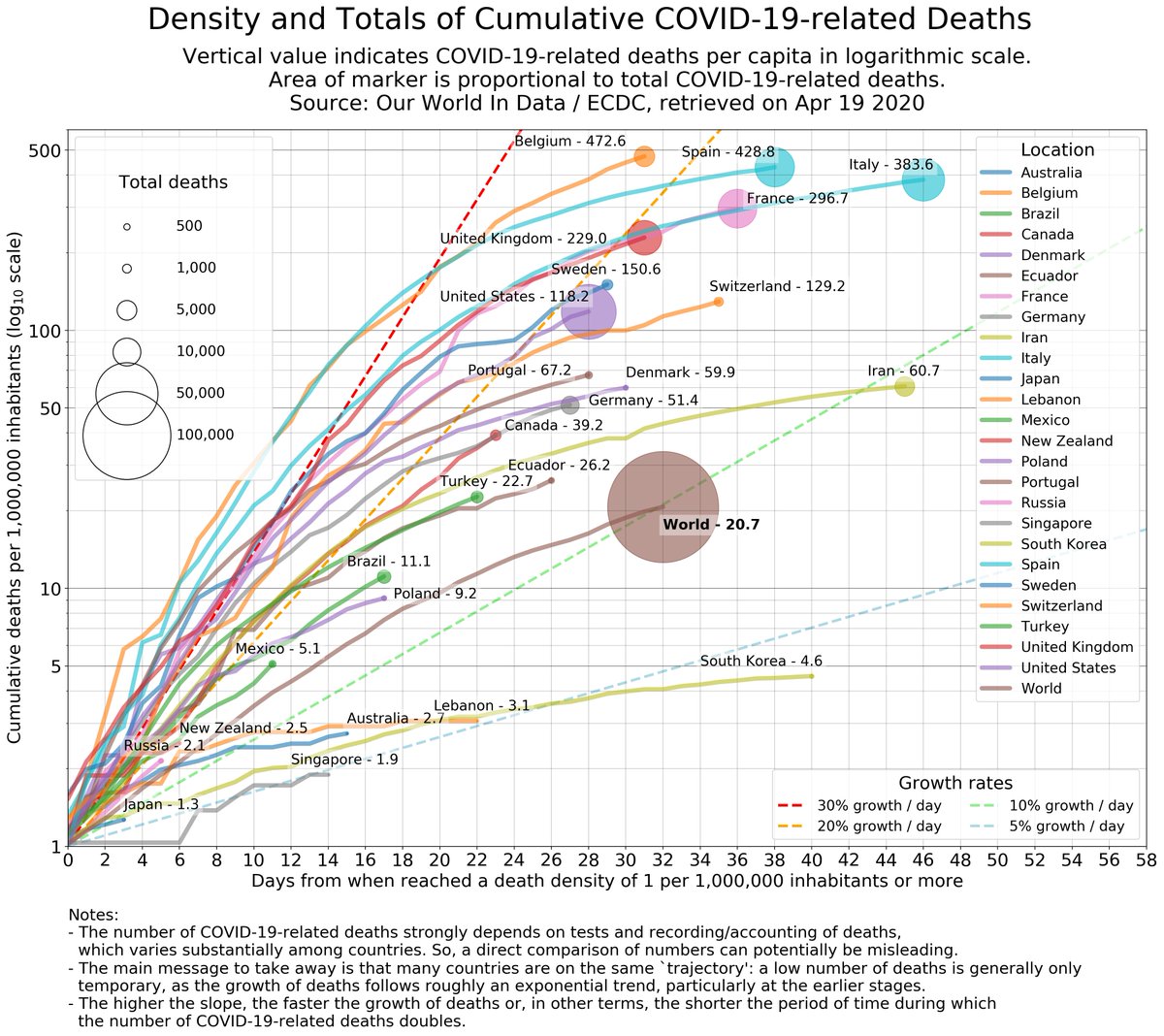
#COVID19 worldwide 19 Apr update: trajectories, timelines, rate of growths (cases&deaths).
China not included as:
- the situation there is stable
- keeping China within the plot requires squeezing the other trajectories
- China revised the death count & I have not handled it yet
China not included as:
- the situation there is stable
- keeping China within the plot requires squeezing the other trajectories
- China revised the death count & I have not handled it yet
Marker/circle area in "trajectories" plots is directly proportional to cumulative numbers (allows direct visual comparison), while the vertical axis is logarithmic (allows to judge growth rate; trajectory bending right = growth slowing). India enters the cases graph.
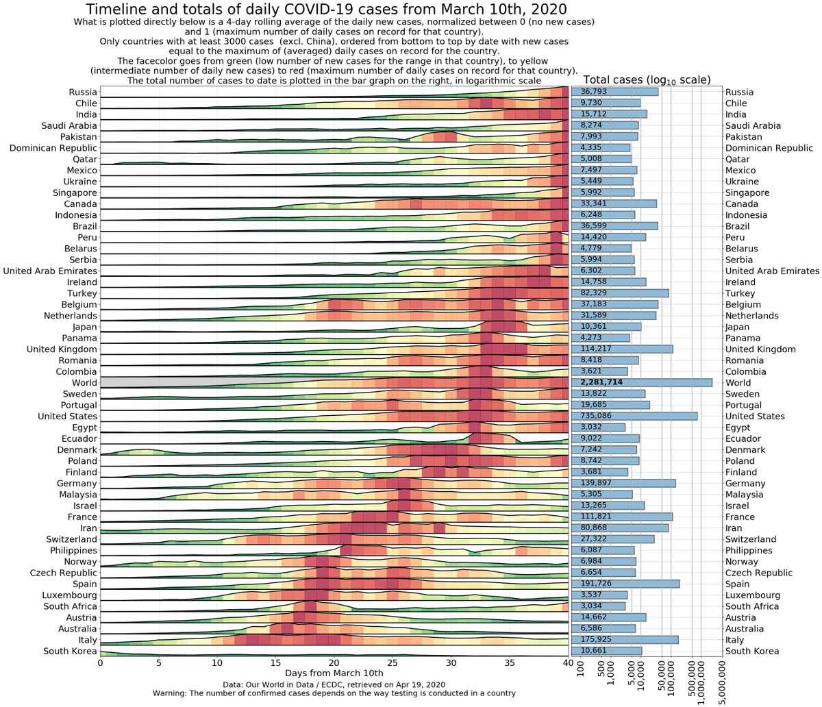
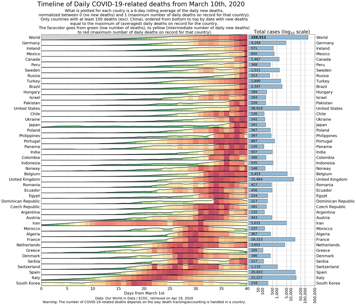
Timelines for daily cases and daily deaths: Countries are ordered from bottom to top based on the date of the (first) largest number recorded so-far. Countries at the top are still dealing with a surge. Worth going over this to check the variety in the dynamics of the pandemic.
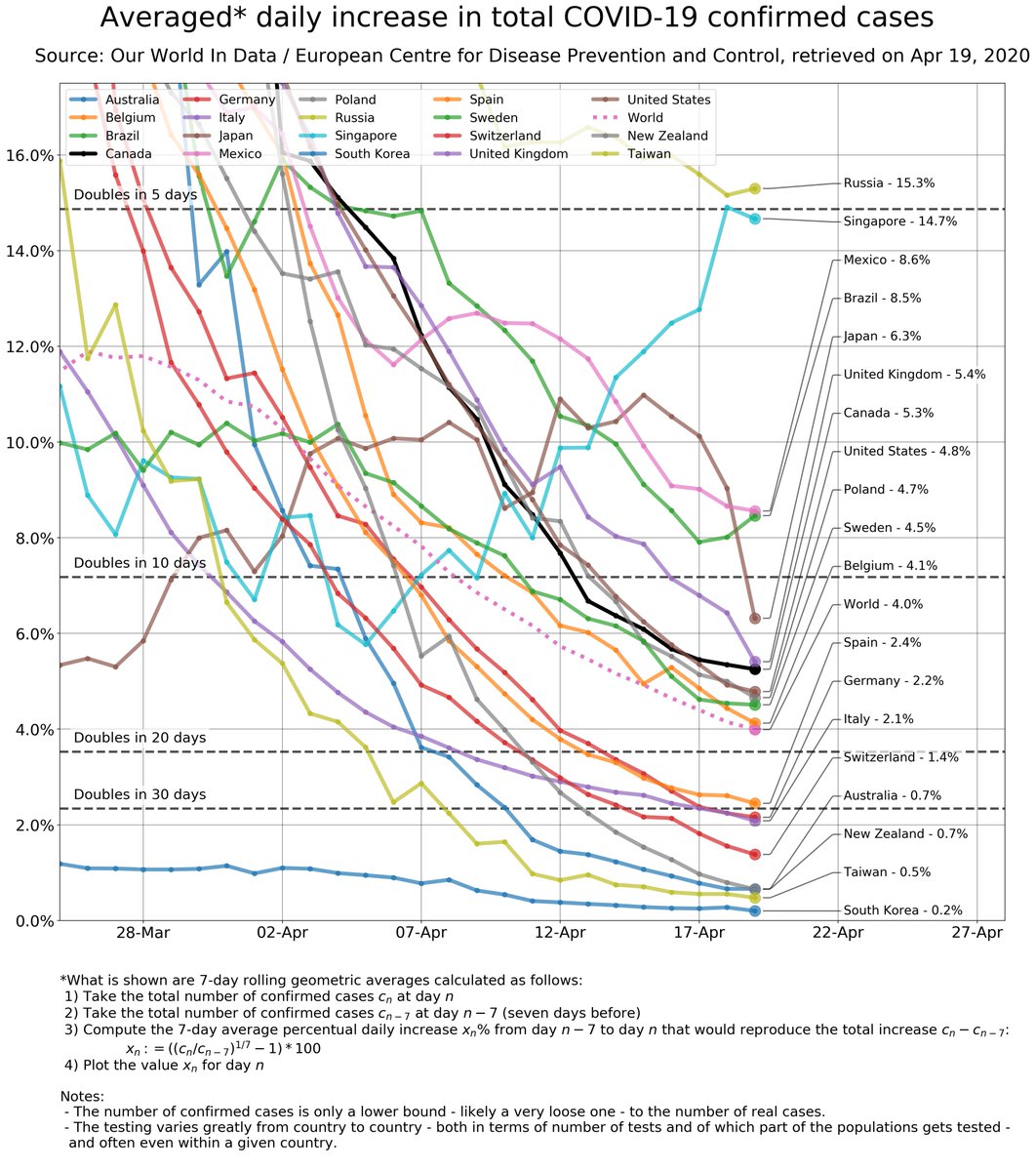
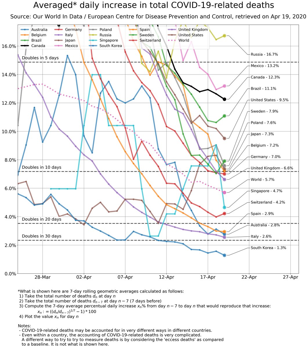
Growth rates of cumulative cases and cumulative deaths.
These are rolling geometric averages, so to be taken with a grain of salt; they roughly correspond to the slope of the trajectories above. Japan&Singapore have had recent speed-ups in cases...
These are rolling geometric averages, so to be taken with a grain of salt; they roughly correspond to the slope of the trajectories above. Japan&Singapore have had recent speed-ups in cases...
... which makes it clear that caution is of paramount importance: there can be a resurgence in cases and deaths.
Notice that, since these are about totals, the best possible scenario is to get to zero growth (corresponding to a horizontal trajectory in the trajectory plots)
Notice that, since these are about totals, the best possible scenario is to get to zero growth (corresponding to a horizontal trajectory in the trajectory plots)
Warnings:
- I am not an epidemiologist
- data need to be interpreted cautiously, especially during (vs, at the end of) a pandemic.
- please read the notes in the figures to understand what is plotted and caveats about data
- I am not an epidemiologist
- data need to be interpreted cautiously, especially during (vs, at the end of) a pandemic.
- please read the notes in the figures to understand what is plotted and caveats about data
Info:
- I am using the @OurWorldInData / @ECDC_EU dataset (thx for your work!). You can explore more data, and in different ways, at https://ourworldindata.org/coronavirus
-">https://ourworldindata.org/coronavir... potential mistakes in handling the dataset are mine. Let me know in case you spot any (and apologies in advance)

 Read on Twitter