
 Read on Twitter
Hello tweeps!
In this #Thread, I& #39;ll be explaining step-by-step process of designing the below #UI #Mockup (by @frontendmentor) with only #html & #css.
You can follow along by typing out the #codes in the images.
#100DaysOfCode #CodeNewbie
#WomenWhoCode #freeCodeCamp
1/25
 with only #html & #css. You can follow along by typing out the #codes in the images. #100DaysOfCode #CodeNewbie #WomenWhoCode #freeCodeCamp1/25")
 with only #html & #css. You can follow along by typing out the #codes in the images. #100DaysOfCode #CodeNewbie #WomenWhoCode #freeCodeCamp1/25")
In this #Thread, I& #39;ll be explaining step-by-step process of designing the below #UI #Mockup (by @frontendmentor) with only #html & #css.
You can follow along by typing out the #codes in the images.
#100DaysOfCode #CodeNewbie
#WomenWhoCode #freeCodeCamp
1/25
2/25
We& #39;ll learn how to look at mockups so we can do the following:
1. Deduce #html tags to #code the #webpage
2. Declare #css properties to style the webpage
3. Establish #breakpoints to make the webpage #responsive.
.
.
First, let& #39;s set up our html page.
#webdev
We& #39;ll learn how to look at mockups so we can do the following:
1. Deduce #html tags to #code the #webpage
2. Declare #css properties to style the webpage
3. Establish #breakpoints to make the webpage #responsive.
.
.
First, let& #39;s set up our html page.
#webdev
3/25
As shown below, we started with the following:
1. Create an #html document.
2. Specify the title.
3. Set the width.
The width is set to equal the viewport width. This means that it& #39;ll be as wide as the screen viewing the page - first step to #responsive #designs!

As shown below, we started with the following:
1. Create an #html document.
2. Specify the title.
3. Set the width.
The width is set to equal the viewport width. This means that it& #39;ll be as wide as the screen viewing the page - first step to #responsive #designs!
4/25
Our approach will be to #design for #Mobile First. Then, work our way upwards to design for #Tablets, #Desktops, and #Laptops.
.
.
To begin, I want you to take a look at the mobile design below and note what you see. The next post highlights what I see.
#100DaysOfCode

Our approach will be to #design for #Mobile First. Then, work our way upwards to design for #Tablets, #Desktops, and #Laptops.
.
.
To begin, I want you to take a look at the mobile design below and note what you see. The next post highlights what I see.
#100DaysOfCode
5/25
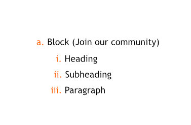
There& #39;s a container divided into 3 parts which we will call blocks.
Each block has its own set of elements which are represented in a tree structure in the second image.
Next post is a tip on how to get the #html tag for these labels.
#100DaysOfCode #WomenWhoCode


There& #39;s a container divided into 3 parts which we will call blocks.
Each block has its own set of elements which are represented in a tree structure in the second image.
Next post is a tip on how to get the #html tag for these labels.
#100DaysOfCode #WomenWhoCode
6/25
Tip: We can easily get the corresponding #html tag to mark up the page. Simply do a Google Search in the format "label html tag".
For examples:
- container html tag
- heading html tag
and so on.
.
.
We can now begin to #code the container & blocks.
#Webdesign

Tip: We can easily get the corresponding #html tag to mark up the page. Simply do a Google Search in the format "label html tag".
For examples:
- container html tag
- heading html tag
and so on.
.
.
We can now begin to #code the container & blocks.
#Webdesign
7/25
#Coding Containers
If you do a search for - container html tag, one option will be using <div>.
However, to convey meaning rather than just presentation only, I used <main> for container, and I& #39;ll use <section> for blocks. This act is called #html #semantics.
#Webdev


#Coding Containers
If you do a search for - container html tag, one option will be using <div>.
However, to convey meaning rather than just presentation only, I used <main> for container, and I& #39;ll use <section> for blocks. This act is called #html #semantics.
#Webdev
7.5/25
#Coding Blocks
As discussed previously, we will be using <section> to markup the blocks
#100DaysOfCode #WomenWhoCode #webdev #freeCodeCamp #CodeNewbie #Webdesign


#Coding Blocks
As discussed previously, we will be using <section> to markup the blocks
#100DaysOfCode #WomenWhoCode #webdev #freeCodeCamp #CodeNewbie #Webdesign
8/25
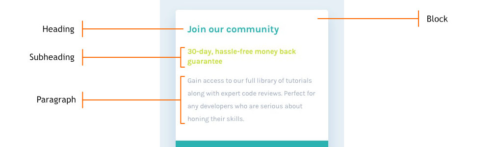
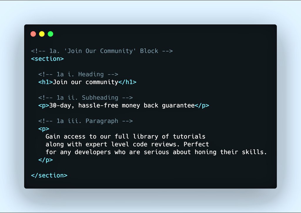
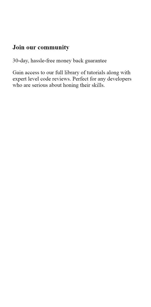
The images below show the UI of "Join our community Block", its Content Tree, #html code, and the result.
NB: Neither of the heading tags is suitable for subheading, <p> is! See the link below for more information.
http://html5doctor.com/howto-subheadings/
https://html5doctor.com/howto-sub... href="https://twtext.com//hashtag/100DaysOfCode"> #100DaysOfCode #WomenWhoCode
The images below show the UI of "Join our community Block", its Content Tree, #html code, and the result.
NB: Neither of the heading tags is suitable for subheading, <p> is! See the link below for more information.
http://html5doctor.com/howto-subheadings/
 #100DaysOfCode #WomenWhoCode" title="8/25 The images below show the UI of "Join our community Block", its Content Tree, #html code, and the result. NB: Neither of the heading tags is suitable for subheading, <p> is! See the link below for more information. https://html5doctor.com/howto-sub... href="https://twtext.com//hashtag/100DaysOfCode"> #100DaysOfCode #WomenWhoCode">
 #100DaysOfCode #WomenWhoCode" title="8/25 The images below show the UI of "Join our community Block", its Content Tree, #html code, and the result. NB: Neither of the heading tags is suitable for subheading, <p> is! See the link below for more information. https://html5doctor.com/howto-sub... href="https://twtext.com//hashtag/100DaysOfCode"> #100DaysOfCode #WomenWhoCode">
 #100DaysOfCode #WomenWhoCode" title="8/25 The images below show the UI of "Join our community Block", its Content Tree, #html code, and the result. NB: Neither of the heading tags is suitable for subheading, <p> is! See the link below for more information. https://html5doctor.com/howto-sub... href="https://twtext.com//hashtag/100DaysOfCode"> #100DaysOfCode #WomenWhoCode">
 #100DaysOfCode #WomenWhoCode" title="8/25 The images below show the UI of "Join our community Block", its Content Tree, #html code, and the result. NB: Neither of the heading tags is suitable for subheading, <p> is! See the link below for more information. https://html5doctor.com/howto-sub... href="https://twtext.com//hashtag/100DaysOfCode"> #100DaysOfCode #WomenWhoCode">
9/25
Like we did previously, below is that of "Monthly Subscription Block".
NB: The result webpages are shown at a #mobile view of 375px width.
If you are on Chrome, use the shortcut Ctrl + Shift + I to access the Mobile View, and choose iPhone X preset.
#webdev #Webdesign


Like we did previously, below is that of "Monthly Subscription Block".
NB: The result webpages are shown at a #mobile view of 375px width.
If you are on Chrome, use the shortcut Ctrl + Shift + I to access the Mobile View, and choose iPhone X preset.
#webdev #Webdesign
10/25
#Coding "Why Us Block"
Tip: Use <ul> tag for list items that can be rearranged without losing meaning. If it was a cooking recipe where further step depends upon the previous, I would use an ordered list (<ol>).
(This step completes the #html #code of the mockup.)
. (This step completes the #html #code of the mockup.)")
. (This step completes the #html #code of the mockup.)")
. (This step completes the #html #code of the mockup.)")
. (This step completes the #html #code of the mockup.)")
#Coding "Why Us Block"
Tip: Use <ul> tag for list items that can be rearranged without losing meaning. If it was a cooking recipe where further step depends upon the previous, I would use an ordered list (<ol>).
(This step completes the #html #code of the mockup.)
11/25
#stage1 completion.
The images below show the code we& #39;ve used so far, and the result.
Next, we will be looking at the mockup for element& #39;s styles and use these styles to beautify the webpage.
#100DaysOfCode #CodeNewbie #WomenWhoCode #freeCodeCamp #webdev #Webdesign


#stage1 completion.
The images below show the code we& #39;ve used so far, and the result.
Next, we will be looking at the mockup for element& #39;s styles and use these styles to beautify the webpage.
#100DaysOfCode #CodeNewbie #WomenWhoCode #freeCodeCamp #webdev #Webdesign
12/25
#stage2 - Styling the #webpage with #css
The image below highlights the visual properties of each element in the mockup.
The next set of posts will show how to style our poor looking html code to look as beautiful as needed.
#100DaysOfCode #CodeNewbie #WomenWhoCode

#stage2 - Styling the #webpage with #css
The image below highlights the visual properties of each element in the mockup.
The next set of posts will show how to style our poor looking html code to look as beautiful as needed.
#100DaysOfCode #CodeNewbie #WomenWhoCode
13/25
First, we create a style tag (Image 1).
Inside it, we specified the following to make our #webpage look consistent across different browsers:
- Set the margin and padding of all elements to 0.
- Set padding and border of all elements to be inclusive of the width.
. Inside it, we specified the following to make our #webpage look consistent across different browsers: - Set the margin and padding of all elements to 0. - Set padding and border of all elements to be inclusive of the width.")
. Inside it, we specified the following to make our #webpage look consistent across different browsers: - Set the margin and padding of all elements to 0. - Set padding and border of all elements to be inclusive of the width.")
First, we create a style tag (Image 1).
Inside it, we specified the following to make our #webpage look consistent across different browsers:
- Set the margin and padding of all elements to 0.
- Set padding and border of all elements to be inclusive of the width.
14/25
Secondly, we set the #typography of the #webpage.
The root container& #39;s properties were also set.
NB: You need to be connected to the internet for the font family to work.
Next, we& #39;ll set up a good convention to style the elements.
#100DaysOfCode #WomenWhoCode


Secondly, we set the #typography of the #webpage.
The root container& #39;s properties were also set.
NB: You need to be connected to the internet for the font family to work.
Next, we& #39;ll set up a good convention to style the elements.
#100DaysOfCode #WomenWhoCode
15/25
The following steps are how we& #39;ll #style each element:
1. Add a classname to the element
2. Style the classname
The advantages include the following:
- Changing the element will not change the styles.
- Multiple elements can have the same classname.
#CSS #HTML
The following steps are how we& #39;ll #style each element:
1. Add a classname to the element
2. Style the classname
The advantages include the following:
- Changing the element will not change the styles.
- Multiple elements can have the same classname.
#CSS #HTML
16/25
#Styling the Container
NB: Shadows are darker version of their background. Hence, the shadow color is same to that of the root background& #39;s.
Tip: To provide a subtle Shadow effect, I reduced the lightness value from 93% to 90%.
#CSS #100DaysOfCode #WomenWhoCode #html


#Styling the Container
NB: Shadows are darker version of their background. Hence, the shadow color is same to that of the root background& #39;s.
Tip: To provide a subtle Shadow effect, I reduced the lightness value from 93% to 90%.
#CSS #100DaysOfCode #WomenWhoCode #html
17/25
#Styling "Join Our Community Block"
Note: - Heading no longer needs a weight property because it& #39;s bold already.
- Paragraph& #39;s line spacing is increased to match that of the mockup.
- Block& #39;s top corners bleed through the root container. (Let& #39;s fix this next.)
#CSS
 #CSS")
 #CSS")
 #CSS")
 #CSS")
#Styling "Join Our Community Block"
Note: - Heading no longer needs a weight property because it& #39;s bold already.
- Paragraph& #39;s line spacing is increased to match that of the mockup.
- Block& #39;s top corners bleed through the root container. (Let& #39;s fix this next.)
#CSS
18/25
#Fix Overflow
We don& #39;t want any child element to go beyond the parent container. For this reason, on the main container, we hide anypart that overflows.
#CSS #100DaysOfCode #WomenWhoCode #freeCodeCamp #HTML #CodeNewbie #webdev #Webdesign


#Fix Overflow
We don& #39;t want any child element to go beyond the parent container. For this reason, on the main container, we hide anypart that overflows.
#CSS #100DaysOfCode #WomenWhoCode #freeCodeCamp #HTML #CodeNewbie #webdev #Webdesign
19/25
#Styling "Monthly Subscription Block"
NB:
- Heading& #39;s font weight has been set to normal just like it looks on mockup.
- Amount& #39;s size provided enough space around it. Hence, no need for margin-bottom.
- Call-To-Action used more styles to achieve the mockup& #39;s view.


#Styling "Monthly Subscription Block"
NB:
- Heading& #39;s font weight has been set to normal just like it looks on mockup.
- Amount& #39;s size provided enough space around it. Hence, no need for margin-bottom.
- Call-To-Action used more styles to achieve the mockup& #39;s view.
20/25
#Styling "Why Us Block"
NB:
- The bullets of the list items are removed so it look exactly like that of the mockup.
.
.
.
With this step, we conclude the Mobile Design.
Next, we will make it look good on larger screens like tablets, laptops, and desktop.
#CSS


#Styling "Why Us Block"
NB:
- The bullets of the list items are removed so it look exactly like that of the mockup.
.
.
.
With this step, we conclude the Mobile Design.
Next, we will make it look good on larger screens like tablets, laptops, and desktop.
#CSS
21/25
Below is what we have so far.
The #webpage scales to fill the entire screen& #39;s width but ends up being too wide.
However, we can tell the #container not to grow beyond a certain #width. (What will this be? Well, Let& #39;s take a cue from #typography.)
#100DaysOfCode #CSS
Below is what we have so far.
The #webpage scales to fill the entire screen& #39;s width but ends up being too wide.
However, we can tell the #container not to grow beyond a certain #width. (What will this be? Well, Let& #39;s take a cue from #typography.)
#100DaysOfCode #CSS
22/25
Tip:
For readability, an ideal paragraph should have between 40 - 85 characters on each line.
From our mockup, the paragraph "Gain access to..." is at its 82nd character at ("..review.").
At this point, the screen width is ABOUT 670px.
#100DaysOfCode #WomenWhoCode
Tip:
For readability, an ideal paragraph should have between 40 - 85 characters on each line.
From our mockup, the paragraph "Gain access to..." is at its 82nd character at ("..review.").
At this point, the screen width is ABOUT 670px.
#100DaysOfCode #WomenWhoCode
23/25
Here, we set the container to never exceed 39rem.
Here& #39;s how I got 39rem:
Screen Width = Padding Left + Container Width (CW) + Padding Right
=> 670px = 1.5rem + CW + 1.5rem
=> CW = 670px - 3rem = 41.875rem - 3rem (16px = 1rem hence 670px = 41.875rem)
~= 39rem
 + Padding Right => 670px = 1.5rem + CW + 1.5rem => CW = 670px - 3rem = 41.875rem - 3rem (16px = 1rem hence 670px = 41.875rem) ~= 39rem")
Here, we set the container to never exceed 39rem.
Here& #39;s how I got 39rem:
Screen Width = Padding Left + Container Width (CW) + Padding Right
=> 670px = 1.5rem + CW + 1.5rem
=> CW = 670px - 3rem = 41.875rem - 3rem (16px = 1rem hence 670px = 41.875rem)
~= 39rem
23.5/25
This is how our #webpage looks like now.
#100DaysOfCode #WomenWhoCode #freeCodeCamp #CodeNewbie #Webdesign #webdevelopment #Devs
This is how our #webpage looks like now.
#100DaysOfCode #WomenWhoCode #freeCodeCamp #CodeNewbie #Webdesign #webdevelopment #Devs
24/25
Now, let& #39;s center the main container vertically and horizontally using #CSS flexbox.
This is specified in the root container since it& #39;s the parent of the main container.
Next post is a video of how our page looks like now.
#100DaysOfCode
#WomenWhoCode
#CodeNewbie

Now, let& #39;s center the main container vertically and horizontally using #CSS flexbox.
This is specified in the root container since it& #39;s the parent of the main container.
Next post is a video of how our page looks like now.
#100DaysOfCode
#WomenWhoCode
#CodeNewbie
24.5
The video below shows how our webpage looks like now.
One more step to go!
#100DaysOfCode
#WomenWhoCode
#CodeNewbie
#freeCodeCamp
#CSS #HTML
The video below shows how our webpage looks like now.
One more step to go!
#100DaysOfCode
#WomenWhoCode
#CodeNewbie
#freeCodeCamp
#CSS #HTML
25/25
The following steps align both "Subscription" & "Why Us" block on the same row:
1. Wrap both blocks within a row container.
2. Assign each block a classname of "block".
3. Target both blocks at a specified breakpoint (670px).
#100DaysOfCode #CodeNewbie #WomenWhoCode
. #100DaysOfCode #CodeNewbie #WomenWhoCode")
. #100DaysOfCode #CodeNewbie #WomenWhoCode")
. #100DaysOfCode #CodeNewbie #WomenWhoCode")
. #100DaysOfCode #CodeNewbie #WomenWhoCode")
The following steps align both "Subscription" & "Why Us" block on the same row:
1. Wrap both blocks within a row container.
2. Assign each block a classname of "block".
3. Target both blocks at a specified breakpoint (670px).
#100DaysOfCode #CodeNewbie #WomenWhoCode
The video below shows our final result.
I hope you learnt something. Thank you for your time.
If you have any challenges or request, do call my attention.
Stay safe.
#100DaysOfCode #WomenWhoCode #CodeNewbie #HTML #CSS #Webdesign
I hope you learnt something. Thank you for your time.
If you have any challenges or request, do call my attention.
Stay safe.
#100DaysOfCode #WomenWhoCode #CodeNewbie #HTML #CSS #Webdesign


