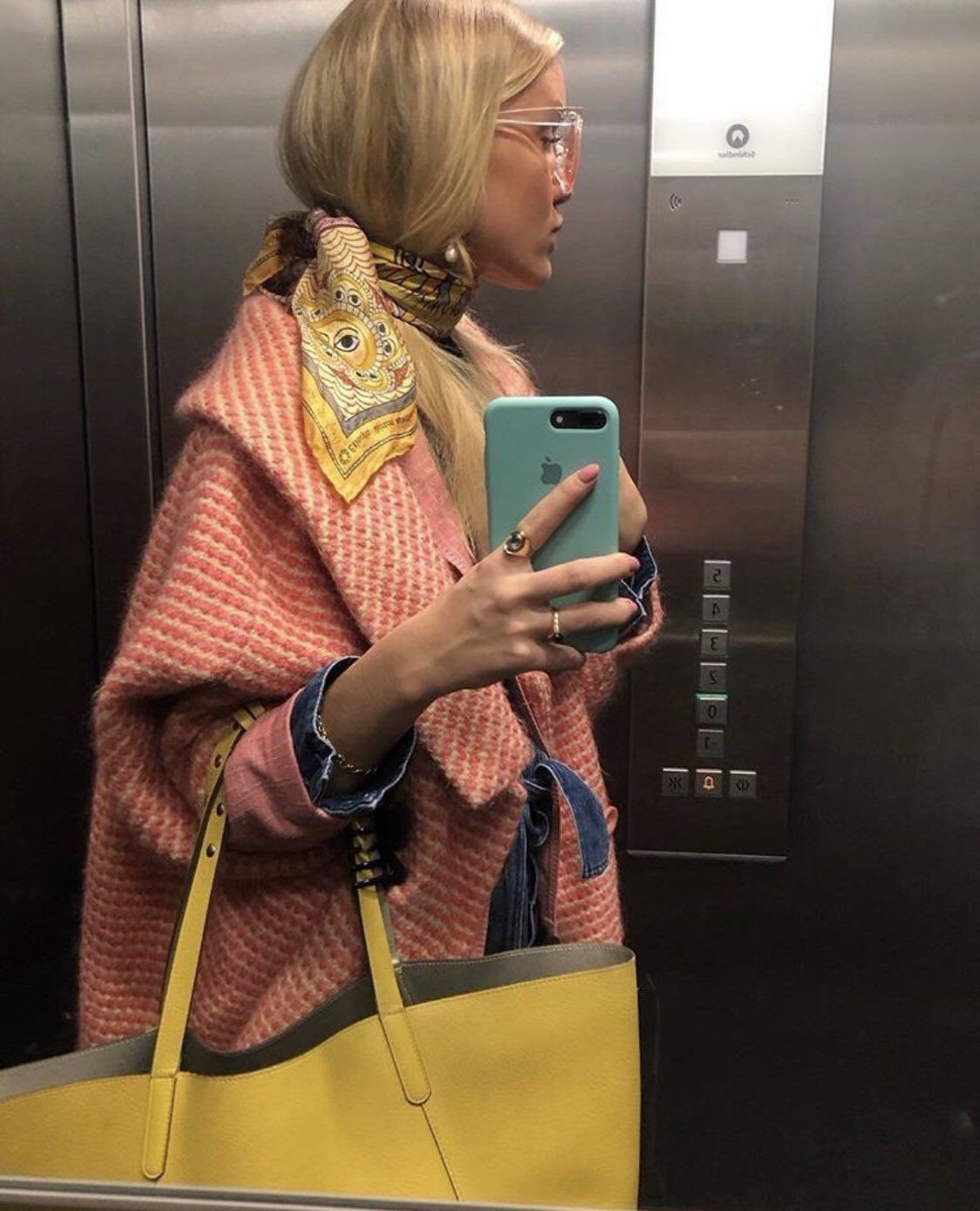
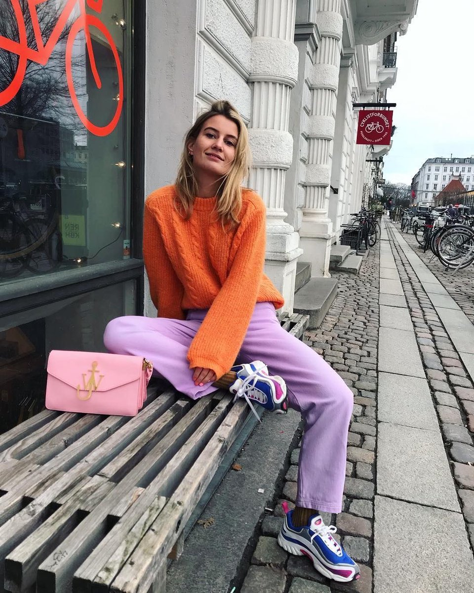
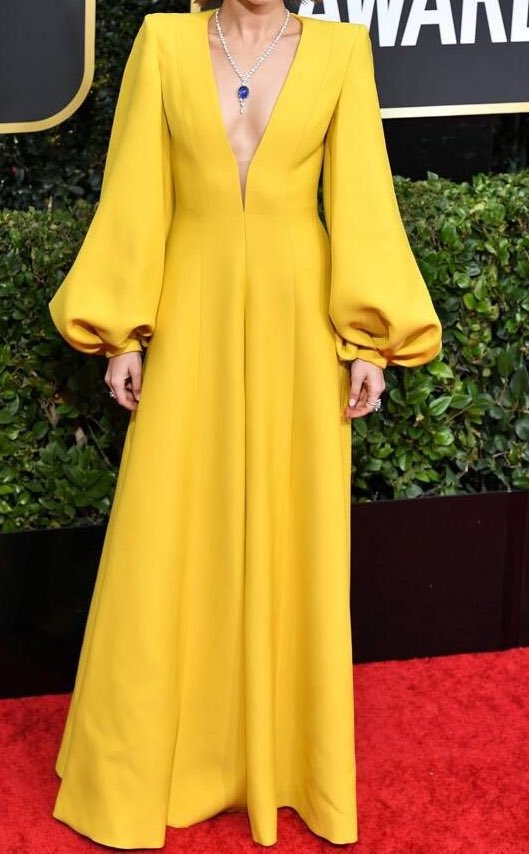
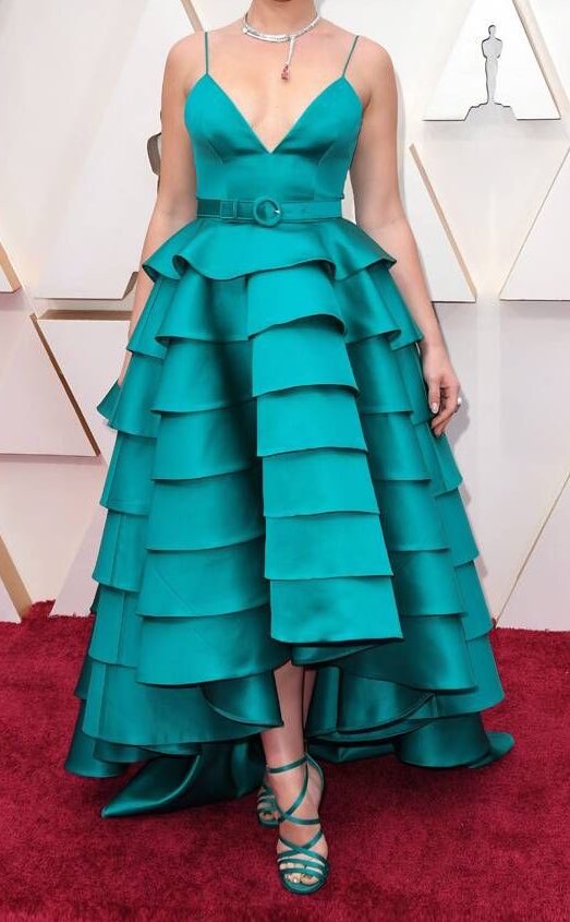
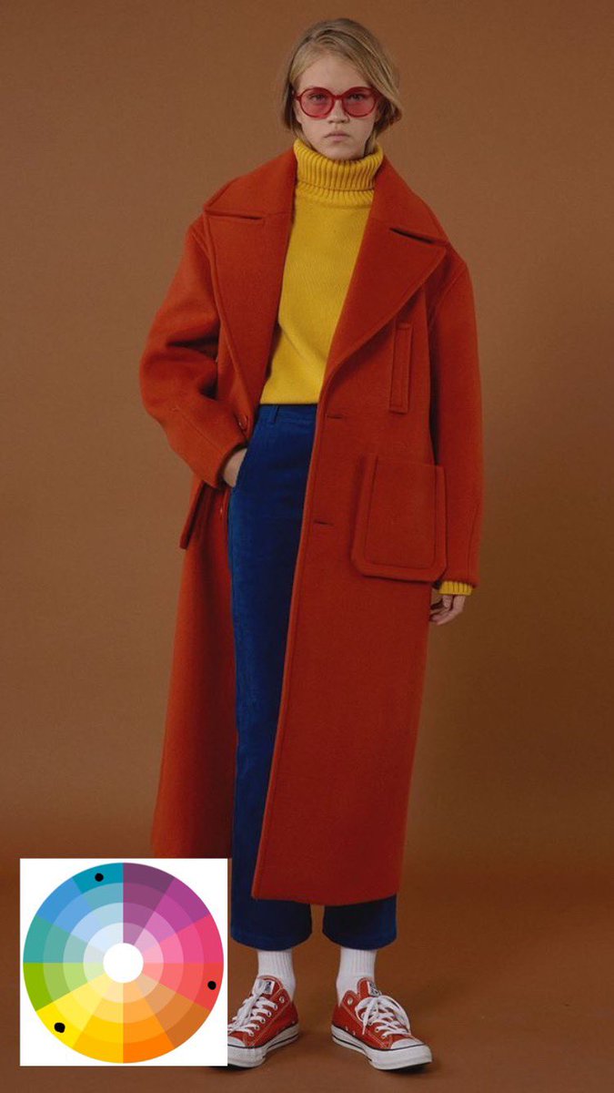
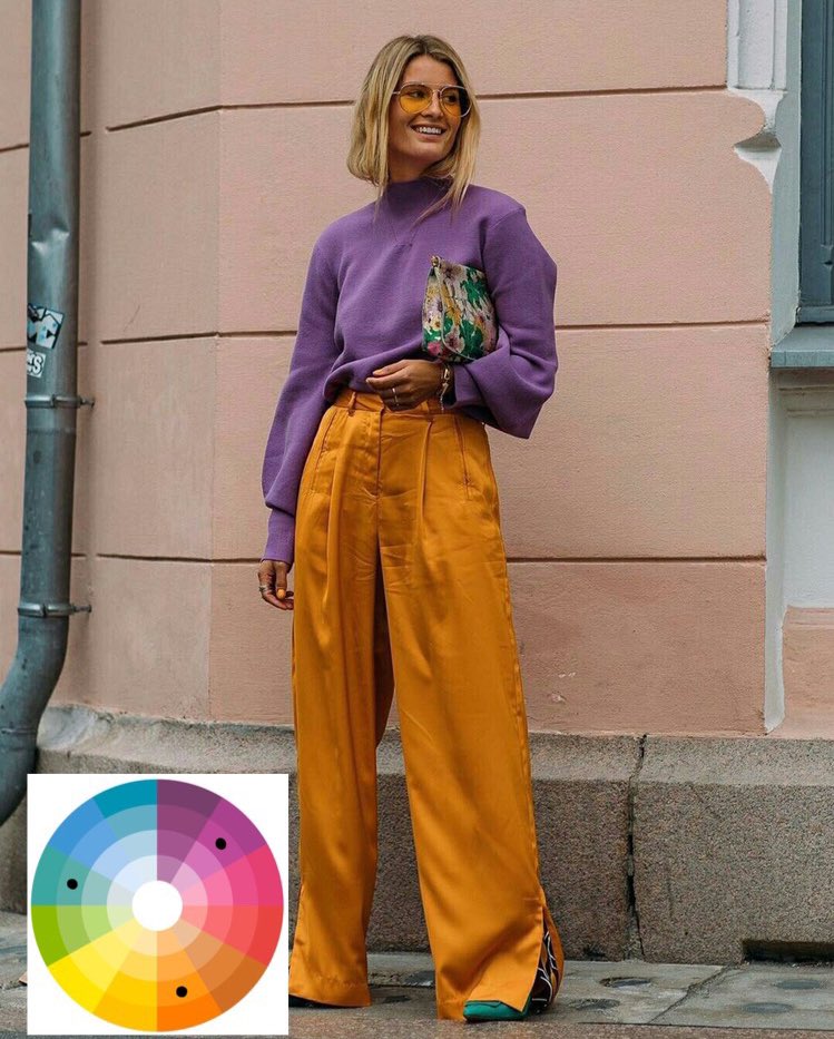
for all of you who want to incorporate more colors in their outfits, i bring you: color theory 101—a thread
2020 has been all about colors, at least before corona made us all hide in our homes. Since the beginning of the year celebrities walked down the red carpet with dresses in bright colors, even if it was still winter.
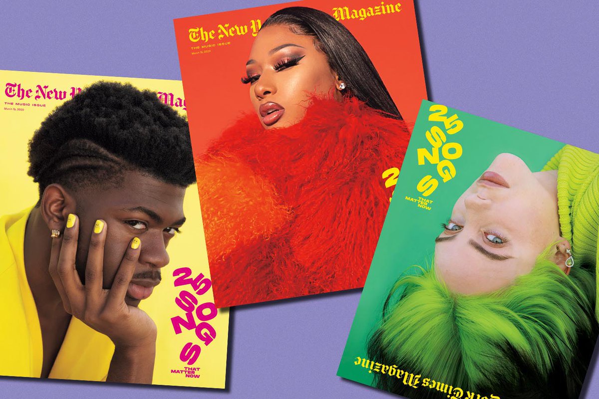
Magazines have been exploring their colors in their different issues, in their covers or fashion editorials, giving uf bright and bold colors that caught our attention
Even the music industry has their eyes on the color wheel. j balvin with his album colores and lady gaga with her future to drop -not so soon- algum chromatica .
with the comeback of 70’s, 90’s and 00’s styles, colors are one more time in the scene, specially thanks to celebrities like Dua Lipa who can’t seem to hold themselves from exploring different color combos.
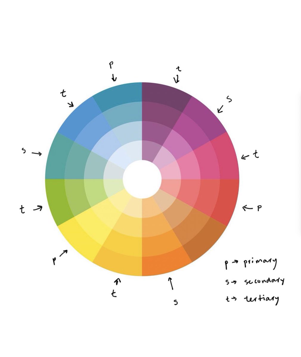
But how exactly do they do that? meet your new best friend, the color wheel, made by primary, secondary and tertiary colors.
there are three main concepts:
hue: the name of the color. is it red? green? blue?
brightness: describes how light or dark it is. basically, how much white or black is mixed
saturation: talks about intensity or paleness, in other words it is how much grey a color has
hue: the name of the color. is it red? green? blue?
brightness: describes how light or dark it is. basically, how much white or black is mixed
saturation: talks about intensity or paleness, in other words it is how much grey a color has
by balancing the interactions between these three concepts you’ll be able to combine colors and harmonize them, getting your outfit popping
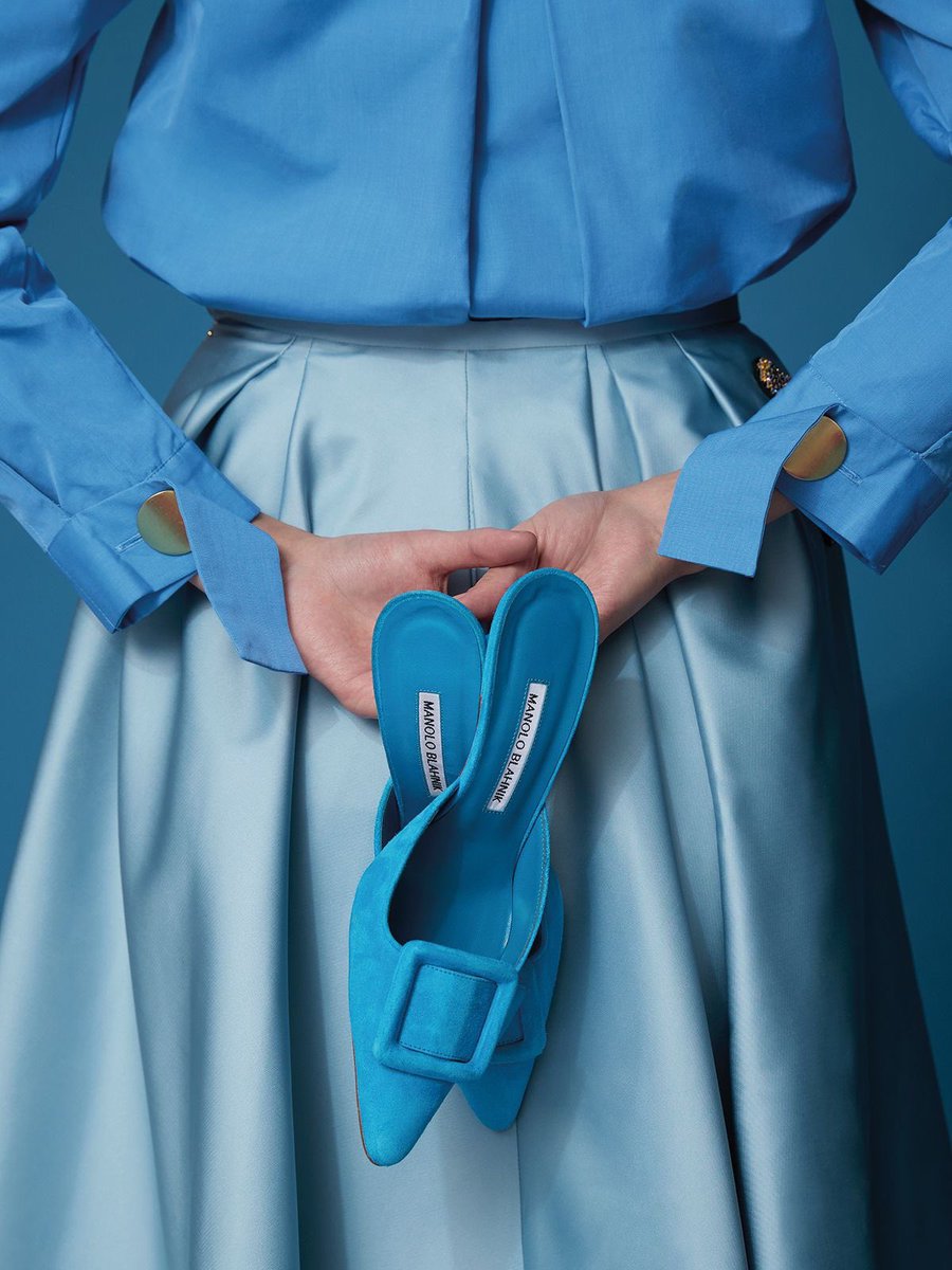
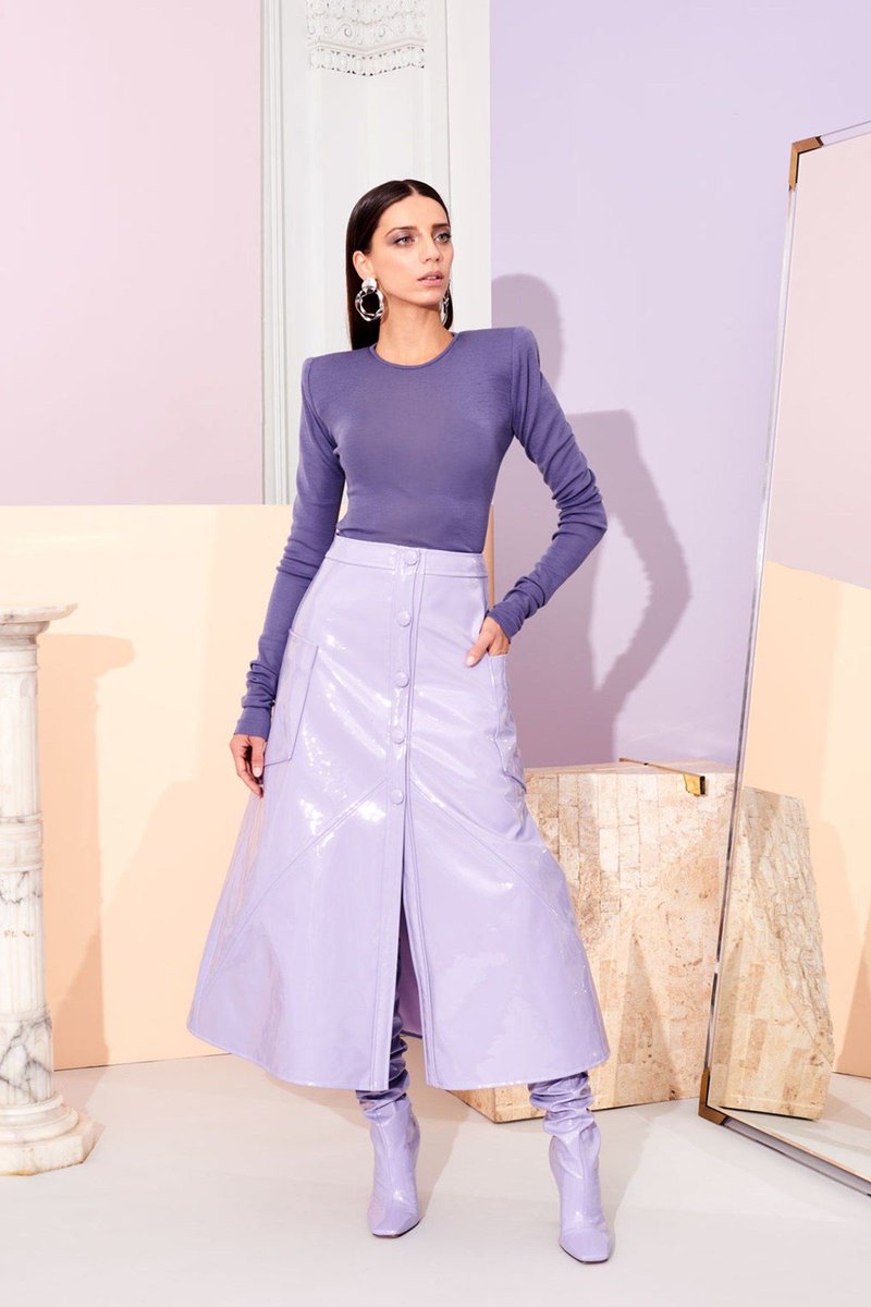
for the basics: a monochromatic look. the scheme takes a color and plays with different variations of the same hue but different levels of brightness. it’s minimalistic, sober and very simple to harmonize because of the uniformity of the scheme.
the analogous scheme: combine neighbor colors that are consecutive to one another in the color wheel. it’s a design based in gradual variations, very balanced and harmonic, yet predictable.
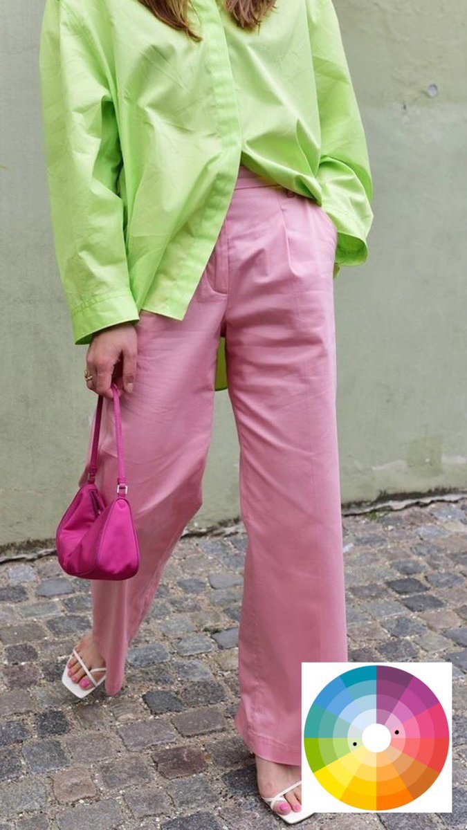
now, imagine taking an analogous scheme of three colors and then ignoring the intermediate hue, you get an ‘alternate analogous’ dyad. a common example is orange + pink, ignoring the red
lastly, you can always go for a full warm or cold colors. while warm colors are associated with comfort and effusion cold ones evoke freshness and distance
now, color blocking is really more about a strong contrast between colors, specially if their hues are far from one another. so héroe come the wildest color combos
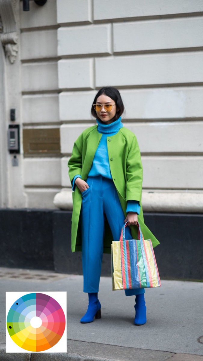
our first go to would be complementary colors. it consists in combining two opposite colors from the color wheel, which results in an intense and vibrant interaction with a very high impact
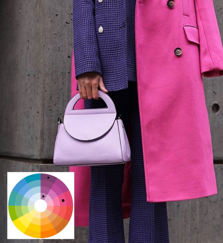
A triadic uses colors that are even spaced through the color wheel, so none of these colors share the same hue. Think about it as an imaginary equidistant triangle, this is exactly what helps the harmony to come to life.
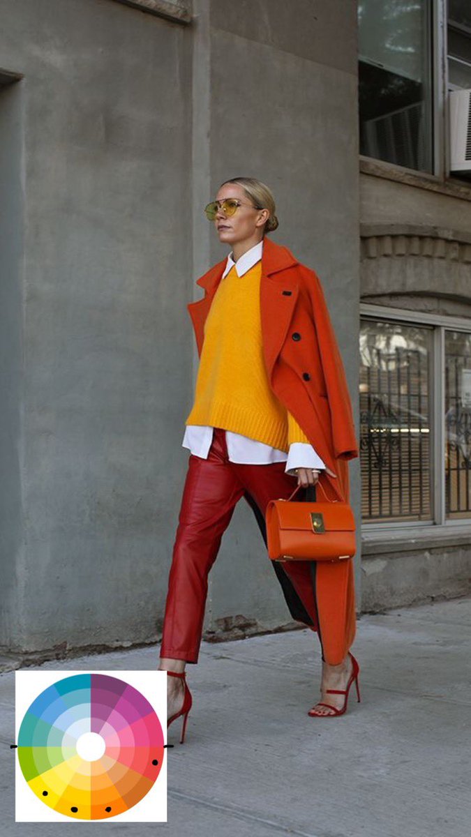
A complementary tetradic combines four colors: it starts on ‘alternate analogous’ dyad, but includes their complementaries. This gives a multicolor, diverse and vibrant design, but way more complicated than other schemes that’s why it isn’t used that much
lastly, i really want to mention how proportions are the key to success. each color has a & #39;limit& #39; on what is actually harmonizing to the eye and what is not, so be careful. [i could talk about this later if you want xx]
also this is just theory! but what it is more about is having fun exploring the diversity of our color wheel so don& #39;t be afraid to try! hope this helps you out and you dare to add more color to your outfits ♡

 Read on Twitter
