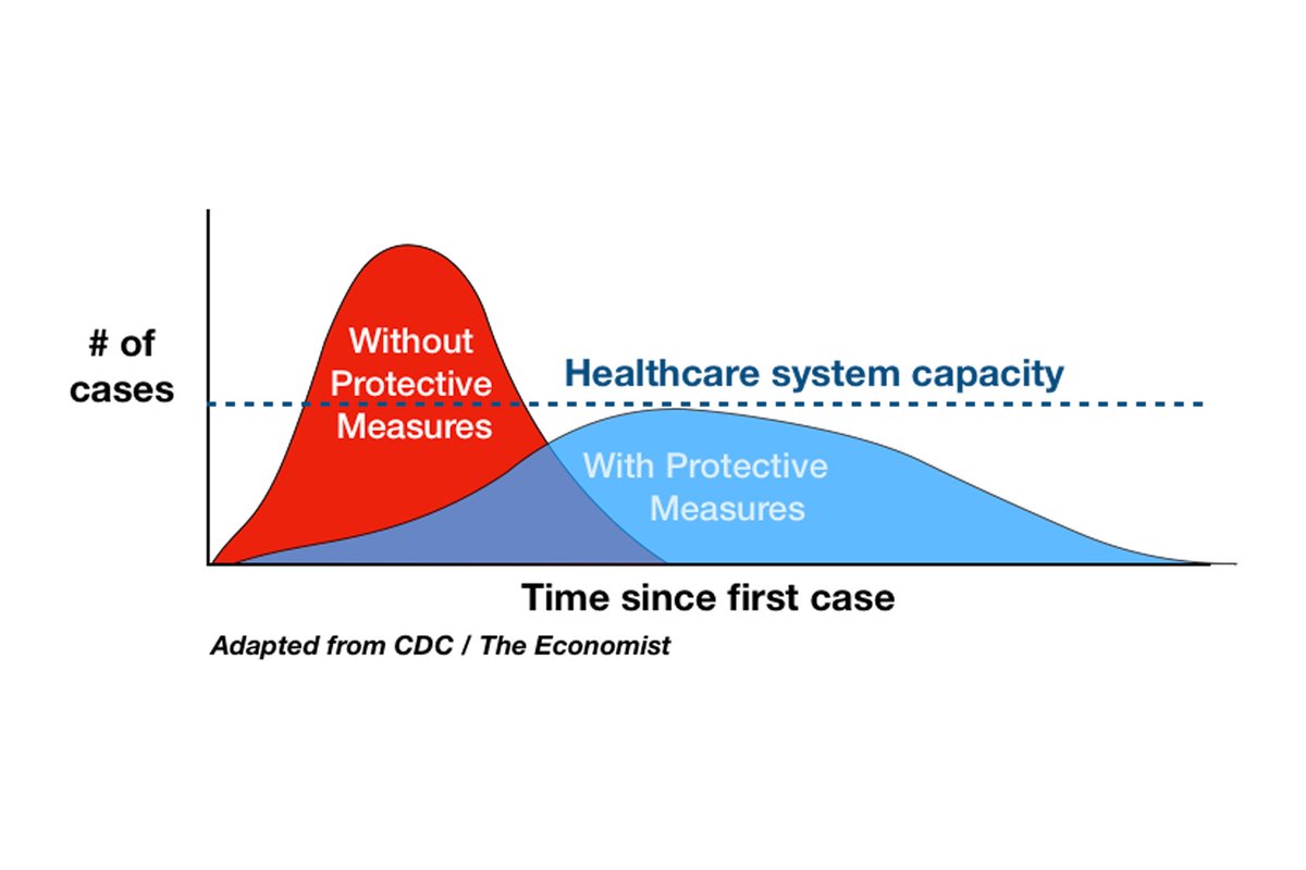
I am starting to think I have misunderstood this chart. This is the flatten the curve chart from the NY Times and the CDC that has largely been the justification for quarantine measures and still appears on nearly every public information site about COVID19
Perhaps my eye is bad, but the area under the blue curve has always looked at least as large as the area under the red curve, meaning that the explicit objective was NOT to reduce total cases but to spread them over time to prevent overwhelming the medical system.
Now, though, people are arguing against even partially lifting lockdowns because the number of cases might rise again. Almost certainly this is true, but does this represent a new understanding of the disease and our protective measures different from "flatten the curve"?
It appears that in almost every location, with the exception of a handful of hospitals, we have successfully kept the curve well below total hospital capacity. So doesn& #39;t that mean by our entry criteria into these protection measures that its time to loosen such measures?
Is there every going to be a time of any reasonable duration that lifting the lockdowns does NOT lead to a bump in cases? If flatten the curve is not the metric we are using any more to make policy, what is the new metric?

 Read on Twitter


