Michael Baum in the spectator argues that it& #39;s foolish to compare countries. I couldn& #39;t disagree more. This thread examines why. https://www.spectator.co.uk/article/the-foolishness-of-comparing-different-countries-coronavirus-outcomes">https://www.spectator.co.uk/article/t...
Understanding the math of exponential growth is key. In this context - from minute 7 is key. The graphic shows how with even a minimal interaction between each country - in the end they all get infected. https://www.youtube.com/watch?v=Kas0tIxDvrg">https://www.youtube.com/watch...
This applies across countries, within countries and even at a local community level. Even within a single college/university some will get it earlier than others as this demonstrates: https://twitter.com/NAChristakis/status/1235566497591742464?s=20">https://twitter.com/NAChrista...
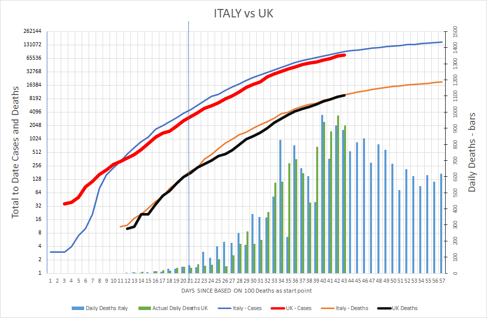
I instinctively got this when I first wondering where we in the UK were headed. So I looked at Italy vs the UK. Aligning the numbers from 100 deaths and using a log axis to focus on growth showed that we were running around 14 days behind. A crystal ball and a #mediamiss
In this thread I had a look at what happens if you compare the UK to Europe on a similar basis. What did it show? The same trends. https://twitter.com/BottoMatt/status/1249481983232823297?s=20">https://twitter.com/BottoMatt...
There was one Big EU company bucking the trend - Germany and there was a lot of noise in the press out there. I explored that in this thread - similar trends initially but they then diverged - a bit of investigation gave a clear possible reason as to why https://twitter.com/BottoMatt/status/1249388813086076929?s=20">https://twitter.com/BottoMatt...
Just in case you didn& #39;t follow the earlier thread. This thread explains why the lines of Germany and Italy start to flatten sooner than us. https://twitter.com/BottoMatt/status/1249389173620060166?s=20">https://twitter.com/BottoMatt...
Cause to celebrate in Germany and Ireland? Not necessarily as I touch on here. https://twitter.com/BottoMatt/status/1249581745344786432?s=20">https://twitter.com/BottoMatt...
What about South Korea? I covered this within an earlier attempt at using Twitter threads https://twitter.com/BottoMatt/status/1249588550494031872?s=20">https://twitter.com/BottoMatt...
So overall comparing numbers both across and within countries is an essential part of our toolkit to tackle the spread of this virus. We need to be smart about how we do it, we actually need to look for variances and to understand why these occur when in theory they shouldn& #39;t.
As an example taken if you are armed with this knowledge and the date on age of death profile - perhaps we can expect to see a lower death rate than we fear in developing countries where life expectancy is below 60. https://twitter.com/BottoMatt/status/1250003100829724672?s=20">https://twitter.com/BottoMatt... #all-charts-preview">https://ourworldindata.org/life-expectancy #all-charts-preview">https://ourworldindata.org/life-expe...

 Read on Twitter


