THREAD. Graphs tell a story that readers must grasp quickly, whatever their knowledge of the topic and taste for figures, while remaining true to the facts. As with any story, data visualization requires a lot of editing to clarify the point. https://synaps.network/post/lebanon-finance-economy-ponzi-bankrupt">https://synaps.network/post/leba...
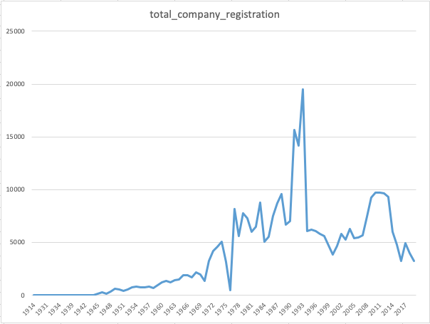
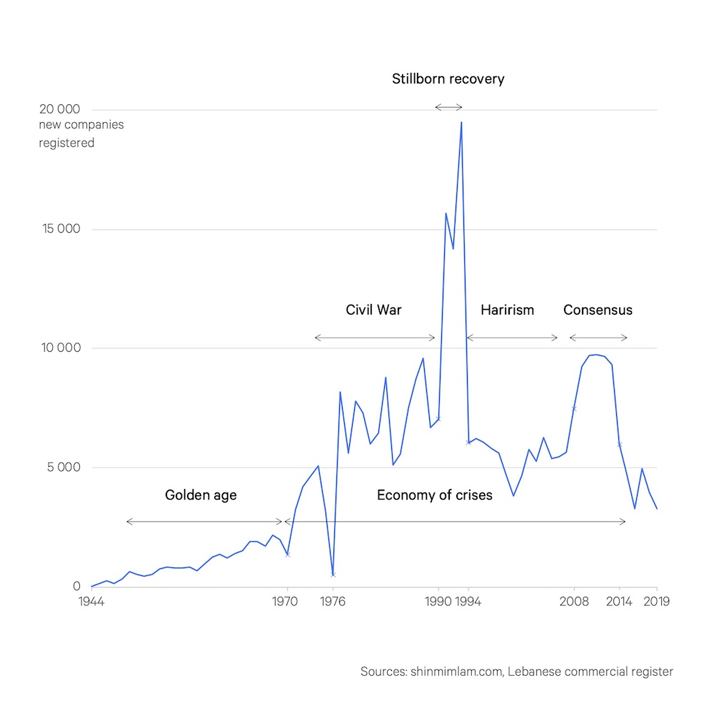
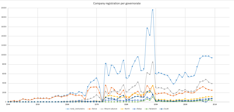
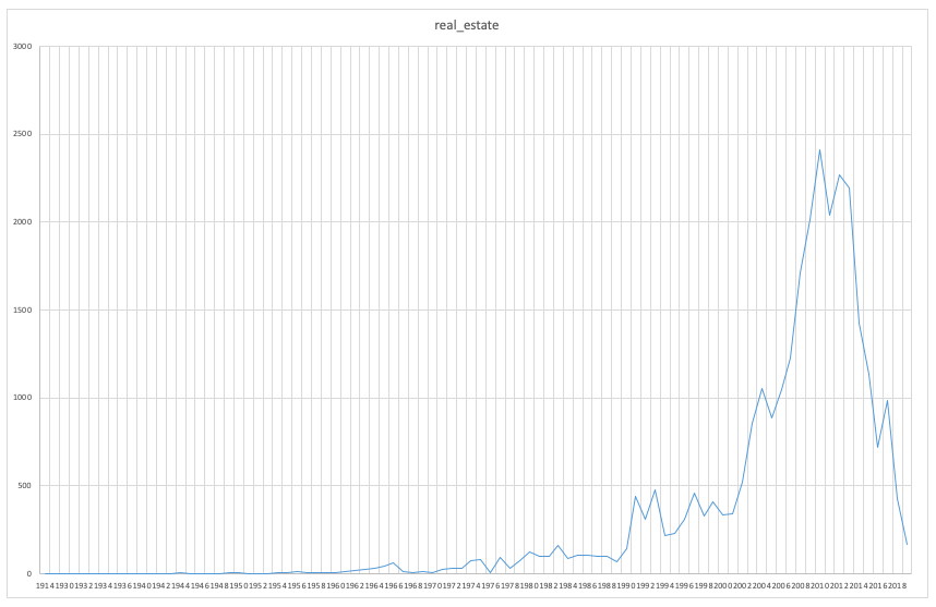
1/ For the yearly registration of companies, Excel’s default line graph works well as it displays important trends. Editing aims mostly to declutter the image–trimming dates, gridlines, scales–and add labels to bring out the message.
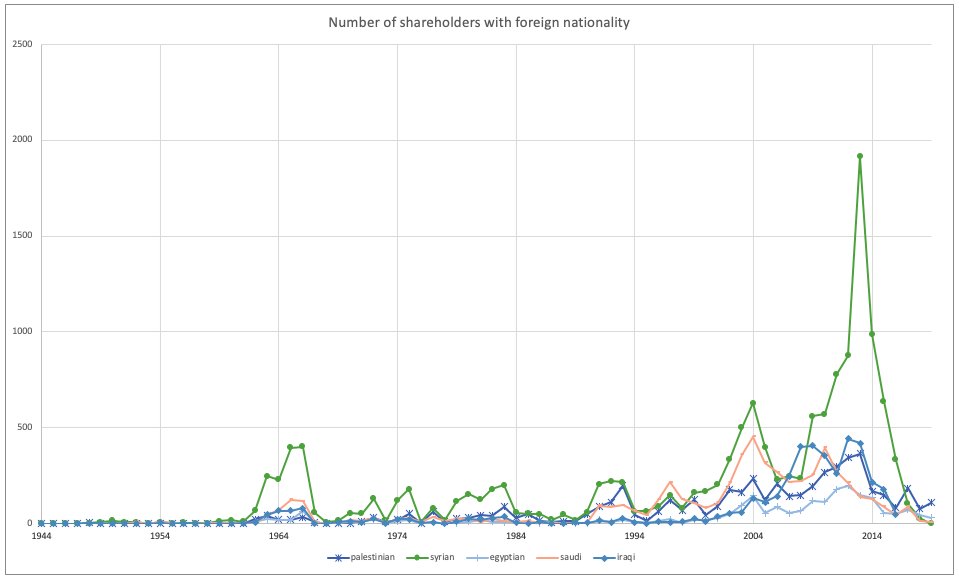
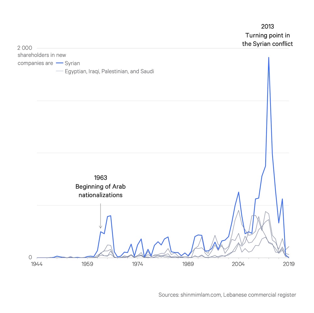
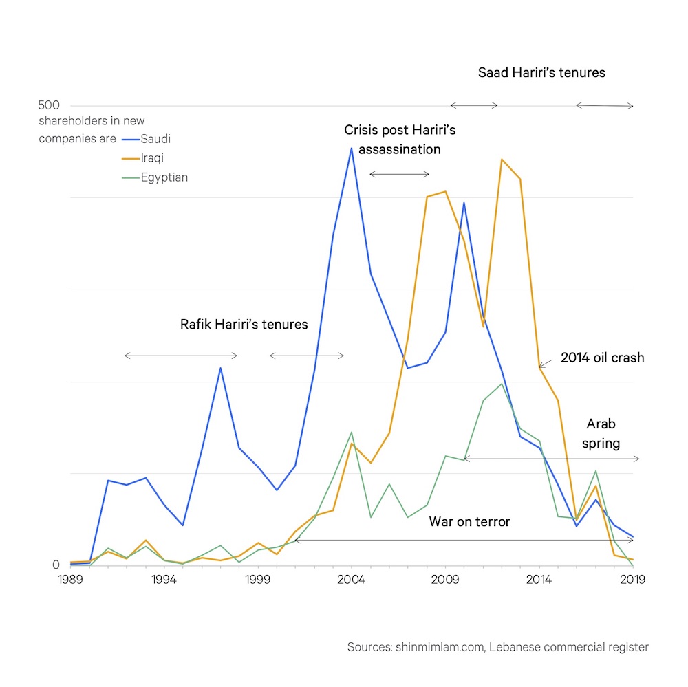
2/ Line graphs quickly reveal their limits with multiple sets of data. On Arab shareholders, the post-2011 contribution of Syrians becomes clearer when other categories are deemphasized, while the nuances of Saudi, Iraqi or Egyptian investments require a zoom in.
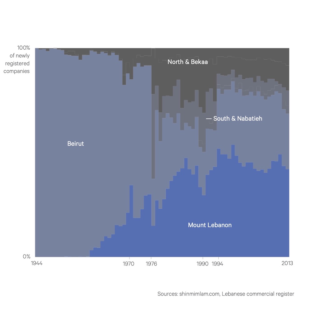
3/ With this graph on governorates, proportions are key, thus the 100% stacked columns that bring into focus regional trends, subsumed under similar geographies (North & Bekaa, South & Nabatiyeh). Less information helps emphasize the analysis.
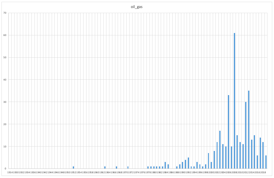
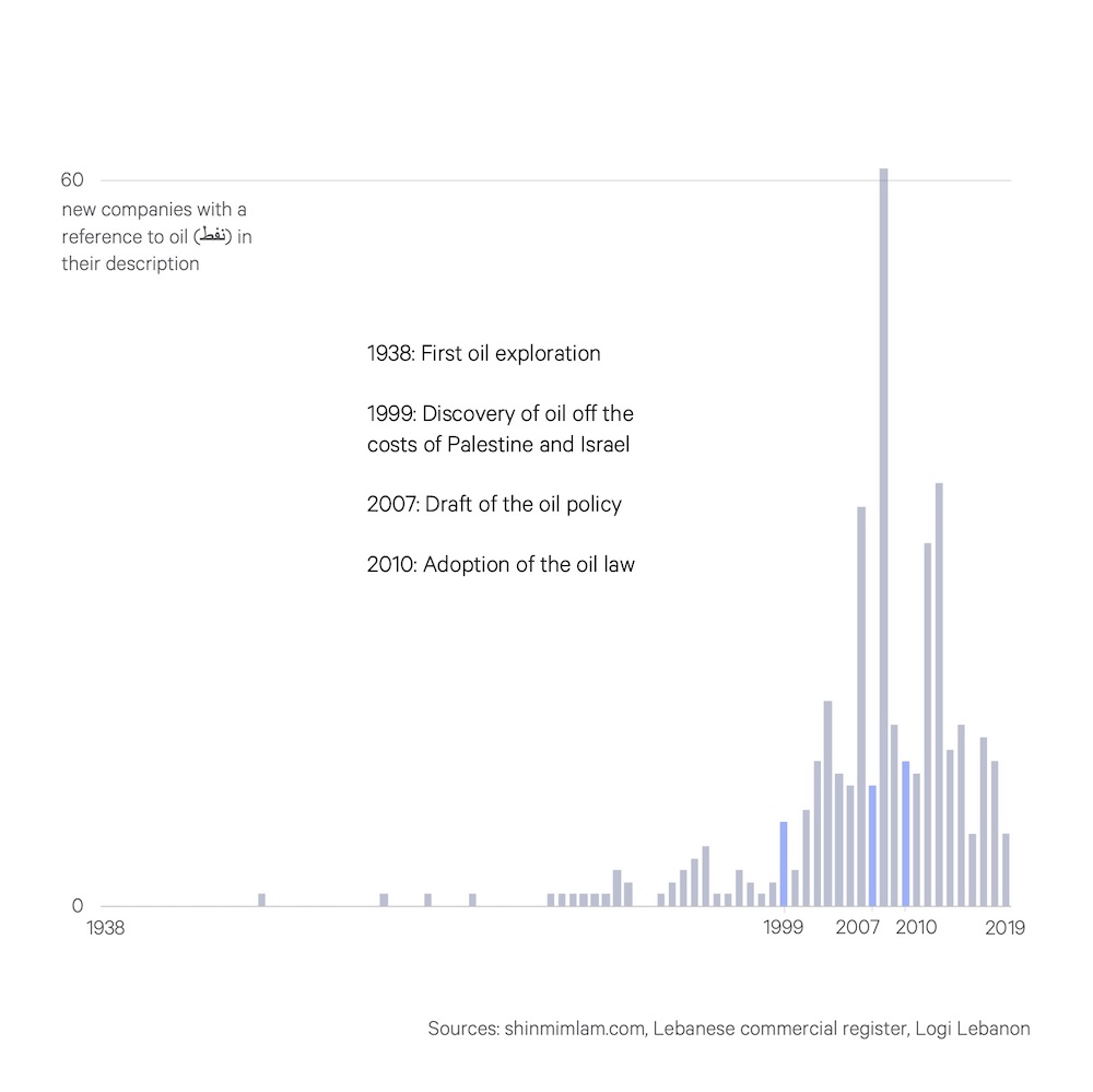
4/ A bar chart is another classic, which here illuminates the trend in the oil and gas industry. Editing not only declutters but highlights the years most important to capture a problematic timeline, as most companies emerged prior to the framework that should regulate them.
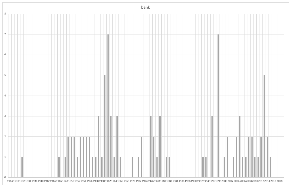
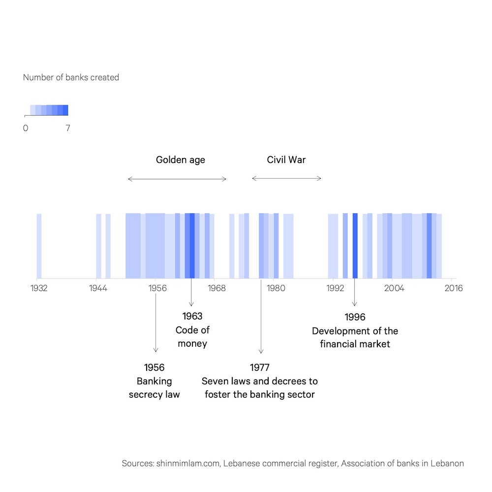
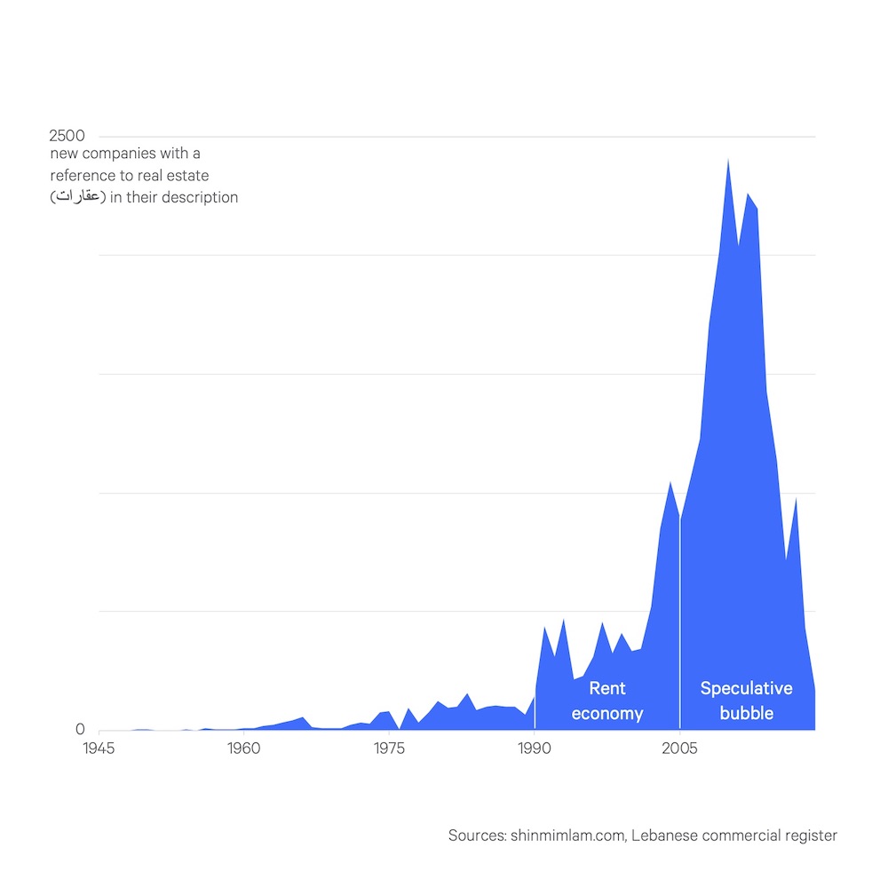
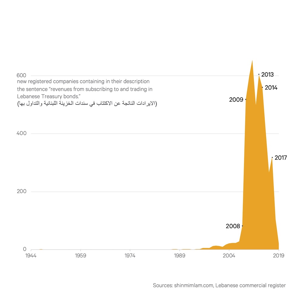
5/ Applied to bank registration, a bar chart produces a weak effect. The important information is less the number created per year than the delimitation of certain periods. A simplified spectrogram separates phases and conveys their intensity.

 Read on Twitter