This is figure is from a paper just submitted to CMAJ, but I think it& #39;s important for people to see this.
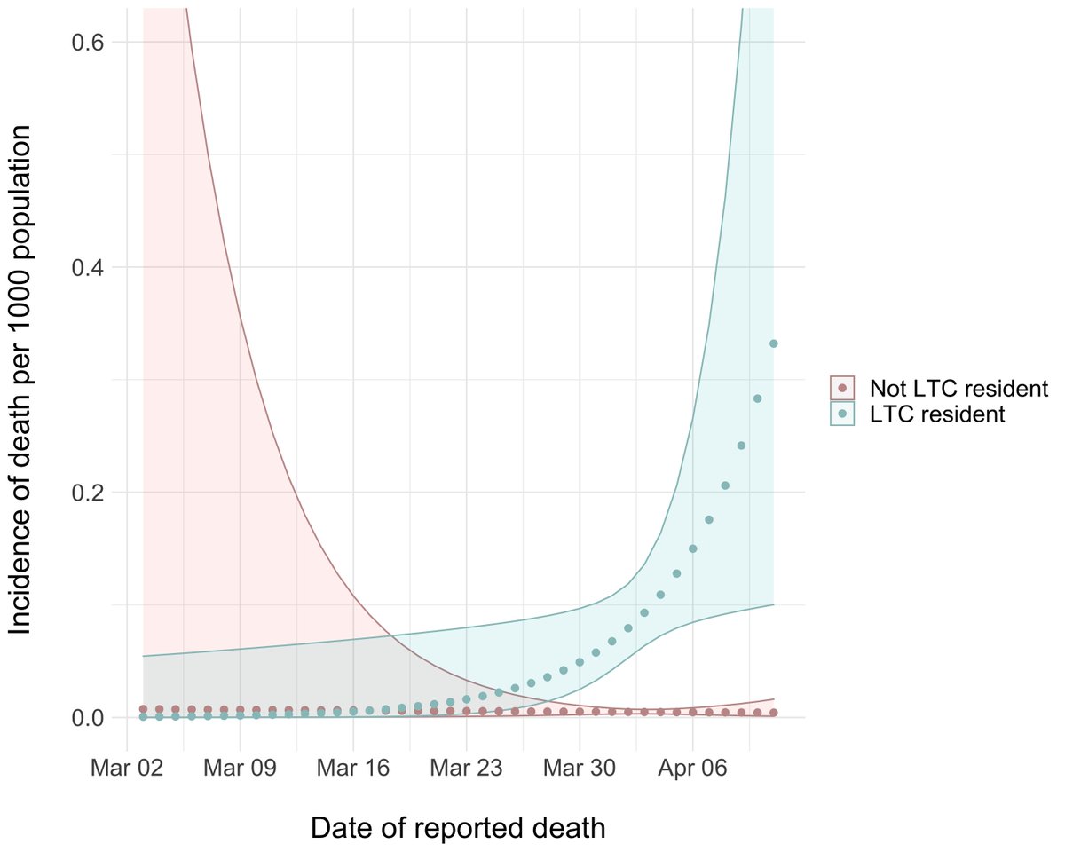
The green curve is incidence of death in LTC by date in Ontario, the pink is death in community living elderly (age > 69). Shaded areas are confidence imits.
The green curve is incidence of death in LTC by date in Ontario, the pink is death in community living elderly (age > 69). Shaded areas are confidence imits.
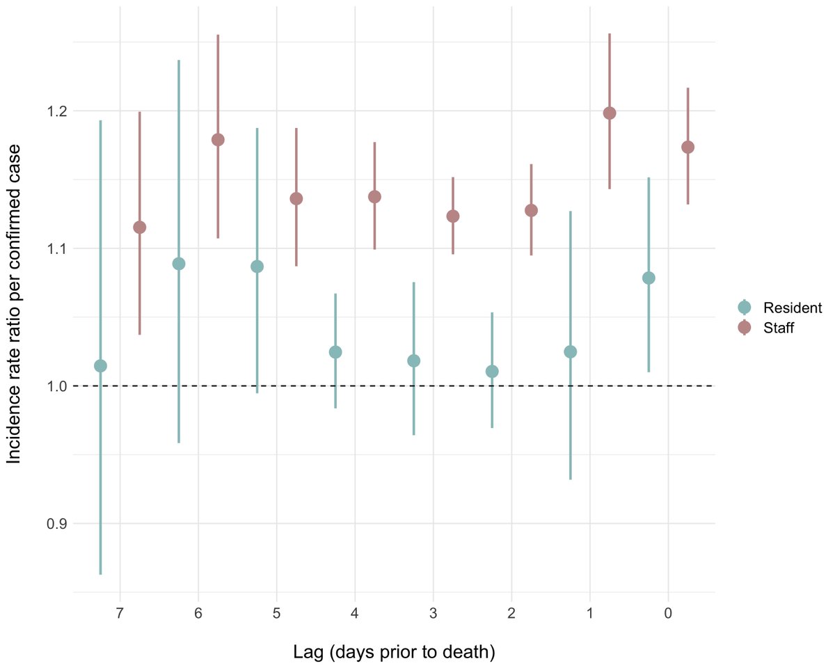
That& #39;s relative risk of resident death as a function of infections in residents (green) or staff (red), at lags of 0-7 days. You can see that infected staff are predictive of resident deaths...infected residents aren& #39;t.
This is indirect evidence that we need to focus on staff (testing, PPE, assignment to a single facility) to protect these vulnerable residents.
@jkwan_md @katecallen @AshTuite @BogochIsaac @LapointeShaw @janinemccready
@jkwan_md @katecallen @AshTuite @BogochIsaac @LapointeShaw @janinemccready

 Read on Twitter


