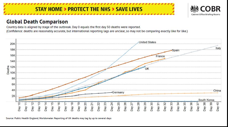
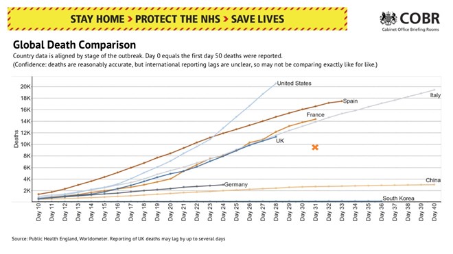
Govt briefing just included a graph of global deaths, showing UK line below France.
But @HSJnews says the graph is misleading, as Patrick Vallance had said graph included only hospital deaths. In fact French figs include care home deaths, so UK line is really higher than France.
But @HSJnews says the graph is misleading, as Patrick Vallance had said graph included only hospital deaths. In fact French figs include care home deaths, so UK line is really higher than France.
https://www.hsj.co.uk/coronavirus/government-has-misled-public-over-uk-deaths-being-lower-than-france/7027404.article?utm_source=t.co&utm_medium=Social&utm_campaign=newsfeed">https://www.hsj.co.uk/coronavir...
International data is very difficult, lots of different methodologies and time lags and so on. But of course important than insofar as possible, if these things are put into public domain and be informative, we need to be sure we’re comparing like with like.
Otherwise, if the difficulties in comparing countries is that difficult, something said a lot at the briefing podiums and majored on in answers to my colleagues& #39; questions about these issues this afternoon, perhaps govt should stop producing graphs which do so.

 Read on Twitter


