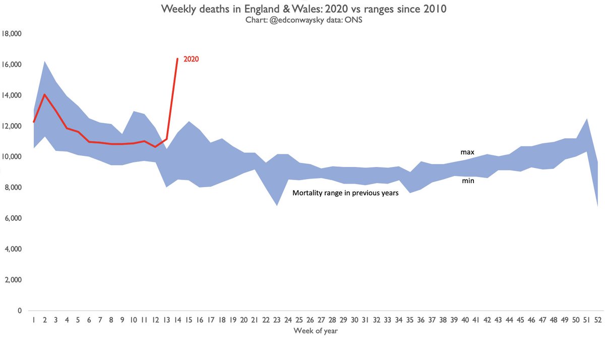
Here is the story of today& #39;s @ONS mortality statistics in a single chart. The worst week for UK mortality (all causes) since records began.
The blue area shows the minimum and maximum mortality each week since 2010.
The red line shows you this year so far.
The blue area shows the minimum and maximum mortality each week since 2010.
The red line shows you this year so far.
Incidentally in this case I DO mean it when I say UK rather than England & Wales. Having examined N Ireland and Scotland weekly death rates too it’s clear we are far, far above the average for mortality

 Read on Twitter


