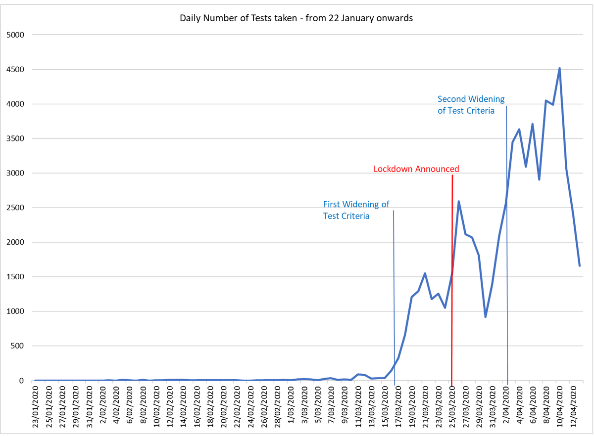
Late last week the Ministry of Health finally released the full daily Covid 19 test data. If shows the number of tests processed daily for the first month a half averaged 6.5 tests per day. We didn& #39;t exceed 100 tests in a single day until 15 March. #COVID19nz
I say finally because a friend of mine OIA& #39;d the Ministry and was initially fobbed off until May, before an appeal to the Ombudsman resulted in partial data and then the full data being released. I& #39;m pleased to see as of Thursday the full data is up on the MOH website.
This second graph shows the close correlation between the number of Covid 19 cases in New Zealand and the number of tests. It raises a question about the nature of NZ& #39;s observed "curve" and its assumed exponential nature.
If the test availability had remained constant throughout the period we could say that the amount of testing increased with the prevalence of the disease. However the testing criteria changed twice, on March 15 and 31, and both changes led to a rapid increase in tests taken.
On top of that we had other changes that made tests easier to access, including the introduction of drive-in testing centres.
What then if New Zealand& #39;s observed curve is more the result of increased testing rather than increased transmission? That would suggest we had more cases earlier than we thought, and a flatter curve.
Interesting to see David Skeggs today calling again for more testing - including surveillance testing of communities like Queenstown in order to get a better picture. I agree.

 Read on Twitter


