NEW: Mon 13 April update of coronavirus trajectories
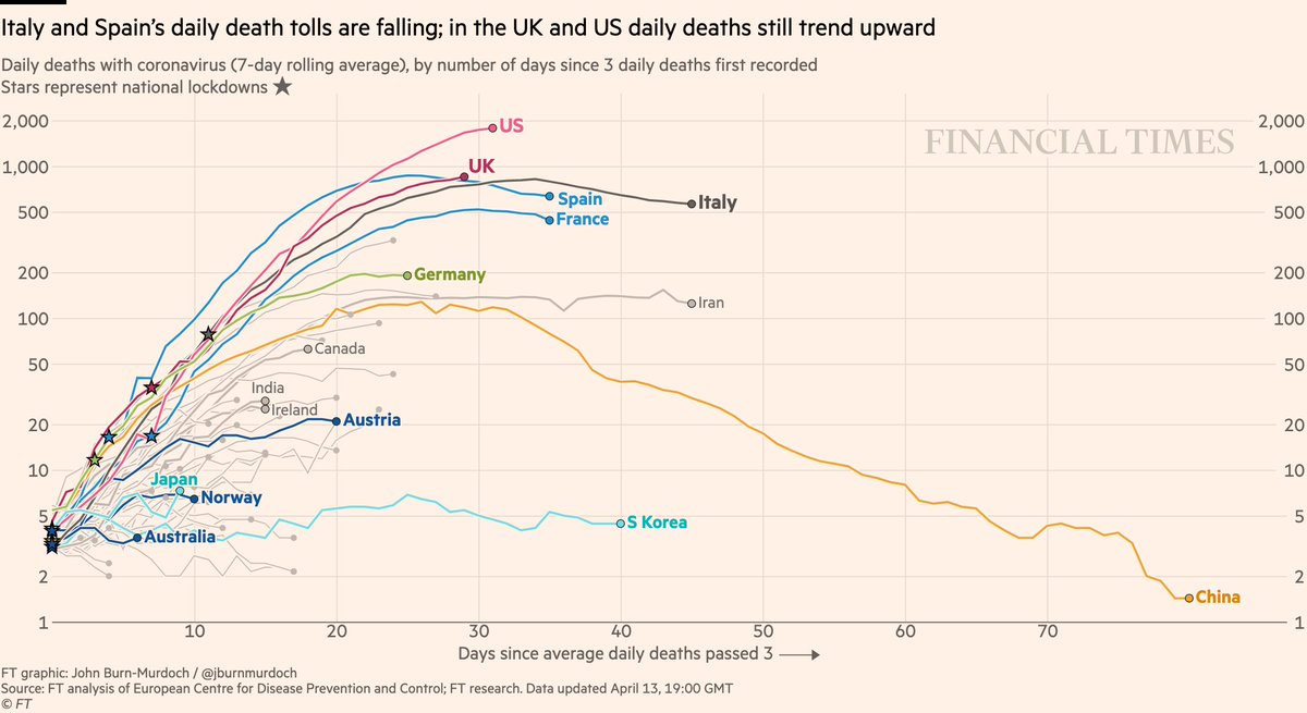
Daily deaths:
• US & UK still trending up, though the peak could be in sight for both
• Success stories in dark blue: Australia, Norway, Austria locked down early => gentle slopes
Live charts: http://ft.com/coronavirus-latest">https://ft.com/coronavir...
Daily deaths:
• US & UK still trending up, though the peak could be in sight for both
• Success stories in dark blue: Australia, Norway, Austria locked down early => gentle slopes
Live charts: http://ft.com/coronavirus-latest">https://ft.com/coronavir...
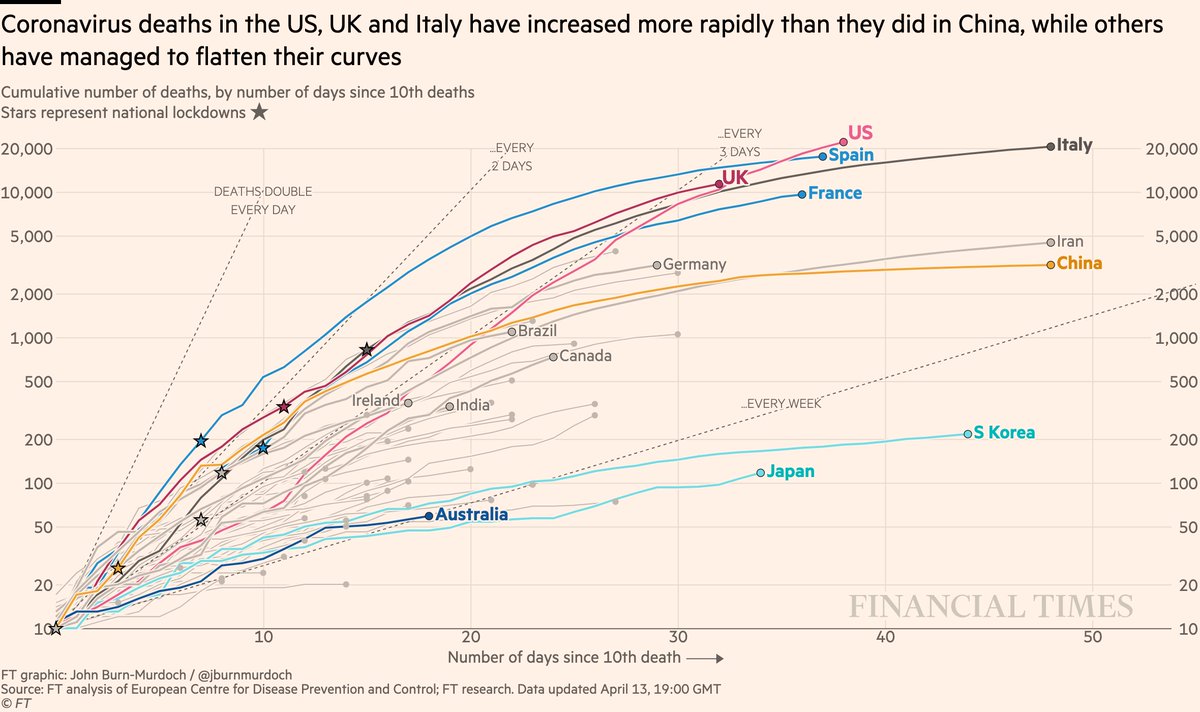
Now cumulative deaths:
• US death toll highest worldwide and still rising steeply https://abs.twimg.com/emoji/v2/... draggable="false" alt="📈" title="Chart with upwards trend" aria-label="Emoji: Chart with upwards trend">
• UK curve still matching Italy’s, but death toll could end up higher
• Australia still looking promising
All charts: http://ft.com/coronavirus-latest">https://ft.com/coronavir...
• US death toll highest worldwide and still rising steeply
• UK curve still matching Italy’s, but death toll could end up higher
• Australia still looking promising
All charts: http://ft.com/coronavirus-latest">https://ft.com/coronavir...
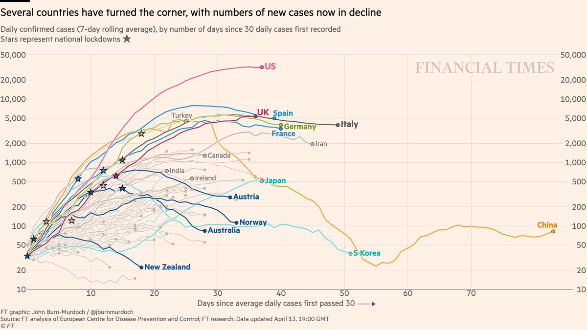
Now daily new cases:
• Signs still point toward new infections in US & UK peaking
• New cases falling in four countries that acted early: New Zealand, Australia, Norway, Australia
All charts: http://ft.com/coronavirus-latest">https://ft.com/coronavir...
• Signs still point toward new infections in US & UK peaking
• New cases falling in four countries that acted early: New Zealand, Australia, Norway, Australia
All charts: http://ft.com/coronavirus-latest">https://ft.com/coronavir...
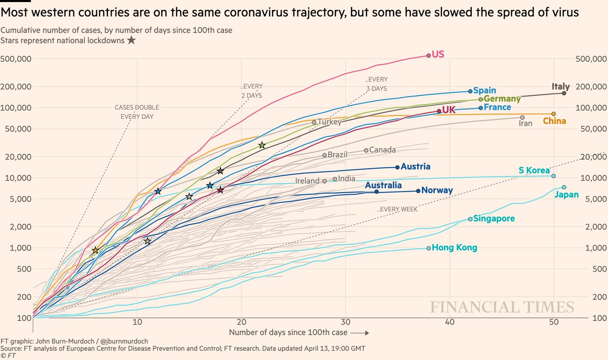
Cases in cumulative form:
• US approaching 600k confirmed cases
• Turkey still battling one of the world’s most severe outbreaks
• Curves flattened early in Austria, Australia, Norway
All charts: http://ft.com/coronavirus-latest">https://ft.com/coronavir...
• US approaching 600k confirmed cases
• Turkey still battling one of the world’s most severe outbreaks
• Curves flattened early in Austria, Australia, Norway
All charts: http://ft.com/coronavirus-latest">https://ft.com/coronavir...
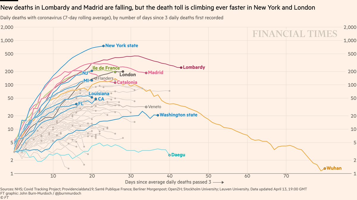
Now subnational region daily deaths:
• Early signs that NY daily deaths may be peaking, but need to wait and see
• Same in London, though Easter weekend reporting is having a big downward effect on UK numbers
All charts: http://ft.com/coronavirus-latest">https://ft.com/coronavir...
• Early signs that NY daily deaths may be peaking, but need to wait and see
• Same in London, though Easter weekend reporting is having a big downward effect on UK numbers
All charts: http://ft.com/coronavirus-latest">https://ft.com/coronavir...
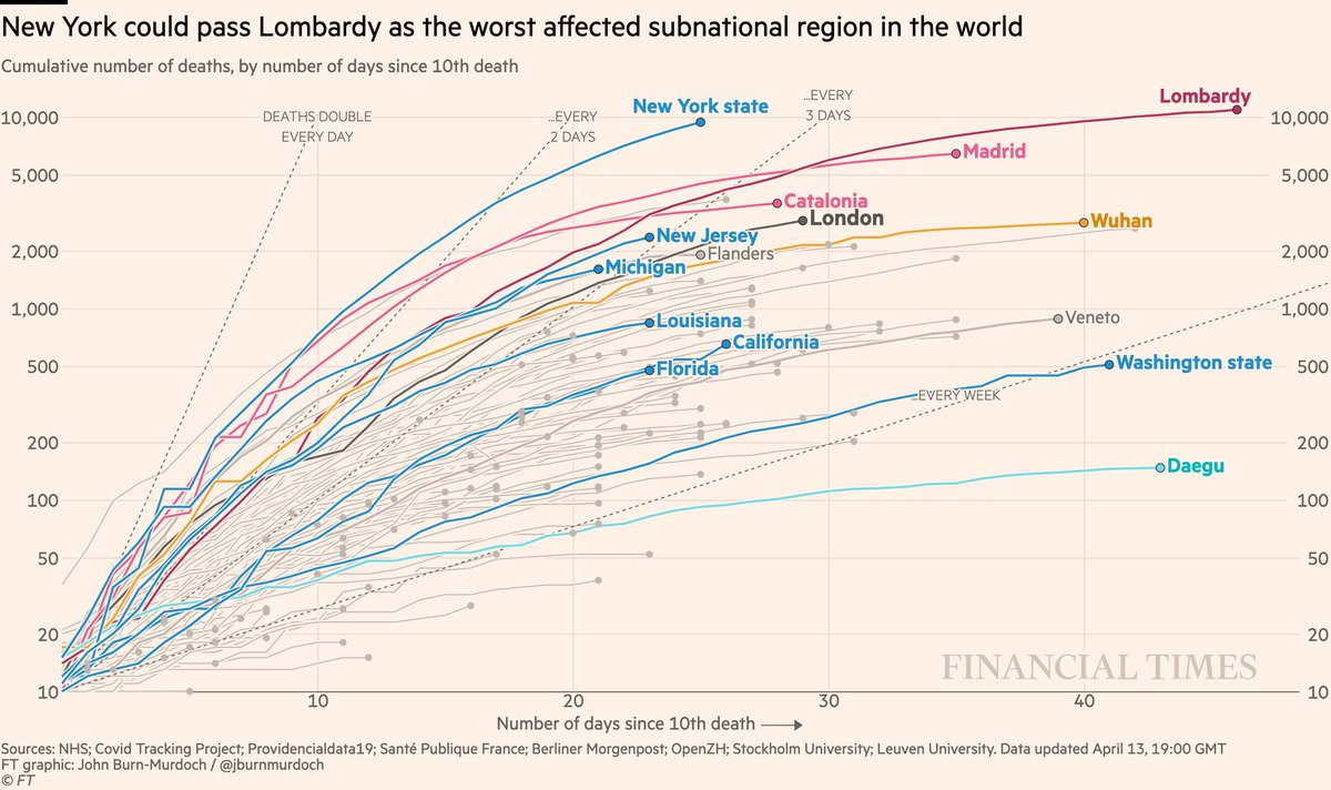
Subnational death tolls cumulatively:
• NY death toll still tragically rising faster than any other region at this stage of its outbreak. Has passed 10,000 deaths; likely to pass Lombardy within days
All charts: http://ft.com/coronavirus-latest">https://ft.com/coronavir...
• NY death toll still tragically rising faster than any other region at this stage of its outbreak. Has passed 10,000 deaths; likely to pass Lombardy within days
All charts: http://ft.com/coronavirus-latest">https://ft.com/coronavir...
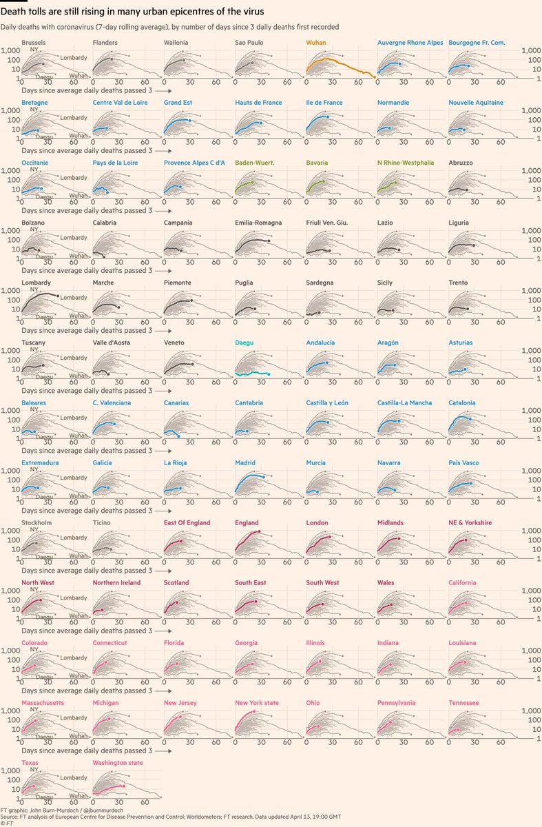
Small multiples of daily deaths in subnational regions, grouped by country
• Sao Paulo death toll rising
• Daily deaths may have peaked in Paris
• Tennessee added, now 17 US states
• Sicily, Sardinia, Balearics all low curves: do islands fare better?
• Sao Paulo death toll rising
• Daily deaths may have peaked in Paris
• Tennessee added, now 17 US states
• Sicily, Sardinia, Balearics all low curves: do islands fare better?
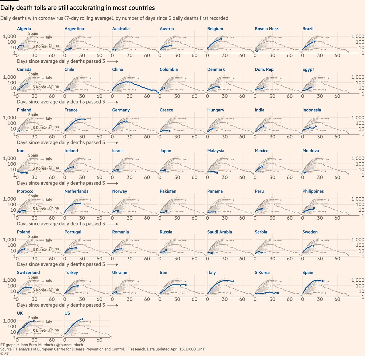
Small multiples for daily new deaths in 51 countries:
• Norway locked down while Sweden didn’t; Norway’s daily death toll rising much more slowly than Sweden’s
• Australia flat-ish so far
• In Europe, Austria & Denmark faring well
All charts: http://ft.com/coronavirus-latest">https://ft.com/coronavir...
• Norway locked down while Sweden didn’t; Norway’s daily death toll rising much more slowly than Sweden’s
• Australia flat-ish so far
• In Europe, Austria & Denmark faring well
All charts: http://ft.com/coronavirus-latest">https://ft.com/coronavir...
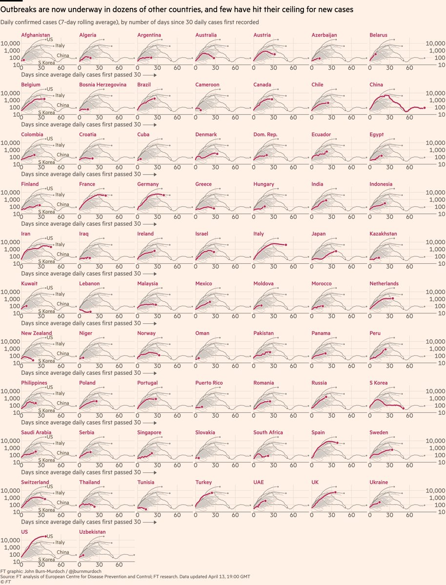
Small multiples for daily cases in 72 countries
• Early action in Australia & New Zealand may have turned the corner early https://abs.twimg.com/emoji/v2/... draggable="false" alt="🇦🇺" title="Flag of Australia" aria-label="Emoji: Flag of Australia">
 https://abs.twimg.com/emoji/v2/... draggable="false" alt="🇳🇿" title="Flag of New Zealand" aria-label="Emoji: Flag of New Zealand">
 https://abs.twimg.com/emoji/v2/... draggable="false" alt="📉" title="Chart with downwards trend" aria-label="Emoji: Chart with downwards trend">
• Austria & Norway locked down early; new cases falling
• New cases in Belgium may be peaking
Live versions of all charts: http://ft.com/coronavirus-latest">https://ft.com/coronavir...
• Early action in Australia & New Zealand may have turned the corner early
• Austria & Norway locked down early; new cases falling
• New cases in Belgium may be peaking
Live versions of all charts: http://ft.com/coronavirus-latest">https://ft.com/coronavir...
Things to note:
• Daily covid data is extremely noisy and implies false precision
• This is why we use a rolling average. Watch for general trends. Focus on slopes, not specific daily numbers
• Read Tuesday’s thread for more on this https://twitter.com/jburnmurdoch/status/1247666977566490626">https://twitter.com/jburnmurd...
We’ve also changed our data sourcing recently.
I’m no longer happy using Worldometers, so now sourcing all data directly from official country sources (health ministries etc).
This takes longer, but given my concerns over data quality on covid, I think this is important.
I’m no longer happy using Worldometers, so now sourcing all data directly from official country sources (health ministries etc).
This takes longer, but given my concerns over data quality on covid, I think this is important.
Here’s a video where I explain why we’re using log scales, showing absolute numbers instead of per capita, and much more: https://twitter.com/janinegibson/status/1244519429825802240">https://twitter.com/janinegib...
And a new chart showing why we& #39;re using absolute numbers rather than population-adjusted rates: https://twitter.com/jburnmurdoch/status/1249821596199596034">https://twitter.com/jburnmurd...
Please email coronavirus-data@ft.com with feedback, requests & subnational data.
All of these are invaluable, and we incorporate your suggestions and data every day.
We’ll keep getting back to as many people as possible.
Goodnight, one and all :-)
All of these are invaluable, and we incorporate your suggestions and data every day.
We’ll keep getting back to as many people as possible.
Goodnight, one and all :-)
And I do mean the above. We reply to 100s of queries each week and take on board all feedback. In fact that’s now pretty much a full time job!
These charts cover a complex & critical subject, and there are dozens of legitimate questions to be asked of them. Please keep asking https://abs.twimg.com/emoji/v2/... draggable="false" alt="🙂" title="Slightly smiling face" aria-label="Emoji: Slightly smiling face">
These charts cover a complex & critical subject, and there are dozens of legitimate questions to be asked of them. Please keep asking

 Read on Twitter
 • UK curve still matching Italy’s, but death toll could end up higher• Australia still looking promisingAll charts: https://ft.com/coronavir..." title="Now cumulative deaths:• US death toll highest worldwide and still rising steeply https://abs.twimg.com/emoji/v2/... draggable="false" alt="📈" title="Chart with upwards trend" aria-label="Emoji: Chart with upwards trend">• UK curve still matching Italy’s, but death toll could end up higher• Australia still looking promisingAll charts: https://ft.com/coronavir..." class="img-responsive" style="max-width:100%;"/>
 https://abs.twimg.com/emoji/v2/... draggable="false" alt="🇳🇿" title="Flag of New Zealand" aria-label="Emoji: Flag of New Zealand">https://abs.twimg.com/emoji/v2/... draggable="false" alt="📉" title="Chart with downwards trend" aria-label="Emoji: Chart with downwards trend">• Austria & Norway locked down early; new cases falling• New cases in Belgium may be peakingLive versions of all charts: https://ft.com/coronavir..." title="Small multiples for daily cases in 72 countries• Early action in Australia & New Zealand may have turned the corner early https://abs.twimg.com/emoji/v2/... draggable="false" alt="🇦🇺" title="Flag of Australia" aria-label="Emoji: Flag of Australia">https://abs.twimg.com/emoji/v2/... draggable="false" alt="🇳🇿" title="Flag of New Zealand" aria-label="Emoji: Flag of New Zealand">https://abs.twimg.com/emoji/v2/... draggable="false" alt="📉" title="Chart with downwards trend" aria-label="Emoji: Chart with downwards trend">• Austria & Norway locked down early; new cases falling• New cases in Belgium may be peakingLive versions of all charts: https://ft.com/coronavir..." class="img-responsive" style="max-width:100%;"/>


