Thread: Is India "flattening the curve"?
Working with data of other countries and the exemplar cases of China and South Korea for 80+ days, I realized that it& #39;s rather difficult, if not impossible, to judge that just off a couple of indicators.
#COVID19India
1/n (n=20) https://twitter.com/UntergrundmannG/status/1249656222095048704">https://twitter.com/Untergrun...
And it& #39;s most certainly daft to try and read that off some noisy changes in a few days data. This has not been an easy fight for most countries that are gaining control over their #COVID19 spread.
#nCoV2019India #coronavirusindia
2/n
#nCoV2019India #coronavirusindia
2/n
And involves tight coupling of 3-4 measures for a sustained period of time. To understand what they are and how to take control of the situation, @yaneerbaryam is a good follow.
One of the measures is extensive testing. Including asymptomatic cases.
#COVID19India
3/n
One of the measures is extensive testing. Including asymptomatic cases.
#COVID19India
3/n
Now, this is where we have some confusion. India headed into a #Lockdown21 relatively early (at ~ 500 confirmed cases) but without testing and quarantine/isolation measures commensurate. Our testing protocols have only now allowed for some testing of asymptomatic cases.
4/n
4/n
We& #39;ve had capacity constraints and other issues, including test kits of reliable accuracy. Now, it& #39;s next to impossible that testing can be ramped up in lock-step with an exponentially growing infection spread. The best one can expect is some linear ramp-up. Realistically.
5/n
5/n
So, when @ShamikaRavi - an academic with substantial influence - has been claiming, asserting or inferring (take your pick) that India has been flattening the curve, it sounded too good to be true. And my workups disagreed strongly. Even w/o looking at testing data.
6/n
6/n
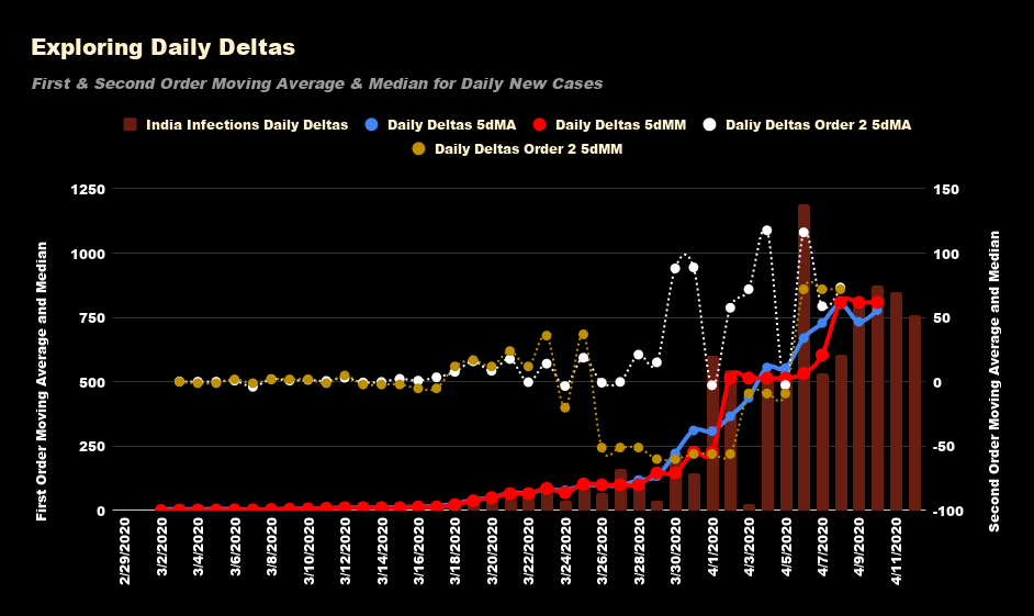
She uses a "statistic of significance" viz the Moving Media (for growth of daily new cases) to drive her claim/inference.
That didn& #39;t make sense to me, so I looked at the contrast between the Moving Median and the Moving Average. Of the second order differences. In new cases
7/n
That didn& #39;t make sense to me, so I looked at the contrast between the Moving Median and the Moving Average. Of the second order differences. In new cases
7/n
And that divergence between the two signalled to me - is that the second order MA gives you an estimate of the # of daily test positives while the second order MM indirectly points to capacity.
And it& #39;s the latter that drives the former.
#Covid19India
8/n
And it& #39;s the latter that drives the former.
#Covid19India
8/n
Now India has been adding around 500 cases for a week just after the superspreader incident blew up. This followed up with - now - shifting to a level of 800 new cases each day. This is a behavior NOT SEEN in the case of other hotspot countries.
#nCoV2019India
9/n
#nCoV2019India
9/n
So, what& #39;s going on?
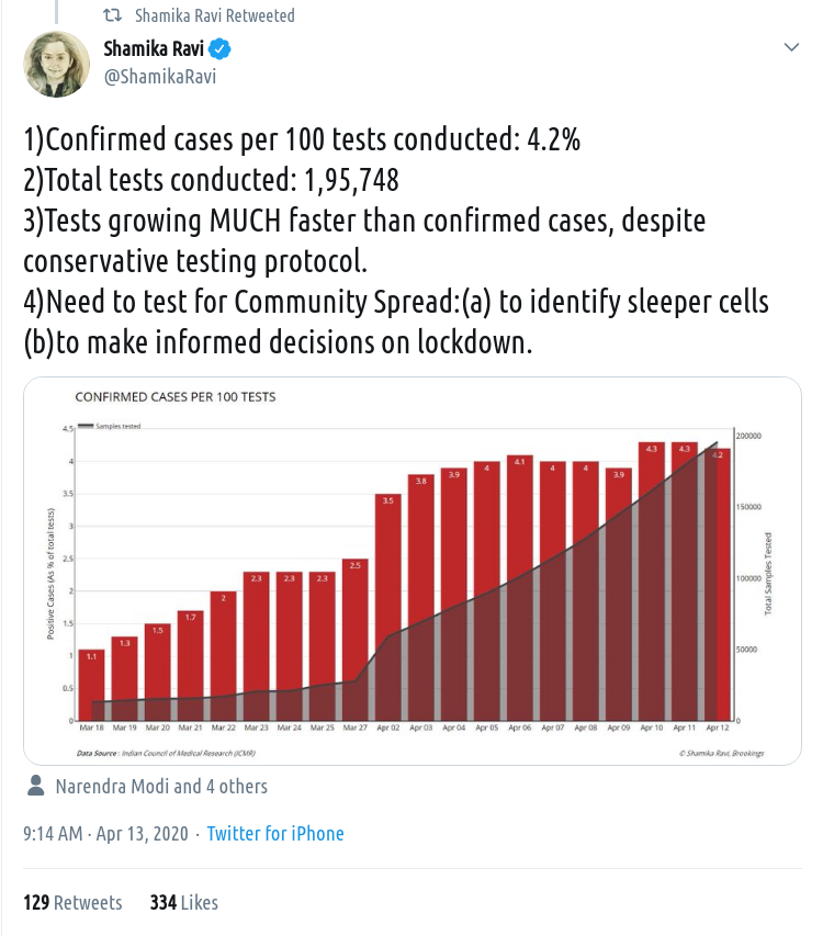
Let& #39;s look at Claim #3 here. Are tests growing much faster than confirmed cases? If so, the # of -ve& #39;s would grow faster than +ve& #39;s.
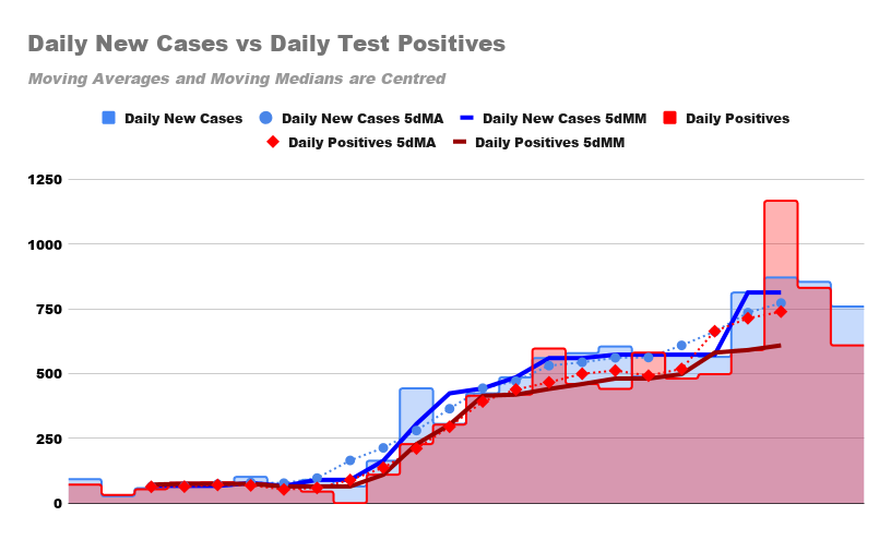
The chart has daily new cases vs test positives. 5dMM for new cases >> 5dMM for positives. The 5dMAs are in sync.
10/n
Let& #39;s look at Claim #3 here. Are tests growing much faster than confirmed cases? If so, the # of -ve& #39;s would grow faster than +ve& #39;s.
The chart has daily new cases vs test positives. 5dMM for new cases >> 5dMM for positives. The 5dMAs are in sync.
10/n
Since those are absolute numbers, these are the daily growth rates, with 5dMAs and 5dMMs superimposed. They& #39;re in perfect sync. And for most of the period, the growth rate of new infections has been >> than the rate of growth of testing (which is to be expected).
11/n
11/n
It& #39;s a reasonable call to make - at this point - seeing what we have, that it is the level of testing accessible that is driving the new case count. Via specified protocol and available/functional capacity.
How would we know if they match as pointed above?
#Covid19India
12/n
How would we know if they match as pointed above?
#Covid19India
12/n
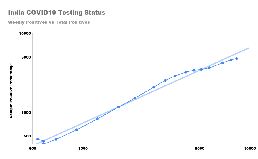
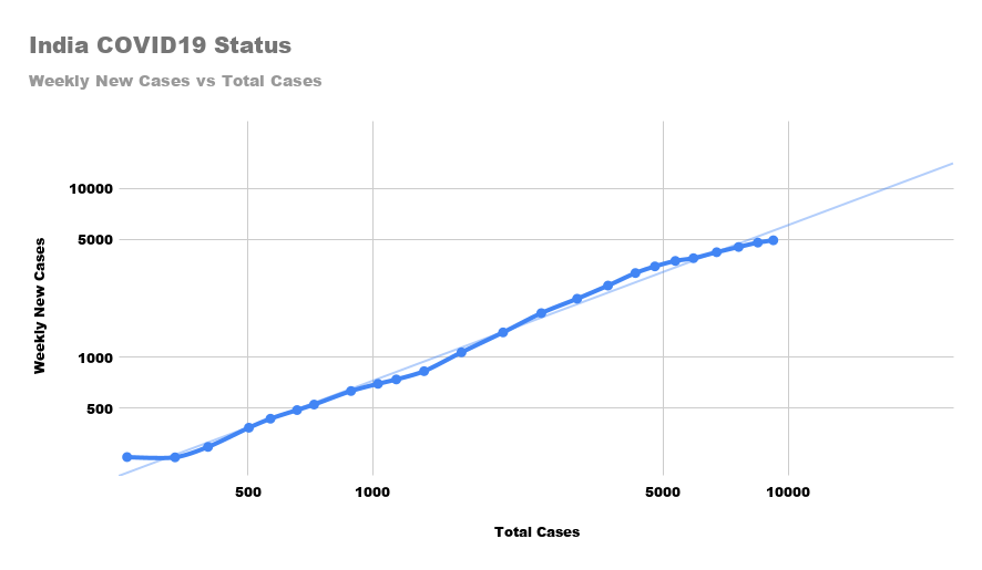
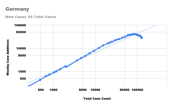
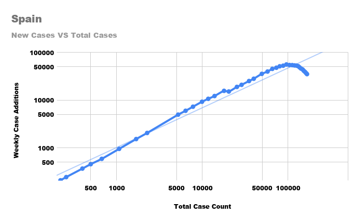
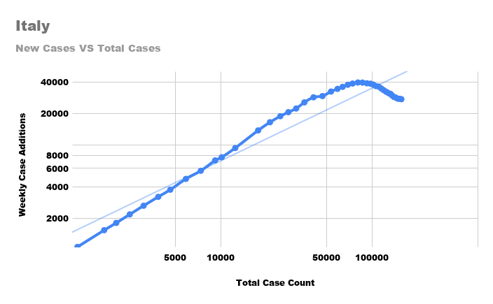
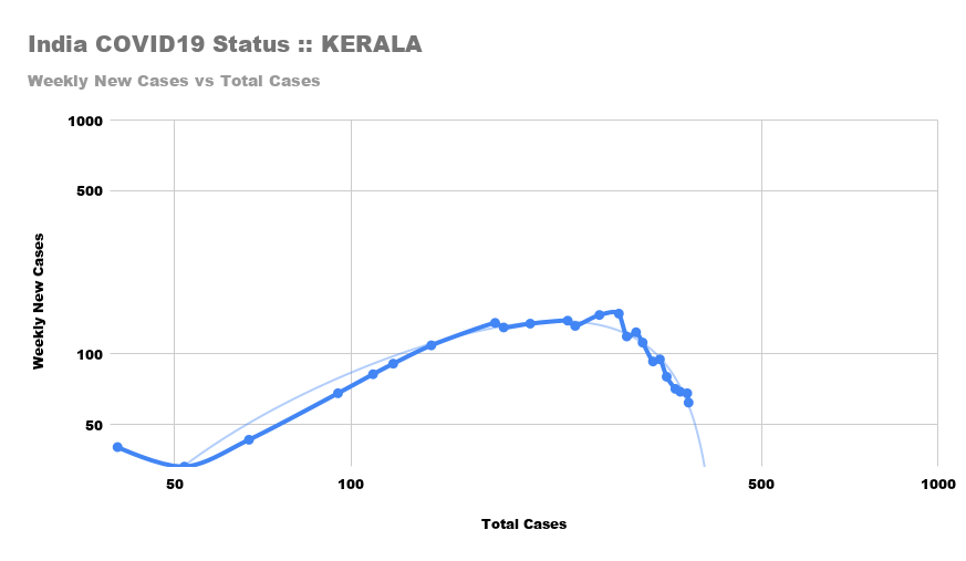
A good indicator - completely agnostic to country specifics is a Log-Log plot of weekly new cases (Y axis) verus total case count (X axis). There& #39;s supposed to be a math relationship here which we can ignore. The visual is a straight line during infection EXP growth.
13/n
13/n
So, here& #39;s the chart for India with a similar chart for the weekly test positives versus Total test positives.
Now, which is driving or shaping which? Hard to tell? It shouldn& #39;t be. If we were testing enough.
#COVID19India
14/n
Now, which is driving or shaping which? Hard to tell? It shouldn& #39;t be. If we were testing enough.
#COVID19India
14/n
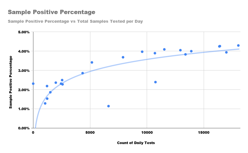
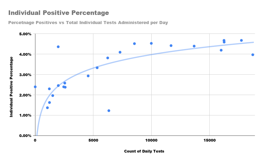
Another judgement criterion follows from the simple principle that IF we were testing enough, the positives rates should saturate with testing scale/capacity expansion. Do they? For #COVID19India?
Here& #39;s two graphs of % of test positives against # of daily tests.
15/n
Here& #39;s two graphs of % of test positives against # of daily tests.
15/n
Still not good enough?
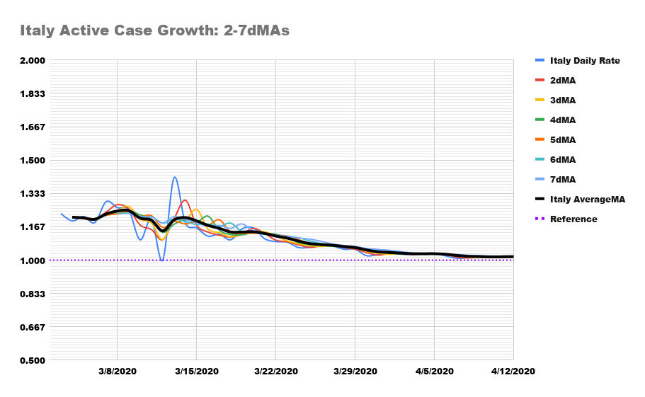
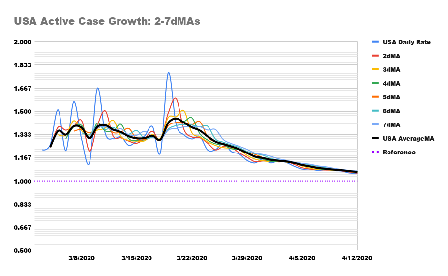
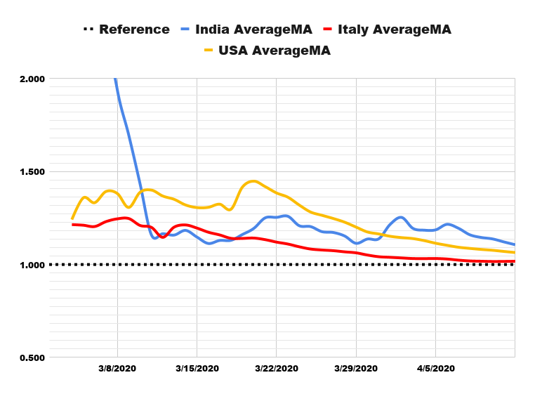
I also like to look at the convergence of different MAs and their consistent downtrend for a sustained length of time, to infer that some impact of NPIs is being felt on the infection spread.
This is what India looks like vs Italy and the US.
16/9
I also like to look at the convergence of different MAs and their consistent downtrend for a sustained length of time, to infer that some impact of NPIs is being felt on the infection spread.
This is what India looks like vs Italy and the US.
16/9
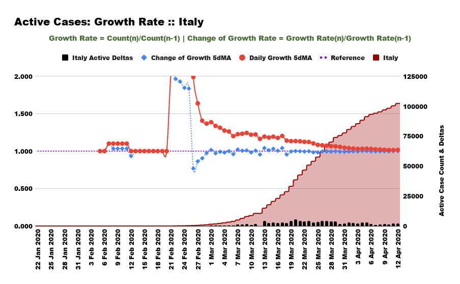
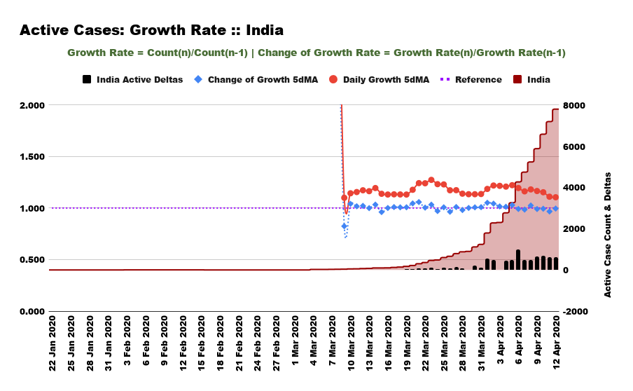
And those indicators reflect in these charts for comparison ...
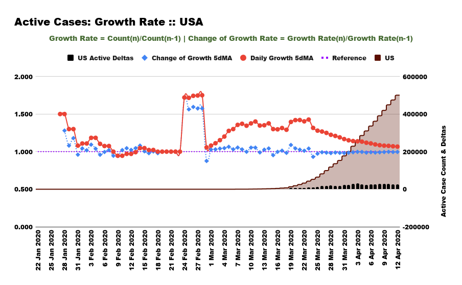
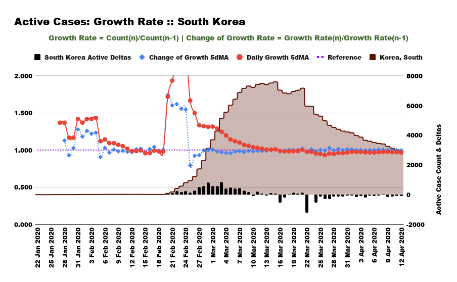
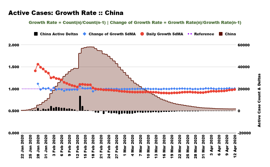
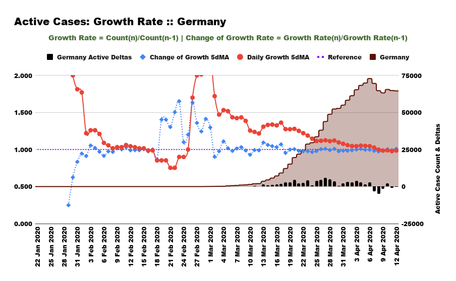
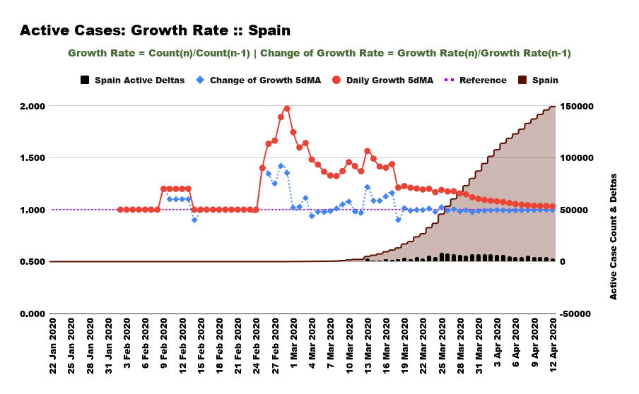
The little black bars at the bottom are the daily active case counts DIFFERENCES day-to-day. Flattening occurs when they turn negative. Like for South Korea.
#COVID19India #nCoV2019India
17/9
The little black bars at the bottom are the daily active case counts DIFFERENCES day-to-day. Flattening occurs when they turn negative. Like for South Korea.
#COVID19India #nCoV2019India
17/9
China sets a great standard here ...
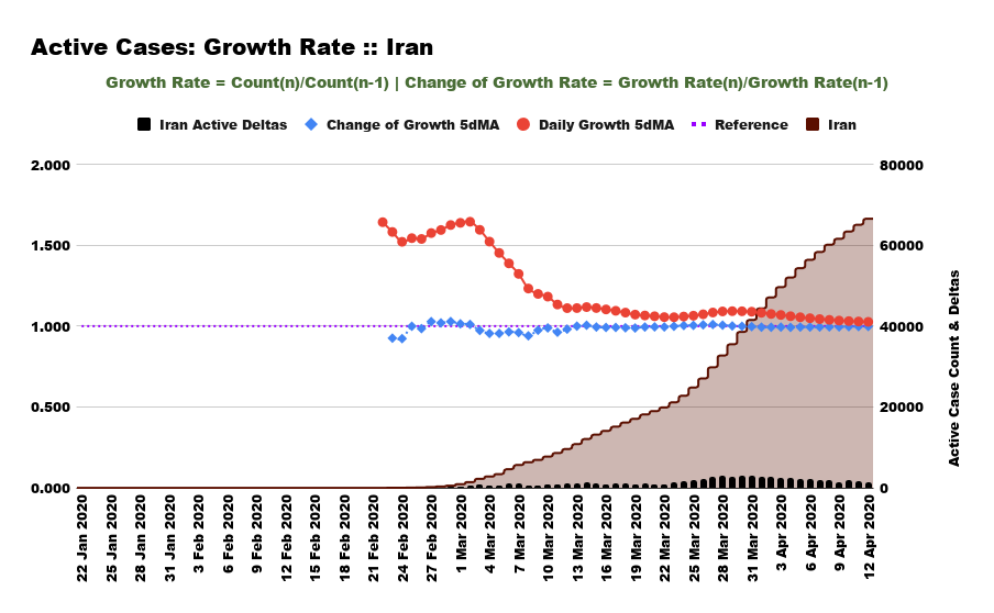
Germany& #39;s doing it now. Spain and Iran are close.
The point is - we are nowhere close.
#coronavirusindia #COVID19India #nCoV2019India
18/9
Germany& #39;s doing it now. Spain and Iran are close.
The point is - we are nowhere close.
#coronavirusindia #COVID19India #nCoV2019India
18/9
To verify, take a look at the Log-Log plots for these countries ... AND The state of Kerala.
Unless the rest of the states of India do what Kerala is doing and HOW, this is a battle that WILL NOT BE WON. Kerala is also leading in extensive testing for #COVID19India ...
19/9
Unless the rest of the states of India do what Kerala is doing and HOW, this is a battle that WILL NOT BE WON. Kerala is also leading in extensive testing for #COVID19India ...
19/9
To close this off...
If the Q of how we& #39;re doing is so easily answered, it& #39;s likely a misjudged call. And if you& #39;re doing so off some "credentialled" or "influential" expert telling you so, you& #39;re likely being misled.
#StaySafe #StayHomeIndia
#COVID19India #nCoV2019India
20/20
If the Q of how we& #39;re doing is so easily answered, it& #39;s likely a misjudged call. And if you& #39;re doing so off some "credentialled" or "influential" expert telling you so, you& #39;re likely being misled.
#StaySafe #StayHomeIndia
#COVID19India #nCoV2019India
20/20

 Read on Twitter