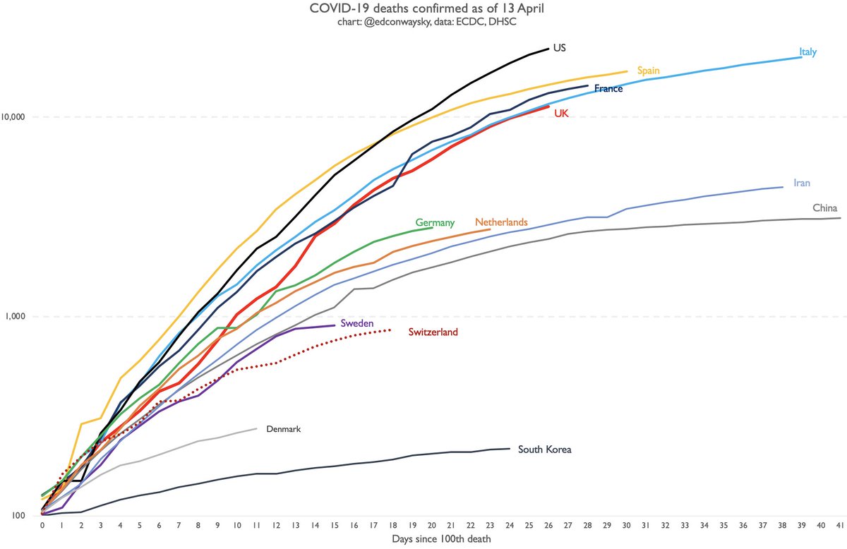
Following @DHSCgovuk update that UK #COVID19 death toll is now 11,329, an updated chart of trajectories.
- UK still in line with Italian path. Death toll heading in same direction.
- % growth rate of death toll is slowing - but NB figs around weekends are often understatements
- UK still in line with Italian path. Death toll heading in same direction.
- % growth rate of death toll is slowing - but NB figs around weekends are often understatements
While UK #COVID19 numbers continue to shock, bear in mind the growth rate is slowing.
A week ago the death toll was doubling every four days.
Now it& #39;s doubling every week.
That& #39;s a big difference.
A week ago it looked like we were heading for 20k deaths around now.
A week ago the death toll was doubling every four days.
Now it& #39;s doubling every week.
That& #39;s a big difference.
A week ago it looked like we were heading for 20k deaths around now.
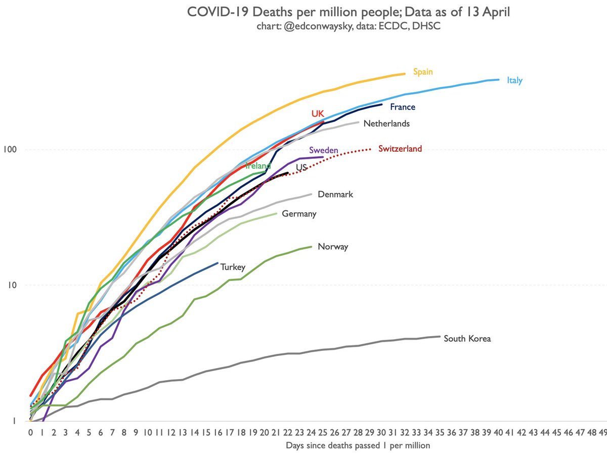
A few of you have asked why my charts don& #39;t adjust for population. Stock answer is that outbreaks don& #39;t tend to be determined by population in early stages. Now I& #39;ve finally got round to making a population-adjusted version of the chart to compare and contrast with the other one
If you& #39;re wondering: why is he using this data - aren& #39;t there BIG question marks over it? Why is he using weird log axes? Why include Chinese data...?
These are all good questions and I& #39;ve tried to answer as many as possible in a running Q&A on my blog: https://www.edmundconway.com/2020/04/covid-19-data-qa/">https://www.edmundconway.com/2020/04/c...
These are all good questions and I& #39;ve tried to answer as many as possible in a running Q&A on my blog: https://www.edmundconway.com/2020/04/covid-19-data-qa/">https://www.edmundconway.com/2020/04/c...

 Read on Twitter


