The Shit Planning Guide to Design & Access Statements
They’ve been called motherhood & apple pie, as much use as a chocolate teapot but having looked through a few recently I thought is worth sharing thoughts on how to blag, sorry write one. The vital ingredients - a thread.
They’ve been called motherhood & apple pie, as much use as a chocolate teapot but having looked through a few recently I thought is worth sharing thoughts on how to blag, sorry write one. The vital ingredients - a thread.
Vision
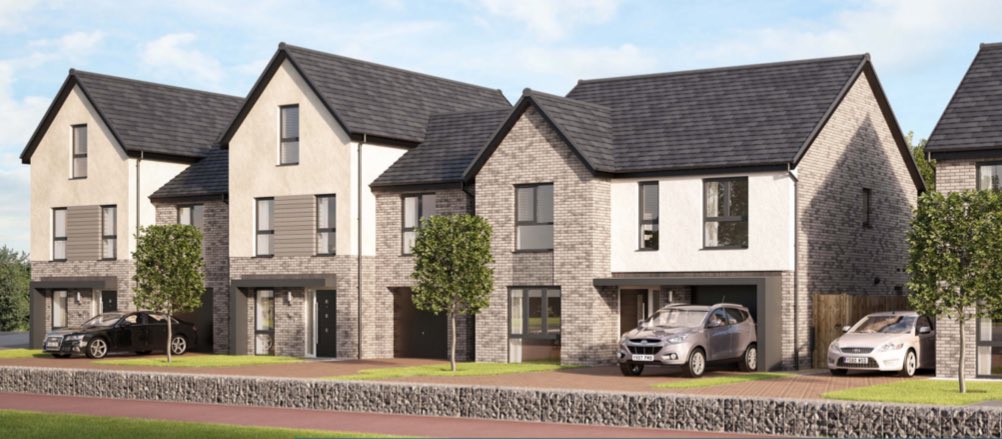
Firstly a CGI image of ‘aspirational’ detached buildings which will never look like this. This glowing rendered CAD or Sketchup vision will be value engineered, fucked over by suits and modified to death post consent. So take a last look at what you might have won.
Firstly a CGI image of ‘aspirational’ detached buildings which will never look like this. This glowing rendered CAD or Sketchup vision will be value engineered, fucked over by suits and modified to death post consent. So take a last look at what you might have won.
Policy Section rinse and repeat - This is easy peasy lemon squeezy simply a cut and paste the local plan with ‘this scheme meets this policy’ helpfully written after each policy. Its winner winner chicken dinner time.
Context
Screen shot a Google image helicopter view of the area with site outlined in red - this is vital and possibly the only context required.
Screen shot a Google image helicopter view of the area with site outlined in red - this is vital and possibly the only context required.
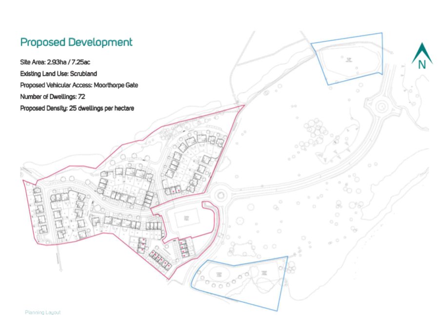
Brief shot of the scheme & a red line which was designed at the outset, you just need to shown other stuff so they think you’ve negotiated. Never mention that the two blue areas are disconnected completely from the main site. Heads up, these bits can be public space.
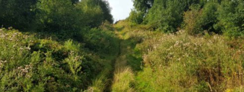
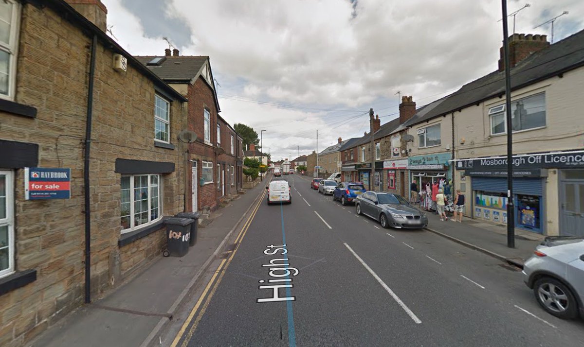
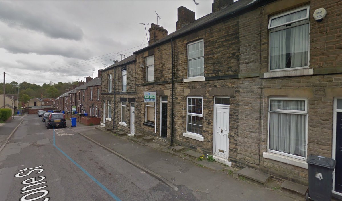
Random photos of bits of the area, in the sunshine, taken by the office trainee that really don’t show or inform any of the context or inform the design. If you are really lucky you may even get away with google streetview images.
Photocopies of the Local OS map with bits highlighted to let people know where stuff is, that they already know is there. Radial distance circles to show how near you are and because everybody flies like a fucking crow!
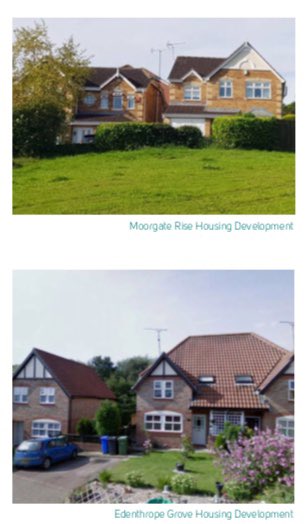
Don’t for fucks sake don’t use images of real local character which would mean you may not be able to build standard detached houses like your client wants. Plus there are well designed local versions of a ‘node’ space which you’ll be expected to match - piss that right off.
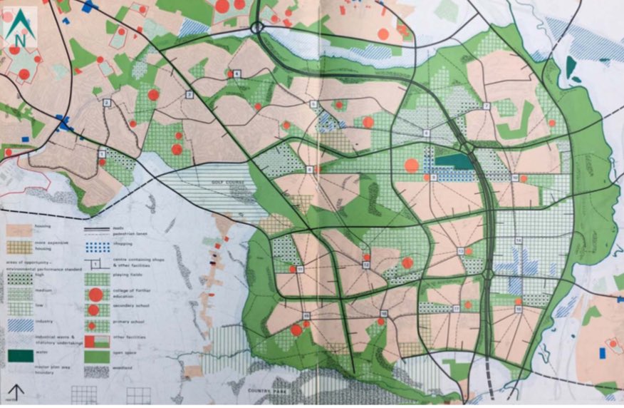
No need for local assessments between the helicopter shot & the site only assessment. Doesn’t matter what’s around the site or understanding it because you are delivering the same old detached shit you did last time. At a push use some old folded thing that Local Authority did!
Assessment 1
Vehicle Entrance surprisingly off the roundabout! Use arrow.
Where trees are put green shapes & triangles - make them green too.
Sloping site = arrow pointing to it but don’t waste arrows on others.
Important view arrow - important.
Tell locals what paths they use.
Vehicle Entrance surprisingly off the roundabout! Use arrow.
Where trees are put green shapes & triangles - make them green too.
Sloping site = arrow pointing to it but don’t waste arrows on others.
Important view arrow - important.
Tell locals what paths they use.
Assessment 2 - big felt pens.
Don’t mention the important view has changed!
Green zig zag good, red zig zag bad!
We need a node, where, middle, why, don’t worry.
Landmark positions, why, again don’t know - do two.
Ransom strip - say future link.
Again locals, paths etc.
Don’t mention the important view has changed!
Green zig zag good, red zig zag bad!
We need a node, where, middle, why, don’t worry.
Landmark positions, why, again don’t know - do two.
Ransom strip - say future link.
Again locals, paths etc.
Brief summary of what you can bin off! Detailed topography & landscape, local links & connections, site orientation, barriers, street forms, views analysis, layout assessment, density, scale & massing, block size, dealing with the lump of a doctors surgery, & loads of other shit.
Layout 1
Focus design on shit roundabout.
Appears block size is important!
Key view blocked https://abs.twimg.com/emoji/v2/... draggable="false" alt="😎" title="Smiling face with sunglasses" aria-label="Emoji: Smiling face with sunglasses">
Realise slope arrow, meant slope!
Old trees need space - who knew?
Tree stamp out.
Floating doctors surgery - ignore
Bendy road layout = DB32
Cul de sac - check.
Where’s the node?
Focus design on shit roundabout.
Appears block size is important!
Key view blocked
Realise slope arrow, meant slope!
Old trees need space - who knew?
Tree stamp out.
Floating doctors surgery - ignore
Bendy road layout = DB32
Cul de sac - check.
Where’s the node?
Layout 2
Improve sense of enclosure with black line over standard houses
Sales area needs to dictate design - vital constraint.
Don’t tell anyone play areas not connected.
Don’t mention crossing the big road.
Bendy edge always looks natural by trees.
Sprinkle houses & simmer.
Improve sense of enclosure with black line over standard houses
Sales area needs to dictate design - vital constraint.
Don’t tell anyone play areas not connected.
Don’t mention crossing the big road.
Bendy edge always looks natural by trees.
Sprinkle houses & simmer.
Layout 3
Facilitate link road by drawing it.
Outward edge looking inwards
Node actually a junction but just colour it differently.
Key view still blocked by standard house types - ignore.
New area maybe this can do the roundabout thing!
Left awkward space, so colour it green!
Facilitate link road by drawing it.
Outward edge looking inwards
Node actually a junction but just colour it differently.
Key view still blocked by standard house types - ignore.
New area maybe this can do the roundabout thing!
Left awkward space, so colour it green!
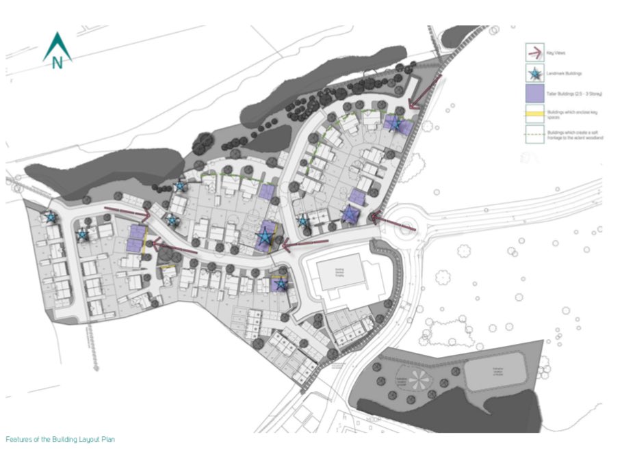
Final Layout
The key view actually meant view of our houses!
A key view from the middle of roundabout - gateway!
Landmark means slightly taller shit house.
More landmarks = use star stamp
More key views of parking & shit houses.
Buildings enclose big spaces without enclosing.
The key view actually meant view of our houses!
A key view from the middle of roundabout - gateway!
Landmark means slightly taller shit house.
More landmarks = use star stamp
More key views of parking & shit houses.
Buildings enclose big spaces without enclosing.
Don’t forget
Inspirational elevations!!
Start to manage aspirations with actual drawings.
Hang on these don’t look like the CGI buildings - they will trust us!
Just repeat CGI for good measure.
Inspirational elevations!!
Start to manage aspirations with actual drawings.
Hang on these don’t look like the CGI buildings - they will trust us!
Just repeat CGI for good measure.
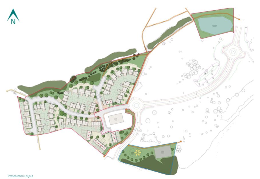
Final Layout
This is just dicking deckchairs about on Titanic. Dealt with the stronger edge, central node, that extra bit of green space & the wide crossing to the play space. After all that, it now looks like every fucking where else. Monopoly houses, Scalextric roads.
This is just dicking deckchairs about on Titanic. Dealt with the stronger edge, central node, that extra bit of green space & the wide crossing to the play space. After all that, it now looks like every fucking where else. Monopoly houses, Scalextric roads.
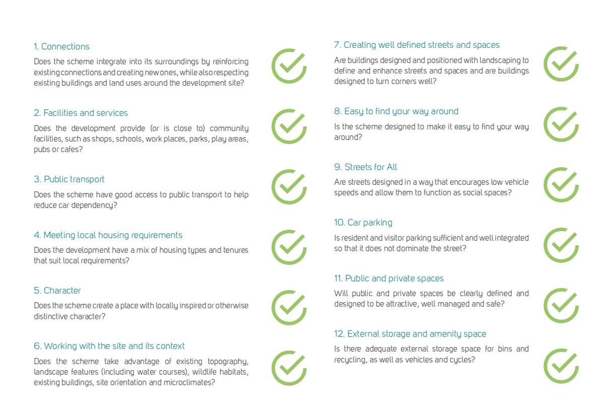
Carry out your own Building for Life Assessment and give yourself a well deserved, dogs bollocks, top score of 12. Green ticks will assist.

 Read on Twitter










 Realise slope arrow, meant slope! Old trees need space - who knew? Tree stamp out.Floating doctors surgery - ignoreBendy road layout = DB32Cul de sac - check. Where’s the node?" title="Layout 1Focus design on shit roundabout.Appears block size is important!Key view blockedhttps://abs.twimg.com/emoji/v2/... draggable="false" alt="😎" title="Smiling face with sunglasses" aria-label="Emoji: Smiling face with sunglasses">Realise slope arrow, meant slope! Old trees need space - who knew? Tree stamp out.Floating doctors surgery - ignoreBendy road layout = DB32Cul de sac - check. Where’s the node?" class="img-responsive" style="max-width:100%;"/>


