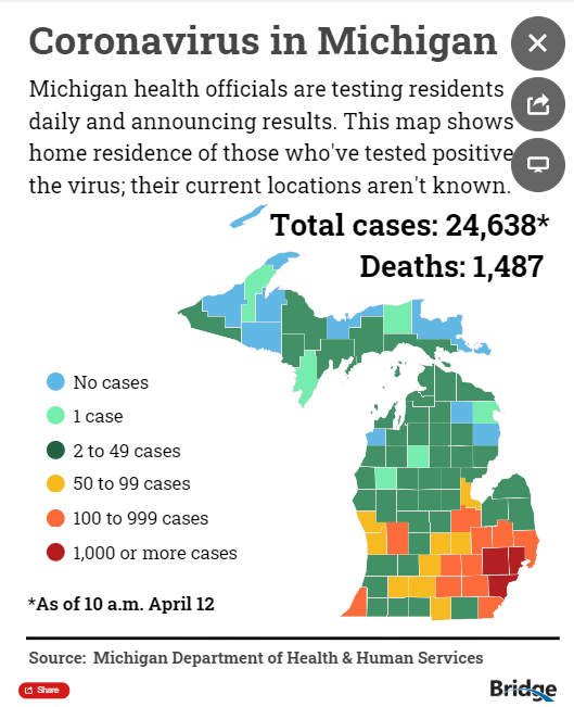
With the caveat that I truly appreciate Bridge, their coverage of COVID-19, and their coverage about state policy issues more broadly, this map I& #39;ve been seeing everywhere is pretty misleading. Let me explain... @BridgeMichigan #mileg #maps #COVID19 1/10
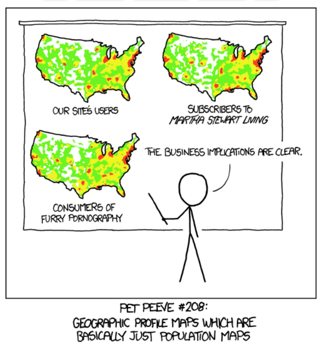
The fundamental problem is that people are not distributed evenly across the state. Michigan& #39;s population is clustered primarily in the southeast corner of the state So, making a map that shows the straight number of cases is basically just showing population. 2/10
For example, if we mapped a situation in which every county had the same x% of their population infected with COVID-19 it would be the exact same as a population map. The better way to show this data is to do it as a percentage of the county& #39;s population. 3/10
Another way to do it that& #39;s pretty common is to use COVID-19 cases per 100,000 people. This controls for the number of people in the country and avoids using very tiny percentages, which are understandably annoying. 4/10
After a quick test, my suspicions were confirmed! COVID-19 cases by county has a 92% correlation with the population in that county. When you consider the large classification buckets used in the map, it is virtually indistinguishable from a population map. 5/10
While there is significant variation in the percent of people by country that are infected with COVID-19, this map doesn& #39;t show that. 6/10
The problem with this map, outside a cartographers nightmares, is that it& #39;s feeding into a dangerous narrative that the tri-county area and Detroit specifically are the only places impacted by this pandemic in Michigan. 7/10
Just yesterday, the highest ranking Republican in Michigan, issued an opinion in Bridge relating the geographic differences in weather to the geographic differences in COVID-19 ultimatly arguing for geographic variation to the stay-at-home order. 8/10
As far as public information goes, Bridge& #39;s map is the Doppler radar of the COVID-19 health emergency in Michigan. It would be nice if it wasn& #39;t just a population map.... 9/10
Link to original Bridge Map: https://www.bridgemi.com/michigan-health-watch/coronavirus-tracker-what-michigan-needs-know-now
Link">https://www.bridgemi.com/michigan-... to xkcd cartoon: https://xkcd.com/1138/
Link">https://xkcd.com/1138/&quo... to Shirkey& #39;s opinion: https://www.bridgemi.com/guest-commentary/opinion-gov-whitmers-stay-home-order-needs-common-sense-changes
10/10">https://www.bridgemi.com/guest-com...
Link">https://www.bridgemi.com/michigan-... to xkcd cartoon: https://xkcd.com/1138/
Link">https://xkcd.com/1138/&quo... to Shirkey& #39;s opinion: https://www.bridgemi.com/guest-commentary/opinion-gov-whitmers-stay-home-order-needs-common-sense-changes
10/10">https://www.bridgemi.com/guest-com...
And a couple of rough examples: (numbers are COVID-19 case per 100,000 people). [10 classes using Jenks natural breaks]
While there are clear similarities between the map above and Bridge& #39;s version there are also important differences. Population density plays an important role in the transmission of the virus, but adjusting for population shows important hot spots popping up in rural areas too.
Specifically, Schoolcraft, Otsego, and Hillsdale seem to have relatively high proportions of their population with COVID-19 that are invisible when you only map total number of cases without adjusting for population.
*nerdy geography note* We probably shouldn& #39;t use a diverging color scheme in this context. It& #39;s better here to use a sequential color scheme... and a cool resource on color pallets for cartographers: #type=sequential&scheme=PuRd&n=3">https://colorbrewer2.org/ #type=sequential&scheme=PuRd&n=3">https://colorbrewer2.org/...

 Read on Twitter

![And a couple of rough examples: (numbers are COVID-19 case per 100,000 people). [10 classes using Jenks natural breaks] And a couple of rough examples: (numbers are COVID-19 case per 100,000 people). [10 classes using Jenks natural breaks]](https://pbs.twimg.com/media/EVfHcFeUcAEl_1l.png)
![And a couple of rough examples: (numbers are COVID-19 case per 100,000 people). [10 classes using Jenks natural breaks] And a couple of rough examples: (numbers are COVID-19 case per 100,000 people). [10 classes using Jenks natural breaks]](https://pbs.twimg.com/media/EVfHodlU4AEIZgv.png)


