I& #39;m working on a comic that explains how to read a logarithmic graph. Here are my references.
https://youtu.be/Kas0tIxDvrg ">https://youtu.be/Kas0tIxDv...
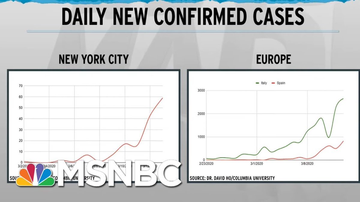
Bad use of two linear graphs with different scales. https://www.youtube.com/watch?v=m2HgeK73ctU">https://www.youtube.com/watch...
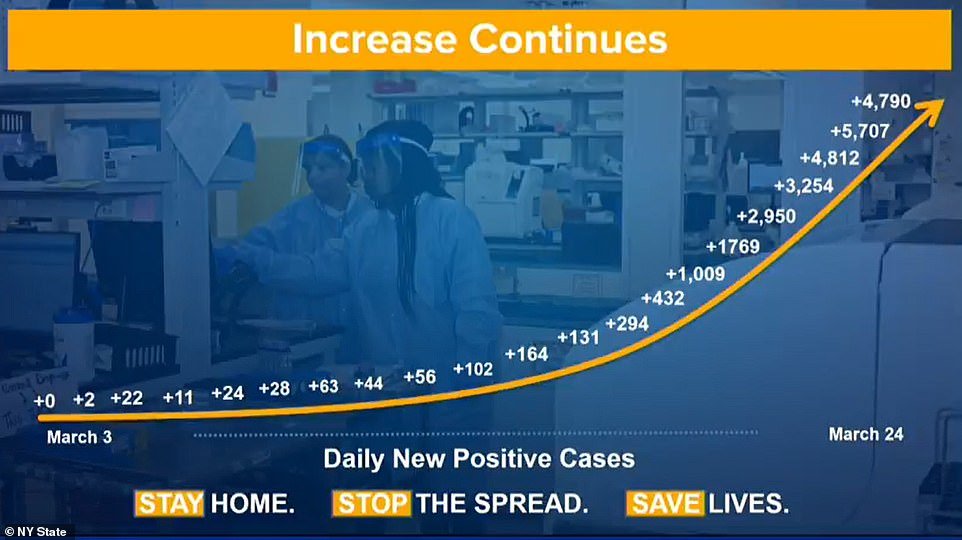
Gov Cuomo& #39;s Daily new positive cases in a linear graph may cause panic https://www.news10.com/wp-content/uploads/sites/64/2020/04/04.04.20-COVID19-Briefing.pdf">https://www.news10.com/wp-conten...
WEF& #39;s explainer about the importance of logarithmic graph https://www.weforum.org/agenda/2020/04/covid-19-spread-logarithmic-graph/">https://www.weforum.org/agenda/20...
Vi Hart& #39;s video http://vihart.com/pi-day-rant-2020/">https://vihart.com/pi-day-ra... and white paper: Outpacing the Virus https://ethics.harvard.edu/files/center-for-ethics/files/white_paper_5_outpacing_the_virus_final.pdf">https://ethics.harvard.edu/files/cen...
A useful collection of interactive graphs. You can switch between linear and log graphs. I have not checked accessibility features. https://ourworldindata.org/coronavirus ">https://ourworldindata.org/coronavir...
Searchable map + interactive graphs https://trackthevirus.info/ ">https://trackthevirus.info/">...
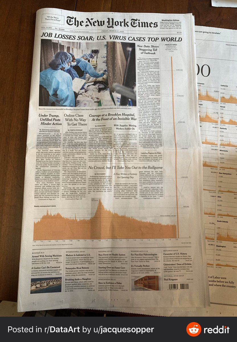
Hey Data friends. Can you help me articulate -- what& #39;s problematic about this NYTimes front page?
I saw an image of the times a front page from a few days ago - that had a data viz of NY area spike up really high, invading in the headings. can& #39;t find it now, if you know what it is, pls share ")

 Read on Twitter


