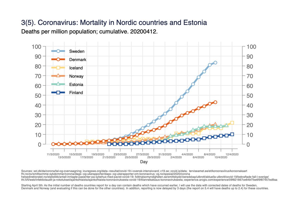
Use of care and mortality due to corona in Finland, Sweden, Norway, Denmark, Iceland and Estonia; data from yesterdays 12.4 reports.
Read the whole thread. (English version)
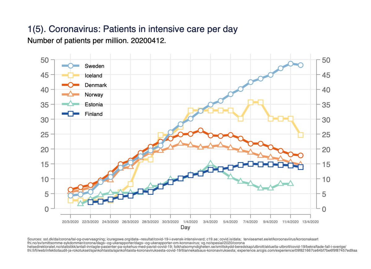
Fig 1. Number of persons in intensive care per day. Measures the burden on intensive care capacity. 1/x
Read the whole thread. (English version)
Fig 1. Number of persons in intensive care per day. Measures the burden on intensive care capacity. 1/x
Fig 2. Number of persons in hospital care per day. One person can be counted for several days. Measures the burden on hospital capacity. 2/x
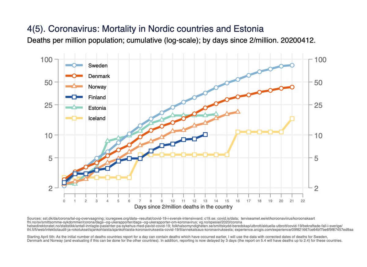
Fig 4. Mortality per million population on log-scale, by days since 2/million deaths in the country. Same data as fig 3, but y-axis helps to understand rate of change, and time-scale unified. 4/x
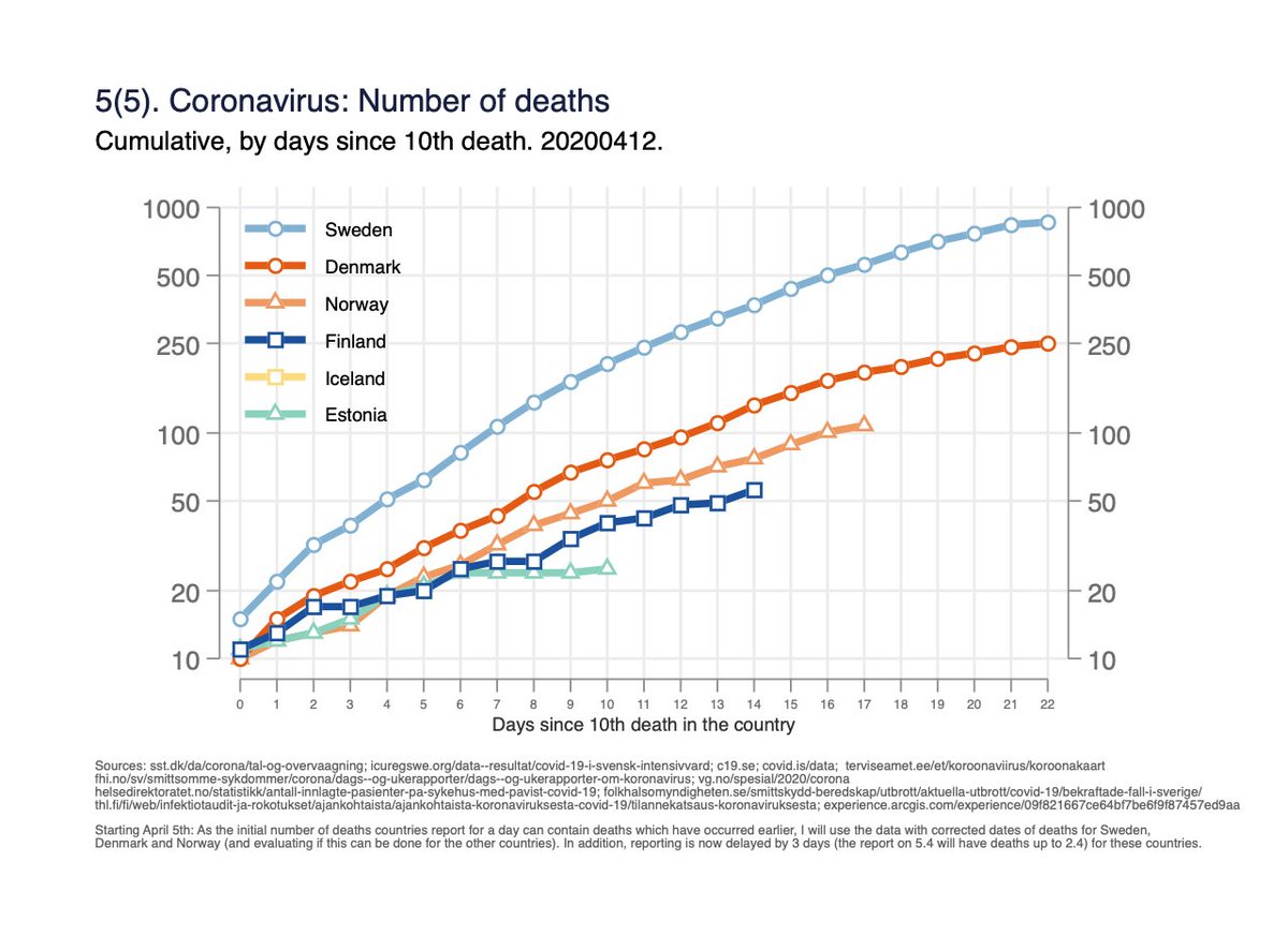
Fig 5(5). Absolute number of deaths by days since 10th death in the country.
(Attempts to get same starting point/phase of the epidemic for all countries). 5/x
(Attempts to get same starting point/phase of the epidemic for all countries). 5/x
General comment: one can’t read too much into these graphs about differences in actions the countries have taken vs effects; that would be much more complicated to do and require better data and long-term follow-up.
This is just simple monitoring of a complex situation. 6/x
This is just simple monitoring of a complex situation. 6/x
There could be differences between countries in: how they define corona deaths; how the disease have spread in pop.; case-mix; distributions of demographics and comorbidities of those diagnosed etc.
Data for recent days is not final; can chagne (and usually do). 7/x
Data for recent days is not final; can chagne (and usually do). 7/x
Some more thoughts about the complexities interpreting the data is provided in the posts 6-10 in my previous thread: 8/8 https://twitter.com/MarkkuPeltonen/status/1248100434230771715?s=20">https://twitter.com/MarkkuPel...

 Read on Twitter


