It& #39;s the first Monday of Eastertide here in Hong Kong, a lovely, sunny, breezy day with incredibly nice air quality, and around the world people are dying of a novel coronavirus.
So let& #39;s do some charts.
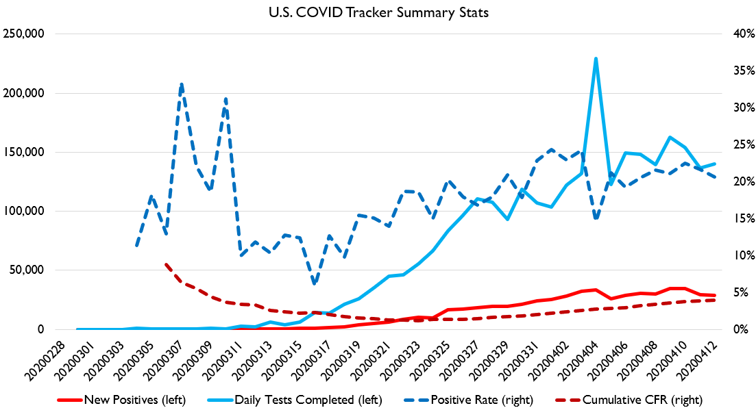
Here& #39;s our basic US stats chart. Tests flat, positive % down. CFR up.
So let& #39;s do some charts.
Here& #39;s our basic US stats chart. Tests flat, positive % down. CFR up.
This is, on the whole, actually a nice report for the US. Having flat tests but falling positives is a good sign.
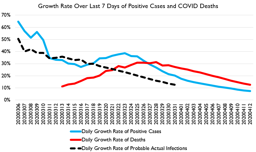
FWIW, at the current pace of death-curve-flattening, we& #39;re on track for 40-90k confirmed deaths by summer. Which probably means a total death spike of 50-200k, if the NY data is any indication.
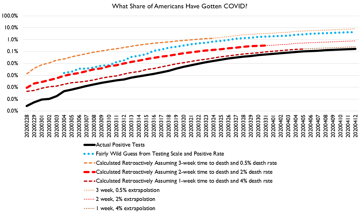
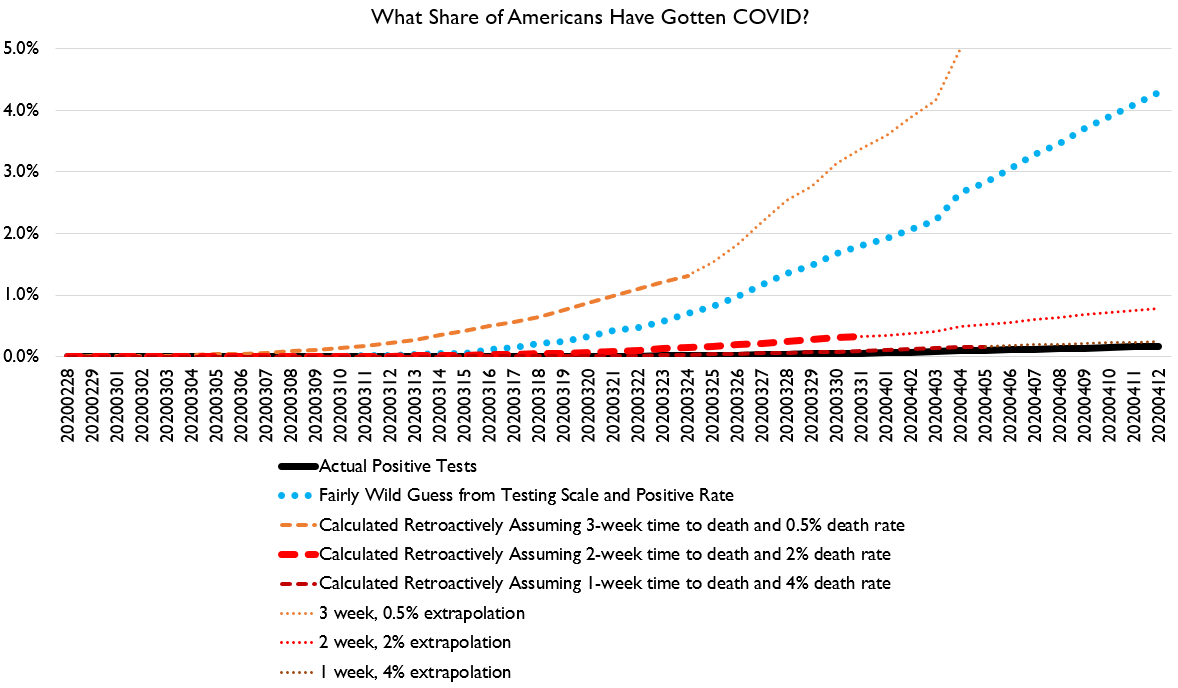
And here& #39;s the range of estimates of how many Americans have been infected up to present.
I think up to April 12, the true share of Americans who have been exposed to COVID is somewhere between 0.8% and 4.5%. That means somewhere between 2.5 mil and 15 mil have been exposed.
But I worry people are misinterpreting this. This is not how many people are CURRENTLY sick. This is how many have EVER been sick.
Calculating exactly how many are currently sick is a bit trickier; I haven& #39;t done it. But right now, probably between 10% and 40% of people who& #39;ve been exposed to COVID are through it now. Of those, somewhere between 10-25% are probably no longer infectious.
(When I say "I haven& #39;t done it" I mean "I haven& #39;t done it in a way I& #39;m confident enough to graph in detail," not, "here& #39;s some random numbers I haven& #39;t thought much about")
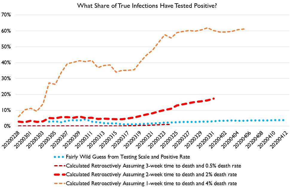
But we can assess with somewhat more confidence how well our testing regime is performing. Basically, we take positive tests, and we divide them by estimates of total infections. This shows us what share of cases the system has flagged positive.
I think somewhere between the thick red dashes and the light blue dots is what& #39;s really going on. So we& #39;ve probably caught 5-15% of positive cases.
HOWEVER, this is a bit misleading.
In my hometown, there have only been 3 positive tests for COVID of which I& #39;m aware. But we "know" there are at least 13 cases: the 3 infected households have had 13 people show symptoms.
In my hometown, there have only been 3 positive tests for COVID of which I& #39;m aware. But we "know" there are at least 13 cases: the 3 infected households have had 13 people show symptoms.
That ratio may be a bit high. But we can probably safely assume the average positive test has at least one other "known associated case" which is nonetheless not being reported as a "confirmed COVID case."
This is not accidental. I know of actual cases of people who get a positive test, the health department tells the family members they will *not* be tested and should assume they& #39;re infected, and when I look up county stats later, they clearly have not added the family members.
So, and this will interest @Noahpinion I think, I think that the number of people who have acquired near-100% certainty that they have COVID is *greatly in excess* of positive tests.
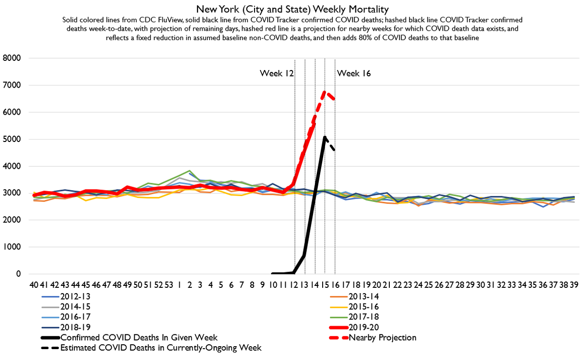
Here& #39;s my latest update for NY deaths. We got finished week 15 confirmed COVID deaths, and we& #39;ve got super-extremely-provisional Week 14 actual all-cause total deaths ( https://www.cdc.gov/nchs/nvss/vsrr/COVID19/">https://www.cdc.gov/nchs/nvss... ). I& #39;ve added bars marking weeks. (cc @JDVance1 )
Let me note that projections for week 16 COVID deaths are obviously extremely low-quality. We have a grand total of 1 day of data. But we& #39;re all assuming, I think, that curve-bending HAS to start showing up.
New Jersey& #39;s data is not reported quite as speedily as New York& #39;s but is still one of the faster-reporting states. It& #39;s good enough we can kinda make some basic expectations. Here& #39;s what NJ looks like.
So folks, look. Quibble all you like about R0 and CFR. Those were fun debates back before we had reliable data.
We are now at a stage where we& #39;re getting reliable data, and it shows a very large spike in deaths.
We are now at a stage where we& #39;re getting reliable data, and it shows a very large spike in deaths.
It& #39;s worst in New York. But it could get very bad elsewhere. And in another 2-4 weeks or so we should have enough data to begin to make some conclusions about other states like Michigan, Washington, California, Maine, hopefully Louisiana, maybe Florida, Georgia, etc.
Finally, here& #39;s a little something to brighten your day!
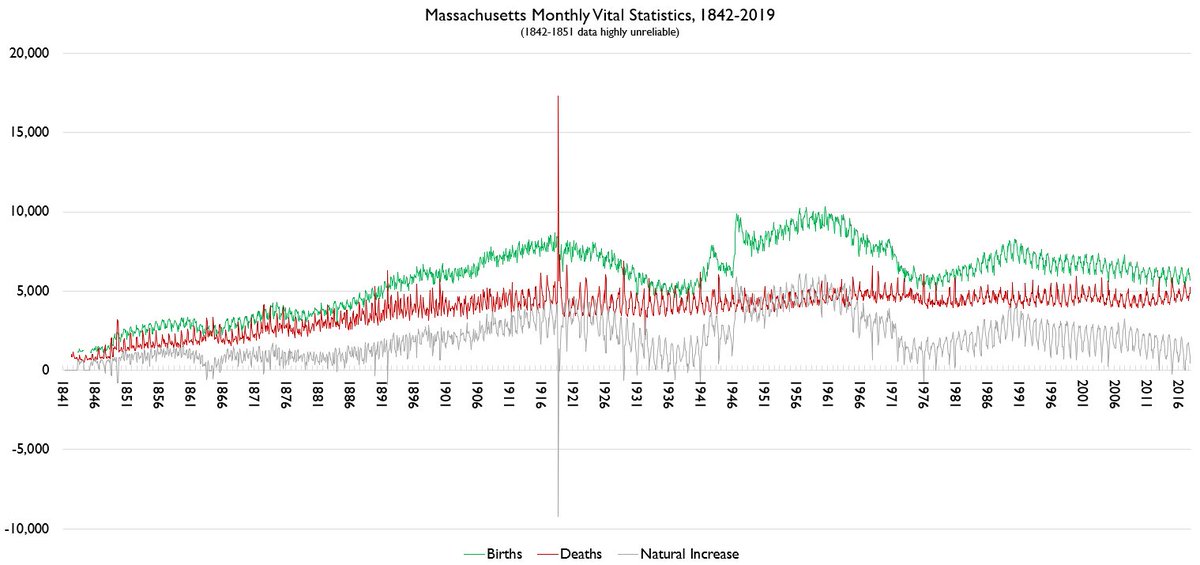
Massachusetts monthly vital statistics 1842-2019!
Massachusetts monthly vital statistics 1842-2019!
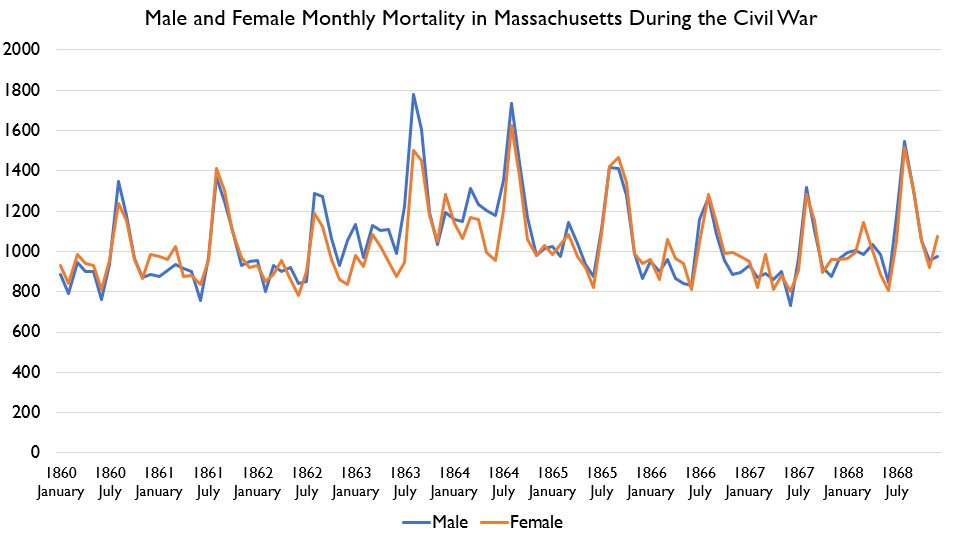
One of the most interesting things in this data to me is 1861-1865. Here it is zoomed in. The lines mark the Civil War. Births fell.... but deaths ***in Massachusetts*** rose significantly!
I don& #39;t *think* that rise in deaths is mostly war deaths. The rise in male deaths is way too small to be an even partial coverage of wartime casualties, and female deaths rise too. So it seems like *civilian* deaths in MA were way up during the civil war.
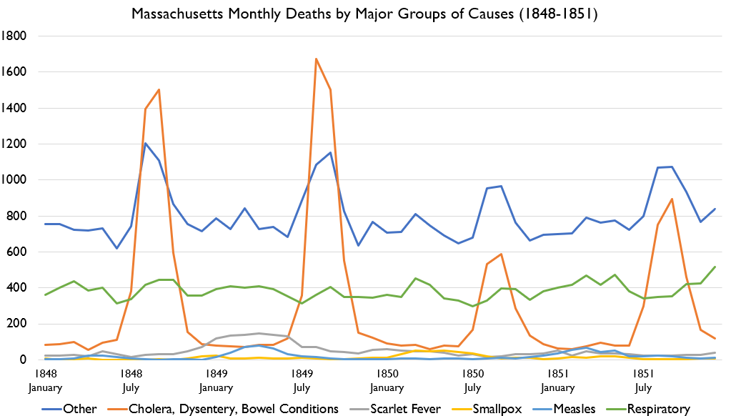
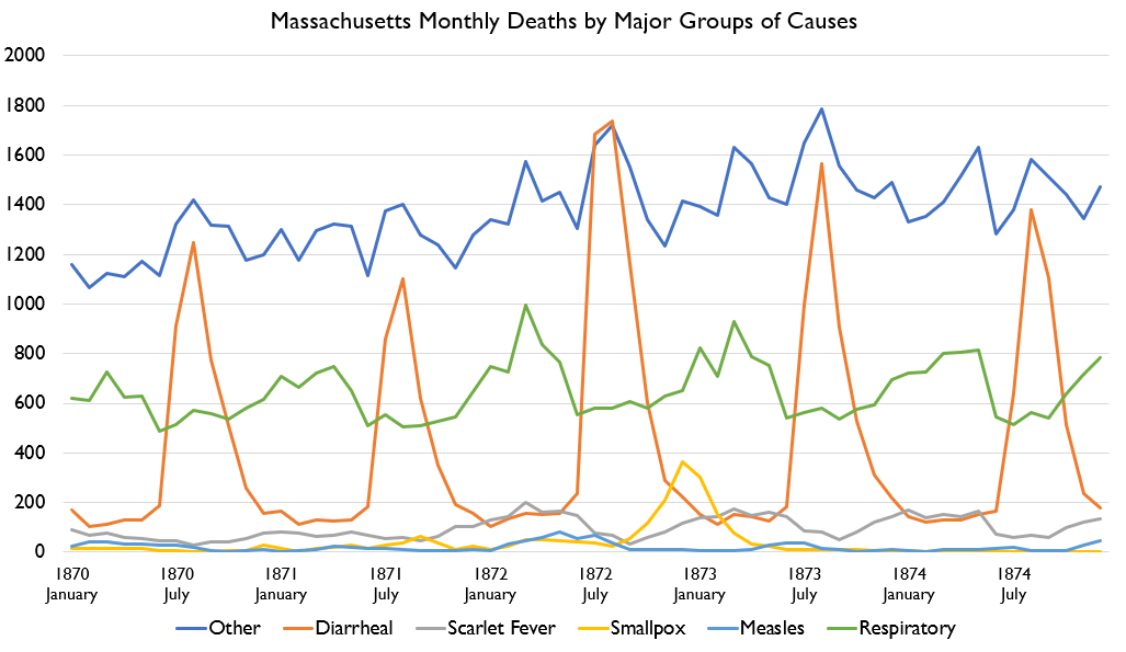
By the way here& #39;s major death causes for the big death spikes in 1849ish and 1872ish. In both cases, there were above-normal summer cholera seasons, but ALSO spikes in Scarlet fever, measles, and smallpox.
1872 was particularly gnarly. It began with a much worse than normal flu season. Then a worse-than-normal Scarlet fever season. Then a small measles outbreak. Then a MUCH worse than usual cholera season. Then a substantial smallpox outbreak.
Rough year!
Rough year!
And here& #39;s 1889-1892, which captures the earliest flu pandemic for which vital statistics data is available from several jurisdictions allowing truly modern study of the disease. It struck in multiple waves, as most pandemics do.
Let& #39;s note something about that pandemic.
It is probably the same strain in both cases, and public health measures to combat it were extremely limited. It basically just burned through the population.
It is probably the same strain in both cases, and public health measures to combat it were extremely limited. It basically just burned through the population.
And yet even so, herd immunity was NOT acquired after the first wave! Deaths fell BEFORE the weather turned very warm as well.
WHich is to say: I have some skepticism of models that suggest a disease is going to burn through the population quickly and then we& #39;ll be through it and life will go on.
That isn& #39;t how most pandemics have actually occurred.
That isn& #39;t how most pandemics have actually occurred.
It& #39;s not like humanity eventually acquired an immunity to cholera or something. Cholera deaths remained at epidemic levels for a century at least, not declining until modern sanitation efforts kicked in.
Smallpox kinda worked the way models suggest, and so did Bubonic plague, more-or-less. But tuberculosis didn& #39;t! Gastroenteritis doesn& #39;t!
If you go looking for historic pandemics, most of them are named with a date range, and the date range isn& #39;t usually, like, 2 months. It& #39;s usually measured in years.... or decades.
Which is to say, I really don& #39;t have a lot of faith that we can just expose ourselves to COVID and then it& #39;ll pass and things can go back to normal.
Some historic pandemics worked that way. But many did not. Probably scientists can give a good answer as to why the difference; I don& #39;t know the answer.

 Read on Twitter