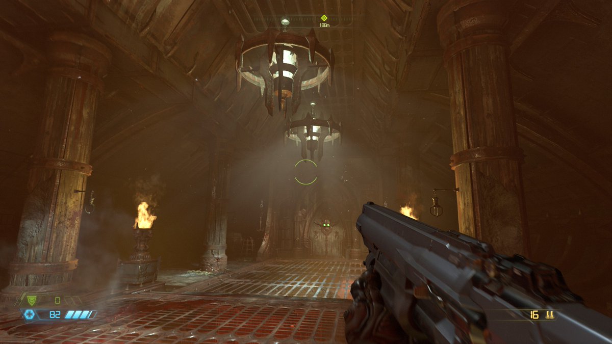
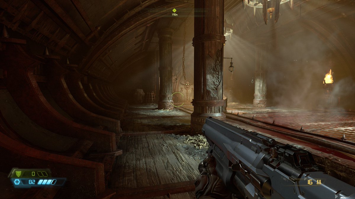
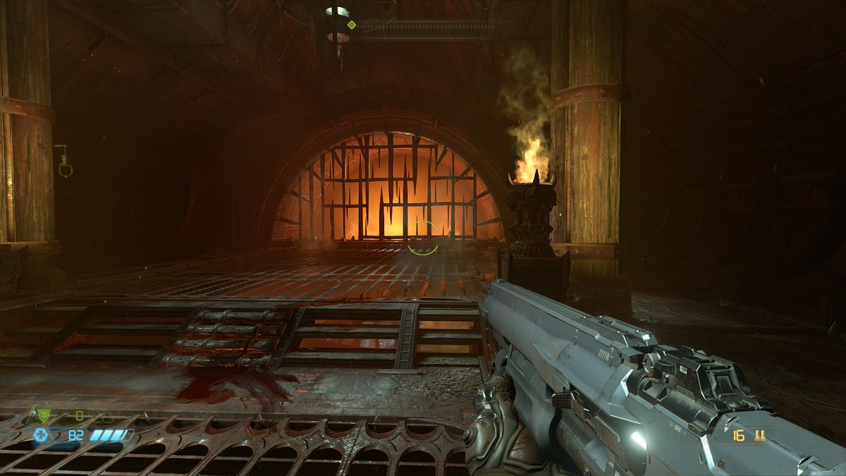
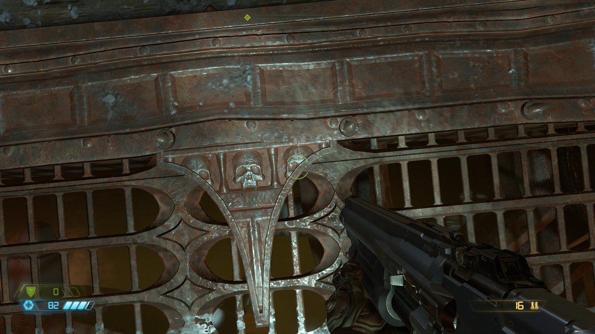
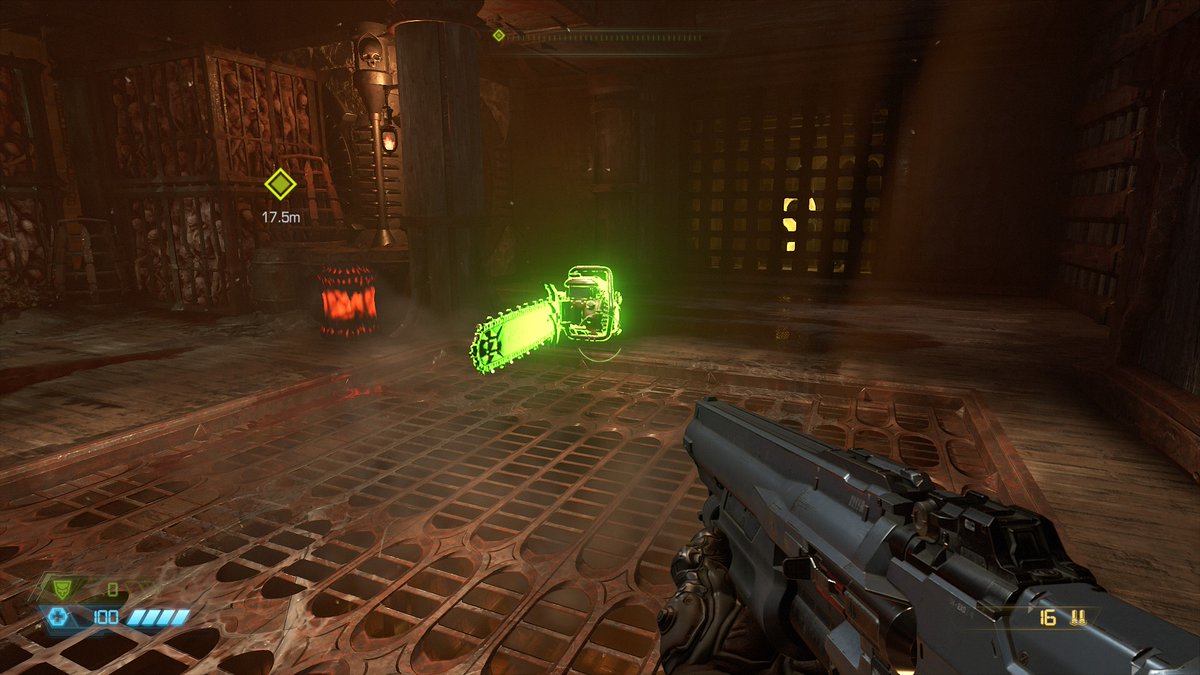
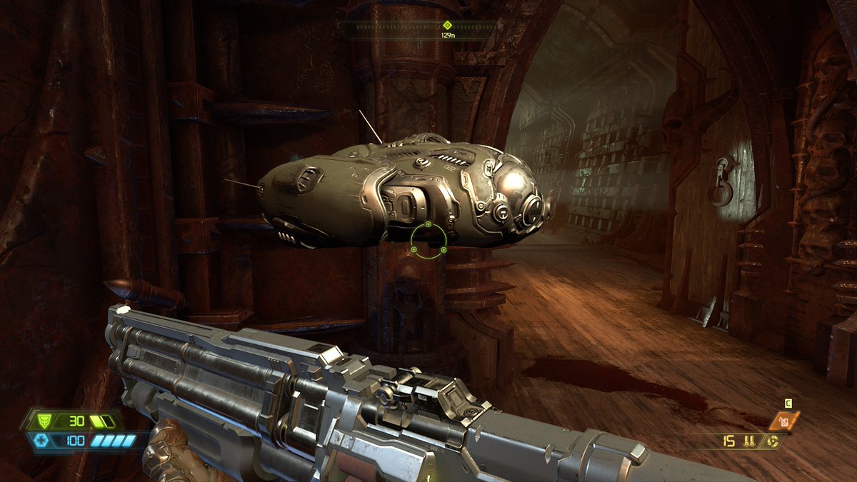
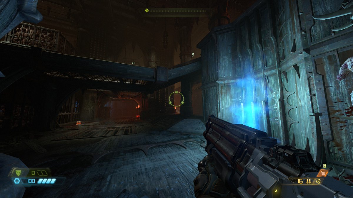
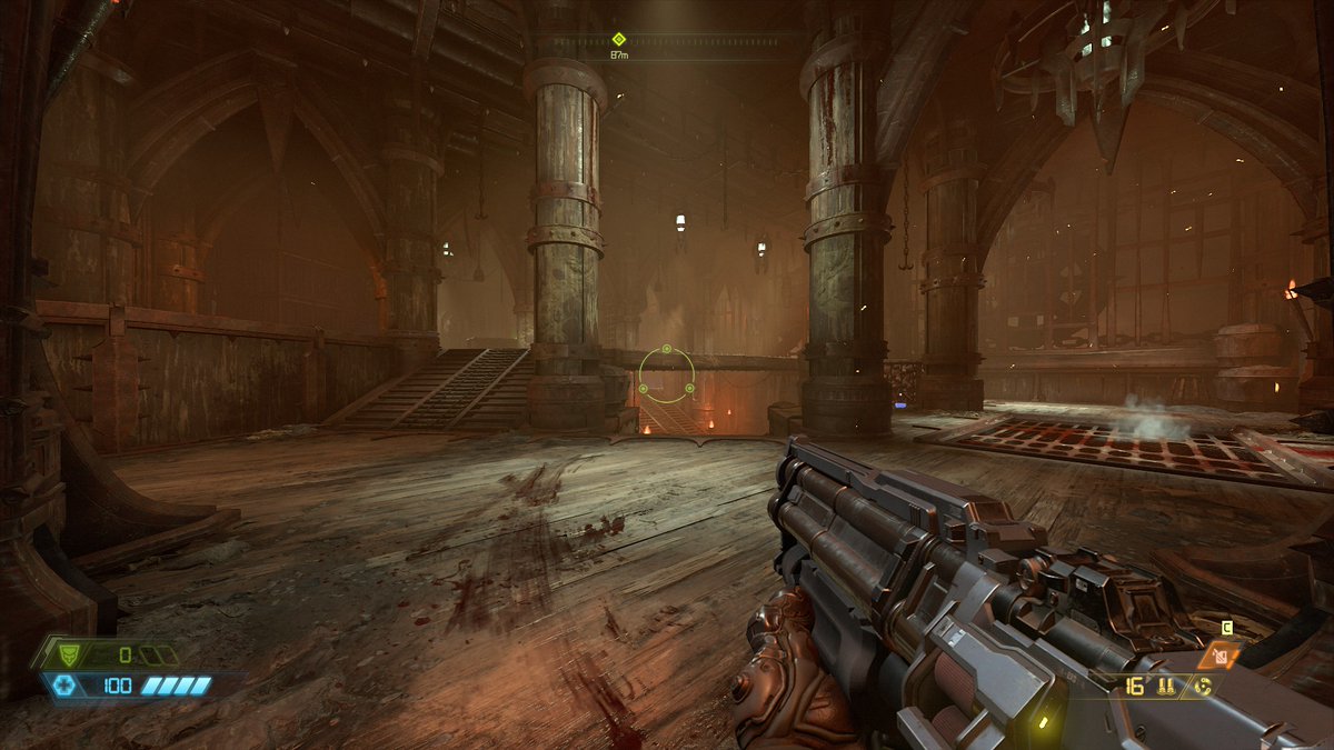
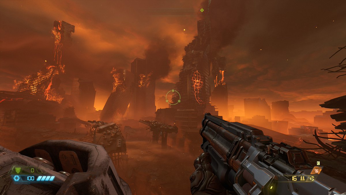
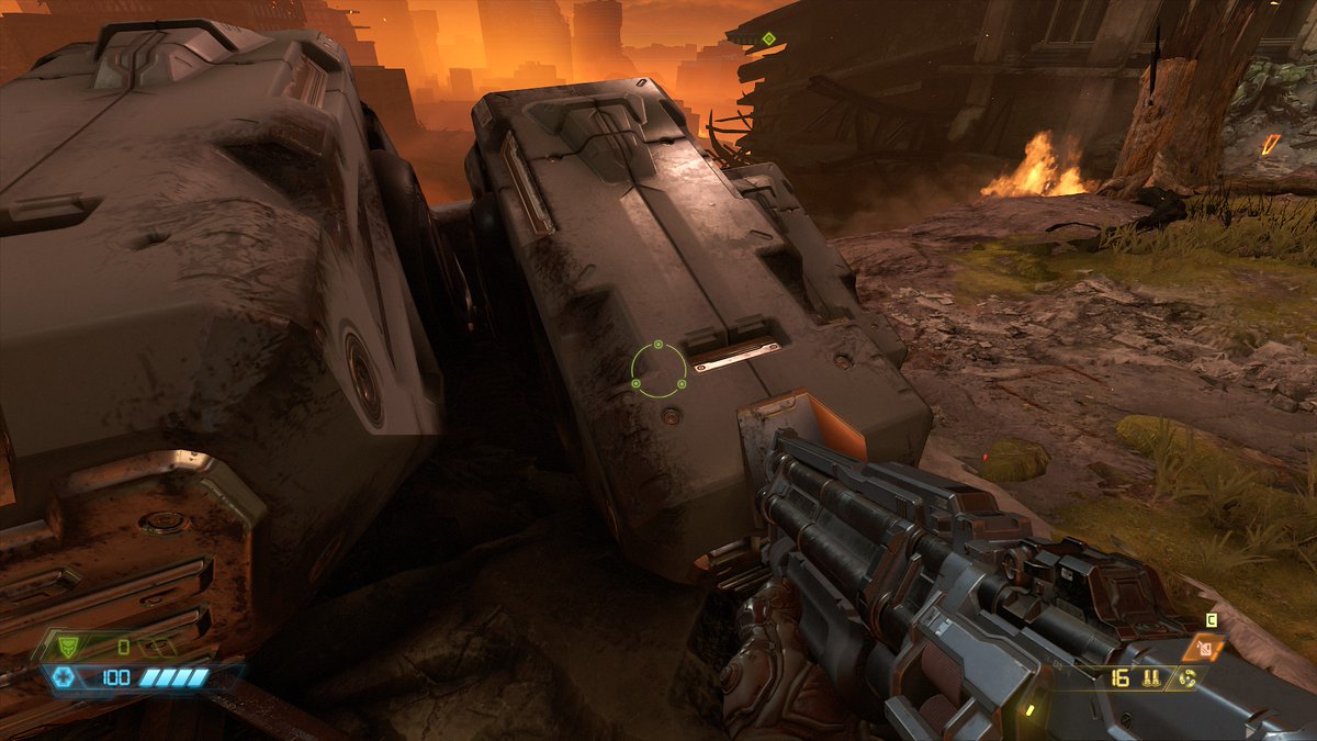
Right off the bat there is some admittedly nice stuff going on, though I wish there were more distinct highlights and shadows in this area. I get the impression that it& #39;s supposed to be moody, but it feels a little flat.
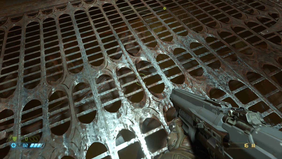
There& #39;s also the question of what materials are what. For example, the gun looks like it& #39;s probably supposed to be painted metal, but the texturing is very clean. Clean textures without much contrast in gloss values tend to lead to muddy materials.
Hopefully things gel later.
Hopefully things gel later.
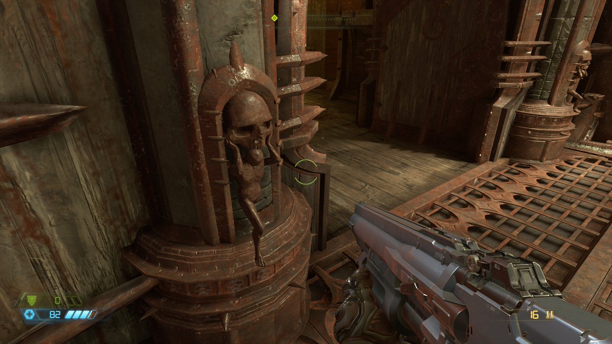
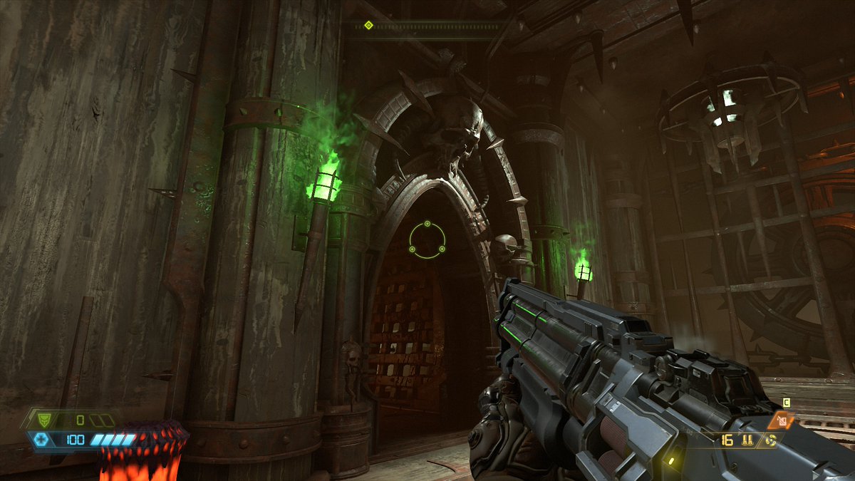
I& #39;ll definitely say that the move away from megatexture was a great one. These bolts, ribs, and skulls would be pretty muddy in Doom 2016, so it& #39;s nice to see this kind of resolution.
The way they modeled this little detail on this doorframe is suuuuper nice. This isn& #39;t the type of detail I& #39;d expect on an area this small, but it feels great.
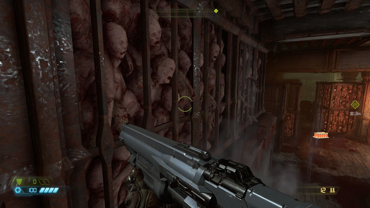
It& #39;s tough to see here, but these bodies in the walls are fully animated Alembic cached meshes. This is a really neat detail that I wish other games had. It& #39;s basically like a geometry flipbook. You can have tons of them in a scene and only pay for the vertices; no anim required.
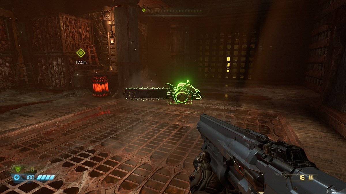
I fucking love Fresnel glow on objects. It& #39;s kind of old school now, but it warms my dead little heart.
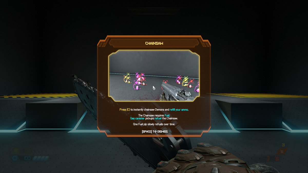
Ok, I don& #39;t like this. They just popped me into a tutorial room after killing five zombies with my shotgun and picking up the chainsaw. It feels weirdly like a tutorial from an MMO, complete with a popup and animated demo.
Pretty strange choice here.
Pretty strange choice here.
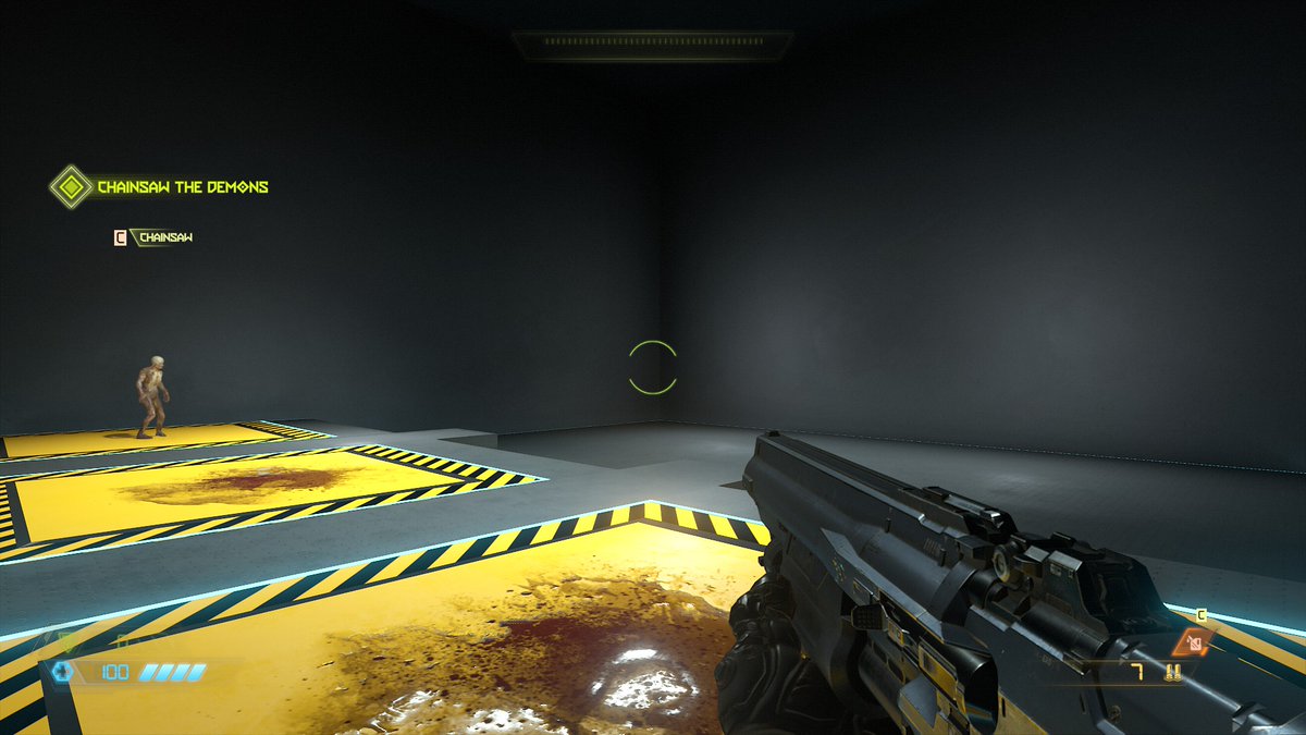
Yup, definitely a very strange choice. This is the extent of the tutorial room I was teleported to.
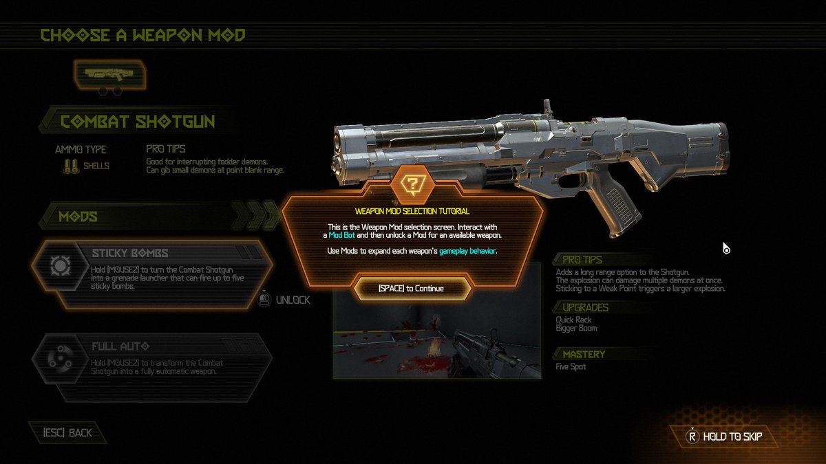
I definitely understand the need for accessibility, but this seems like they swung too far in the wrong direction? Couldn& #39;t you do an in-environment tutorial?
Very odd.
I definitely understand the need for accessibility, but this seems like they swung too far in the wrong direction? Couldn& #39;t you do an in-environment tutorial?
Very odd.
They& #39;re just dumping all this on me within what should be the first five minutes of gameplay.
I& #39;m not mad, just... puzzled?
This seems very antithetical to what Doom is supposed to be?
I thought this was going to be fast fast shooty pew pew.
I& #39;m not mad, just... puzzled?
This seems very antithetical to what Doom is supposed to be?
I thought this was going to be fast fast shooty pew pew.
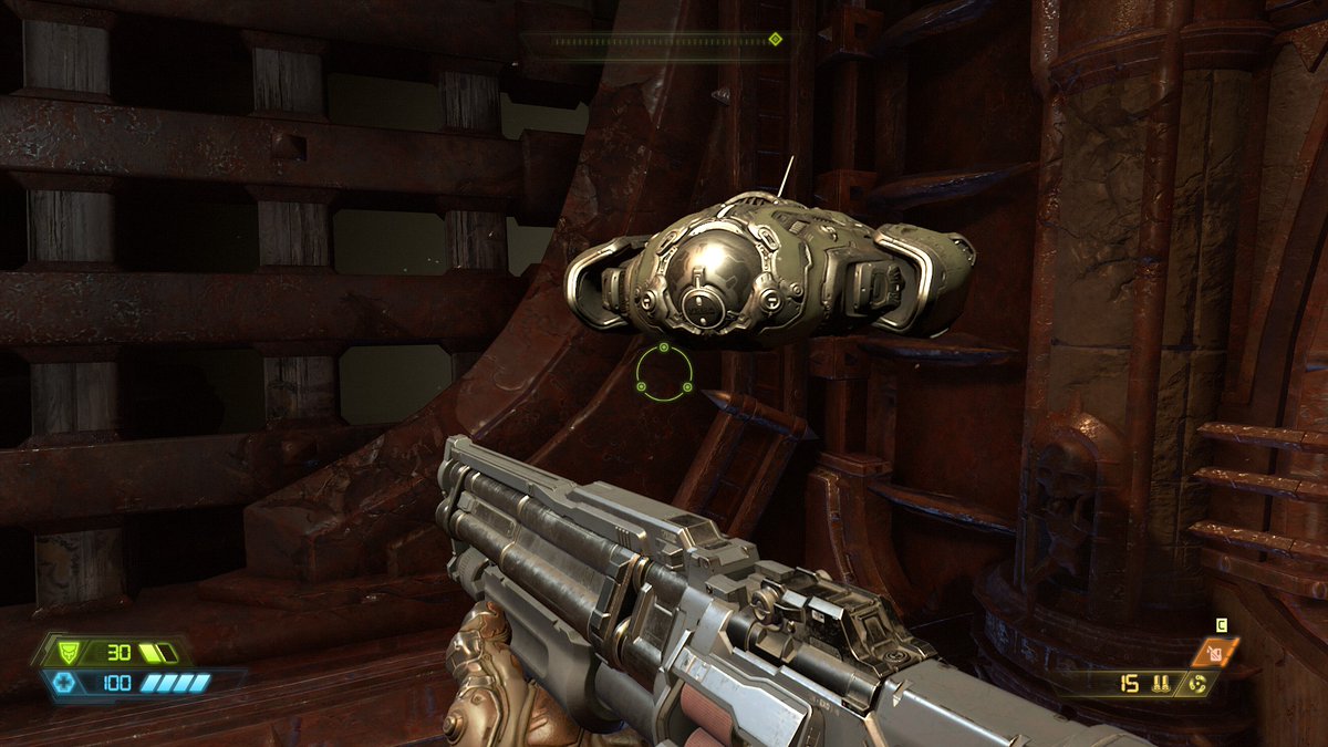
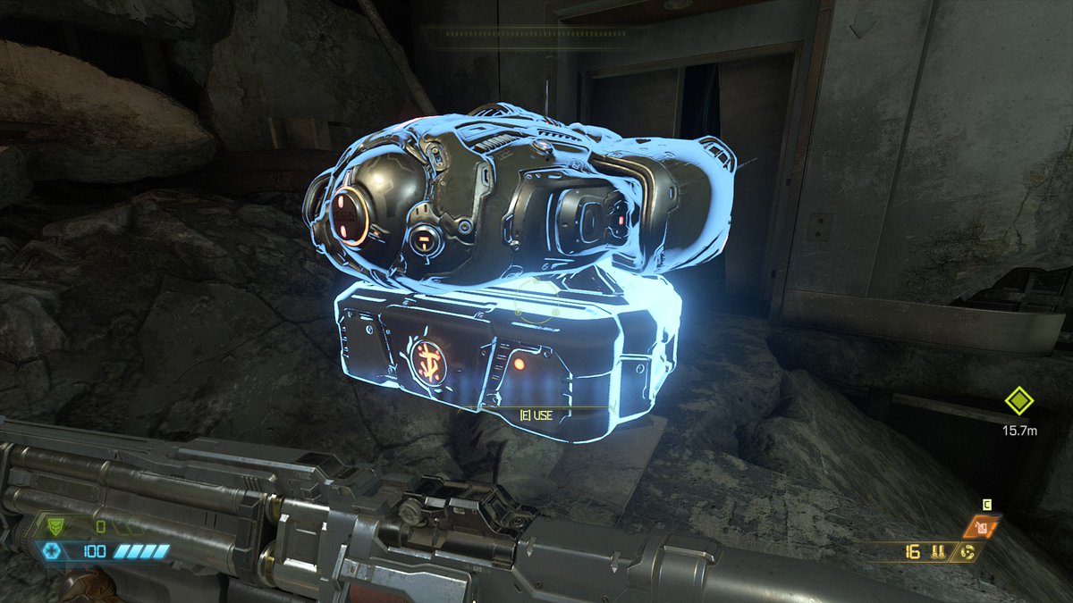
This little floating upgrade bot is interesting. With the way the detail is packed into it, I& #39;d expect it to be like the size of a fighter jet. Really interesting choices for adding detail to key areas.
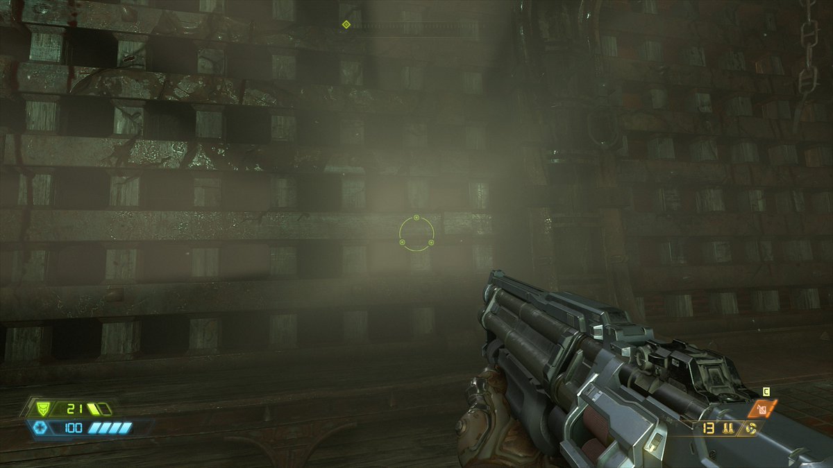
This is one of the things I was talking about earlier with having more contrasting light. I& #39;d expect the light behind these bars to be very bright given how intense the light shafts are, but this isn& #39;t the case. I& #39;m curious what this would look like in HDR.
With my back turned to the light, I can actually go inside the light shaft. Interesting that they fully modeled the Doom Slayer for cutscenes, but decided not to go with a shadow casting version behind the camera for shots like this.
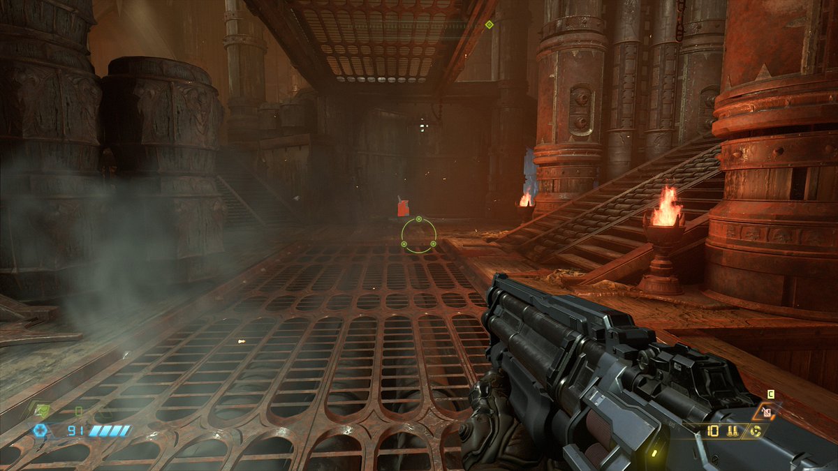
Interesting rendering decisions all around here. It looks like they don& #39;t do a ton of post processing in at least this area, and the item pickups are emissive without having bloom.
I wonder how much of this was driven by it being forward rendered rather than deferred?
I wonder how much of this was driven by it being forward rendered rather than deferred?
I find this area extremely interesting. It& #39;s the first area in the game where you fight aggressive enemies, and it& #39;s designed very much like a multiplayer arena. Lots of line-of-sight blockers, verticality, and even jump pads.
Very, very interesting from a gameplay design view.
Very, very interesting from a gameplay design view.
After taking a look at the rest of the area, it& #39;s starting to become clear why there isn& #39;t much contrast like you see here:
Enemies are should pop out from their background without having things like colored lights on them, and there& #39;s a clear arena combat style.
Fascinating!
Enemies are should pop out from their background without having things like colored lights on them, and there& #39;s a clear arena combat style.
Fascinating!
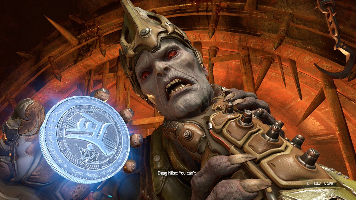
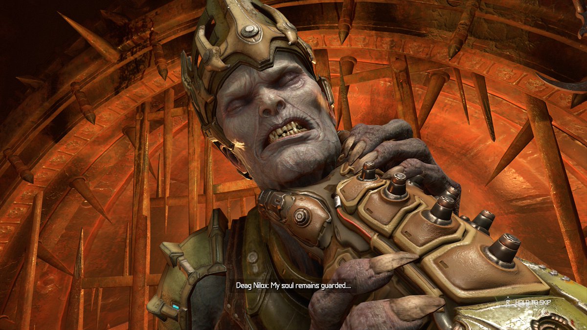
This guy his really lovely animation for someone you see for less than five seconds. I have no idea who he is, but I assume he& #39;ll show up at some later point.
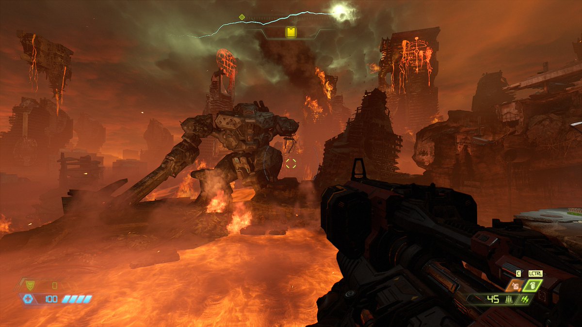
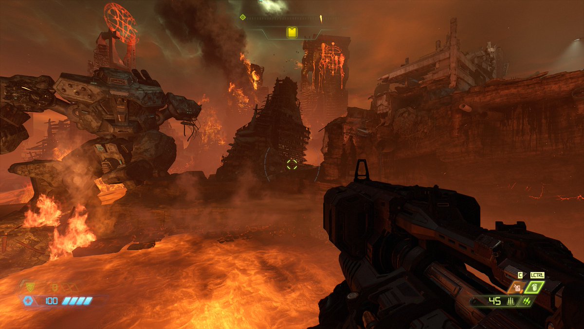
This is a really nice, illustrative backdrop. It& #39;s clear they& #39;re not going for anything realistic, but more for a comic book version of a demonic invasion. Really cool use of color and depth, not to mention exaggerating highlights and shadows.
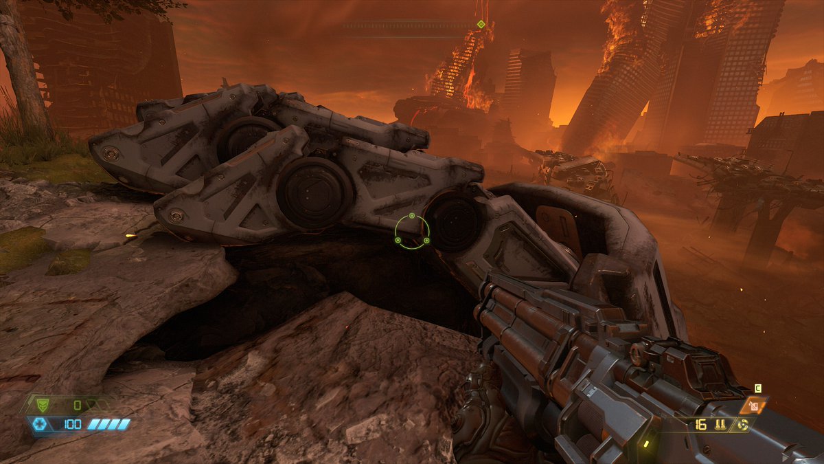
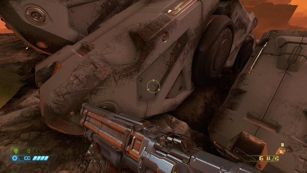
I really, really dig this big robot hand. It& #39;s an excellent example of mid-poly modeling with decals for detail. Having done this type of work professionally, it& #39;s always nice to see it well executed in other games.
It& #39;s always fascinating seeing where different artists choose to model and bake or paint detail
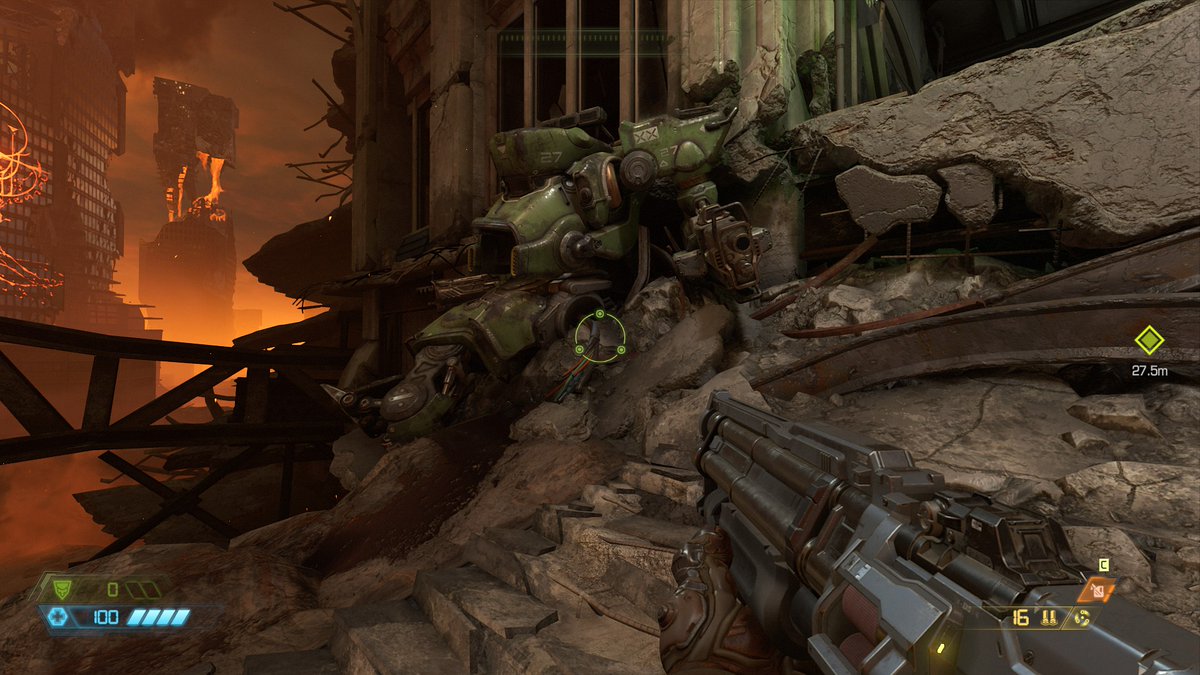
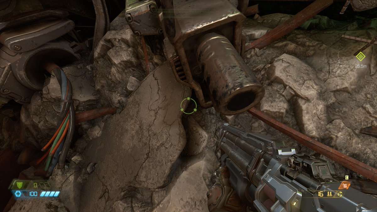
The barrel of this gun is an example of where many people would be tempted to model something in — even an inverted cone with a black gradient.
The barrel of this gun is an example of where many people would be tempted to model something in — even an inverted cone with a black gradient.
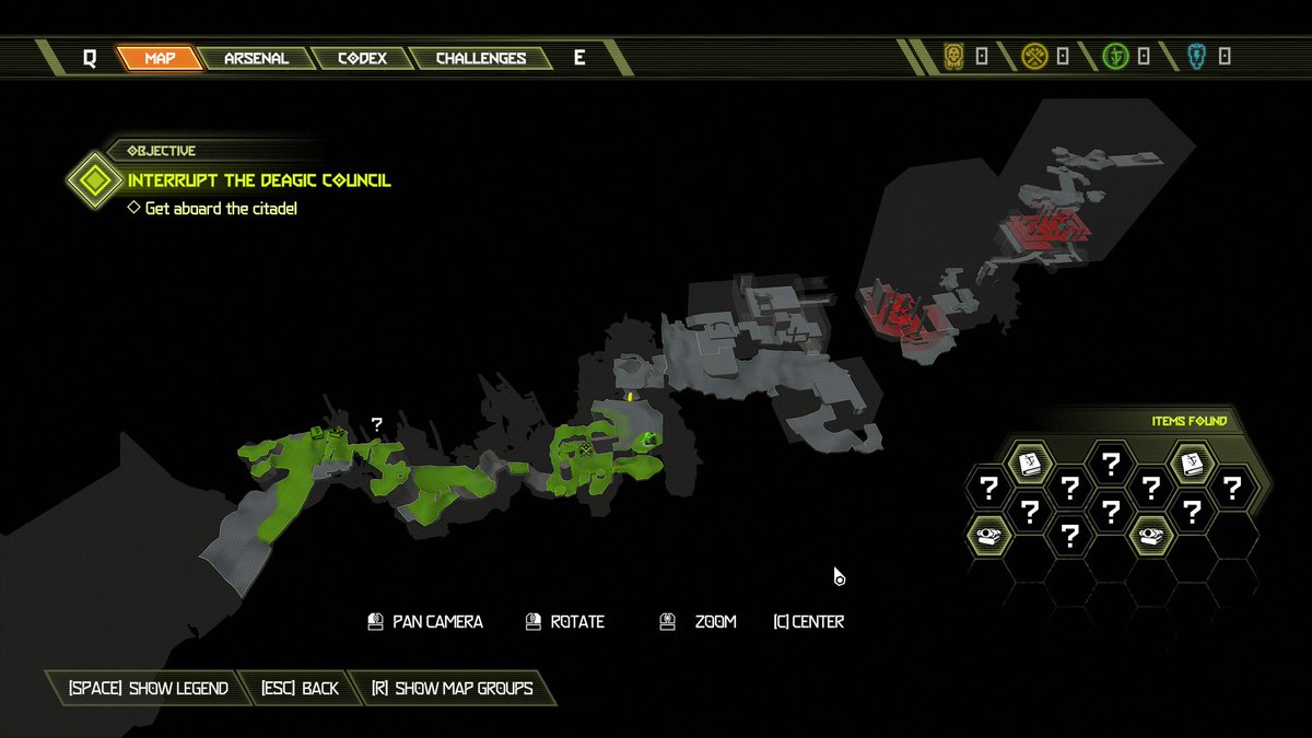
This is a really interesting decision. Instead of having parts of the map obscured, they make everything abundantly clear in the map screen.
Also neat: They display where you have and haven& #39;t gone in a shader showing hexes. A cool confluence of programming and art!
Also neat: They display where you have and haven& #39;t gone in a shader showing hexes. A cool confluence of programming and art!
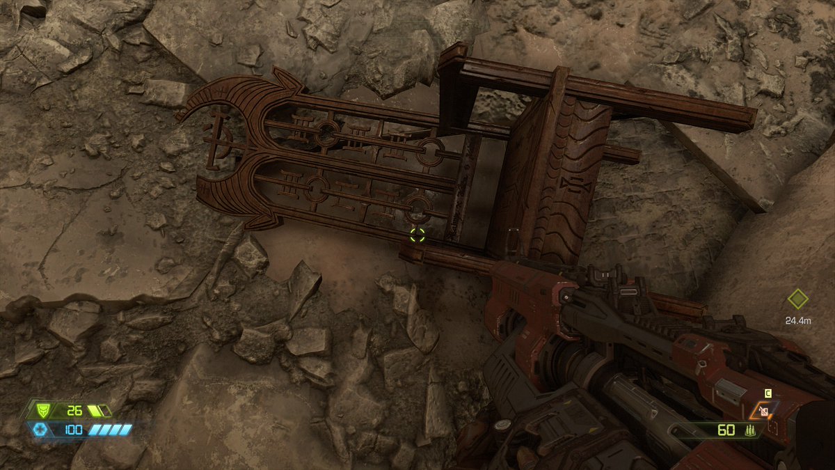
I love this chair. It has no reason to exist, especially since nobody from hell ever seems to sit down, and this is on the ruins of Earth, but fuck it.
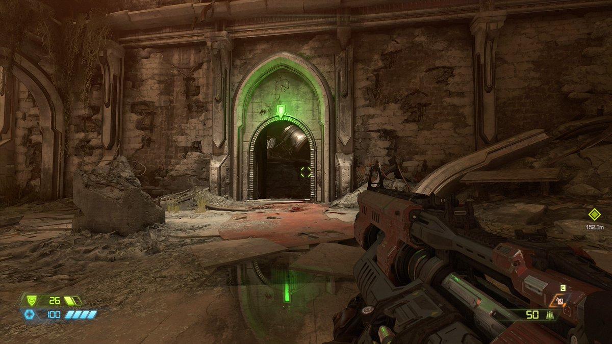
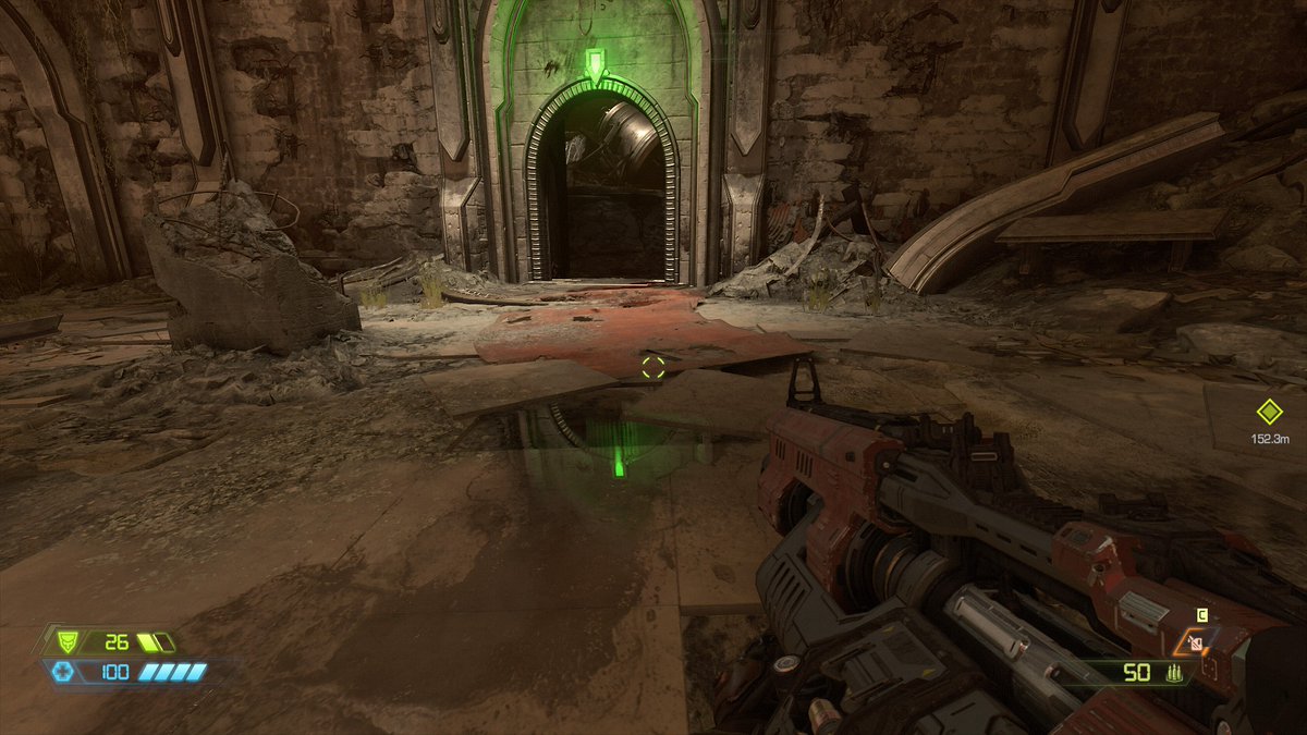
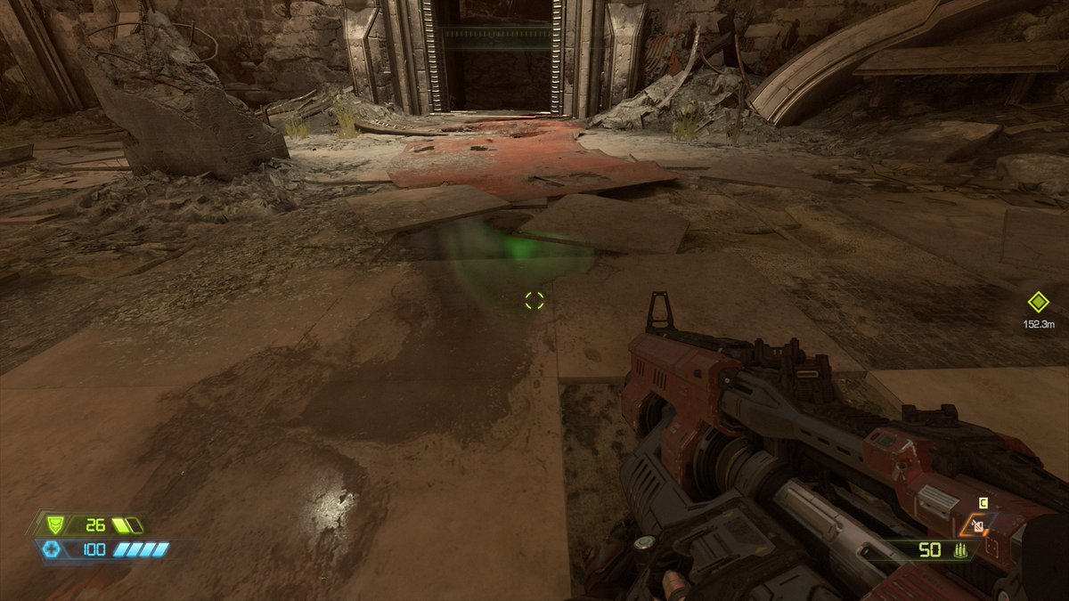
Take a look at the reflection in the puddle. As the doorway goes out of frame, it fades from screen-space reflections to a baked cubemap.
This is a pretty great solution to a common problem, though certainly only useful for static objects.
This is a pretty great solution to a common problem, though certainly only useful for static objects.
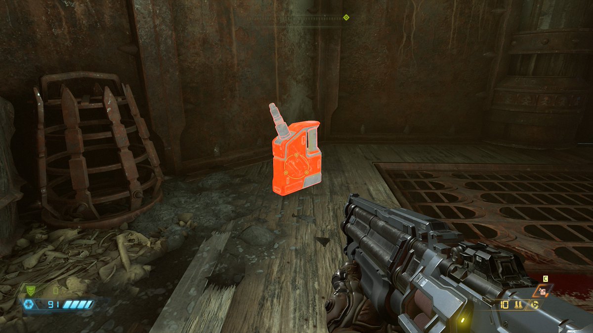
Wow, you really don& #39;t get a lot of ammo in this game, do you?
Check this out:
These tentacles and the ENTIRE TRAIN CAR are all animated. This is another example of cached animation that essentially just plays a flipbook consisting of models. It can be baked from skeletal animation, but it& #39;s not being computed in realtime here.
These tentacles and the ENTIRE TRAIN CAR are all animated. This is another example of cached animation that essentially just plays a flipbook consisting of models. It can be baked from skeletal animation, but it& #39;s not being computed in realtime here.
The level design in this game is absolutely fascinating. They& #39;re clearly leaning heavily on their roots with Quake-style arena combat, and it& #39;s a really interesting way to handle single-player multi-enemy fights in a confined space.
I find it fascinating that they& #39;re not even giving a token effort to making any of this look *not* like a game. It has all the hallmarks of a very gamey, constructed scene, including contrast that& #39;s all over the place, multiple noisy visual landmarks, and wild saturation.
This IS NOT to say it& #39;s bad. I just think it& #39;s an interesting set of choices to make in a time when so many games are specifically trying to emulate the language of film to feel more grounded.
OOOOH
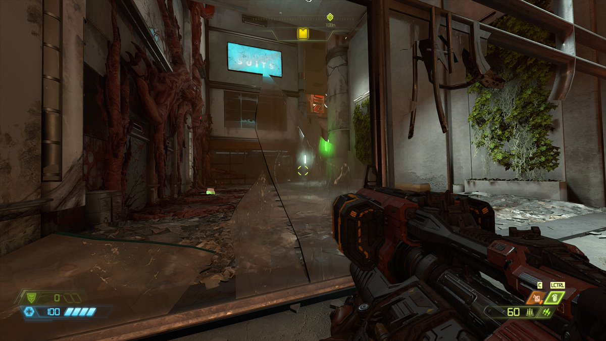
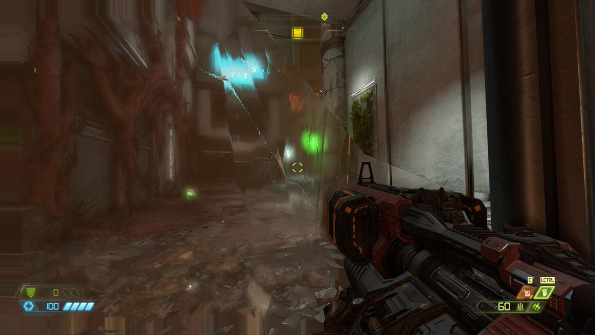
Blurry transparency. So. Look at the glass near the edges of the screen.
Looks like they either render what& #39;s behind the glass at a lower resolution and then upscale, or they just downsample.
This leads to stretching artifacts where there& #39;s no pixel data.
Neat!
Blurry transparency. So. Look at the glass near the edges of the screen.
Looks like they either render what& #39;s behind the glass at a lower resolution and then upscale, or they just downsample.
This leads to stretching artifacts where there& #39;s no pixel data.
Neat!
This hologram is rendered as a separate pass and then composited into the final image with an additive blend mode, most likely. If it was just a model with additive turned on in the shader, you& #39;d see the torso through the arm.
God, this has such a different feel compared to Alien: Isolation. Same exact type of environment, but here I feel powerful, where in AI I felt completely helpless.
GAME DESIGN, FOLKS
GAME DESIGN, FOLKS
This game, especially having just come down off Control, feels wild.
I don& #39;t want to make too many early judgments, but my initial impression is that the art for Control was very *directed* while the art in Doom is very *produced.*
I don& #39;t want to make too many early judgments, but my initial impression is that the art for Control was very *directed* while the art in Doom is very *produced.*
To me, Control felt like they wanted you to feel things about your environment, and they tried to evoke these things by producing something moody and distinct.
By contrast, Doom feels more like they want to evoke things about gameplay and interaction, and art is secondary.
By contrast, Doom feels more like they want to evoke things about gameplay and interaction, and art is secondary.
The art in both games is extraordinary, but for entirely different (and probably opposing) reasons.
I& #39;m interested in diving into Doom some more tomorrow.
I& #39;m interested in diving into Doom some more tomorrow.

 Read on Twitter
